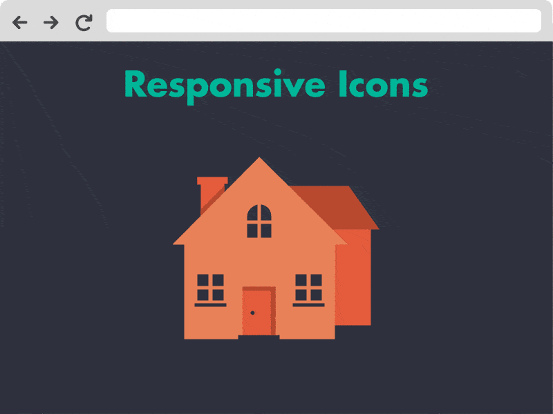
The Next Big Thing: Responsive Icons
Honestly, this topic sounded a little bit strange to me when I first learned about responsive iconography, as we have recently adapted icon fonts in order to make sure they scale well for various device. However, the idea of responsive icons it takes both responsive design and iconography a step further, much further.
What are these said responsive icons?
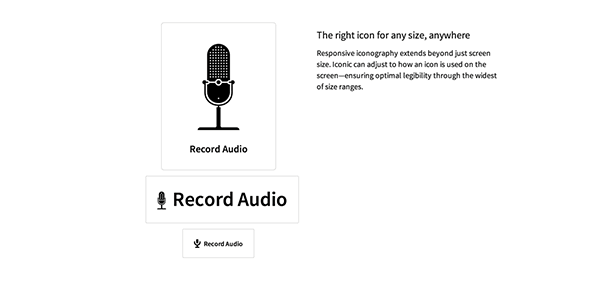
Responsive icons do not mean that the width of the screen determines how big an icon is displayed; actually it means that a different icon is displayed based on the size it is presented in. This means that screen size does not matter but the size of the icons itself does. This is because some icons will be displayed in various sizes – at the same time, on the same screen.
The difference between icons won’t be anything more but the quality of detail displayed. We are talking about having a lot of detail in an icon which is displayed big at say 500px by 500px, a little less detail for an icon which is displayed 250px by 250px and as little detail as possible for an icon that is only 25px by 25px in size. I’m sure you can image that a single icon would look boring and even render poorly if you have very extensive icon and displaying it very small.
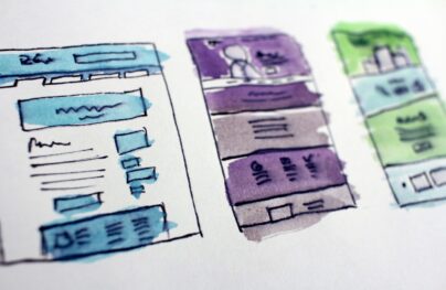
Why is this important?
With the boom of font icons, responsive website and minimalistic design our styles has changed to implement flat icons so much more in our designs. Now, I’m not saying there is anything wrong with that nor that all design out there do or should use flat font icons but those who do can take it a step further.
By creating responsive icons we are taking iconography to a whole new level where it helps create a better experience, better usability and better visual design for users. By going with responsive icons the idea is to make the web better, which is what everyone wants and needs for you as the designer and your users.
With Postcards Email Builder you can create and edit email templates online without any coding skills! Includes more than 100 components to help you create custom emails templates faster than ever before.
Free Email BuilderFree Email Templates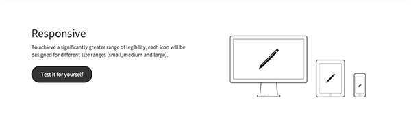
How does Iconic fit in?
Iconic is a product that if you have not heard of it, you at least have seen it in use as they created a set of icons that just so happened to be very popular. The team at Iconic is taking a plunge in creating responsive icons; they are they force behind this new movement, if you will.
Iconic recently launched and successfully finished a Kickstarted campaign where they received $92,624 – yes you read that right – which is 618% of what they were asking for (they only wanted $15,000). With this money, they are able to research methods and technologies, which will allow for responsive icons as it currently is not that easy to do. Basically, they are aiming to revolutionize web iconography.
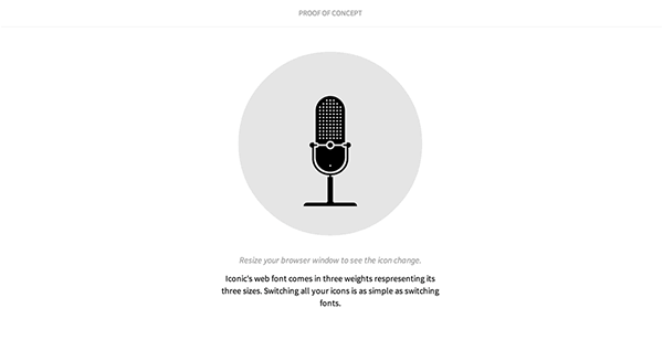
“Just because an image is scalable doesn’t mean it’s legible at all sizes. Most visual elements have a sweet spot in terms of legibility—icons are no different in this regard. To achieve a significantly greater range of legibility, each icon will be designed with different amounts of detail to look great for three different size ranges: small, medium and large.”
What is their current take on it?
There are a few ways you can currently go about creating and implementing responsive icons. Let’s go over some of the ways Iconic has revealed as possible solutions.
Media queries
The simplest and most obvious approach is to create media queries and pair them with web fonts. The idea is that although each icon – the ones with most and least detail – has its own font weight (such as 200, 400 or 600) and are indeed all part of one font face; therefore, when you resize a browser you change the font-weight being used at a particulate screen width to have appropriate icon show.
With Pulsetic you’ll be instantly notified the moment your website, API, or server becomes unavailable. Monitor uptime from multiple global locations and respond to incidents before your users are affected.
Create beautiful status pages in minutes to keep customers informed during outages and build trust with transparent communication.
Start Monitoring for FreeHowever, this method falls short when you want accuracy. As it seems, media queries are still a key concept in bringing various icons at different conditions, read on to find out what I mean by this.
Element query polyfills
I’m not sure if you know what element query polyfills are so let me explain them to you really quickly. You can think of them like media queries that are set on elements instead. Take for instance the example below, what it means is that when the footer is at least 250px wide, make its background white. In a way, it is a much more direct and concise version of media queries.
footer[min-width~=”250px”]{
       	background: #fff;
}
The idea of element query is a very new concept that is not at all supported by browsers but it works if you implement it with JavaScript. You can find out more about it here.
The idea, which Iconic is after with element queries, is very similar to that of media queries where when the size of the icon changes – its font weight does too giving you the appropriate icon. The reason this is a cool concept is because combining element queries with media queries allows for a very specific way to select the right icon at the right time.
SVG breakpoints
This is the third and final way in which Iconic has publicly talked about exploring, SVG breakpoints. The idea with SVG breakpoints a little interesting – it is for sure thinking outside the box. SVG allows for dynamic control of elements and icons so this would take static iconography to the next level once more. If you imagine combining this with media queries where the icon itself can be trigger to change independent of the screen’s actual size. However, that is a little far fetch as SVG breakpoints are hard to integrate with DOM at this point.
What to expect?
What Iconic is after is a big leap of innovation when it comes to web iconography; and let’s hope they will achieve it, and soon! As per their Kickstarter campaign, they are promising to deliver a full open source toolkit to aid in customization and efficiency. This toolkit would allow integration of any vector icons in addition to the sets they will be providing.
On top of that, they are setting out to revolutionize icons a step further once again. One thing they mentioned in their camping is their desire to reinvent current but outdated icon conventions such as the dire floppy disc as the save icon. We no longer relate to floppy discs as none of us has seen one in years, not to mention actually used one. The Iconic team is setting out to correct some of these outdated aspects of design; I have my finger crossed for this, as it is one hell of a challenge.
Conclusion
The take away from this is very simple; I have given you an overview of an up and coming technology that will make the web so much better. Can you image the types of experiences we will e babel to make? Can you image what other usability or UX innovations will this set into motion? I have high hopes for what Iconic is doing. I wish them the best of luck and hope they get this done as soon as possible!