Using Square Blocks in Web Design
There are so many different things that come to mind when you take a look at the examples below in terms of how or why they use square – or rectangular – elements. To just list a few some are utilized for alignment, organization, decoration or juxtaposition between circular and boxed elements on the page. There are many ways and reasons go ahead and use squares in a design. Let’s go over them in a little greater detail.
What’s the purpose of using them?
To get a little philosophical and theoretical on you, I’d like to go over why someone might way to use squares. (By the way, I’m including rectangles when I say squares as some examples too have rectangles.) There are two key reasons why such elements are used. First and foremost, it is to help organize. Second, it is to set a specific style. They are the perfect type of element to use in order to showcase anything your heart desires or needs.
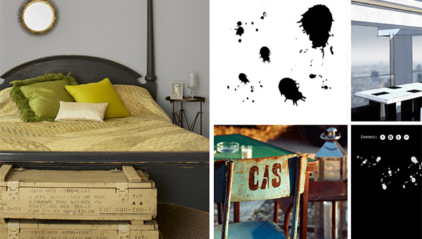
If you look at Dennis Adelmann’s portfolio you can clearly see that the rectangular elements were used to organize his work. That is a very simple way to organize any amount of content; it keeps things clean.
But if you look at the website for We Love Noise; it is totally different! Yes, you see square elements all over; yes, there is a fun animation as you move your mouse about. But, besides organizing content, you can clearly see that the square elements are being used as a part of the design style. It is actually a very crucial and key element to the style.
With Postcards Email Builder you can create and edit email templates online without any coding skills! Includes more than 100 components to help you create custom emails templates faster than ever before.
Free Email BuilderFree Email TemplatesHow to use them well?
I don’t think square or rectangular elements are anything hard to figure out. Web specifically has been using boxed shapes to create designs and interfaces since the get go. But, if you want to use these boxed element a little bit more significantly, you’ll need to follow three simple steps.
Determine what you want to accomplish
The goal of the page or section can be very different based on what it is you are trying to accomplish. Once you figure that out you can use box elements to help you achieve your goal. Are you doing this to organize your content? Are you trying to make the page a little bit more fun?
Take a look at Paper and Paint. They use boxed elements in order to keep their page in order; they use them to emphasize the specific flow of the page. As you scroll down different things are parallaxing within each box – which is a pretty cool effect – and each box has something unique to tell you that relates to the overall story of the page. The goal of these boxes is to keep the different section of the page aligned in a neat fashion, which also helps in developing the particular story that the page is after.
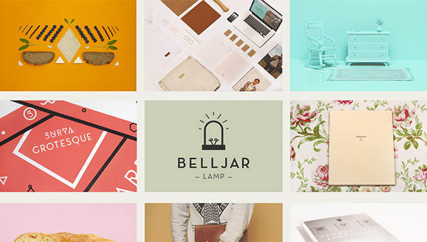
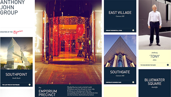
Anthony John Group uses boxes to exhibit different projects they have developed as well key company information such as ‘the man behind the name.’ This homepage is well planned and constructed yet very cohesive. It is very obvious they strive for high-end architecture based on the elegance of the page, which couldn’t not have been achieved without the boxes.
Use the squares to organize
Now that you know what it is you are after – albeit, it is most likely cohesion among your information – you can get to the organization part. You’ll have to catalogue you content. How do you want to organize your content among different boxes – will one box have more content than another? This is where organizing your content will be very helpful; you’ll have to play around with what works and what does not, play with what is too much and too little. I promise it is not rocket science, it is actually quite easy – more often then not very intuitive too – you just have to sit down and do it.
With Pulsetic you’ll be instantly notified the moment your website, API, or server becomes unavailable. Monitor uptime from multiple global locations and respond to incidents before your users are affected.
Create beautiful status pages in minutes to keep customers informed during outages and build trust with transparent communication.
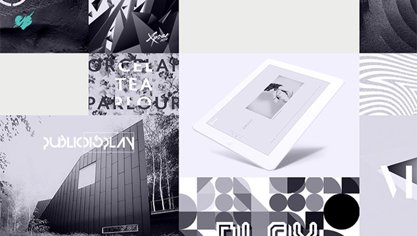
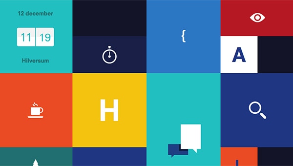
Start Monitoring for FreeHave you noticed that at the site below, Block Level, just about all of the icons in the squares and rectangles are just that, only icons. This is exactly what I meant by organizing your content, the people involved with designing Block Level made a conscious choice for each box to have a single icon. The next step is to figure out how to incorporate this newly coordinated content into a delightful design; and that is, in fact coming up next.
Organize the actual squares; or not!
Now that you know what your information groups look like from organizing your content you’ll have to figure out what you’re going to do with the boxes themselves. This is where you’ll refine the sizes of the content if you want to have them all be unified and the same – or, this is where you’ll decided you would like them to be mismatches and messy. This all depends, again, on the overall goal you are after.
As you can see on Nedd, the boxed elements are actually pretty big but they are similar in width and all the same high giving the site a very organized look. As I hope you have noticed, although this is a more organized approach the style of the site is very fun and light; that is due to the colours, the vector elements, the play with the circles, typography, and so on.
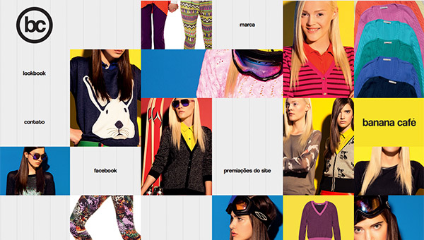
On the other hand we have something like Banana Café where the elements are scattered – elegantly reshuffled, if you will. This site too has a fun feel to it thanks to its choices of typography, colours, etcetera. This specific use of boxed elements is nothing but a conscious design decision to help ground your design.
Setting a style
You have plenty of design options you can pick from in order to create a specific style that integrated boxed elements in your next project. You are free to combine squares with other elements such as circles or make them the main focal point of the site’s design by only having square or rectangular shapes throughout. In the last two examples below you will see once again how utilizing square and rectangular elements very well within their designs; I hope you get inspired to use these in your next design.
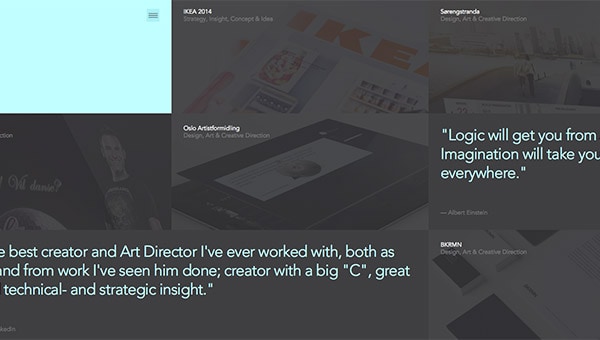
Jan Finnesand uses the full width and height of the page to utilize the rectangles; each one of them has a specific purpose, most of which are to showcase a case study of project he has previously worked on. The fact that the boxes are spread across to the full browser window makes for a very cool design.
This agency uses boxes all over! On the homepage you can see they too are showing off specific case studies. They use different size squares to guide the user’s eye. My favorite thing about their site is that they use two squares to form a bigger image yet each one of them has a link to a different project – just thought this was cool.