17 Startups with Great-Looking Websites
Startups are an incredibly interesting business model with employees that have ambition, work hard and have great ideas.
Personally, I’ve worked with a number of them and I love the high pace environment. But the thing I loved the most about startups is the emphasis they put toward great design in both product and web presence. Stakes are high in order to accumulate exponential growth for these companies so design is placed on a pedestal.
I’ve assembled a list of 17 startups which figured out how to create amazing websites.
Startup Website Examples
Exposure
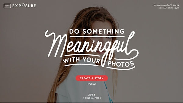
If you’re a fan of photography and storytelling, you’ll love Exposure. They are a photo platform filled with incredible photo stories from people all over the world. The pages are very simple but the focus is clearly places on photos and it’s working very well for them. Couple this with the crisp and clean sans serif typography and you’ve got great looking pages.
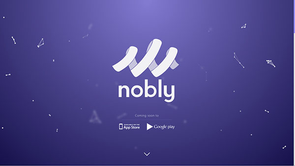
Nobly
With Postcards Email Builder you can create and edit email templates online without any coding skills! Includes more than 100 components to help you create custom emails templates faster than ever before.
Free Email BuilderFree Email TemplatesNobly is a social app that tries to connect people wanting to do good deeds. The hero section on their home page is eye-catching. It has their logo all big and white against a bold, purple background. This is a grand entrance or greeting, rather – and it works.
The Fernmway
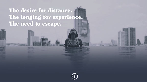
The Fernway is a travel resource for people that want to discover new places and experiences and if you’re into traveling this might interest you. But, if you’re only interested in great design, that’s also good. The Fernway’s layout seems to be inspired by magazine layout design, which works for them. The dark website is simple but shows really well.
Flowmail
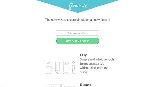
Flowmail is for email newsletters and they have the cleanest of landing pages. There is little one the screen aside from three value propositions and a sign up form. They get right to the point which helps their message that they can do things in an elegant, simple and effective way.
Xero
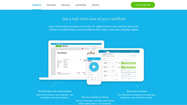
Xero is online account software that truly takes design to heart. The home page has a lot of information to offer for potential users. Information is thoroughly organized and it looks good. They have a sense of style!
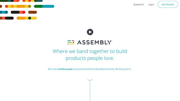
Assembly
With Startup App and Slides App you can build unlimited websites using the online website editor which includes ready-made designed and coded elements, templates and themes.
Try Startup App Try Slides AppOther ProductsAssembly is an online community where makers of all backgrounds – design, development, marketing, etc. – meet up and work on projects in exchange for ownership. It’s a great community built on trust and togetherness. The fantastic branding reflects this connection people have. The look and feel of the brand is friendly, inviting and fun; this further sells the appeal of being part of this community.
eRated
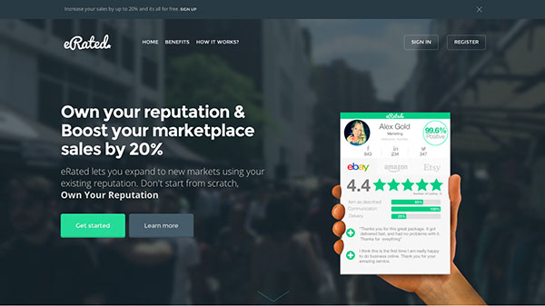
If you’re an online retailer, your reputation is important. eRated comes in handy as it helps you keep track of your reputation and helps you improve it. Their website is filled with thick and big typography as well as colorful icons and graphics. All this makes for a friendly and trustworthy atmosphere.
Brewster
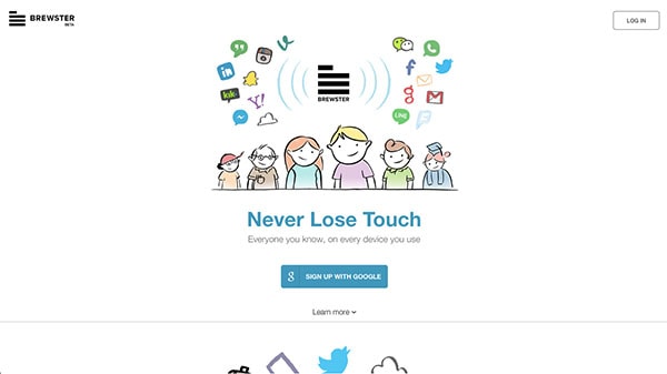
Brewster is an app that keeps track of contacts for you. They have a great grasp on design as the landing page and app itself have been featured as an inspiration for years. The current landing page stays away from a typical high-end polished look; instead they use cartoons to help facilitate friendly and approachable brand. It’s quite different, but it’s refreshing.
Squarespace
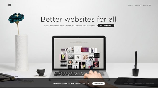
Squarespace is a website platform and web hosting service that specializes in helping people and companies achieve high quality and high end design. The style is simple, clean and sophisticated. It’s all in the way they use typography, white space, proportions and photography to craft and excellent web platform.
Rdio
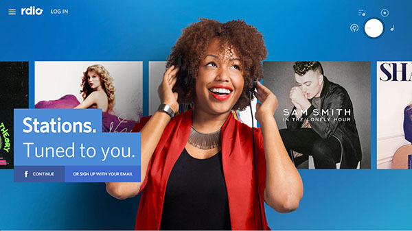
Rdio is for steaming music and their recent redesign was an interesting one. They stayed away from a typical website layout and got creative with experimentation. To further their creative design direction, they chose to utilize vibrant colors. Their website looks good; it is fun, exciting and upbeat.
Kissmetrics
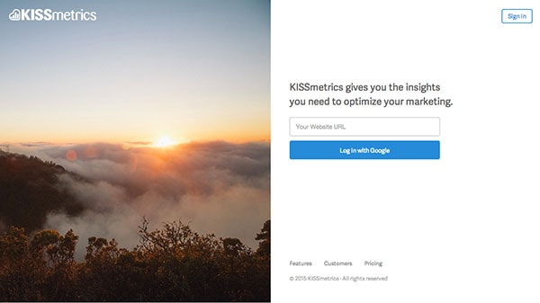
Kissmetrics’ landing page is minimal and to the point. The analytics web app makes use of screen space by dividing it in half and posting only a call to action on one side. On the other is a completely irrelevant but beautiful photo. This works because a lot of people already know what Kissmetrics is all about and they don’t need anything else but a signup, or sign in, form.
Virb
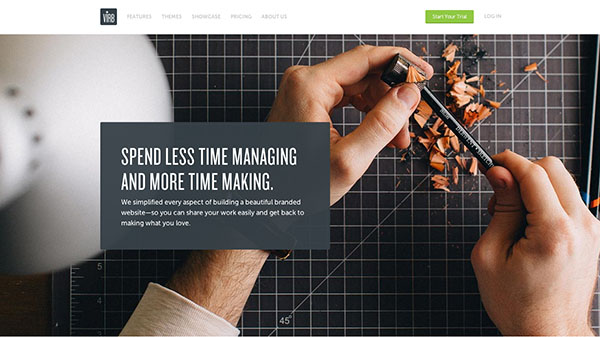
Virb is a website creation platform. The website is gorgeous, which makes signing up for their service that much more convincing and easier. They make good use of photography throughout the site.
Evernote
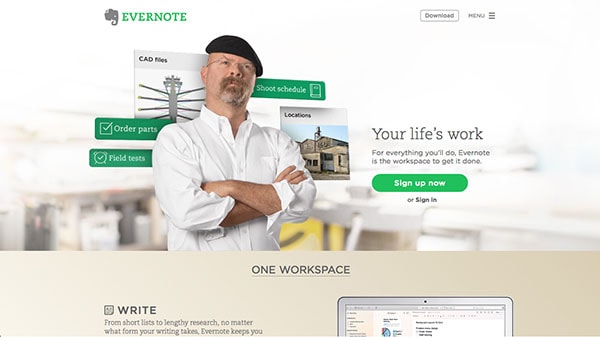
Evernote is a product we all know and love. However, the guys at Evernote truly know the power of social proof as they hit the ultimate cool by featuring Adam Savage and Jamie Hyneman as one of their power users. It’s no longer about just how their product looks; it’s now about amping up the experience of the app through namedropping.
Narrative
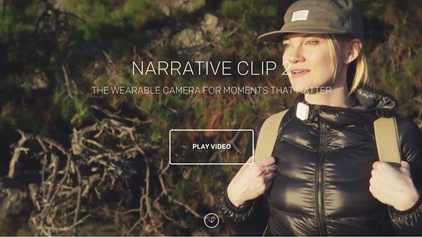
Narrative is a wearable camera. The landing page features the device front and center as you scroll. All around are magnificent photos taken with the app. It tells a great story about the product and how it relates to you through all the great photos you too could be taking.
Square
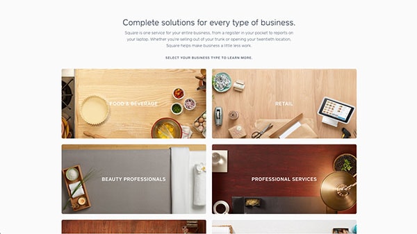
Square has enjoyed a reputation for having a high-quality design standard. The website and product have evolved a lot over the years but their sense of style is still the same and it’s pretty great. Their user of typography, photography and color is spot on – designs are clean and pixel-perfect.
Hotel Tonight
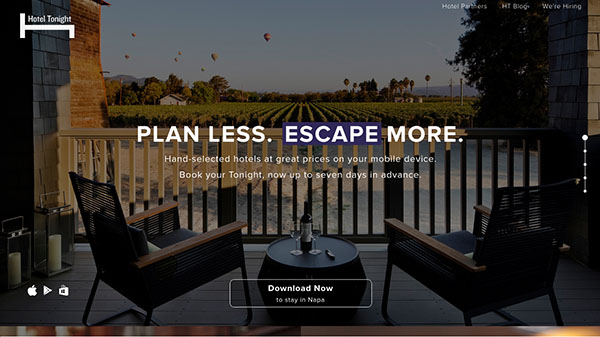
Hotel Tonight is an app for booking a last minute hotel rooms. Their landing page shows off an intimidating look and feel – just like the app. A sense of intimacy is an interesting take for a product like theirs. Moreover, their landing page is filled with great, high quality photos of places you might have adventures, or at least inspire one.
Geckoboard
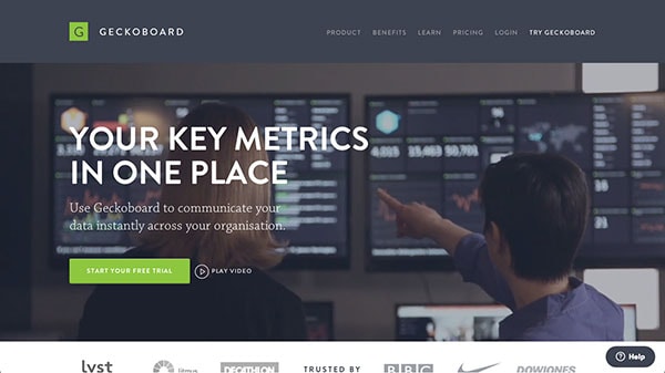
Geckoboard is a platform for displaying company metrics. Their product – and their website – clearly shows that data doesn’t have to be bland or boring. Their branding touches upon subtle but elegant design elements like a great color scheme and well chosen typography.
Conclusion
Starups show time and time again that investing in great design pays off. When design is done right, it compels us to try something new and it introduces you to new products and companies we might fall in love with. I hope this list of 17 websites proved helpful for you to understand that design is a big deal and felt inspired by these companies to create fantastic designs on your next project.
I tend to like minimal and bold designs, but which one of these sites was your favorite? Share your thoughts in the comments.


