How Time Perception Impacts Interaction Design
How can you use time to your advantage in interaction design? Is it even controllable?
The elements of timing can be difficult to describe, but we all feel them, from the annoyance of waiting for something to load, to the exhilaration of breezing through page after page. The scale of timing is wide, ranging from noticeable increments to the tiny milliseconds that individually seem meaningless, but can add up to sway a user’s opinion one way or the other.
Our discussion in this piece applies all content that changes over time: video, sound, animations, and more. We’ll start by explaining why time matters, then discuss the elements of timing and how they can be improved, and then we’ll explore how speed and simplicity play a role.
Why Time Matters
Time can be a difficult concept to grasp because its range is so vast. Just as the size of an electron is almost unfathomable compared to the enormity of our galaxy, so too the span of a millisecond seems unrecognizable to the duration of a Millenium.
But digital time is not the same as human time. A few seconds can mean the difference between a frustrating experience and a delightful one. We can attribute that to basic human psychology:
- Limits of memory and attention — As we described in Interaction Design Best Practices, designers must evaluate the cognitive load of interfaces. Otherwise, users will suffer from the loss of information in short-term memory, which causes frustration.
- People must feel in control — Nobody wants to be at the mercy of technology. Like we stated in a recent blog post, some people still treat computers as a black box. Digital products that make you wait will give off the impression of incompetence and/or arrogance.
There is a rhythm to user actions. In the field of UX, the power of time is measured in magnitudes of 10. It takes users 0.05 seconds to decide if a website is worth their time. If they decide to stay, they usually leave within 2-4 minutes.
With Postcards Email Builder you can create and edit email templates online without any coding skills! Includes more than 100 components to help you create custom emails templates faster than ever before.
Free Email BuilderFree Email TemplatesWhether the goal is getting an update on your Facebook feed or comparing and buying products on Amazon, every experience breaks down into a series of interactions, and the time between interactions has a compounding effect on the user experience.
Elements of Time in Interaction Design
So how exactly does time relate to interaction design? David Malouf, Design Consultant, believes that time separates interaction design from all other UX disciplines. Time is more than just a linear progression because all interactions happen over time. As Malouf suggests, we can actually examine time from 3 separate perspectives: pace, responsiveness, and context.
1. Pace
In terms of design, pacing relates to how much is accomplished in a given amount of time. Immediately, you may be thinking, “well, the more the user can accomplish, the better,” but that’s not necessarily true.
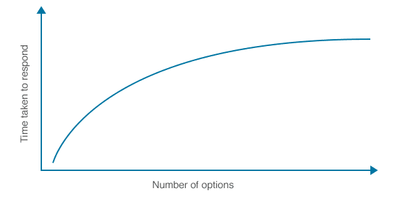
Source: Hick’s Law
Experiential flow is much more important than the sheer number of available actions. As described by Hick’s Law, too many interface objects actually impede decision-making (and therefore goal accomplishment).
Consider, for example, the difference between one gigantic signup form and a multi-page series of smaller forms with the same information. The one long form will take less time, but the series of smaller forms will seem more manageable and less complicated to the user.
In the below example from LinkedIn, combining a wizard form with a progress bar is a great tactic for improving the pace of the experience. The long process of creating a professional profile is divided into 4 manageable steps. Users can also see how far they’ve progressed, which incentivizes them to proceed further. Pacing is less about efficiency, and more about what the user is comfortable with (UX) — not overburdening them, but not slowing them down either.
With Pulsetic you’ll be instantly notified the moment your website, API, or server becomes unavailable. Monitor uptime from multiple global locations and respond to incidents before your users are affected.
Create beautiful status pages in minutes to keep customers informed during outages and build trust with transparent communication.
Start Monitoring for Free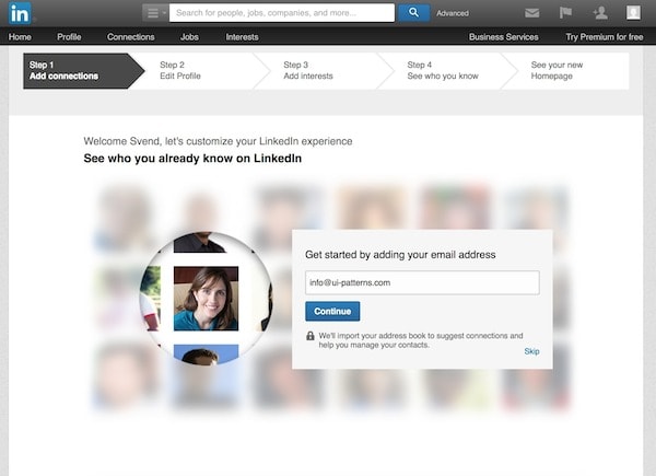
Source: LinkedIn Wizard Form
2. Responsiveness
A product’s reaction time relates directly to the level of user control. According to Jakob Nielsen, the 3 most important response time ranges for digital products are:
- 1 second – Direct Control — The user feels they are directly manipulating the system, as they would a physical tool. No feedback is necessary except the visual manifestation of their results.
- 1 second – Indirect Control — The user notices the delay, but still feels in control over the site experience. For example, this delay is acceptable for loading new pages.
- 10 seconds – Little Control — The user loses their attention and their workflow is interrupted. Feedback is crucial to minimizing abandonment, which is why load screens are so popular.
Delays in response time must match the magnitude of the task. For instance, 5 seconds is acceptable for loading a cloud-based dashboard, but it’s unacceptable for triggering a dropdown menu. The longer the delay, the more the relationship between the user and the interface dissolves.
Source: UXPin
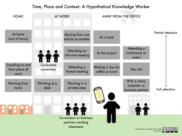
3. Context
How, when, where, and even why an application is used all affect the perception of time.
For example, the average website visit lasts 2-4 minutes, while the average ecommerce sale lasts 28 minutes (and that’s not even factoring in what kind of sale — buying a car could take months). Likewise, someone comparing prices on their mobile device while at the mall values speed more than someone doing the same thing at home on their couch.
If you find that users are leaving your site prematurely, you may want to revise your link copy. You can also check the visual hierarchy (colors, contrast, typography) of the page to ensure important information is emphasized.
However, these attention-grabbing methods can be counter-intuitive on a site where you want your user immersed in a single page of content, such as a blog. In that case, you’d probably want to make better use of white space to emphasize the content (similar to Medium). The same strategy for capturing attention has two different effects depending on the type of site — it all depends on context.
Faster = Better…To A Certain Extent
When discussing an interface’s pace, we mentioned that faster is not always better
To be fair, most time-related usability problems result from the system being too slow. However, there are some instances when speed kills. Most often, an interface that is too fast can lead to two problems: information is missed, or the users can’t keep up.

Source: FourSquare
1. Users Miss the Information
When information changes too quickly, the user might miss it, even if they were simply looking at the wrong part of the screen for a moment. These apply mainly to unexpected actions that were not initiated by the user, and generally the farther the change is from the relevant action, the more likely the change will be missed. A simple fix is to draw attention to the change with properly executed animation (which we’ll discuss later in the book).
We can actually look to Siemens for a cautionary tale of excessively fast interfaces. In this case, users were shown the below site and asked if they could find out if Siemens was running any special sales on washing machines.

Source: Auto Forwarding
As Jakob Nielsen, co-founder of the Nielsen-Norman Group describes, users failed the task even though the top of the page mentioned the sale in massive font. Why did this happen? Because the carousel (which looks more like an accordion) auto-rotates every 5 seconds. Once that screen changed, the only other indication was the sidebar on the right side — and that was mostly ignored because of the two calls-to-action look like banners (which induces banner blindness).
2. Users Can’t Keep Up
Even users that notice rapid on-screen transitions still may not understand them. This is most common with carousels, rotators, and other automatic functions — a user becomes intrigued by the image on the screen, but by the time they move their mouse interaction over it, it’s been replaced by a new, less interesting one.
You can see that the prior Siemens example shows a combination of bad UX decisions. The 5-second carousel, however, ranks as the worst. Because of it’s prime location on the page, the carousel image immediately draws user attention. But instead of clearly communicating the sale information, the carousel disorients the user by changing the slide every 5 seconds. Users didn’t trigger the action, so in the effort to regain control of the experience, they become more sensitive to other UX shortcomings (like the bad copy, for instance).

Source: Should I Use a Carousel?
In fact, it’s best to do away with auto-rotating carousels altogether since they are distracting at best and frustrating at worst. Users trying to accomplish goals unrelated to the carousel content will find it distracting. Users who actually need to access the content won’t react in time.
Reactionary problems are even worse for foreign-language users, the elderly, the disabled, or those unfamiliar with technology. To make sure your interface doesn’t react too quickly, here’s some other helpful tips:
- Hand control to the user — Rapid on-screen updates must be restricted to actions initiated by the user. Otherwise, this violates the Principle of Least Astonishment that states that users generally don’t like surprises.
- Slow it down with an animation — Try signalling any on-screen changes with animations that last between 800 ms – 1 second.
- Give each slide enough time — If you absolutely must use an auto-rotating carousel, read the copy aloud, then multiply by 2.5. That’s how long you should show each slide. Then once people mouse over a slide, make sure the rotation pauses.
Remember, perception is reality in interaction design. It’s much better to make the wait more pleasant than it is to push people forward in line.
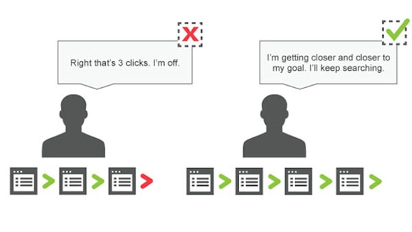
Strive for Simple Clicking Over Quick Clicking
While we’re on the topic of speed, it’s important to dispel another common design misconception, the 3-click rule — the rule citing that a user should be able to access any content on a site within 3 clicks. The 3-click rule can be best described as “well-intentioned, but misguided.”
Source: 5 Lies About UX You Still Believe
This chart created by former Hubspot UX Director Joshua Porter shows that there’s no real correlation between the amount of clicks and a user’s satisfaction. The lesson here is that designers should worry less about users completing a task as quickly as possible, and more on completing the task as easily as possible — two very different goals that warrant very different interface designs.
To further our point, just take a look at this diagram. It follows the 3-click rule since any page is accessible within 3 clicks, but does that pattern actually improve usability? It actually hurts it because users now need to sift through too many navigation choices at once. Besides, once someone reaches a new page, they’ll need to sift through all the options again.
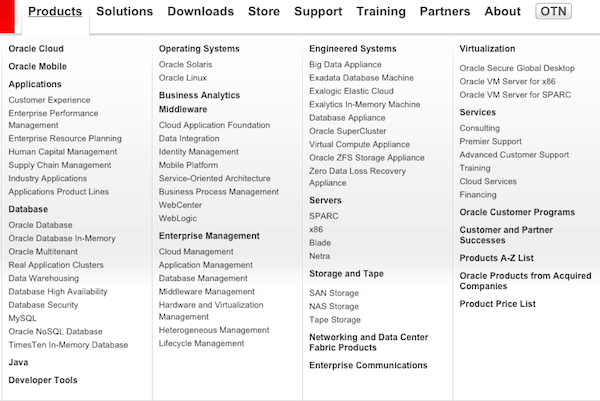
Source: Oracle
Just take a look at the Oracle site above. Sure, you can access any product category (like database or Java) within 3 clicks, but do you actually want to?
Instead, we recommend following the 1-Click Rule: every interaction must bring the user 1 step closer to their goal. This tactic helps you trim the number of top-level navigation items without sending the user down a rabbit hole. It helps you focus on the experience of exploration rather than the path itself.
1. I visit the homepage. Navigation options include Products & Services, News & Stories, and Log In or Enroll. I click Log In or Enroll.
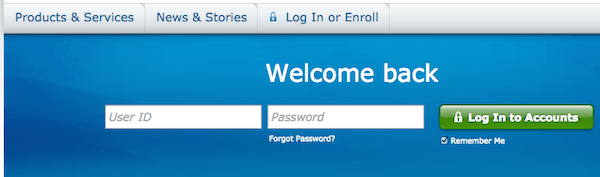
Source: Chase
2. My account page loads. I see a call to action for Ultimate Rewards and I click it.

Source: Chase
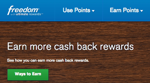
3. The rewards page loads. I see options to either Use Points or Earn Points. I click on Use Points.
Source: Chase
4. Once the point redemption page loads, I can see how many points are available and how many I can redeem. I select the amount, redeem for cash, and complete the goal.
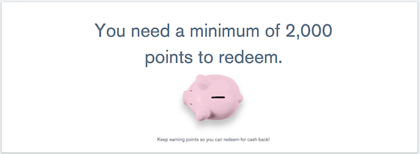
Source: Chase
More than 3 clicks are required, but each of the clicks requires very little effort. Each click also moves the user forward a step on their path to the goal. Now, if you were adamant about the 3-click rule, you might make one of the top-level navigation labels “Use Your Rewards”. The clicks are certainly reduced, but this wide-and-flat strategy will eventually present too many items to sift through at once. Usability is therefore sacrificed for the sake of a shorter click path.
We want to emphasize the spirit behind the 3-click rule: clicking should be as simple and organic as possible. Make sure that the time users spend on site isn’t just minimal, but worthwhile.
Takeaway
When it comes to interaction design, even a delay of one second can mean the difference between success or failure. If the user experience is too slow, then people become frustrated. If the user experience is too fast, people might miss vital information (or not know what it means). Understand the human perception of time, the limits of speed (and carousels), and the importance of directness in clicking.
When in doubt, remember this simple usability principle: clear is smooth, and smooth is fast.


