5 Ways to Enhance Your Website Login Process
The best way to enhance an experience, or to actually make it great, comes down to making the entire process simple for the user. There are many different things you can do to improve the login process.
Here we’ll discuss five things you can do to improve the experience of the process, starting with the two types of logging in and ending with the importance of labels and scalability.
Types of Logins
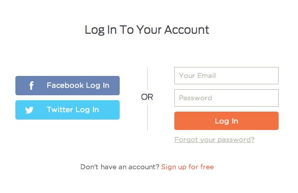
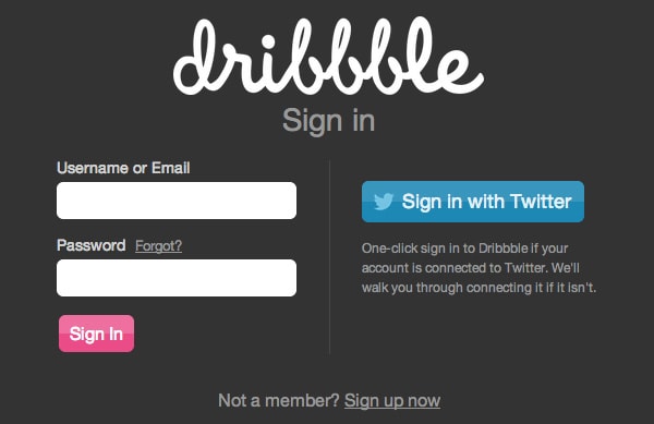
There are two different ways a user can log in to a website. The newest method is through social networks and you see it on many apps. This is especially true with new apps or products that don’t want to bother you with creating an account. Logging in with a social network like Twitter or Facebook is a breeze because all you do is click a button, wait a couple of seconds for the social network to connect and voilà!
The second way to log in is by providing a username or email and password. This is a traditional process and one we can improve. The tips here relate to this type of login. Both types of logins have advantages and disadvantages but for now lets talk about improving the typical, old school way of logging in.
1. Allow Email Logins
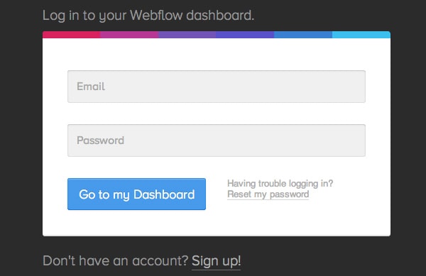
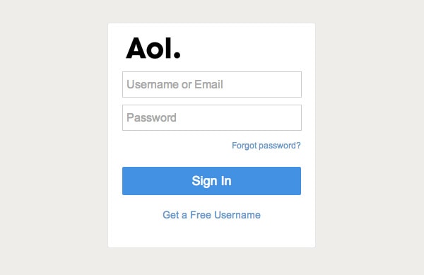
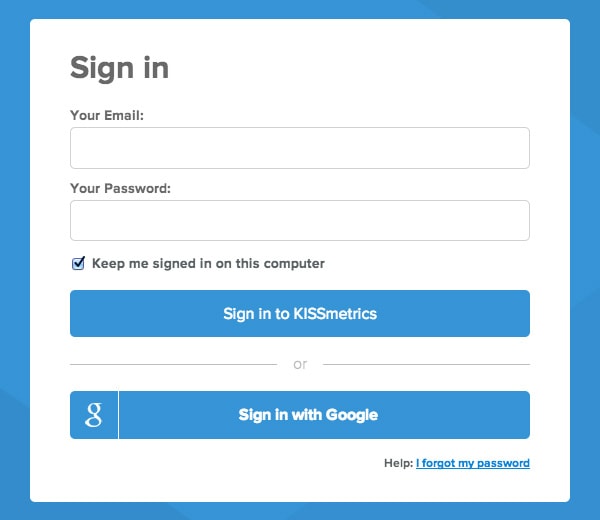
It’s natural to see websites that don’t require a username at sign up. To use email for logging in is natural, right? I don’t think there is anything wrong with using either username or email; please allow for both. My problem is with only accepting usernames when clearly emails should be allowed as well.
I have encountered logins which accepted both but only stated ‘username’ as the input label. This is a flaw in design.
With Postcards Email Builder you can create and edit email templates online without any coding skills! Includes more than 100 components to help you create custom emails templates faster than ever before.
Free Email BuilderFree Email Templates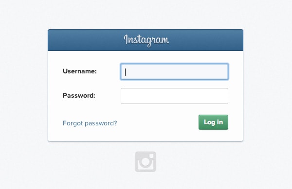
Here’s the deal, people often will use the same email address but may not use the same username. For instance, my username is different for my Twitter account than my Instagram because someone else had gotten to the Instagram handle I had on Twitter. It happens.
Additionally, those are different than my OKCupid account, this time on purpose as I don’t need people knowing my full name there. However, all of those use the same email address. Whatever the scenario, allowing both email and username login is more convenient for users.
2. Provide Clear Error Messages
When it comes to logging in, there an art to detecting whether or not you are giving a user too much or not enough information. Too much could inform a hacker, and too little could further confuse a user.
We can agree that robotic errors like “Invalid input” are not helpful. State the error in plain language..
With Pulsetic you’ll be instantly notified the moment your website, API, or server becomes unavailable. Monitor uptime from multiple global locations and respond to incidents before your users are affected.
Create beautiful status pages in minutes to keep customers informed during outages and build trust with transparent communication.
Start Monitoring for FreeIf you want to provide an even better experience, use JavaScript to help users and validate some of the information. The perfect example of this is typing “.con” on a smartphone instead of “.com” or not having a period at all. Before clicking to submit and having to redo the whole thing, let users know a head of time. It makes your user’s life easier as it saves time. (These error messages don’t have to be specific if you are security conscious.)
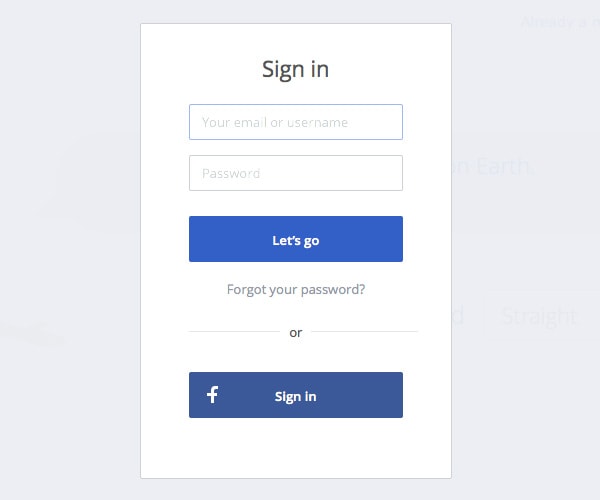
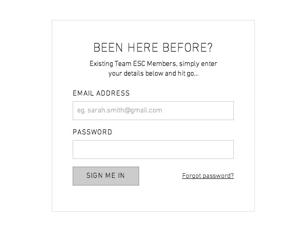
3. Include a Forgotten Password Link
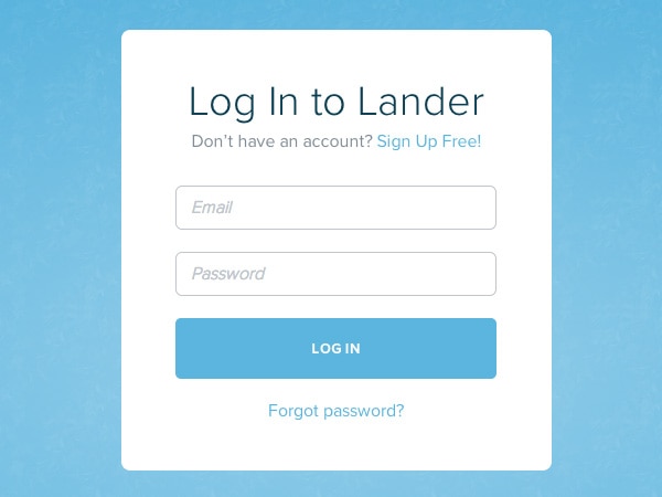
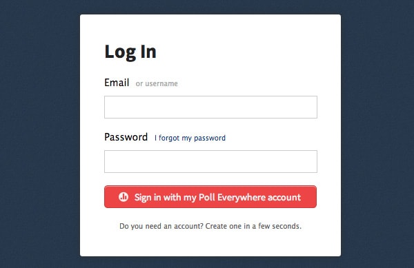
You would think that this is something obvious, but some websites overlook it. You always want to have a link to retrieve forgotten passwords. (Same is true for usernames!) Don’t hide this link nor make users jump through hoops to find it like multiple failed attempts. Always have it ready. It doesn’t have to be in anyone’s face; it shouldn’t be for that matter. But, it should ways be around a login form.
4. Distraction-Free Logins
There are two common ways to have a login set up, it can be a pop up on top of the page, or it can be it’s own page.
There are several advantages to having a login on a single page. However, if you choose to do this keep in mind that there shouldn’t be many distractions around it. You want users to be logged in to accounts first, then throw promotions or whatnot their way. It’s easier to sell to someone after they log in.
Additionally, I will raise the issue of retention/conversion. The fewer distractions there are, the easier it is for people to actually log in and for you to then up-sell them. If this approach is valid for sign up or checkout forms, it should extend to logins. Also loading speeds are faster with fewer items on the page.
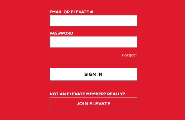
5. Labeling is Important
Copy and its placement on any type form is important. Whatever you do, don’t label the submit button “submit,” use “log in” instead. It’s that easy. This allows people to know and expect specific things for submitting the form.
It enhances the experience and can go a long way for you. Avoid using placeholders for input titles. Do if you must but at least with an icon within the input itself. At best, use an input label. And don’t forget to specify that email or username can be used to log in.
Conclusion
There you have it, five awesome ways to enhance the login process. I hope these tips prove to you helpful and use them as you wish. They can help users move smoothly within the login process. It’s all about making things simpler and easier!