How to Create a Content Accordion in Pure CSS3
![How to Create a Content Accordion in Pure CSS3 [Tutorial] How to Create a Content Accordion in Pure CSS3 [Tutorial]](https://designmodo.com/wp-content/uploads/2012/02/preview1.png)
Difficulty: Intermediate
Estimated Completion Time: 45 mins
Today’s tutorial we will learn how to create a pure CSS3 content accordion. This will work on all browsers and devices that support the :target selector.
Step 1 – Basic HTML Markup
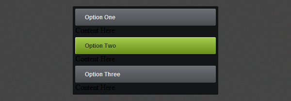
Let’s create three divs with a different id and each div will have a link with the class of tab and a div with the class of content.
To be able to style and open the accordion when we click on it we need to use the :target selector. The target selector will only work if we will have a link that points to an id and when we click on that link the id becomes the target element.
<div class="accordion">
    <div id="tab-1">
        <a href="#tab-1" class="tab">Option One</a>
        <div class="content">
            <img src="img/post-img-1.png" alt="">
            <h1>The Big Elephant in the City</h1>
            <span>5 days ago</span> <em class="bullet"></em> <span>17 comments</span>
            <p>Known locally as "SoMa", this neighborhood was home to the dot.com boom and boasts cutting-edge restaurants and boutiques.</p>
            <ul>
                <li><img src="img/thumb-1.png" alt=""></li>
                <li><img src="img/thumb-2.png" alt=""></li>
                <li><img src="img/thumb-3.png" alt=""></li>
            </ul>
        </div>
    </div>
</div>

Step 2 – Accordion Basic Layout
We’ll start by adding some CSS reset styles to remove all the margins, paddings and borders.
With Postcards Email Builder you can create and edit email templates online without any coding skills! Includes more than 100 components to help you create custom emails templates faster than ever before.
Free Email BuilderFree Email Templates
.accordion,.accordion div,.accordion h1,.accordion p,.accordion a,.accordion img,.accordion span,.accordion em,.accordion ul,.accordion li {
	margin: 0;
	padding: 0;
	border: none;
}
And then we’ll give a fixed 300px width (290px + 5px margin left + 5px padding right), background color, rounded corners and some shadows.
.accordion {
	width: 290px;
	padding: 1px 5px 5px 5px;
	background: #141517;

	-webkit-box-shadow: 0px 1px 0px rgba(255,255,255, .05);
	-moz-box-shadow: 0px 1px 0px rgba(255,255,255, .05);
	box-shadow: 0px 1px 0px rgba(255,255,255, .05);

	-webkit-border-radius: 2px;
	-moz-border-radius: 2px;
	border-radius: 2px;
}

Step 3 – Styling the Tab Header
Now let’s start styling the default tab header with some CSS3 gradients, shadows, rounded corners and some basic CSS properties (font, padding, color, etc).
.accordion .tab {
	display: block;
	height: 35px;
	margin-top: 4px;
	padding-left: 20px;
	font: bold 12px/35px Arial, sans-serif;
	text-decoration: none;
	color: #eee;

	text-shadow: 1px 1px 0px rgba(0,0,0, .2);

	-webkit-border-radius: 2px;
	-moz-border-radius: 2px;
	border-radius: 2px;

	background: #6c6e74;
	background: -moz-linear-gradient(top,  #6c6e74 0%, #4b4d51 100%);
	background: -webkit-gradient(linear, left top, left bottom, color-stop(0%,#6c6e74), color-stop(100%,#4b4d51));
	background: -webkit-linear-gradient(top,  #6c6e74 0%,#4b4d51 100%);
	background: -o-linear-gradient(top,  #6c6e74 0%,#4b4d51 100%);
	background: -ms-linear-gradient(top,  #6c6e74 0%,#4b4d51 100%);
	background: linear-gradient(top,  #6c6e74 0%,#4b4d51 100%);

	-webkit-box-shadow: 0px 1px 0px rgba(0,0,0, .1), inset 0px 1px 0px rgba(255,255,255, .1);
	-moz-box-shadow: 0px 1px 0px rgba(0,0,0, .1), inset 0px 1px 0px rgba(255,255,255, .1);
	box-shadow: 0px 1px 0px rgba(0,0,0, .1), inset 0px 1px 0px rgba(255,255,255, .1);
}
And then we need to add a hover and active style. We’ll change the text and the gradient color to a green one.
.accordion .tab:hover,
.accordion div:target .tab {
	color: #2b3b06;

	text-shadow: 0px 1px 0px rgba(255,255,255, .15);

	background: #a5cd4e;
	background: -moz-linear-gradient(top,  #a5cd4e 0%, #6b8f1a 100%);
	background: -webkit-gradient(linear, left top, left bottom, color-stop(0%,#a5cd4e), color-stop(100%,#6b8f1a));
	background: -webkit-linear-gradient(top,  #a5cd4e 0%,#6b8f1a 100%);
	background: -o-linear-gradient(top,  #a5cd4e 0%,#6b8f1a 100%);
	background: -ms-linear-gradient(top,  #a5cd4e 0%,#6b8f1a 100%);
	background: linear-gradient(top,  #a5cd4e 0%,#6b8f1a 100%);

	-webkit-box-shadow: 1px 1px 1px rgba(0,0,0, .3), inset 1px 1px 1px rgba(255,255,255, .45);
	-moz-box-shadow: 1px 1px 1px rgba(0,0,0, .3), inset 1px 1px 1px rgba(255,255,255, .45);
	box-shadow: 1px 1px 1px rgba(0,0,0, .3), inset 1px 1px 1px rgba(255,255,255, .45);
}

Step 4 – Display and Hide the Content
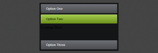
In this step we will hide all the content and only show it when you click on a tab. To hide we’ll use the display: none; property and the display: block; for the target div. We’ll also add some transition animations to make it look better and a 100px height for the target div.
.accordion div .content {
display: none;
margin: 5px 0;
}
.accordion div:target .content {
display: block;
}
.accordion &gt; div {
height: 40px;
overflow: hidden;
-webkit-transition: all .3s ease-in-out;
-moz-transition: all .3s ease-in-out;
-o-transition: all .3s ease-in-out;
-ms-transition: all .3s ease-in-out;
transition: all .3s ease-in-out;
}
.accordion &gt; div:target {
height: 100px;
}

Step 5 – The Tabs Content
HTML Markup
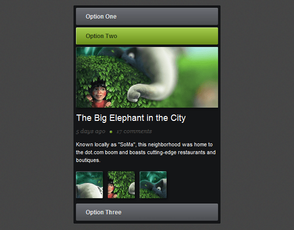
Let’s add some content to the tabs. We will create a blog post preview with a title, paragraph text, some images and some meta info. You can change the markup as you like, this is optional, just to make this accordion more complete.
With Pulsetic you’ll be instantly notified the moment your website, API, or server becomes unavailable. Monitor uptime from multiple global locations and respond to incidents before your users are affected.
Create beautiful status pages in minutes to keep customers informed during outages and build trust with transparent communication.
Start Monitoring for Free<div class="content"> <img src="img/post-img-1.png" alt=""> <h1>The Big Elephant in the City</h1> <span>5 days ago</span> <em class="bullet"></em> <span>17 comments</span> <p>Known locally as "SoMa", this neighborhood was home to the dot.com boom and boasts cutting-edge restaurants and boutiques.</p> <ul> <li><img src="img/thumb-1.png" alt=""></li> <li><img src="img/thumb-2.png" alt=""></li> <li><img src="img/thumb-3.png" alt=""></li> </ul> </div>
CSS Styles
The content styles are all basic except the CSS3 stuff, I recommend you to search the properties that you don’t understand on Google and you will find a lot of information about them.
.accordion .content h1 {
	color: white;
	font: 18px/32px Arial, sans-serif;
}

.accordion .content p {
	margin: 10px 0;
	color: white;
	font: 11px/16px Arial, sans-serif;
}

.accordion .content span {
	font: italic 11px/12px Georgia, Arial, sans-serif;
	color: #4f4f4f;
}

.accordion .content em.bullet {
	width: 5px;
	height: 5px;
	margin: 0 5px;
	background: #6b8f1a;
	display: inline-block;

	-webkit-box-shadow: inset 1px 1px 1px rgba(255,255,255, 0.4);
	-moz-box-shadow: inset 1px 1px 1px rgba(255,255,255, 0.4);
	box-shadow: inset 1px 1px 1px rgba(255,255,255, 0.4);

	-webkit-border-radius: 5px;
	-moz-border-radius: 5px;
	border-radius: 5px;
}

.accordion .content ul li {
	list-style: none;
	float: left;
	margin: 5px 10px 5px 0;
}

.accordion .content img {
	-webkit-box-shadow: 2px 2px 6px rgba(0,0,0, .5);
	-moz-box-shadow: 2px 2px 6px rgba(0,0,0, .5);
	box-shadow: 2px 2px 6px rgba(0,0,0, .5);
}
Also change the div height to 360px.
.accordion &gt; div:target {
height: 360px;
}

Conclusion
We have finished this Pure CSS3 Content Accordion. Hope you like it and don’t forget to live some feedback or any question you have in the comments.


