Interfusion – Best Australian Website Designs
Creatives of world’s smallest continent have never suffered from a lack of stimulation, just take a glance at the best Australian website designs to see it yourself.
Being inspired by mind-blowing indigenous aboriginal masterpieces, and at the same time, having fallen under the influence of Western Europe art direction, they receive a powerful spur from this skillful and lavish interfusion. Although some art movements may have passed by unnoticed, however, contemporary art, modernism (including high modernism, postmodern art), as well as Colonial art (mostly from Victorian era) has certainly left its indelible and unmistakable imprint. Despite of being located far from the center of events, artists have a great cultural legacy and fertile source of inspiration that actively encourages building matchless projects.
They manage to perfectly blend in with the mainstream, making their own contributions and enriching the internet with top-notch website designs.
Best Websites from Australia
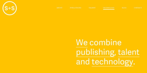
Haigh and Hastings
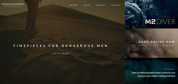
The team ably gives visuals a more dominant position through elegantly populating the front page with multimedia content. For a more pleasant and comfy user experience, each image/video is supported by sharp and contrasting tagline. The latter serves as a focus anchor.
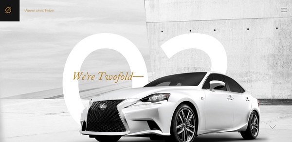
Twofold
With Postcards Email Builder you can create and edit email templates online without any coding skills! Includes more than 100 components to help you create custom emails templates faster than ever before.
Free Email BuilderFree Email TemplatesThe website manages to achieve sophisticated appearance with ease. The image of a luxurious car placed in a refined environment saturated with light coloring and subtle typography provide the “welcome” section with a cutting-edge aesthetics.
Smokehaus
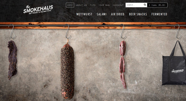
The Smokehaus falls outside of classic homepages of food-related websites and goes for a more elaborate, intricate and exquisite look. While the main range of products effectively takes up a central position, the harmonious blend of flawlessly-crafted textures and line style graphics creates the whole aesthetics.
View 9
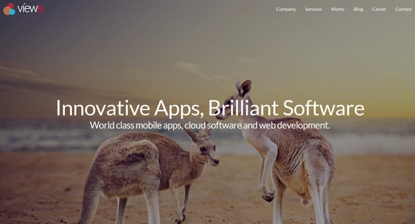
View 9 skillfully achieves overall balance with its vigilantly-executed nature motifs, clear and legible typography, and of course, harmonious layout with a boxy appeal.
Bellroy
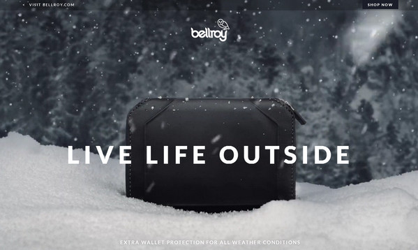
Bellroy has a distinct sense of subtlety and high-quality. The professional, pretty memorable still image with subtle motion, which marks the home page, throws the spotlight on the chic wallet (aka the product to which this website is dedicated). There are lots of first-rate mockups scattered throughout the home page that help drive sales.
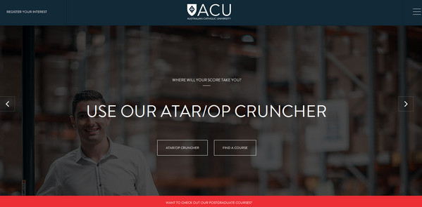
ACU
With Pulsetic you’ll be instantly notified the moment your website, API, or server becomes unavailable. Monitor uptime from multiple global locations and respond to incidents before your users are affected.
Create beautiful status pages in minutes to keep customers informed during outages and build trust with transparent communication.
Start Monitoring for FreeHere the well-balanced horizontal stripe layout tries to tie everything together and provide a quite visceral user experience. The website is a harmonious mix of images, solid color canvases, line style graphics and narrow yet delicate typography.
The Fainga’a Twins
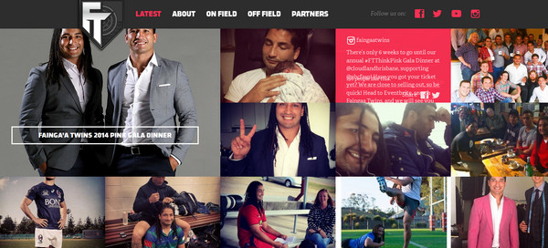
The website establishes a pleasant general feeling and leaves a good first impression. Though the front page is highly populated with images, it strikes a balance and does not overwhelm users thanks to a grid-style layout.
Sleeping Duck
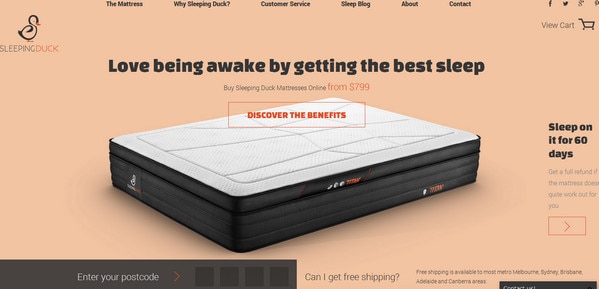
The website boasts a gorgeous smooth and gentle color scheme that allows images to nicely excel from the background. Moreover, it helps to reinforce the theme, liven up the content and even add a little personality.
ANZAC Appeal – The Minute of Silence
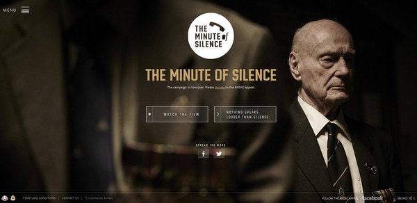
The website simply radiates authority, causing a sense of deep respect for veterans. The team has done a really great job — the website totally corresponds to the theme, matches the tone and reaches the goal. It certainly helps to engage the online audience.
Food and Wine Co
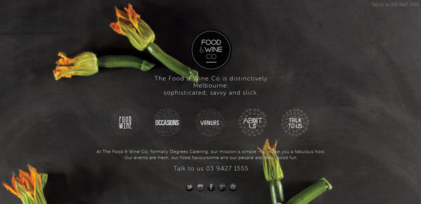
The team opts for a more minimal solution by greeting online visitors with a carefully-crafted hero page that is skillfully built on a chalk-style background. The highly-realistic mockups as well as a sketchy style navigation and handwritten font cooperate in an ideal manner.
Creative Spaces
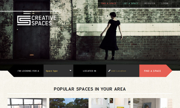
This is another website that recreates a boxy vibe and gets the most out of it. It instantly sets the design off, making the copy readable and easily scannable as well as intensifying images and producing a quite powerful effect.
Victoria University
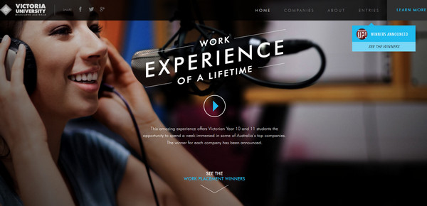
The website clearly demonstrates how to take a regular university website to the next level by meeting modern trends and achieving the greatest output from high-end technologies. The website instantly draws you into it.
Sydney – Stockholm
The website screams flat style on all fronts: There are clean, monochromatic backdrops, sharp regular typography, primitive graphics, plain navigation, lots of well-balanced multimedia, and of course, plenty of white space that give the project its own zest.
Rod McLean
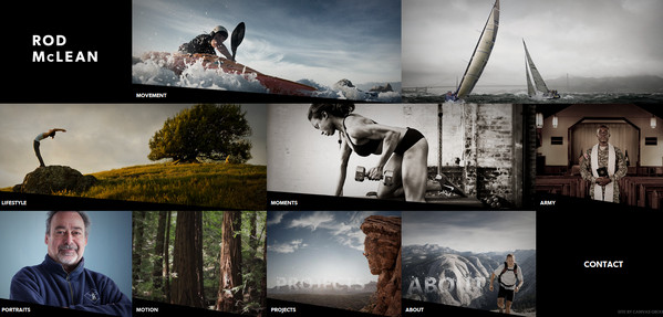
Here, the team prefers to leverage image-based navigation that certainly strikes the eye. Such approach lets smarten the overall design, give it a more sophisticated appearance, and at the same time, enhance the content and engage users into inner sections.
Filter
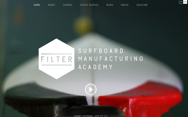
Here, smooth and pastel coloring combined with subtle soft graphics is certainly a win-win. It helps multimedia to get noticed as well as sets the calm and pleasant atmosphere and heightens a sense of harmony.
Give 0.7
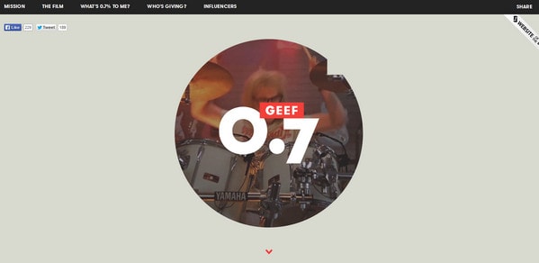
The team effectively establishes a focal point on the screen through utilizing a relatively huge circle filled with a series of short videos thereby getting the whole readers’ attention. The flat style as well as muted color scheme makes the design pop.
Humaan
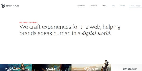
Humaan capably achieves a bit of simplistic feel thereby providing regular readers with a delicate design. The minimal home page concentrates users’ attention on a catchy tagline that is aimed to build up the trust.
Pablo the Flamingo
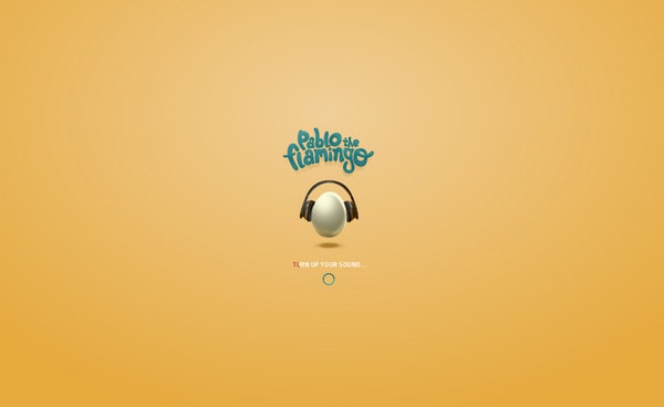
The website offers a memorable experience involving not only visuals, but also complementary sounds. This is a really ingenious solution that certainly won’t leave anybody indifferent. This vibrant, fully illustrated and nicely animated project serves its purpose perfectly-well.
OhDeer Games
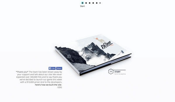
The website looks more less sophisticated. The team has successfully avoided visual clutter and effectively pushes the eye towards the content. The marvelous light color palette breathes an air of elegance and subtlety to the project.
Conclusion
Australian websites don’t strongly rely on cutting-edge techniques in matters of enrichment projects with interactivity, yet when it comes to design, aesthetics and general feeling they certainly push the limits.


