Skillfully Crafted Event Website Designs
For many organizations that stay behind different kinds of events or exhibitions, including festivals or conferences, there comes a time when simple flyers, forums and traditional banner advertisements stop effectively working. Whether event becomes widely popular and it has to offer much more information than just a simple brief description, or whether organizers want to make it more modern, utilizing various contemporary means, for example allowing online registration or selling digital tickets.
Eventually, the necessity of expanding will arise. In such cases, founders often resort to the creation of event website since it has been a great and proven instrument for a long time. Well-organized and elaborate website will quickly and easily inform a large targeted audience about upcoming events, let to book and buy tickets on the go, familiarize with history, attract by video and image reports, give the opportunity to be mentioned, and, after all, won’t let forget about you. Moreover, the online presence of full value helps to establish you, your organization and event as a brand that is really important for those who has long-term plans.
And now, you can check out those who have already take care of its brand establishment. Our amazing showcase reveals all the diversity of event-oriented website designs. I hope you will not only gain inspiration but also find something that let you to extend your knowledge and broaden your experience.
Event Websites Examples
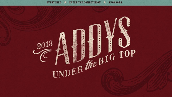
2013 ADDY Awards has an elegant grunge style executed in muted tones which is complemented by huge bold typography and vintage illustrations.
Free your mind uses a blend of paper-made elements that are suspended on strings, vibrant color palette and fat type in order to make welcome page look 3-dimensional and cheerful.
With Postcards Email Builder you can create and edit email templates online without any coding skills! Includes more than 100 components to help you create custom emails templates faster than ever before.
Free Email BuilderFree Email Templates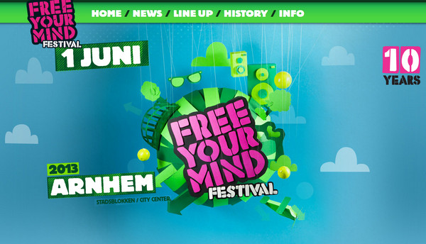
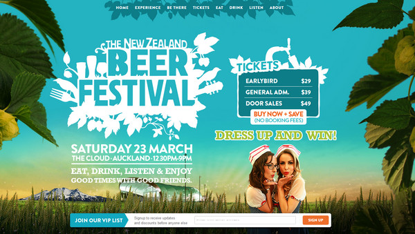
The New Zealand Beer Festival has a lovely nature-inspired appearance which is supplemented by white monochromatic graphics and plain typography.
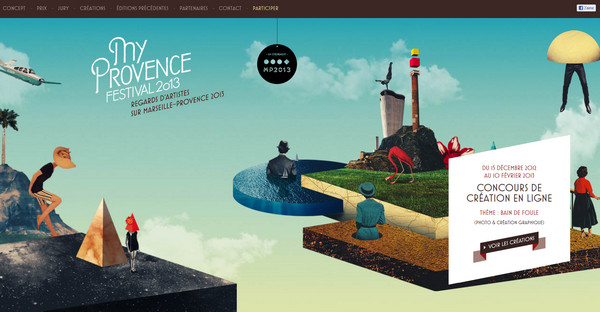
MyProvence Festival is a modern take on scrapbook style that harmoniously intertwined with digital collage technique.
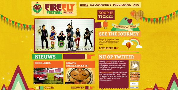
Firefly Festival is a heavy-illustrated flamboyant website design in which graphical and functional elements beautifully complement each other.
Atmosphere Maps features satellite map in order to add a note of naturalness, and make straight rather plain font to stand out.
With Startup App and Slides App you can build unlimited websites using the online website editor which includes ready-made designed and coded elements, templates and themes.
Try Startup App Try Slides AppOther Products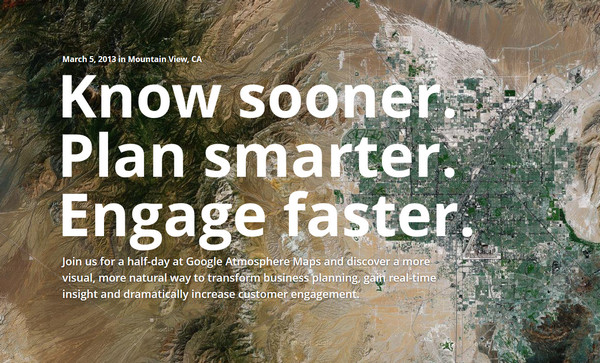
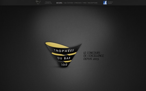
Trophees du bar is a dark slightly textured website with horizontal parallax effect and a bunch of high-quality photos.
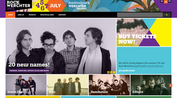
Rock Werchter has a geometric vibe, due to clear grid-based structure and a lot of colorful flat shapes.
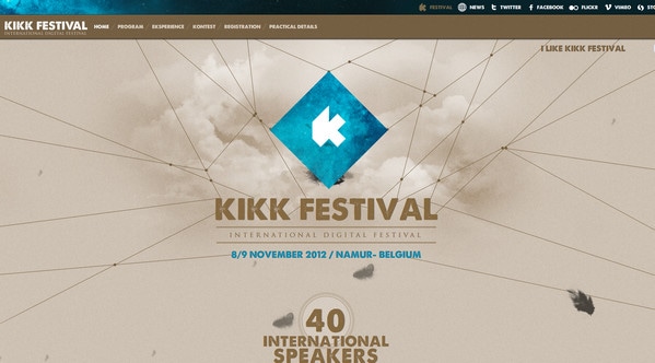
Kikk Festival graphically connects every part of welcome section (including tagline and logo) with threads, diluting it all by light animation, and sky background with rough noise touch.
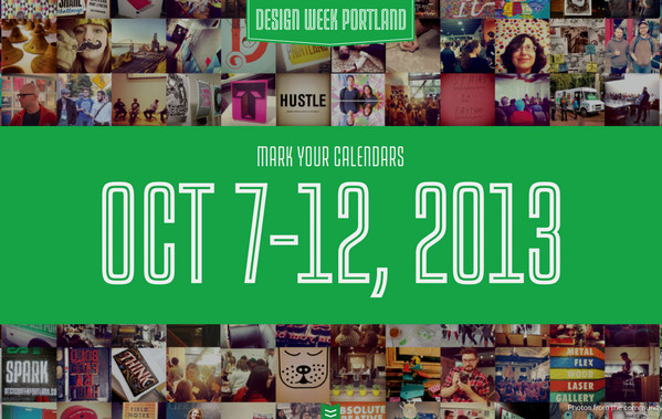
Design Week Portland visually divides landing page into 2 parts. First one is an amazing background that consists of a large number of warm shots and second one is a foreground which represented as a plain one-colored layout with exceptional outline-styled type.
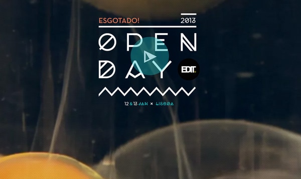
EDIT. Open day 2013 is marked by strong and exquisite typeface with clearly traced Greek touch.
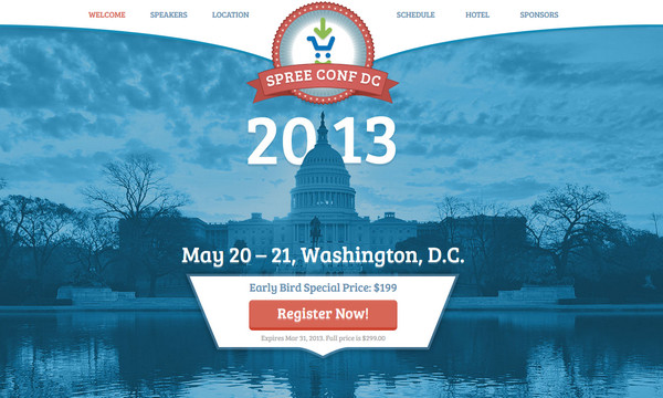
Spree Conf DC looks serious and solemn. Blue color palette conveys positive restrained emotions, whereas red elements add a note of friskiness.
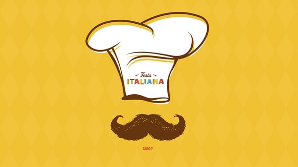
Festa Italiana welcomes visitors with funny hand-drawn illustration with Italian touch, making a great positive first impression.
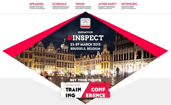
Inspect 2013 looks clean and neat with flat diamond-shaped slider and bright scarlet color injections.
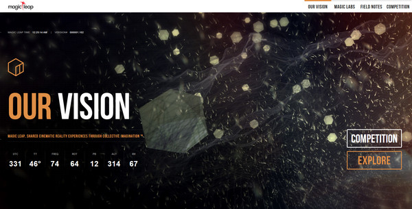
Magic Leap uses full-screen slider with truly captivating and enigmatic photos; although first page is poorly informative, including only necessary data.
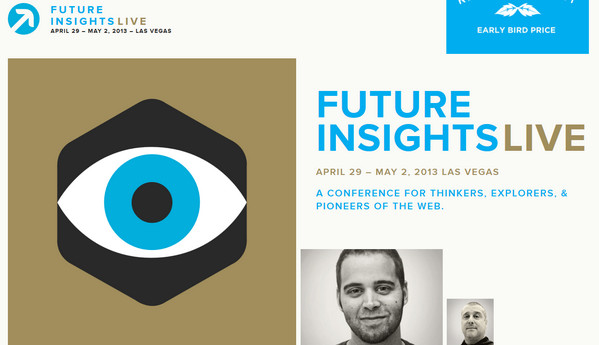
Future Insights Live is executed in modern and sophisticated flat style. Website itself has a blog structure, informing users via various posts.
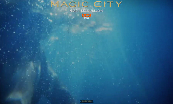
Magic City sur OCS Max principally leans on attractive luxurious images with embed short animations and amazing underwater intro video.
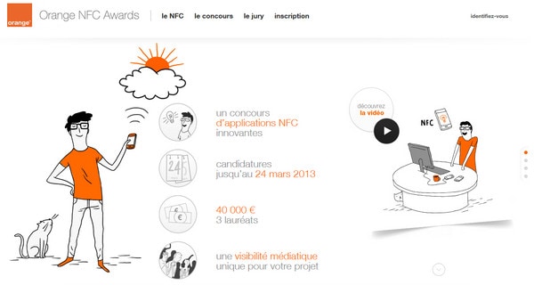
Orange NFC Awards leverages an accurate thin hand-drawn illustrations making website look clean and sometimes rather blank; designer also uses brand orange as a core color.
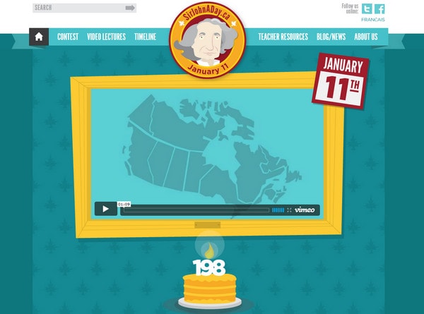
Sir John a Day imaginatively presents an event, recreating warm and kind atmosphere. Vibrant color scheme and irregular graphics adds a note of prettiness.
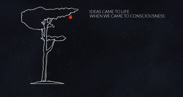
TEDxGUC utilizes classic black and white color scheme, diluting black starry background with white outlined illustration and simple legible typeface.
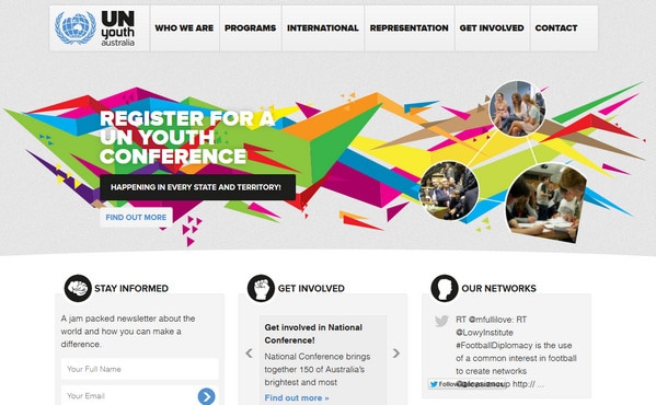
UN Youth Australia has a truly business appeal with vivid geometric background in slider section.
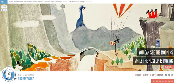
Muumilaakso enables to see marvelous artworks while exhibition is moving, thereby fueling interest of visitors through appealing showcase.
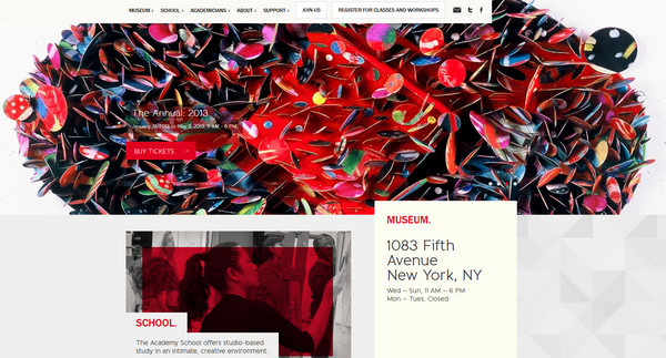
National Academy Museum resembles informative blog with small content section that includes all necessary information about events.
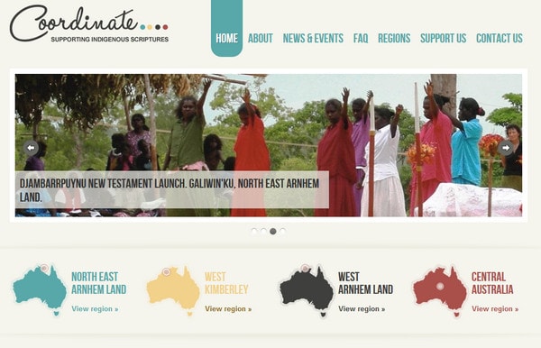
Coordinate is another good example of using magazine-like layout in order to familiarize visitors with valuable well-organized data.
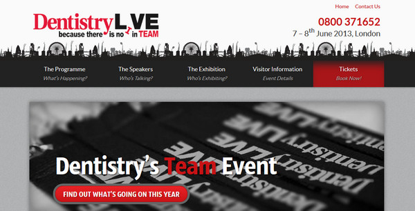
Dentistry Live magnetizes audience with urban silhouetted header background that is repeated on footer. If you take a closer look you will notice that image includes not only buildings, but also harmoniously implemented dentistry graphics.
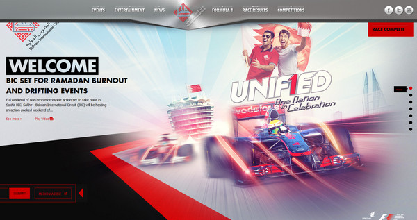
Unified wonderfully exudes an image of power and speed. Colorful, almost glaring slider images give tone of motion and vivacity.
Reflection
Announcement of an event is all about attracting as many people as possible, and there is no better way to draw attention than to utilize power of internet, employing online tools such as social media or website. As for latter, it is the best way to convey required information, putting it in one place; moreover, you can provide engrossing visual data, trying to entice more visitors. When you create event-related website design you should consider both informative and entertaining side of the issue.
Well now, share with us your opinion about such types of websites? Are they well-thought? Are they intriguing? Are they modern and advanced? Which example will force you to book a ticket?
