Web Design Usability Tips For Billing Forms
Each ecommerce site has its own checkout flow moving the user from a shopping cart to the final purchase. This differs based on what the user is buying and their intentions, but finalizing payment is always the toughest part.
Your billing fields need to really keep visitors engaged and encourage them to complete the checkout process. I’d like to share some usability tips you can follow to improve your billing form designs and increase user checkout conversions.
Clarify Intent
Your goal is to design forms that encourage users to buy. So you want to make this process as simple as possible, especially at the billing phase where money is on the line.
There is no single way to clarify an entire billing form. You just need to keep each field clear and concise, never let the user feel confused or unsure of their decision to check out.
Here are some techniques you should keep in mind that work well:
- Larger typography
- Labels instead of placeholders(or both)
- Extra padding between fields
- Custom tabindex for easier navigation
Also add plenty of icons to demonstrate visuals where needed. The Threadless checkout page offers a great example.
With Postcards Email Builder you can create and edit email templates online without any coding skills! Includes more than 100 components to help you create custom emails templates faster than ever before.
Free Email BuilderFree Email Templates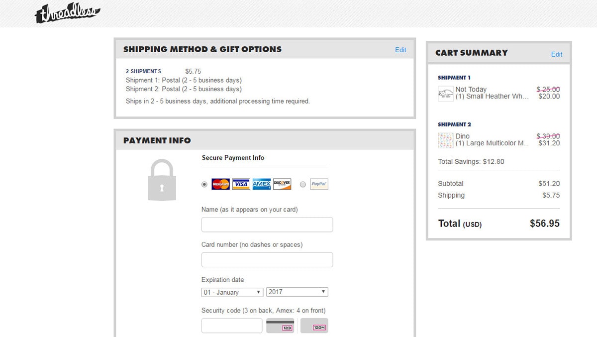
The credit card icons make it crystal clear what the user is selecting as a payment method. The same goes for icons lower in the field which clarify the location of CVV numbers.
Do everything in your power to let the user know exactly what they’re doing at each stage of the billing form. There should be no ambiguous terms, no unclear directions, and plenty of tooltips/icons to answer any questions along the way.
Custom Input Spacing
Some data requires a certain text format like phone numbers and credit cards. This spacing can be dynamically generated on-the-fly using JavaScript and it’s one of the best techniques you can add to your website.
Custom spacing lets users know they’re on the right track when filling out form fields.
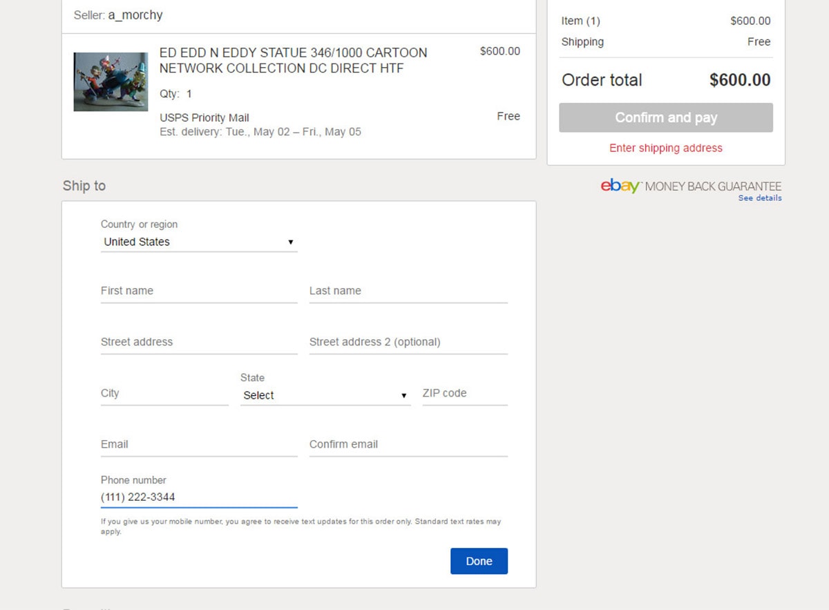
You can do this with zip codes where the form automatically tabs onto the next field once the user enters the proper digits for a zip code. Same with phone numbers where you can auto-style the digits to match a phone number. You can see this on eBay’s checkout form.
But the most useful is the credit card 4-digit spacing format. Credit card numbers are long and they’re easy to screw up. An incorrect CC number also means the order will completely backfire.
With Pulsetic you’ll be instantly notified the moment your website, API, or server becomes unavailable. Monitor uptime from multiple global locations and respond to incidents before your users are affected.
Create beautiful status pages in minutes to keep customers informed during outages and build trust with transparent communication.
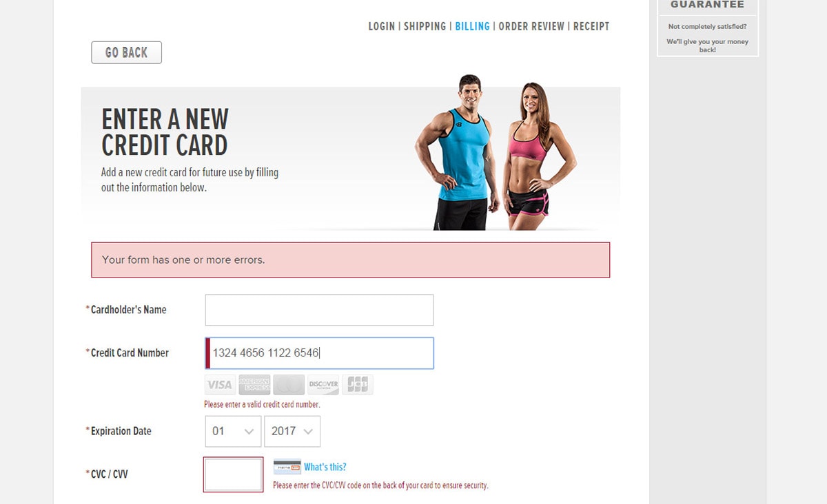
Start Monitoring for FreeThis custom CC spacing in your billing field makes it that much easier for customers to enter their numbers and double-check that they’re correct. You can find a nice example on the BodyBuilding checkout screen which also includes error messages when you have an invalid entry.
There are tons of free plugins you can use to create the auto-formatted text. Most run on jQuery but you can find some vanilla JS solutions too.
These are the best ones I’ve found:
- Card.js
- Creditly.js
- jQuery Card Formatter
Simplify The Action
Some checkout forms are longer than others so the process always feels different for every website. This can be confusing for many visitors and it’s one reason why ecommerce stalled for so long in the early 2000s.
But regardless of your form’s length there are two ways to design around this:
- Smaller forms should try to keep everything on one page for simplicity
- Larger billing forms should break into steps with breadcrumbs
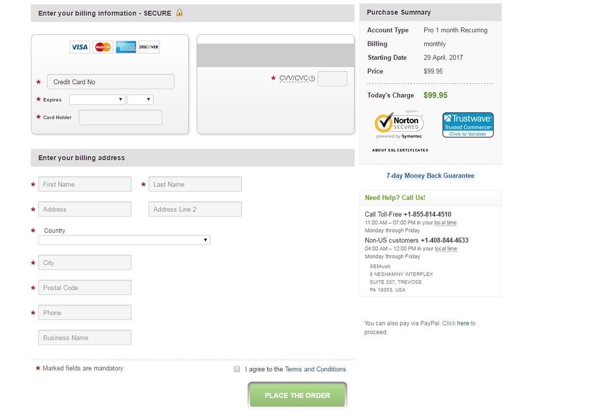
For example, the smaller billing form on SEMrush is fantastic. Very quick to use, easy to read and everything you need to know is clearly visible on the page.
But I don’t mind a longer checkout process so long as it has breadcrumbs. These offer a clear indicator of how far the user has traveled into the checkout process and how much longer they have before completion.
This confidence makes it easier for someone to commit to the billing form at each step. If they have no idea when the checkout process ends they might get confused, anxious, or just annoyed and leave.
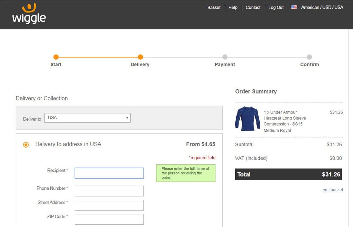
Breadcrumbs are huge and I absolutely recommend adding them to larger billing forms. The Wiggle checkout uses clear breadcrumbs at the top of each form page.
Smaller & larger billing forms can work well just varying different techniques. Be willing to try both!
Run some A/B split tests and see which style performs better. You might be surprised at the results.
Recap The Purchase
Once the user enters their billing information it can be tough to hit that final “submit” button. Hesitation is the death of conversion.
By recapping the purchase order you give customers a final peace of mind. They can see everything at once from the items they’re purchasing to the total fees(plus processing) and even the delivery date if applicable.
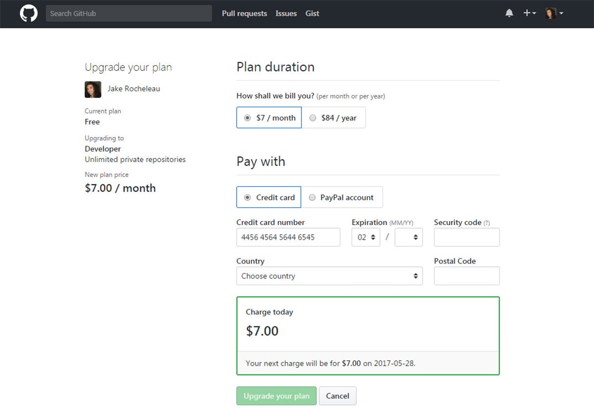
GitHub’s pro upgrade billing field recaps the purchase all on one page. It clarifies how often you’ll be billed, what the final fee is, and when you can expect the next fee. Most fields are filled out from your profile so if you have an account this process is very quick.
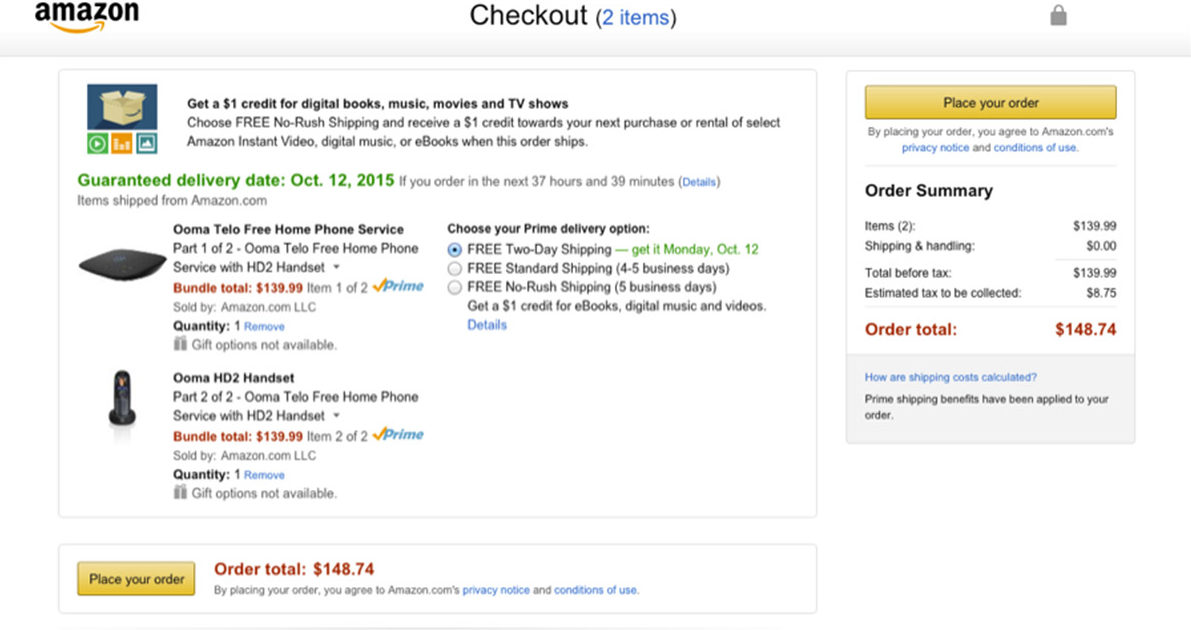
Another example is Amazon, the mother of all ecommerce shops.
Once you enter all your details like shipping address & payment info, one final screen recaps the whole order to make sure you really understand what you’re purchasing.
This reduces returns for wrong items and helps the customer feel confident when they press that “purchase” button.
Recapping the order can be tough on a smaller billing form. But just be openly transparent with your customers and share as much detail as possible.
Wrapping Up
Your site’s billing form is the only thing standing between a potential customer and a paying customer. That’s why form optimization is so important.
I hope these trends can help you craft usable and encouraging billing forms that’ll bring more revenue to your shop and all of your clients. Optimization is an ongoing process but if you’re constantly testing new ideas you’ll always be ahead of the competition.