Optimizing the Usability of Online Forms
Forms are the gatekeepers of the internet. They are often filled out as a starting point for one’s journey – such as signing up for an account. They are also filled out in order to get to one’s account – such as login forms and pages. Do you ever wonder that when you compose a tweet or email you are technically filling out a form? They are everywhere and they are underrated. Form optimization is key when you want to improve conversions.
Here, we’ll discuss some tips to help improve and optimize forms.
Keep it Simple, Stupid
The best thing you can do when creating a form is to keep it as simple as possible. (This almost goes without saying.)
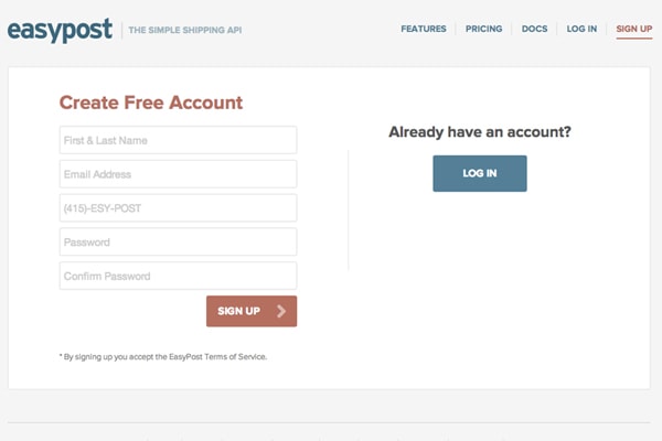
Make sure you are only asking users for information you actually need. If it’s not necessary, don’t bother asking. This makes the life of a user much easier, which is what you want.
With Postcards Email Builder you can create and edit email templates online without any coding skills! Includes more than 100 components to help you create custom emails templates faster than ever before.
Free Email BuilderFree Email TemplatesKeep it Organized
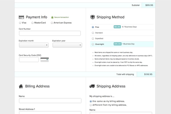
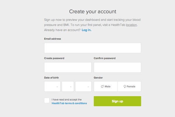
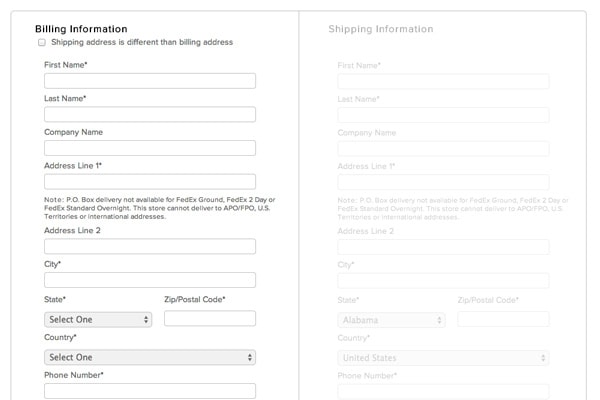
Fewer fields are better, because it makes for a cleaner experience. However if your form is longer, have no fear. Divide it into chunks and sections by putting like information together. Say it’s a questionnaire about one’s parents, separate the questions about mom from dad.
Keeping things organized will help make the user experience easier. It’s okay if you have to divide the form into pages, but do so only if you have to.
If the Form is Long, Show Progress
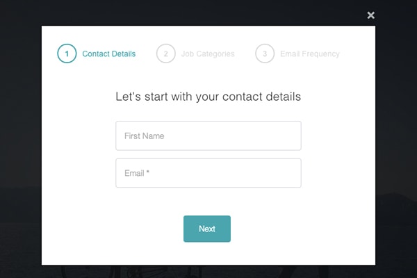
A multipage form, such as a checkout process, should be documented for a user to let them know where they are in the process. When there are multiple pages involved you need to be transparent. Show how many steps/pages there are to complete. (Try to keep these page numbers to a minimum.) On top of that, you will have to show where in that process a user is — for example, page 1 of 3.
Specify Input Syntax
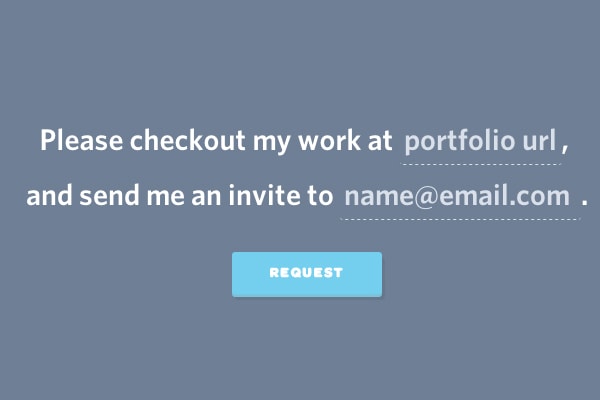
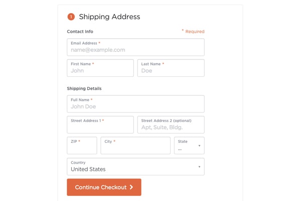
Have you ever wondered about the different ways you can input a phone number into a field? Placeholder text can help specify in what syntax you’d like an entered text to be. If you need a phone number to be (111) 222-333, then say so. However, there is an alternative. If you don’t specify what format you want something, be flexible about formatting. Don’t give errors, when the entered information wasn’t up to your standards.
With Startup App and Slides App you can build unlimited websites using the online website editor which includes ready-made designed and coded elements, templates and themes.
Try Startup App Try Slides AppOther ProductsAfter all, how can anyone know what you needed them to enter if you don’t specify a pattern? Instead, accept what is given to you and parse it with JavaScript or RegEx.
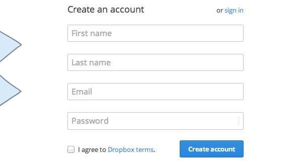
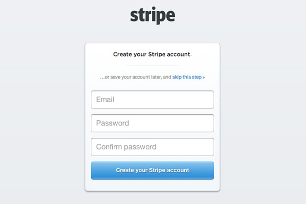
Buttons are becoming notorious for being poorly named or labeled. Having a form submit button titled “Submit” is a big no-no because it doesn’t actually tell you what will happen once you click it. Using “Send” or “Create an account” is more descriptive and reassuring. For example, adding a “Start your Fundraiser” button when new users sign up for your virtual fundraising campaign lets users know what they are actually doing.
Use Proper Labels
Input and form labels should be direct and descriptive. You want users to know exactly what they should be entering. Say again you have a form that is asking about someone’s parents. Be direct and state “Mother’s last name” to be as specific and clear as you can be.
Don’t make users guess which last name you were referring to.
Explain Why You Need Certain Information
For the life of me I sometimes can’t figure out why certain sign up forms or questionnaires want my phone number. That’s because they don’t explain why it’s needed – “for security purposes” means absolutely nothing to me. If you need certain, more sensitive information like a phone number, please explain why.
Personally, I don’t like to give out my phone number. However, if you tell me it’s because you want an easy way to get in touch with me in case something happens to the flight I just booked, I will be reassured that you’re taking good care of my information. Security is key for form conversions.
To Drop Down or Not to Drop Down
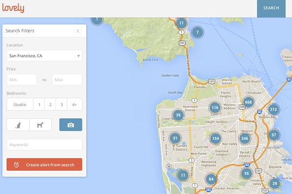
With only a few options, the less sense it makes sense to have a drop down. The biggest flaw is that drop downs don’t allow you to see other options right away. A user has to click in order to see what else is available. If you are giving a user an option of two even four things, it’s easier to see all the options as once. Instead, use radio buttons or a toggle.
Final Tips
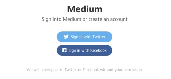
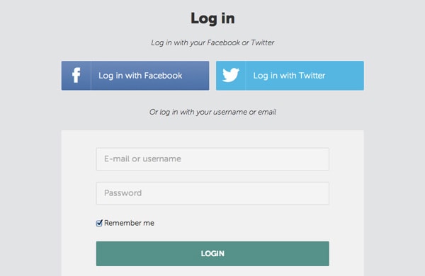
To wrap this up, I want to give you a quick list of some other important tips. Your form should be mobile-friendly; make sure it works fine on a smartphone or a tablet. Additionally, consider using a social network sign up. It can be a great and super-easy way to increase conversions – most people use social networks so its easy to click a button to sign up.
It’s important to have a clear reason for users to complete a form. Remind your users of the value or benefit they will receive for successfully completing your form. Login pages should clearly state you are there to log in, and signing up for an eBook via newsletter should be obvious, too.
Conclusion
Form optimization is all about trust. Explain to users why you are asking for information, and keep it only to things you’d need from them. Make sure to provide as much guidance as possible (placeholder text, anyone?). The best forms are simple, obvious and to the point. Don’t waste anyone’s time.
