Use of Blur Backgrounds in Website Design: Beautiful Examples
Together with wide screen photo backgrounds which are frequently used tools for website decorations, blur backgrounds have thoroughly settled and found their niche in modern website design. Although, at first glance, it is rather difficult to understand what could be so amazing and attractive in blur technique that instantly kills all the detail of spectacular shot or image. But as a matter of fact, it has a whole bunch of advantages that, on the contrary, helps to stress aesthetic side, and make your design sophisticated and elegant.
In addition, such backgrounds are able to add readability to your titles and taglines, focus attention on specified elements, easily make foreground elements stand out, and finally contrast and highlight color schemes. Moreover, such a technique involves different interpretations; so you can freely experiment with various blur filters, making your site appearance smooth and stylish or vice versa noised and resonant. Also, you have an opportunity to localize the effect, partly revealing all the beauty of clarity and quality of a photo.
All in all, it is a good approach of dealing with busy, but really spectacular photos that you have a hankering for incorporating into design; after properly and accurately applying blur effect you will get an image that, at the same time, retains all colors and looks polished and slightly graceful.
So, if you want to have a closer look at clever vague effect realization you should definitely turn your attention to our collection that includes remarkable examples of websites with blurred backgrounds.
Examples of Blur Backgrounds in Web Design
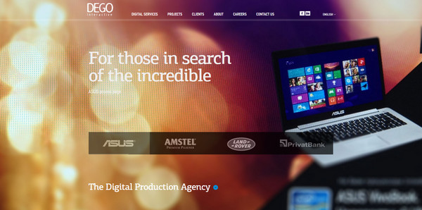
DEGO Interactive looks less formal due to bright illuminating background which is partially filled with bokeh effect.
With Postcards Email Builder you can create and edit email templates online without any coding skills! Includes more than 100 components to help you create custom emails templates faster than ever before.
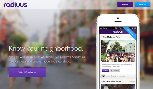
Free Email BuilderFree Email TemplatesRadiuus is a smooth one-page website with elegantly incorporated components in violet color.
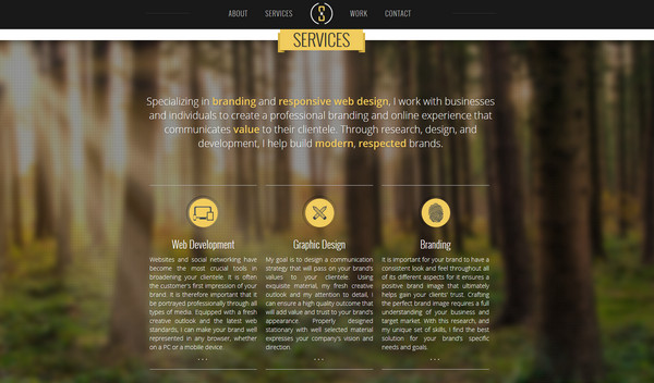
Maxim Siebert uses slightly blurred nature-inspired photo background with pixellated touch in the service section, making white and yellow text perfectly stand out.
Teamgeek has almost black-and-white heavily noised header background that goes well with the overall light gray website color palette.
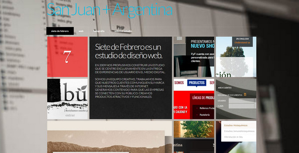
Siete de Febrero has stylish modern Metro 8 vibe with accurately arranged data blocks and monochromatic vague full-screen background.
With Pulsetic you’ll be instantly notified the moment your website, API, or server becomes unavailable. Monitor uptime from multiple global locations and respond to incidents before your users are affected.
Create beautiful status pages in minutes to keep customers informed during outages and build trust with transparent communication.
Start Monitoring for FreeMelonHTML5 is another great example of trendy flat website design with an obvious hint of Metro 8 style and heavily blurred background.
David Massiani looks clean and peaceful due to utilization of vague photo background with soft coloring and polished effect.
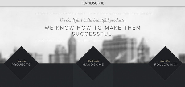
Hey, Handsome goes for classic and elegant dual color combination, which manifests in all aspects of website design.
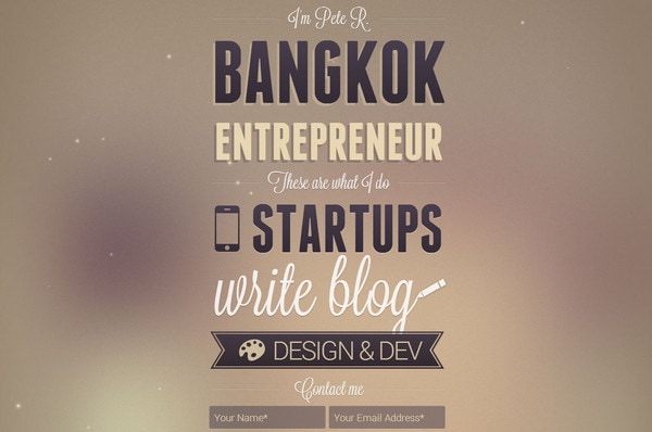
The Pete Design makes use of soft brown background with neatly tactile nuances and marvelous typography treatments.
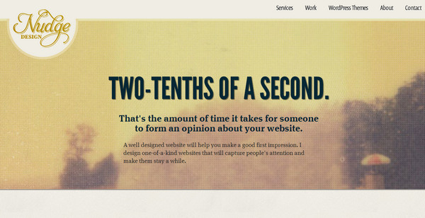
Nudge Design conveys a warm experience with a lovely Lomography vibe, alternating using vague images as a background for several sections.
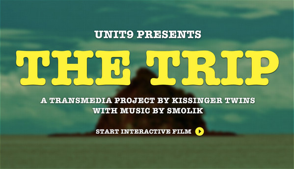
The Trip provides several inner pages with faded unclear photo backgrounds which wonderfully put emphasis on plain bold white text.
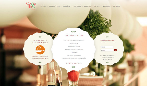
Restaurante Couve e Flor welcomes users with partly blurred restaurant-themed background making elegantly decorated data blocks come to the fore.
Daniel Filler makes himself friendly and clearer for potential customers, establishing a relationship of trust.
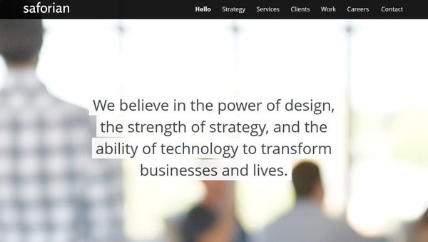
Saforian has a light and luminous appearance. Blurred, but at the same time bright header background beautifully outline tagline.
Rei 1440 Project attracts viewers by amazing spectacular landscape photography that are slightly blurred and showcased as background images.
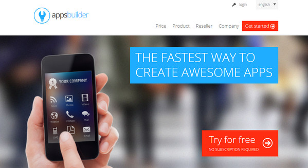
Apps Builder gets its nifty look from trendy Metro 8 style, wonderfully incorporating heavily blurred urban photo as a background for the landing page.
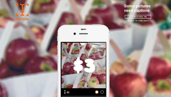
Piction iPhone App is a great example of simple minimalistic landing page that magnetizes its users by means of delicious photo background and tiny slider that is based on iPhone mockup.
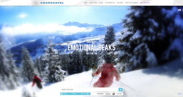
Courchevel partly blurs picturesque photo background in order to concentrate attention on central elements.
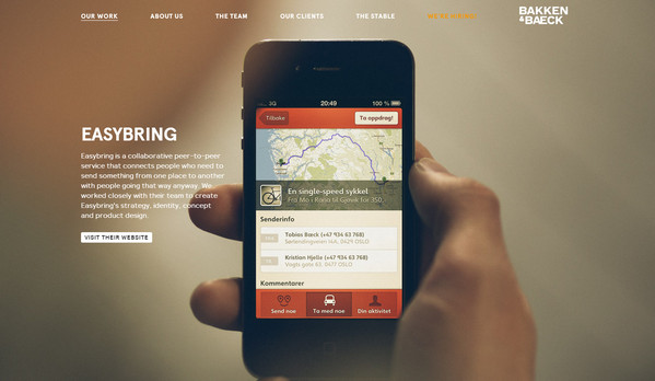
Bakken and Baeck has a full-screen slider that includes crisp images of Apple devices with brief descriptions along with vague and polished backgrounds.
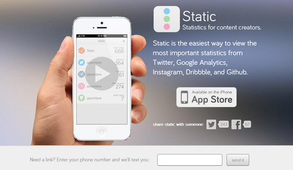
Static exudes an image of purity and sharpness using monochromatic white graphics and typography upon hazy background.
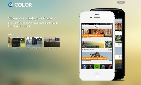
Color features almost glossy background in muted tones that perfectly highlights mobile devices.
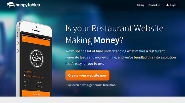
Happy Tables uses deep saturated colors both for background and foreground in order to mark contrast and distinguish necessary message.
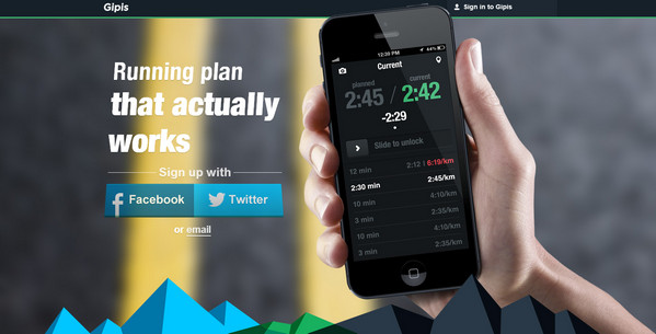
Gipis spices up slider section with polygonal 3-dimensional graphics that beautifully outline polished indistinct image abaft.
Best App Daily uses huge slightly vague image background which is updated accordingly to new application.
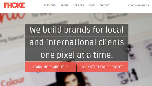
Fhoke looks elegant and business-like with sharp-cut welcome section that is supplemented by unclear photo background.
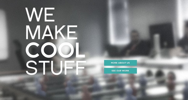
BrightByte leverages diffuse image of working place as a header background. The latter is intentionally darkened in order to complement foreground elements.
Reflection
Undoubtedly, blur effect is primarily intended to easily focus users’ attention on foreground elements, making them readable and protrude, and at the same time adding elegance and burnished touch. There are different ways to creatively include blurred background in web design. Practice shows that you aren’t obliged to make the full background indistinct or fill the whole space with vague image; simply incorporating such effect into header or slider section will be enough to attract people.
So, how do you find such an effect? Is blurred background look modern and sophisticated to you? Do breathtaking images worth sacrificing for the sake of readability? Do not you think this effect is overused on iPhone App website designs?


