Bootstrap Carousel Guide: Examples and Tutorials
Bootstrap carousel is a generic unit of the framework that it is a standard component for cycling through elements. However, it can do much more than that and is undoubtedly one of the most sought-after details in interfaces these days.
Read about Bootstrap grid, Bootstrap buttons, and Bootstrap modal.
Modern websites are teeming with carousels. They are everywhere. Not only are hero areas their natural habitat, but also primary sections. For instance, contemporary testimonial areas are presented as sliders. Whatever website are you up to, chances are you will need sliding functionality, and Bootstrap carousel is here to provide a solid foundation.

Essentials of Bootstrap Carousel
Even though Bootstrap carousel is a symbiosis of advanced CSS styles and JavaScript magic, it is easy to handle. All you need to know is the essentials and stick to the rules described in the official documentation. Let us refresh in your memory:
- It works with different content, such as images, text, and custom markup.
- It has two types of navigation in prev/next controls and indicators that can be used together, separately, or even be omitted.
- It collaborates with Page Visibility API so that a slideshow will not cycle through content until the browser becomes active.
- It does not support nested carousels.
- It does not comply with accessibility standards.
- It does not normalize slide dimensions automatically.
- It requires a unique ID to function correctly.
The rules are not as harsh as they can be, yet still, there are some obstacles. Let us find solutions for the most common issues.
Looking for a Bootstrap online builder?
With Postcards Email Builder you can create and edit email templates online without any coding skills! Includes more than 100 components to help you create custom emails templates faster than ever before.
Free Email BuilderFree Email Templates- 👉 Try our Bootstrap Builder and create unlimited projects for unlimited clients.
- 👉 Start to build a website using our Bootstrap Templates.
How can you prevent Bootstrap carousel from auto sliding on page load?
By default, the Bootstrap carousel starts to work on page load. However, if you do not need this, there is a small hack that requires the utilization of standard data-attributes. Just add data-interval=”false” to the slideshow declaration. The resulting code should look like this:
<div id="carousel-example" class="carousel slide" data-interval="false">
This trick works for both the third and fourth versions of the framework.
Alternatively, you can do it with JavaScript like this:
$(document).ready(function() {
   $('.carousel').carousel('pause');
});
How do you change Bootstrap carousel control colors?
Since Bootstrap uses SVG for carousel controls, it is not evident how to change them right away. You cannot use baseline attributes nor traditional CSS.
First, you need to find the place where the controls are identified in the main CSS file of the framework. They should look like this:
.carousel-control-prev-icon {
    background-image: url("data:image/svg+xml;charset=utf8,%3Csvg xmlns='https://www.w3.org/2000/svg' fill='%23fff' viewBox='0 0 8 8'%3E%3Cpath d='M5.25 0l-4 4 4 4 1.5-1.5-2.5-2.5 2.5-2.5-1.5-1.5z'/%3E%3C/svg%3E");
}

.carousel-control-next-icon {
    background-image: url("data:image/svg+xml;charset=utf8,%3Csvg xmlns='https://www.w3.org/2000/svg' fill='%23fff' viewBox='0 0 8 8'%3E%3Cpath d='M2.75 0l-1.5 1.5 2.5 2.5-2.5 2.5 1.5 1.5 4-4-4-4z'/%3E%3C/svg%3E");
}
After that find the fill=’%23fff’. Here you can set the preferred color.
How can I control the speed of Bootstrap carousel slides?
The catch is that you cannot directly control the speed of the carousel. You need to hack the CSS file. If you use Bootstrap 3, then find bootstrap.css file and a line where .carousel-inner > .item is described. It should look like this:
.carousel-inner &amp;gt; .item {
position: relative;
display: none;
-webkit-transition: 0.6s ease-in-out left;
-moz-transition: 0.6s ease-in-out left;
-o-transition: 0.6s ease-in-out left;
transition: 0.6s ease-in-out left;
}
Here you can change 0.6s to whatever you want.
With Startup App and Slides App you can build unlimited websites using the online website editor which includes ready-made designed and coded elements, templates and themes.
Try Startup App Try Slides AppOther ProductsFor Bootstrap 4 add this piece of code to CSS file:
.carousel-inner .carousel-item {
  transition: -webkit-transform 2s ease;
  transition: transform 2s ease;
}
Or there is a more elegant way using JavaScript.
$(document).ready(function() {
  jQuery.fn.carousel.Constructor.TRANSITION_DURATION = 2000  // 2 seconds
});
How do I make Bootstrap carousel use mobile swipe?
There are two proven ways to add this functionality to the basic Bootstrap carousel. The first option implies the utilization of a touch-optimized web framework (aka jQuery mobile plugin). After embedding it into your project, you can improve your slideshow with several lines of code.
$(document).ready(function() {
$(&amp;quot;#carousel_ID&amp;quot;).swiperight(function() {
$(this).carousel('prev');
});
$(&amp;quot;#carousel_ID&amp;quot;).swipeleft(function() {
$(this).carousel('next');
});
});
An alternative is to employ bcSwipe, a plugin that was created specifically for Bootstrap. It enables swipe gestures. Embed it and use it in the project by adding this line of code:
$('.carousel').bcSwipe({ threshold: 50 });
Even though bcSwipe is initially a solution for the third version, nevertheless, it works for the fourth version as well.
Customize Bootstrap Carousel
Customization of Bootstrap carousel can be quite a challenging task. You do not have to test your limits, but you should be ready to apply some advanced CSS and JS.
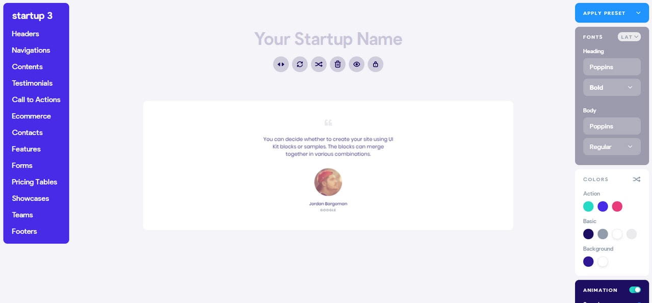
Note, if you seek a viable yet straightforward way to build a slideshow, you can use a ready-made solution like Startup. This free Bootstrap builder for templates and themes is packed with numerous, helpful components. There is a whole range of slideshows, including a full-screen slider for the hero area, a small carousel for testimonial area, dynamic product display, etc. With unlimited styles to choose from, you will be able to create a slider that fits your needs in a matter of seconds and, most importantly, without tech skills.

For those of you who are ready to dive into code, there is a handful of alternative solutions out there. Let us check them out. First, consider Carousel by MDB.
Although there is nothing unusual in it, the team created a beautiful design and lovely fade transitions that result in an elegant outcome. It is a perfect candidate for the hero area.
What’s more, on the website you will find some more fine demos.
Bootstrap 4 vertical carousel by amirito

It may look like a primitive solution that has nothing to show, however namely its plainness makes it an important item in our collection. It has just a skeleton that you can put in work right away without drastic modifications. Also, unlike the above examples, this carousel slides vertically so that you can create a Bootstrap carousel with a twist.

Created by the team behind the Tutorial Republic, this testimonial carousel will delight you with its neat businesslike look and traditional functionality. The markup includes an avatar, feedback, and author’s short bio. It is so generic that it will certainly blend into any project.
Blog Carousel by kimdim

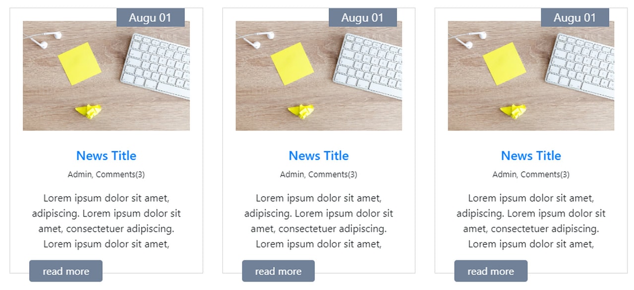
This is the answer to the question of how to show several frames at once. As a rule, this kind of Bootstrap carousel is available as a premium product. However, Kimdim has generously shared the base markup with the Bootsnipp community. It includes two slides where each covers three blocks. It is ideal for demonstrating blog posts or featured products. The snippet was created on the basis of the fourth version of the boilerplate.
Last, But Not Least
Full-screen Bootstrap carousel

By default, Bootstrap carousel is located within the grid. Therefore, if you want to extend its borders and force it to take up the entire screen, you need to play with code. The workaround is not as hard as it may seem.
For those of you who use Bootstrap 3, you need to give HTML, body and carousel container 100% width like this:
HTML,body{height:100%;}
.carousel,.item,.active{height:100%;}
.carousel-inner{height:100%;}
If you are using Bootstrap 4, the solution is more elegant since everything can be done with utility classes. In this particular case set min-vh-100 class on the carousel-item like this:
<div class="carousel slide" data-ride="carousel">
      <div class="carousel-inner">
            <div class="carousel-item active">
                <div class="d-flex align-items-center justify-content-center min-vh-100">
                    <h1>ONE</h1>
                </div>
            </div>
      </div>
</div>

The working demo is here. Explore it and use as a base for your experiments.
Conclusion
Bootstrap carousel is a versatile component. It covers a bulk of information within a small area dynamically presenting it. With a little help from CSS and utility classes, it can be adapted for various purposes: testimonial area, blog post showcase, or full-width presentation. Even though it is not rich in features and it certainly lacks in flexibility, it is still enough to create a solid base for the carousel that meets basic needs.


