Hot Data and Content Design Patterns for Mobile
Proper content and information design are not only important for traditional publishing or user-generated content sites, whether it’s the front-end experience or the underlying systems (ex: content management systems) that keep them operational.
As users are able to interact with and edit more parts of their applications, every piece of information (i.e. location data, timestamping, profile info, mutual connections, etc.) and content (profile images, user-generated content, business listings, etc.) should be designed with that in mind. Beyond technical challenges, allowing multiple users (consumers and/or businesses) – especially non-technical users – edit and interact with more types of content and information requires significant thought about the implementations of existing patterns and development of new ones.
8 Best Practices of Data and Content Design
There are many details to keep in mind when designing for content and data management and the importance of each detail varies by application. Here are a few best practices that I’ve found helpful over the years:
- Keep it consistent
- Consider height and length of info and content blocks
- Design navigation with info and content in mind
- Test with real info and content
- Show only what’s relevant
- Make content dynamic
- Let the user stay organized
- Layer your content and info where possible
An Overview of The Patterns
Keeping in mind the design objectives above, here’s an overview of the design patterns we’ve detailed in this article and at even greater length in our e-book, Mobile UI Design Patterns 2014:
- Full-Screen Modes
- Interactive Content Layers
- Inline Expanding Areas
- Circles
- Transparency
- Maps As Backgrounds
- Group Friends & Content
- Full-Bleed Images
- Grids
- Cards
- Hidden Information
- Empty States
- Direct Manipulation of Content & Data
- Draggable Objects
- Pull to Refresh
1. Full-Screen Modes
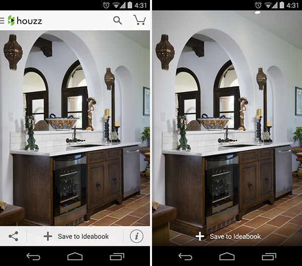
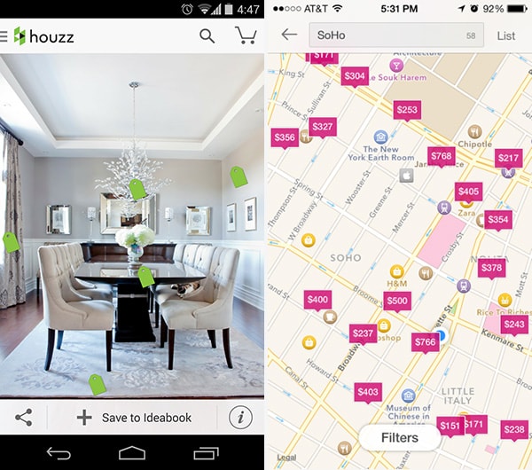
Houzz
With Postcards Email Builder you can create and edit email templates online without any coding skills! Includes more than 100 components to help you create custom emails templates faster than ever before.
Free Email BuilderFree Email TemplatesProblem
The user wants to focus on content instead of being distracted with the UI
Solution
Design a full-screen mode that hides or minimizes the UI clutter around content. This helps users focus on what matters, rather than being distracted by the clutter of the UI. Besides being an essential for video players, this pattern works particularly well for multimedia apps like Medium, Houzz and Kindle, which let users minimize the UI “frame” by tapping on the main content. This minimizes the navigation and other buttons on screen, making for a more immersive experience with the content when users need it. Snapchat implements this in their camera as well, getting rid of most of the UI “chrome” in favor of a minimalistic navigation, showing you the 1 or 2 more important buttons and change these primary buttons depending on what view you’re in. To get between views, you can either click one of these primary buttons or swipe left-or-right.
2. Interactive Content Layers
Houzz, Airbnb
Problem
Users want to know which items within a content view they can interact with in further detail.
Solution
Layer interactive items to provide an “augmented reality” approach to your content. Apps like Houzz do this well by placing a price tag icon on individual items in the pictures that are being sold, and tapping on them provides further information. Not only is this a great way of highlighting content within the picture that the user can interact with, but it also adds an element of playfulness by having the tags swing around based on movement and orientation of the device.
3. Inline Expanding Areas
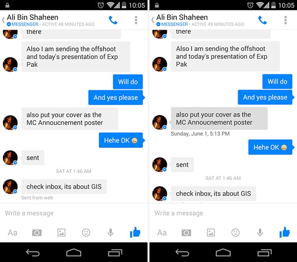
Facebook Messenger
With Startup App and Slides App you can build unlimited websites using the online website editor which includes ready-made designed and coded elements, templates and themes.
Try Startup App Try Slides AppOther ProductsProblem
The user wants access to relevant secondary details without cluttering the main UI.
Solution
Make metadata invisible unless the user explicitly wants to see it. Facebook Messenger for example hides individual timestamps and location data, making it visible only if the user taps on the particular message. Other applications
4. Circles
Facebook Messenger, Instagram
Problem
The user wants to quickly distinguish between buttons and media.
Solution
While the traditional photo thumbnail has always been rectangular both on the web and mobile, we see a lot of apps breaking that mold and opting for circles instead. both because it’s the optimal tap target for a touch screen but cleans the UI up a bit with the extra white space between adjacent content. Some apps like LinkedIn use different shapes to visually distinguish between action buttons and other media. Some apps like Tinder and Swarm are using circles exclusively. Facebook Messenger and Instagram shows all user thumbnails in circles. Popularized by Google+ and improved by Path in some respects, this UI design pattern is gaining popularity although it’s benefit over the traditional square thumbnail is not clear other than adding variety, the unequivocal “spice of life.”
5. Transparency
Rdio, Gogobot
Problem
The user wants to know if there is content behind an overlay.
Solution
Use gradients and fading overlays to show that there is content layered below. Yelp let’s you go between listing details and the photo gallery when you drag downward to further expose the photo hidden behind a semi-transparent listing header. The use of semi-transparency and responsive content creates a wonderful experience here. Rdio and Gogobot use transparency and blur to achieve the same effects, not only providing context to the user about where they are but also making interaction menus look attractive.
6. Maps As Backgrounds
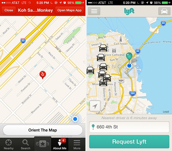
Yelp, Lyft
Problem
Users want to spatially place content on a map to see what’s going on around them.
Solution
Lyft and Yelp provide maps as backgrounds, which makes sense given their local nature. This will become an increasing trend as local applications become more prominent and more information can be layered onto the map view, making maps a full experience not just for one-off directions on web or mobile. You’ll also see a lot more UI design patterns that blossom from videos, pictures, and other media as backgrounds.
7. Group Friends & Content
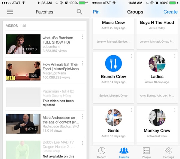
YouTube, Facebook Messenger
Problem
The user wants to organize content according to their own groupings
Solution
Allow users to sort and organize friends and followers inside the app. YouTube and Facebook Messenger allow you to group your friends and contentalike. As content of all forms — including friend profiles — continues to proliferate, the ability for users to curate and organize things in a way that makes sense to them becomes more important.
8. Full-Bleed Images
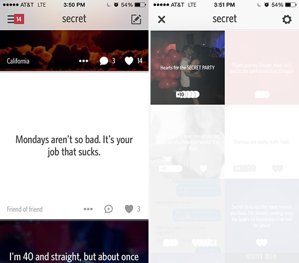
Secret
Problem
The user wants to focus on the content with minimal distractions.
Solution
Eliminate fluff from the UI, leaving just the absolute essentials. Apps like Secret take no whitespace for granted, stacking full-bleed images on top and next to each other while layering some important information on top of them to make the best use of space. These images act as a background with relevant information over them in an overlay. This UI design pattern keeps the user extremely engaged with even less white space and distracting design details than Pinterest.
9. Grids
Problem
The user wants content to be organized.
Solution
Show snippets of content in a grid. Apps like OKCupid and Spotify present all their content in a grid, effectively separating each item from the other while maintaining a structure. Grids are a great alternative to the simple list views and work extremely well for content that can be represented visually, making it much more enjoyable for users to scroll through lots of content.
10. Cards
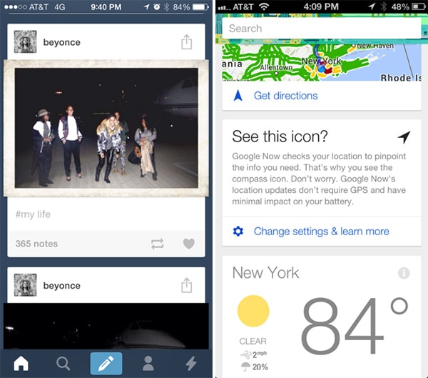
Tumblr, Google Now
Problem
The user wants to browse through content quickly and interact with it, without the detail views cluttering up the UI.
Solution
Present snippets of information in bite-sized cards that can be manipulated to show more information if the user wants it. Popularized by the likes of Pinterest to show large image thumbnails in a compact layout, we see “card” views now being implemented in a variety of apps beyond video and photo galleries on the web. This pattern works best for “modules” of data that can be viewed or manipulated individually, like posts on Tumblr or Facebook. Cards are a way to allow users to browse and discover all kinds of content in a more engaging way while accommodating responsive design trends, as well as social feed patterns.
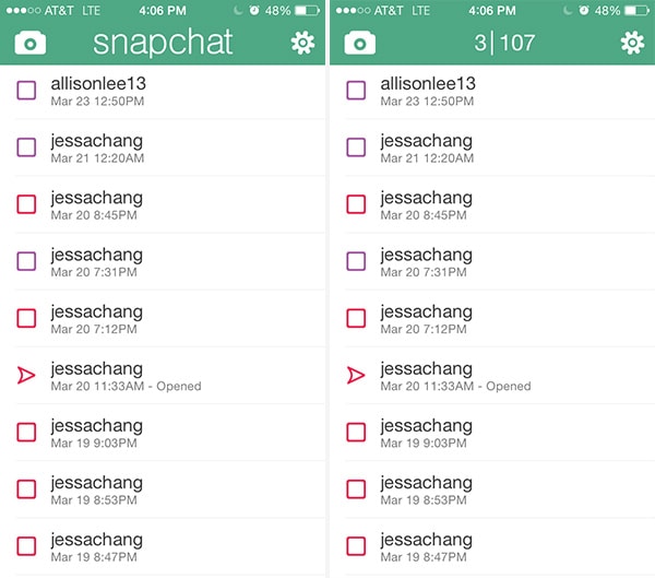
Snapchat
Problem
The user wants quick access secondary information that’s not usually necessary to show.
Solution
Hide contextual information that’s not essential behind the UI but make it accessible for power users. Snapchat let’s you see hidden information — the number of messages received and unread — by clicking on the Snapchat header. Tinder let’s you see timestamping by dragging texts to the left, which is also how Apple’s native Messages app works.
12. Empty States
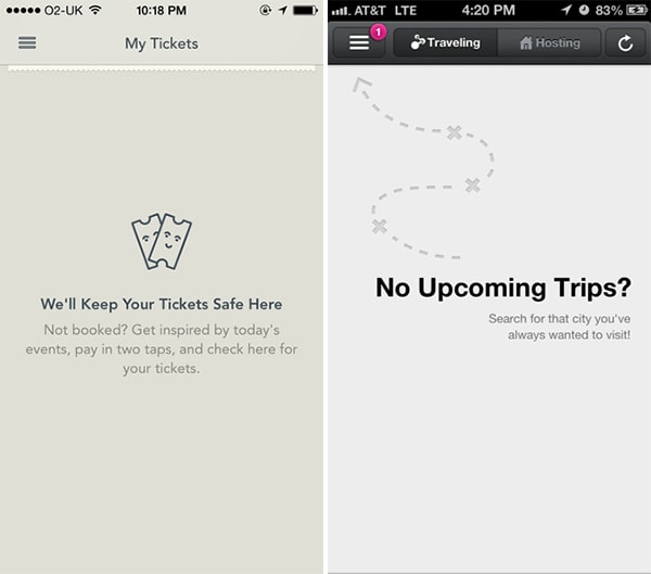
YPlan, Airbnb
Problem
The user needs to know why a section of the application is empty and what to do next.
Solution
Make sure your UI provides a good first impression by designing for the “blank state,” that is the condition when there is no user data. This is the natural state of your UI and the first thing a user sees. It is also the point where many users decide whether its worth it to continue, so designing the empty state is very important. This is a great place to show some examples that will help users get started or simply to show them instructions on how to proceed.
13. Direct Manipulation of Content & Data
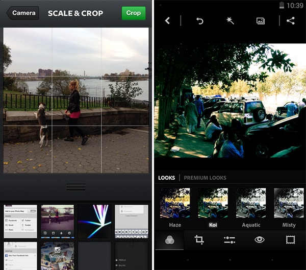
Instagram, Photoshop Express
Problem
The user wants to interact with entered content or data in a direct and intuitive way.
Solution
Allow for content to be edited directly without having to transition between editing or deleting modes. Letting users work with data directly on the screen can make your UI more engaging by eliminating the extra layer of interaction provided by a button or context menu. Instead of selecting the item and then toggling between individual CRUD (Create, Read, Update, Delete) states, users of Wunderlist for example can directly tap on task names to edit or delete them. Photo editing apps like Instagram and Photoshop Express also follow this pattern, allowing users to directly see the results of a filter on the selected photo instead of choosing from a list and hoping for the best. In most map apps, there’s no button to zoom in or turn around, you just do it!
14. Draggable Objects
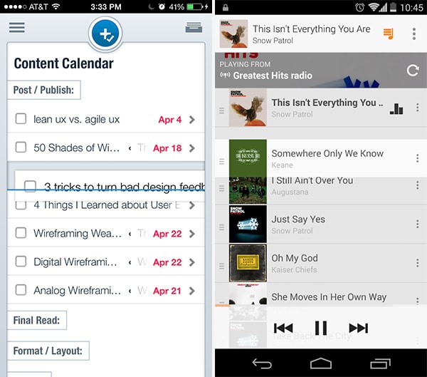
Asana, Google Play Music
Problem
The user wants to sort and organize items in a way that makes sense to them in the current view without pogo-sticking between master and detailed views of content.
Solution
Content can be picked up and rearranged, or simply dragged across to perform an action. One great example of this pattern is when you’re arranging items on the homescreen, but we see this being implemented in a lot of apps as well.
Asana for example let’s you move tasks around by pressing-and-holding then dragging-and-dropping them wherever you want; you may want to move an item into different categories or days, and this drag and drop ability puts this in an intuitiSimilarly, Google Play Music lets you drag and drop songs in a playlist to rearrange the order in which they’re played. Since this is a very interactive action, you should make sure the UI provides visual feedback in the form of animations or color changes to clearly indicate that something is happening. For example, items being dragged in Asana are highlighted with a shadow and icons being rearranged on the iPhone homescreen do that infamous wiggly dance. Another visual cue is highlighting the drop target, that is the location where the item will fall when the user lets go.
15. Pull to Refresh
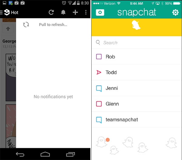
9Gag, Snapchat
Problem
The user wants to be able to refresh content manually.
Solution
Instead of relying on just a refresh button, allow the main content window to be dragged down to refresh it. This is another very interactive pattern and the amount and kind of visual feedback the UI offers during and after the action is important to let users know something is happening. For example, the pull to refresh implementation in Gmail is accompanied by a horizontal colored activity indicator, while the Twitter implementation shows a circular loading animation. Snapchat shows a dancing animation. This pattern is great for lists with content that needs updating, for example a timeline or activity feed. It’s an intuitive gesture to go alongside a standard button for manual refreshing, but doesn’t altogether replace the automatically refreshing interfaces.
Keep Your User Organized
Keep track of where your users are supposed to be interacting with data and content, whether they ever view those sections of the application, how often they interact with them, where they’re coming from and going to in the application (i.e. the user flow) and so on. Keep rearranging, re-sequencing, re-sizing, and tweaking those controls until you get more of the desired actions. And, of course, think deeply about how the user is actually using your mobile application when they’re viewing and engaging with the data and content – make sure you’re not missing something obvious when designing your app.
For a deeper look at how some of the hottest companies are implementing new and existing data and content management design patterns as well as 45+ other patterns, check out UXPin’s new e-book, Mobile UI Design Patterns 2014. Use what you need and scrap the rest – but make sure to tailor them to solve your own problems and, most importantly, those of your users.