How to Create an Interactive Graph using HTML, CSS3 & jQuery
Difficulty: Advanced
Estimated Completion Time: 1 hour
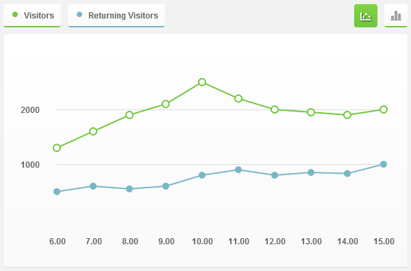
In this tutorial we will code an Interactive Graph using jQuery and CSS3. We will use the jQuery’s popular plotting plugin “Flot”. Flot is a pure JavaScript plotting library for jQuery. It produces graphical plots of arbitrary datasets on-the-fly client-side. This plugin is simple but powerful enough to create some nice and interactive graphs.
For more info take a look at documentation here. You can find the design of the graphs on Impressionist UI.
Step 1 – HTML Markup of Interactive Graph
To start we will create our html markup for the graph. We will create a <div> with the class “graph-wrapper”. Inside of this <div> we will add two more <div>. The first one will have the “graph-info” class, this div will contain the graph legend and the buttons that will allow us to switch between graphs. The second div will contain the two graphics (lines and bars).
<div id="graph-wrapper">
    <div class="graph-info">
        <!-- Using javascript:void(0) is acceptable for preventing default link behavior -->
        <a href="javascript:void(0);" class="visitors">Visitors</a>
        <a href="javascript:void(0);" class="returning">Returning Visitors</a>

        <!-- Use button elements if these are purely functional and don't lead anywhere -->
        <button id="bars" aria-label="Display bar chart"><span></span></button>
        <button id="lines" class="active" aria-label="Display line chart"><span></span></button>
    </div>

    <div class="graph-container">
        <div id="graph-lines"></div>
        <div id="graph-bars"></div>
    </div>
</div>
<!-- end Graph HTML -->
Step 2 – jQuery and Flot Plugin
Let’s include the JavaScript now. Firs think we need to add is the jQuery Library. I will link to the one hosted by Google. You can link to that one too or download it and host on your server. Then download the “Flot” files and include the “jquery.flot.min.js”. We will also add another script tag and there we will add all the scripts to make our graphs work.
<script src="https://ajax.googleapis.com/ajax/libs/jquery/1.7.2/jquery.min.js"></script>
<script src="js/jquery.flot.min.js"></script>
Step 3 – Graph Data
The data of a graph is an array with data series (ex: [series1, series2, … ]). A series can be either raw data or an object with properties (ex: [ [x1, y1], [x2, y2], … ]). We will also set some custom options for each data.
With Postcards Email Builder you can create and edit email templates online without any coding skills! Includes more than 100 components to help you create custom emails templates faster than ever before.
Free Email BuilderFree Email Templates
var graphData = [{
		// Visits
		data: [ [6, 1300], [7, 1600], [8, 1900], [9, 2100], [10, 2500], [11, 2200], [12, 2000], [13, 1950], [14, 1900], [15, 2000] ],
		color: '#71c73e'
	}, {
		// Returning Visits
		data: [ [6, 500], [7, 600], [8, 550], [9, 600], [10, 800], [11, 900], [12, 800], [13, 850], [14, 830], [15, 1000] ],
		color: '#77b7c5',
		points: { radius: 4, fillColor: '#77b7c5' }
	}
];
Step 4 – Load Graphs
Now we will load the two graphs, the one with lines and the one with bars. Both of them have some custom options (colors, shadows, etc.). Also bot of theme use the same data, from the “graphData” variable.
// Lines
$.plot($('#graph-lines'), graphData, {
	series: {
		points: {
			show: true,
			radius: 5
		},
		lines: {
			show: true
		},
		shadowSize: 0
	},
	grid: {
		color: '#646464',
		borderColor: 'transparent',
		borderWidth: 20,
		hoverable: true
	},
	xaxis: {
		tickColor: 'transparent',
		tickDecimals: 2
	},
	yaxis: {
		tickSize: 1000
	}
});

// Bars
$.plot($('#graph-bars'), graphData, {
	series: {
		bars: {
			show: true,
			barWidth: .9,
			align: 'center'
		},
		shadowSize: 0
	},
	grid: {
		color: '#646464',
		borderColor: 'transparent',
		borderWidth: 20,
		hoverable: true
	},
	xaxis: {
		tickColor: 'transparent',
		tickDecimals: 2
	},
	yaxis: {
		tickSize: 1000
	}
});
Step 5 – Graph Container Styles
First of all we will add some reset styles to clear the browser defaults.
/* Resets */
.graph-container,
.graph-container div,
.graph-container a,
.graph-container span {
	margin: 0;
	padding: 0;
}
Second of all we’ll add the gradient and the rounded corners. As you can see we are repeating the same properties over again, we need to do this because this CSS3 features are in test in some browsers and the default property will not work, so we need to add vendor prefixes for each browser. This gradient and border-radius will also be used by the tooltips and buttons.
/* Gradinet and Rounded Corners */
.graph-container, #tooltip, .graph-info a {
	background: #ffffff;
	background: -moz-linear-gradient(top, #ffffff 0%, #f9f9f9 100%);
	background: -webkit-gradient(linear, left top, left bottom, color-stop(0%,#ffffff), color-stop(100%,#f9f9f9));
	background: -webkit-linear-gradient(top, #ffffff 0%,#f9f9f9 100%);
	background: -o-linear-gradient(top, #ffffff 0%,#f9f9f9 100%);
	background: -ms-linear-gradient(top, #ffffff 0%,#f9f9f9 100%);
	background: linear-gradient(to bottom, #ffffff 0%,#f9f9f9 100%);

	-webkit-border-radius: 3px;
	-moz-border-radius: 3px;
	border-radius: 3px;
}
To finish this step we will position the graphs container, set the width, height, paddings, etc. Feel free to change these values according to the size you want for the graphs.
/* Graph Container */
.graph-container {
position: relative;
width: 550px;
height: 300px;
padding: 20px;
-webkit-box-shadow: 0px 1px 2px rgba(0,0,0,.1);
-moz-box-shadow: 0px 1px 2px rgba(0,0,0,.1);
box-shadow: 0px 1px 2px rgba(0,0,0,.1);
}
.graph-container &amp;amp;gt; div {
position: absolute;
width: inherit;
height: inherit;
top: 10px;
left: 25px;
}
.graph-info {
width: 590px;
margin-bottom: 10px;
}
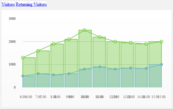
We’ll start to add the basic styles for the links.
.graph-info a {
	position: relative;
	display: inline-block;
	float: left;
	height: 20px;
	padding: 7px 10px 5px 30px;
	margin-right: 10px;
	text-decoration: none;
	cursor: default;
}
For the legends of the graph’s data we will create a small circle with the same color as the lines/bars on the graph. To create this circle we will use the :before pseudo-selector. This selector allows us to add content before the element.
/* Color Circles */
.graph-info a:before {
	position: absolute;
	display: block;
	content: '';
	width: 8px;
	height: 8px;
	top: 13px;
	left: 13px;
	-webkit-border-radius: 5px;
	-moz-border-radius: 5px;
	border-radius: 5px;
}

.graph-info .visitors { border-bottom: 2px solid #71c73e; }
.graph-info .returning { border-bottom: 2px solid #77b7c5; }

.graph-info .visitors:before { background: #71c73e; }
.graph-info .returning:before { background: #77b7c5; }
Then we will style the two buttons that will allow us to toggle between the lines and bars graph. We’ll set a fixed width and height, add the icons images and add a new green gradient for the active state.
With Pulsetic you’ll be instantly notified the moment your website, API, or server becomes unavailable. Monitor uptime from multiple global locations and respond to incidents before your users are affected.
Create beautiful status pages in minutes to keep customers informed during outages and build trust with transparent communication.
Start Monitoring for Free
/* Lines & Bars Buttons */
#lines, #bars {
	width: 34px;
	height: 32px;
	padding: 0;
	margin-right: 0;
	margin-left: 10px;
	border-bottom: 2px solid #71c73e;
	float: right;
	cursor: pointer;
}

#lines.active, #bars.active {
	background: #82d344;
	background: -moz-linear-gradient(top, #82d344 0%, #71c73e 100%);
	background: -webkit-gradient(linear, left top, left bottom, color-stop(0%,#82d344), color-stop(100%,#71c73e));
	background: -webkit-linear-gradient(top, #82d344 0%,#71c73e 100%);
	background: -o-linear-gradient(top, #82d344 0%,#71c73e 100%);
	background: -ms-linear-gradient(top, #82d344 0%,#71c73e 100%);
	background: linear-gradient(to bottom, #82d344 0%,#71c73e 100%);
}

#lines span, #bars span {
	display: block;
	width: 34px;
	height: 32px;
	background: url('../img/lines.png') no-repeat 9px 12px;
}

#bars span { background: url('../img/bars.png') no-repeat center 10px; }

#lines.active span { background-image: url('../img/lines_active.png'); }

#bars.active span { background-image: url('../img/bars_active.png'); }
To finish this step we will clear the floats of the graphs container.
/* Clear Floats */
.graph-info:before, .graph-info:after,
.graph-container:before, .graph-container:after {
	content: '';
	display: block;
	clear: both;
}
Step 7 – Graph Toggle
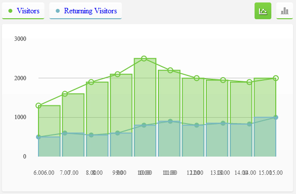
In this step we’ll add the click event for the “bars” and “lines” buttons. On load we’ll hide the “bars” graph, then it will be visible when the users click on the “bars” button. To see the lines graph the user will need to click on the “lines” button.
$('#graph-bars').hide();

$('#lines').on('click', function (e) {
	$('#bars').removeClass('active');
	$('#graph-bars').fadeOut();
	$(this).addClass('active');
	$('#graph-lines').fadeIn();
	e.preventDefault();
});

$('#bars').on('click', function (e) {
	$('#lines').removeClass('active');
	$('#graph-lines').fadeOut();
	$(this).addClass('active');
	$('#graph-bars').fadeIn().removeClass('hidden');
	e.preventDefault();
});
Step 8 – Typography
In this step we will add the typography styles, for links, legends and tooltips.
#tooltip, .graph-info a {
	font-family: 'Helvetica Neue', Helvetica, Arial, sans-serif;
	font-weight: bold;
	font-size: 12px;
	line-height: 20px;
	color: #646464;
}

.tickLabel {
	font-weight: bold;
	font-size: 12px;
	color: #666;
	font-family: 'Helvetica Neue', Helvetica, Arial, sans-serif;
}
We will hide the first and last “label” from the y axis, to do that we will use the first and last pseudo-selectors.
.yAxis .tickLabel:first-child,
.yAxis .tickLabel:last-child { display: none; }

Step 9 – Tooltip
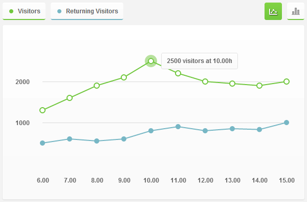
To add the tooltip we’ll append to the <body> a <div> with the id=”tooltip”. The position of this tooltip will be calculated based on the position of the hovered point of the graph.
function showTooltip(x, y, contents) {
	$('
<div id="tooltip">' + contents + '</div>

').css({
		top: y - 16,
		left: x + 20
	}).appendTo('body').fadeIn();
}

var previousPoint = null;

$('#graph-lines, #graph-bars').bind('plothover', function (event, pos, item) {
	if (item) {
		if (previousPoint != item.dataIndex) {
			previousPoint = item.dataIndex;
			$('#tooltip').remove();
			var x = item.datapoint[0],
				y = item.datapoint[1];
				showTooltip(item.pageX, item.pageY, y + ' visitors at ' + x + '.00h');
		}
	} else {
		$('#tooltip').remove();
		previousPoint = null;
	}
});
Then we will add a position absolute, hide it using the display property and add some padding and a nice border.
#tooltip {
	position: absolute;
	display: none;
	padding: 5px 10px;
	border: 1px solid #e1e1e1;
}
Conclusion
That is it. We have finished this tutorial, fell free to customize this graph with CSS and all the possibilities that Flot plugin offers.


