10 Pro Tips to a Smarter Design Process
Being a UX designer myself, it’s important that we fall back in love with the art of design. Especially when you hit a creative wall.
The reasons vary. Maybe you’ve been working too fast and too hard and burnt out. Maybe you work in a non-creative environment and contend with a lot of resistance each day. Maybe you’ve unknowingly become a repeat performer, putting out the same work over and over again. Or maybe you’re just bored.
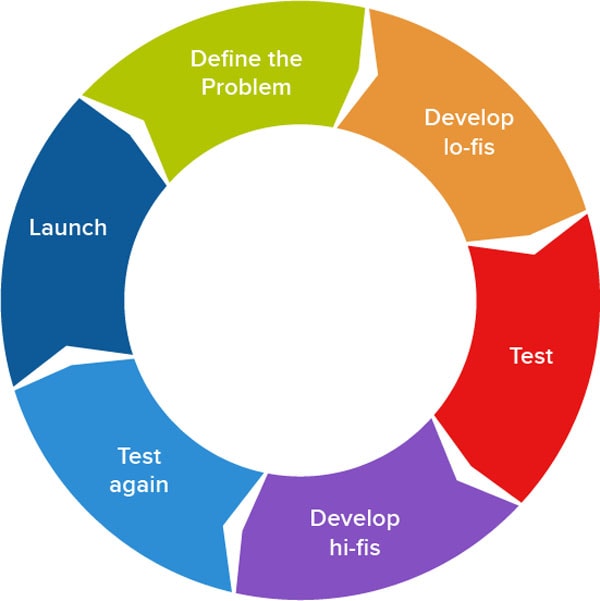
A design process empowers you to confidently innovate because you can map the inception of an idea to its evolution.
Your process should never be so ideal that it can’t change. Every project has limitations. Whether it’s resources or skills, your design process must adapt to all these real-life constraints.
Here’s 10 tips for improving your own design process based on what I’ve experienced in my own career.
With Postcards Email Builder you can create and edit email templates online without any coding skills! Includes more than 100 components to help you create custom emails templates faster than ever before.
Free Email BuilderFree Email Templates1. Define the problem before hunting for solutions
Einstein once said, “If I had an hour to solve a problem I’d spend 55 minutes thinking about the problem and 5 minutes thinking about solutions.”
Many designers make a fatal flaw in thinking problems are obvious. Most of the time obvious problems are merely symptoms of the real problem. You will know when you’ve found the real problem because it will eliminate a lot of other issues at the same time.
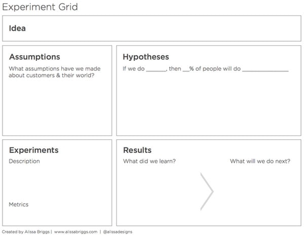
As described in the free e-book Web UI Best Practices, start all your design projects with the “How Might We…” approach of design thinking. Remember that before you design the product correctly, you first need to ensure you’re designing the correct product.
2. Know your user like the back of your hand
A developer once told me she was building a product for “everybody”. That might sound reasonable for a mass market product, but you can’t create meaningful use UX cases if you can’t pinpoint a specific user.

Without meaningful use cases, it’s hard to know what your MVP (minimum viable product) needs to be or how to create a strategic product plan. All great products strive to solve a handful of problems as simply as possible, in a way that’s easily understood by the people who need it.
Conduct user research, create personas, and start mapping out user scenarios and flows. Anything that puts you deeper into the mind of the user is an investment in successful design.
With Pulsetic you’ll be instantly notified the moment your website, API, or server becomes unavailable. Monitor uptime from multiple global locations and respond to incidents before your users are affected.
Create beautiful status pages in minutes to keep customers informed during outages and build trust with transparent communication.
Start Monitoring for Free3. Consider extreme solutions to the problem
Part of the fun in designing is going a little off the deep end with ideas. Celebrate the opportunity to think big.
Break conventions just for the sake of it. Think beyond a single device. Storyboard a day in the life of a user and see where all the possible touchpoints could occur. Bust out the markers and crayons. Do whatever inspires you to think unconventionally.
Don’t spend weeks (unless you can afford the time) but take a creative pause to connect your unconscious mind to the problem you need to solve.
Take a look at Duolingo. The app feels more like a smartphone game than a language learning platform. It’s completely unconventional and might sound questionable on paper, but the proof is in the numbers – the company is valued at $470M by Google Capital as of June 2015.
Seek inspiration outside of your immediate industry, and you’d be surprised by how effective (and creative) your design solutions become.
4. Establish a hypothesis to test before you design
A hypothesis introduces a way to seek truth. Every design has a foundation grounded by something strong enough to build upon.
Think of it like an essay’s thesis statement. It is the heart of the design. And it’s where your use cases come into play far ahead of development work.
Brainstorm as many scenarios as possible and whiteboard with your team. Run a design studio exercise in which participants sketch their solutions for how to complete specific tasks. You should always explore (and iterate) your hypothesis as one of the first steps in design.
For a useful framework, check out Maximilian Wambach’s (Interaction Designer at Ebay) approach. The “If [action] then [outcome] because [customer need/problem]” mindset is extremely helpful.
5. Collaborate with a diverse group on the best solution
If your design is solid, it should hold up to critique and discussion. A group of people from different backgrounds who possess different experiences will lead you to better solutions.
Consider setting up a Think Tank of stakeholders to share their unique perspectives on how your design can be improved. Work with your design manager to ensure that the product team still has the final say, otherwise you fall into the trap of design-by-committee.
6. Create a story with documentation
Produce documentation that tells a story. Your personas are the cast of characters. Your use cases are key parts of the screen play. Your wireframes are the stage. Your process flows and user flows are the choreography. Your UI kit is the set design.
Everything relates and feeds into each other.

Many times documentation is ignored because it lacks context. Think of your design assets and artifacts as puzzle pieces. On their own the pieces have little value, but put together they build a picture that tells a story.
Don’t get tunnel vision and obsess over perfecting one design document. Instead, make sure the relationships between each design stage is easily understood.
Minimize documentation that doesn’t move the design forward. If your documentation isn’t usable, there’s no reason to create it.
7. Design and test on paper
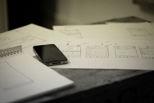
Rapid paper prototyping can be done at any stage and always helps inform design decisions.
Give yourself or a group a set amount of time to quickly iterate ideas. It’s very easy to become attached to a design once it’s move into pixel form. Sketching and prototyping on paper, however, keeps your mind searching for possibilities.
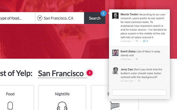
Photo credits: “App sketching”
Draw out sketches for the sake of exploring your own ideas, then run a quick hallway usability test with 3-5 people.
As soon as you come up with a design you think is solid, start testing it by conducting a virtual walk-through. Talk through the different use cases with a partner so you can help each other notice any gaps or potential flaws. Once your partner understands how the design works, they can act as the “human computer” for operating the paper prototype during usability testing.
8. Post artifacts on a wall
Having tons of post-its on a wall might seem cliche, but there’s a sound reason behind the method. .
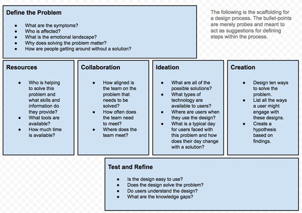
Photo credit: Affinity diagrams by Acquity Group
Think about all those detective shows. When a detective is working a case, a wall is transformed into a map of the crime. All of the witnesses and suspects are displayed with the evidence that’s been collected.
The same thing occurs when you’re designing for specific users. Just like a detective, a UX designer needs to map the connection of the problem to the users and then link it directly to the solution. The physical artifacts aren’t for show. Having a shared place for a team to visit at any time helps infuse UX methodologies into everyone’s workflow.
9. Create a lo-fi prototype to test
Lo-fidelity prototypes can be created with basic HTML, Keynote or Powerpoint, paper cut-outs, storyboards, and specialized prototyping tools like UXPin (which I’m quite familiar with).
As soon as you move into development, certain restrictions are inevitable (browser compatibility, site performance, etc.). Test your design before development because it will better inform your user stories and provide developers with rich insights.
Low-fidelity prototypes allow you to link up multiple wireframes to create flows. In this way, you can test the effectiveness of the order of things, rather than just the elements that the user sees on-screen. You can validate that sequences of interactions make sense for users.
10. Build collaboratively
No designer is an island. Too often people work for too long by themselves.
Just like pair coding has been proven to reduce technical error (because it’s easy to become code blind), try Cooper’s pair design technique for better analysis and iteration. Working with another person generates motivation for self-improvement, establishes a sense of teamwork, and balances productivity by sharing energy.
It’s pretty old school to think that you can only design well when you’re tethered to a desk away from everyone. That idea is as outdated as smoking in the office. By following the guidelines described in Building Mockups Developers Won’t Hate, your projects can be fun and collaborative.
Ready to create your own design process?
Get started with the UX Design Process Map below, then start practicing in tool like UXPin so you can design with your team together.
