Best Examples of Websites That Use Slides App
By now, you’ve probably heard about Slides website builder, an easy-to-use website builder that helps you get a site up and running in no time. If you haven’t tried Slides yet, this dose of visual inspiration might be just the thing for you.
All of the websites below are mini-case studies that show exactly what Slides app can do. From simple landing pages to more complex layouts, the design tool has everything you need to create an amazing website.
Each slide has been carefully crafted to satisfy three key criteria: aesthetic, function and usability. That way you know every element works together seamlessly while enhancing the impact of your content. Plus, Slides comes with plenty of carefully crafted components so that every part of your website will work together seamlessly and showcase your business.
Unlike a lot of other website builders, Slides app allows each user to build a custom design. Every website created with the tool will have a distinct personality and design so you don’t have to worry about duplicated sites.
What can Slides do for you? Here are a few designs built on Slides that we love here at Designmodo! (But you don’t have to just take our word for it; there are testimonials from actual Slides Framework users as well.)
Examples of Websites Based on Slides App
Mago
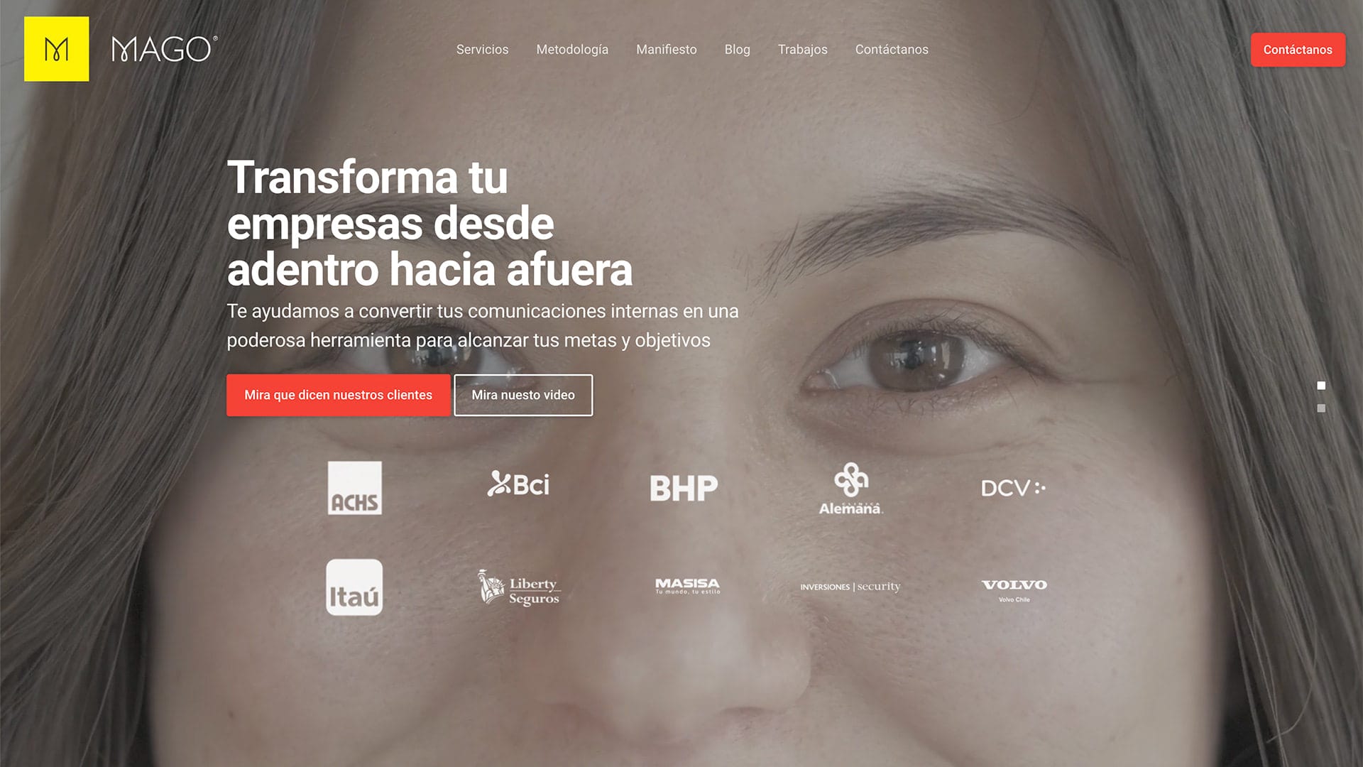
Mago impresses visitors with its compact, minimal, and straight-to-the-point design that instantly separates it from the competition. You will not see here long pages. All the information is accurately packed on several screens. That is very beneficial for the online crowd who cannot boast of long attention spans. Potential customers get what they want and need right here, right now. It is here where the ideology of “less is more” shows its powerful side.
With Postcards Email Builder you can create and edit email templates online without any coding skills! Includes more than 100 components to help you create custom emails templates faster than ever before.
Free Email BuilderFree Email TemplatesAlthough the team has decided to embrace minimalism, they still have managed to impart the impression of sophistication and elegance into the user interface. There are fancy image backdrops, beautiful full-screen videos, sleek cards-styled sections, spectacular human illustrations, etc. In a word, the website is made in accordance with all current standards and trends. Using Slides App, not only did the team behind Mago create all these, but they also ensured that everything works great on all devices and browsers.
DinLAb

While the previous example tries to tell a story in a few words pursuing the minimalist approach, DinLab does not bother about being too loud and too wordy in its self-promotion. The homepage stuns with its impressive outward. Even though the team has set black as a core of the website design aesthetics, nevertheless, still the project screams out creativity on all fronts.
Many things strike an eye and produce a powerful impression here. For instance, each section has its abstract geometric scene set in motion. There is a range of radiant gradients that instantly establish focal points for readers and direct the attention towards the content. Neon coloring also feels particularly well in such a dark and spacious environment.
The team behind DinLAb uses Slides App as a platform where they can quickly and easily create a solid foundation for the project on which they can build on. They have created a user interface with elegant design, well-thought-out structure, and responsive behavior and infused it with their artistic nature and love for imaginative solutions.
DinLab is a great example that shows how the Slides App allows creative people to let their imagination run wild and not worry about the coding stuff.
All the design tools from Designmodo are very great. I have been using them for two years in my project. They can build a creative playground very quickly and let me create freely in it, no longer restricted by technology. – Jingchao
My Pen Name
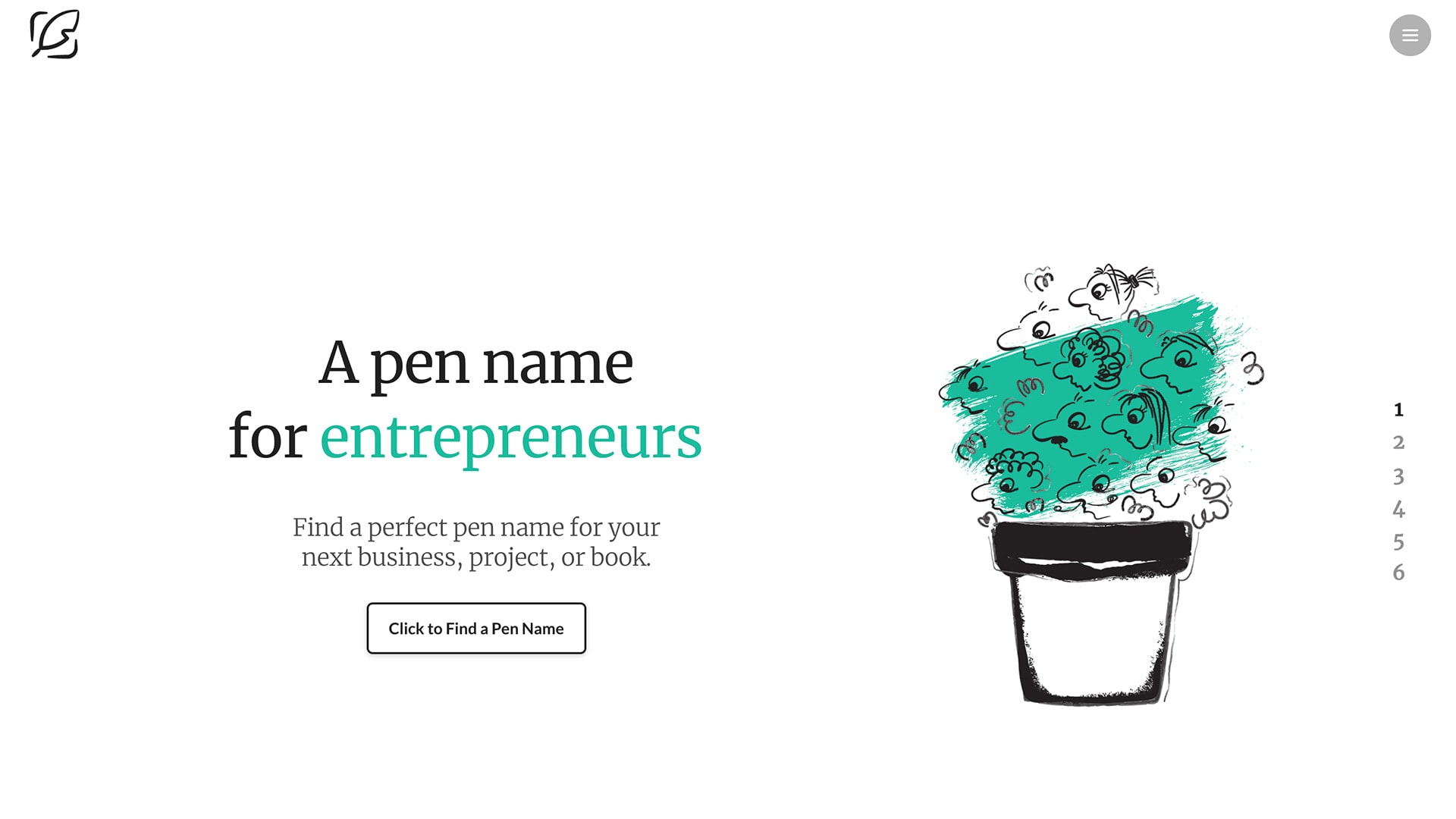
From dark to light, Slides App works great for every color scheme and design solution. Whether it is a scarcely or lavishly decorated interface, whether it is a monochrome or multicolored design, it will provide the best experience for an owner and visitors. And this is another proof of that.
My Pen Name is a skillful symbiosis of two previous approaches. It looks minimal and, at the same time, highly informative. And it is artistic without a doubt.
With Pulsetic you’ll be instantly notified the moment your website, API, or server becomes unavailable. Monitor uptime from multiple global locations and respond to incidents before your users are affected.
Create beautiful status pages in minutes to keep customers informed during outages and build trust with transparent communication.
Start Monitoring for FreeThe landing page is nothing more than just a vertical slider with almost a dozen sections. Each slide feels spacious and well organized. You will find there both text and illustrations that together reinforce the message that should be delivered.
Using Slides App, Andy Thomson has created a good-looking, sleek, fully-fledged website with not only the homepage for promoting the services and introducing the company to the online crowd but also inner pages to make the project complete. Within hours, he was managed to give his startup a boost and begin testing the ground.
I enjoy working with Slides to create beautiful slick-looking websites. – Andy Thompson
Blacksun
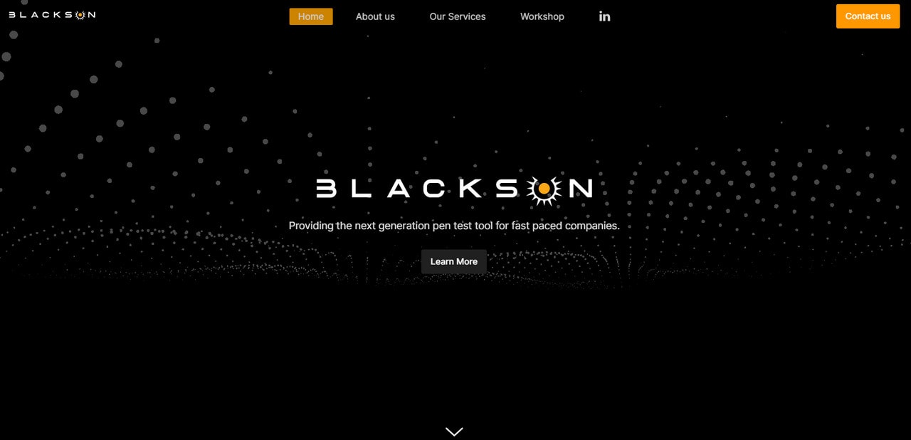
Blacksun is a typical example of the present-day websites that follow the current trends. You will find here an engaging hero area enriched with trendy particles-based animation that creates proper anticipation for the targeted market.
Each section is split into two to accommodate textual and visual information comfortably. There are huge images that help users to get the idea quickly, and many small yet eye-pleasing dynamic effects that add to the user experience and tie everything together.
Thanks to Slides App, the team behind Blacksun was managed to play with various components and even panels to find the best way to communicate the message without coding or design skills. In no time, they have created a sleek mini website to promote the service.
Designmodo’s tool has helped me create amazing websites without little-to-no coding requirements. The best part is, its so easy to add/remove slides, fully mobile-friendly. I would recommend any startup or online marketing team to create a kickass landing page or website on the fly. – Ridin Dinesh
LA BOITE
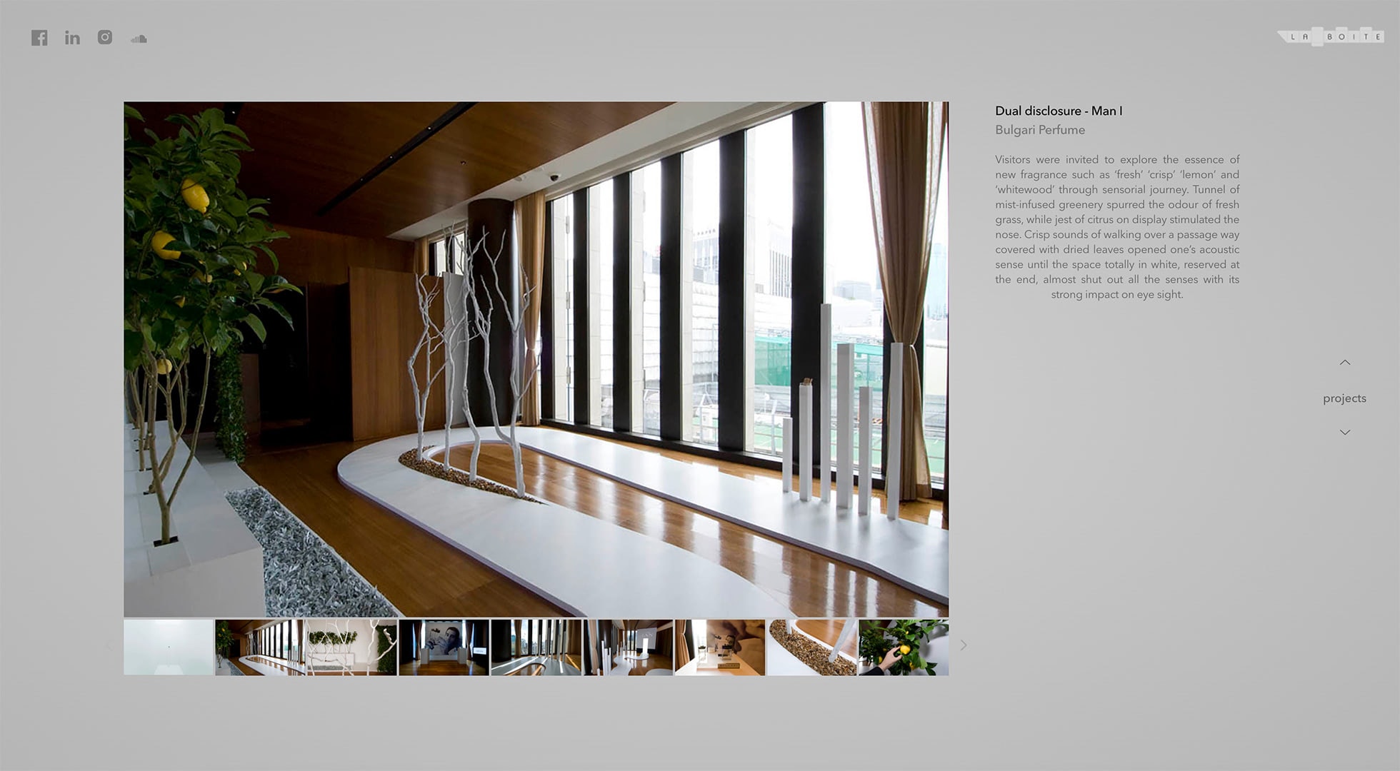
La Boite is a Tokio-based digital studio that specializes in all sorts of creative projects. Agency can boast of some extraordinary works done. However, their official website is not what you call flamboyant or fancy. On the contrary, it maintains a super-clean aesthetics and keeps things neat and straightforward.
Ditching all the popular extravaganzas and opting in favor of traditional solution, neutral coloring, and a ton of whitespace allowed the team to favorably spotlight their portfolio, focus user’s attention on the content and most importantly establish a strong businesslike atmosphere that appeals to serious clients.
Using Slides App, the team has found the best solution for their website. They have implemented a full-screen vertical slider, galleries and showcases that accommodate lots of information and visual material and with all that provide a pleasant user experience. On top of that, they have capitalized on the impact produced by tiny transition effects that can be easily added in the framework.
Accentuate
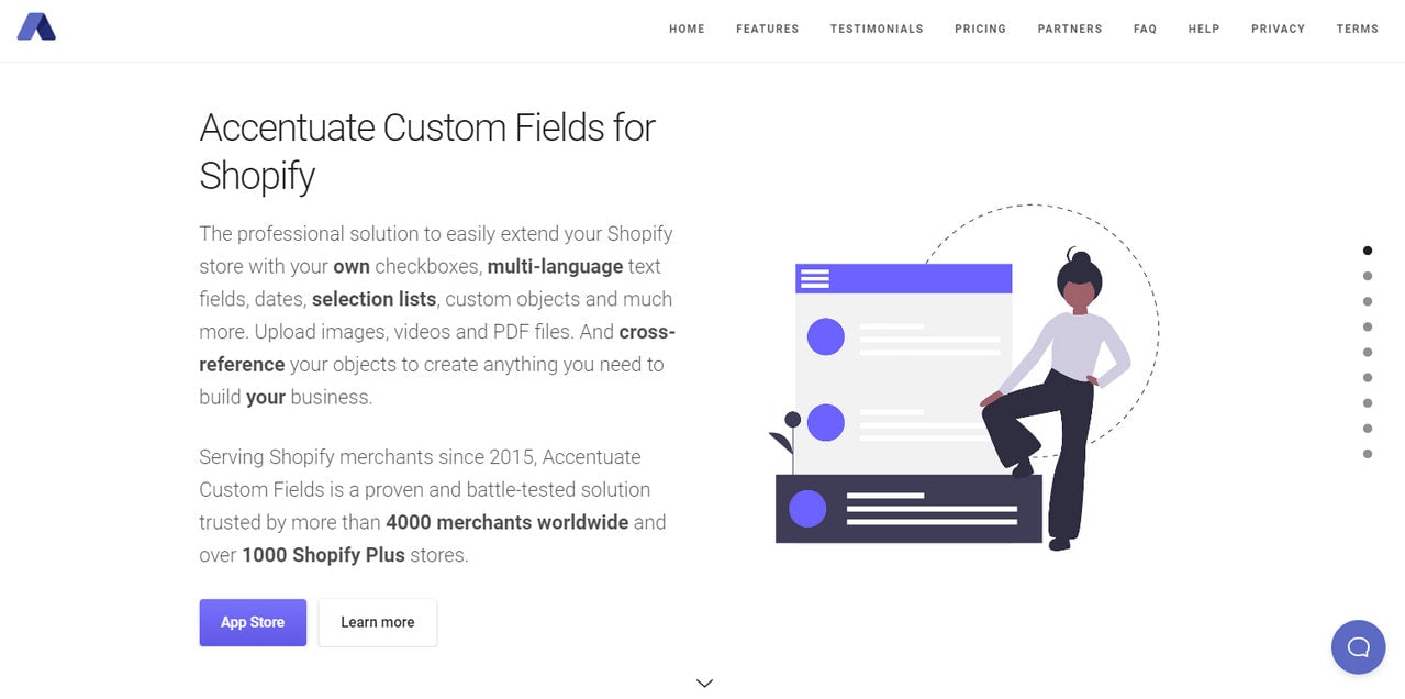
Unlike the others, the team behind Accentuate uses Slides App to create a comprehensive landing page that can easily compete with the regular multipage websites. It includes almost a dozen sections in one place covering all the necessary information. However, long landing pages are not something new for the online crowd. Users know how to handle them properly. Therefore, this approach works here.
The team has skillfully combined functional and artistic constituents to play safe and keep away the homepage from looking boring. Each section has a unique illustration and a unique structure that make things enjoyable. You can see here tables, FAQ, grid with partners, terms section, list of features – all these add to the sense of diversity.
Thanks to Slides App, where all the components are thought through from various angles, the team was managed to create an effective website design, achieve consistency in experience and breathe harmony into UI without much hassle.
We used Slides for this site, and it has worked out great for us. Tried a few page builders over time, and nothing really beats writing the code yourself with an awesome starting point via Slides. – Ole Thorup
Fedro

As we have already said, Slides App works for all types of business. Not only can online ventures and techno startups with their mobile apps benefit from it, but also such ageless industries as fashion. Fedro is a case in point.
Fedro is a small yet respectable fashion company that specializes in making men look fabulous. They have used Slides App to promote their brand online. To do this, they have created an entire website with several inner pages.
The landing page looks outstanding. It exudes strong fashion vibes. Thanks to the full-screen image on the welcome section, the team ensures a powerful first impression. There are seven more sections. However, they are easily digestible so that you cannot feel the tension of long reading.
Inner pages are much shorter and concise, yet still, they are made in the same style. It is here where Slides App shows its powerful side of uniformity in design patterns.
Finally, yet importantly, the team has also employed some modern features of the website generator, such as dynamic effects. They give a particular spice to user experience and certainly reinforce the glamourous side of the interface.
YorkTech Solutions

The website design of YorkTech Solutions lives up to its name. It is techy, modern, and high-tech. It produces the right feel from the get-go thanks to the hero area with particle animation, businesslike image backdrop, and casual typography.
The rest of the layout echoes with the welcome section as well. Each slide has a full-screen image backdrop to support messages visually and beautiful short animations to make reading flow enjoyable. The landing page is not the only one that makes the statement here. Several inner pages also add to the case.
The entire website is created with the help of the Slides App. The builder underlies all layouts, design solutions, and even the dynamic elements. It ensures not only the pleasant aesthetics of the project but also makes sure everything works correctly on all popular devices starting from small cellphones and ending with huge monitors.
Personal portfolio of Max Bratsun
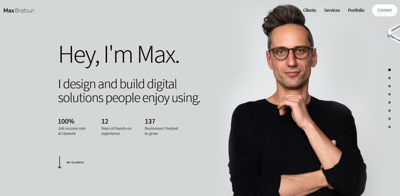
The personal portfolio of Max Bratsun is just a single landing page. However, it is enough to make a statement. It has four main sections that are essential for every artist’s presentation. There are clients, services, contacts, and of course, a gallery with portfolio pieces. Note Max has skillfully extended each section to uncover extra information unobtrusively.
For example, the client section includes not only a list of companies displayed as logotypes but real feedbacks presented as a well-formatted testimonial block. The same goes for the services section that is accompanied by testimonials to elicit trust into prospects.
Max Bratsun is the one who has unleashed the power inside Slides App to introduce yourself to the online crowd in all his glory. His portfolio is an excellent example of how to create a functional website, and with all that not lose charisma and personality. Using Slides App, he was managed to shape his portfolio the way he sees it.
I just love Slides; I’ve slightly modified it for my business website, but that was easy to do, and thanks to extensive features, I could concentrate on final design touch rather than code bits. – Max Bratsun
Absurd.design
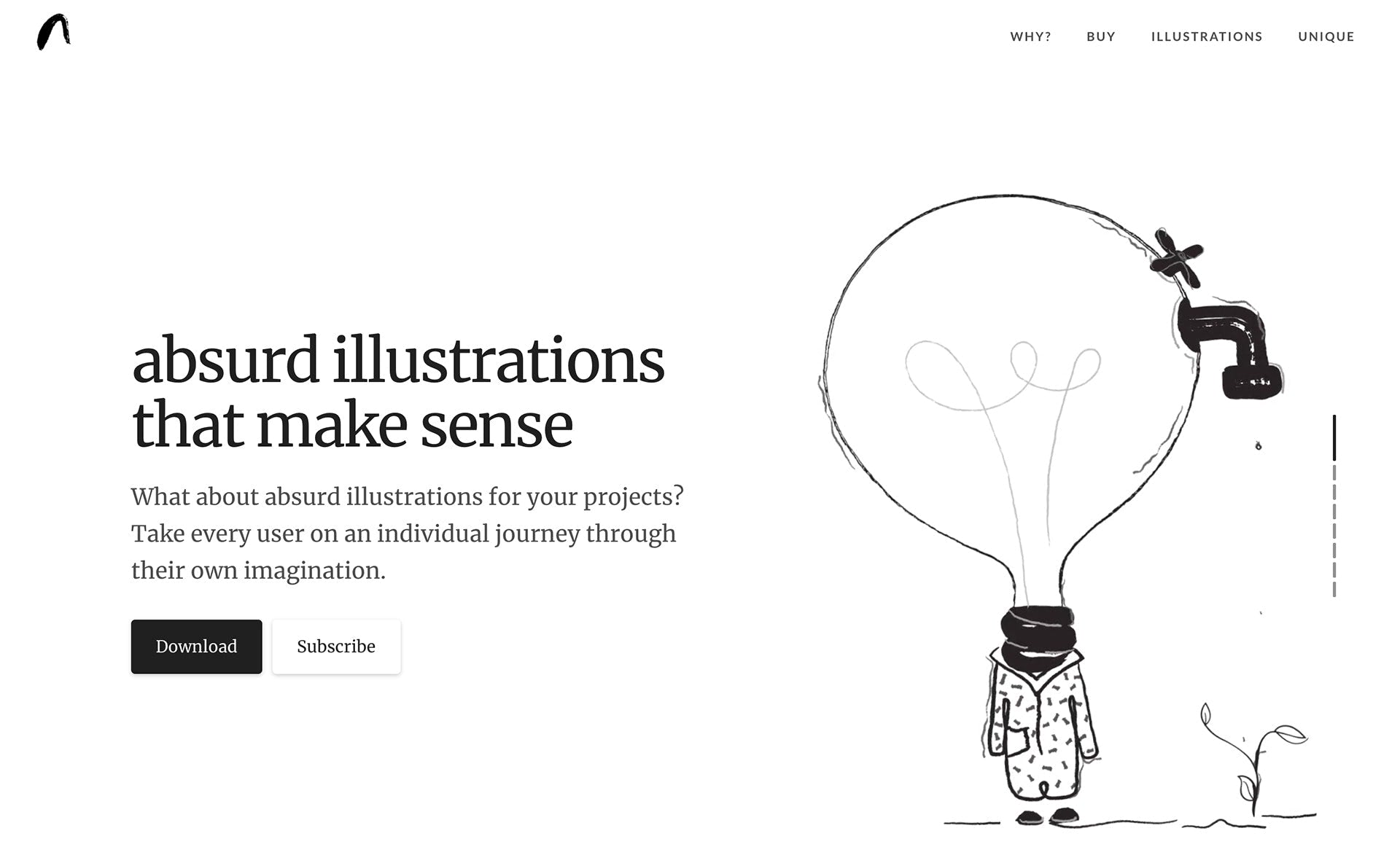
Absurd Design presents a collection of unique illustrations with the bizarre appearance and ambiguous meaning that instantly add to the project an exclusive charisma and powerful touch of personality, to say nothing about giving viewers food for thought.
While the product is whimsical, eccentric, and certainly one-of-a-kind, the promo page stays away from being freakish or out-of-the-box. On the contrary, there is a timelessness to the design of a website. The ageless black and white color scheme, modest typeface, and well-organized structure – that all allows illustrations to speak for themselves. The aesthetics are clean, neat, and subtle. This is exactly what is needed to naturally direct the attention towards the product and make it the star of the show.
Adopted a favorite approach of the multi-page vertical slider where all information is broken into easily digestible portions, the team has created small yet effective teasers. Using various Slides’ units such as pricing table, card-style blocks, image gallery, subscription form, and some other, they have covered all the necessary information in style, leaving an excellent overall impression.
With Slides, the team has created an environment where their product flourishes in no time and no extra expenses.
Obscure orchestra
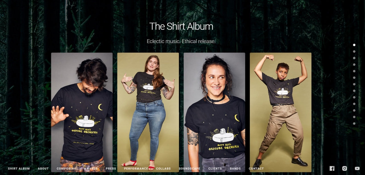
We have already seen a long landing page; Accentuate showed us how to deal with lots of sections under one roof gracefully. However, the team behind the Obscure Orchestra has gone even further.
Their landing page has 13 chapters that comfortably co-exist in one space. They do not overpower nor bore users. On the contrary, they ignite interest and lead visitors from top to bottom without losing their attention. Here, users can find all the information about the company in one place without extra moves and extra hustle.
There is a considerable diversity of functional blocks: tables, features blocks, video players, cards, sliders, galleries, various layouts. Add to these full-screen images and numerous videos. It seems that the landing page should be a total mess. However, everything is the other way around.
One of the main reasons for that is that all elements perfectly play together. They are made in the same style, tone, and design. They complete each other creating harmony rather than chaos. Slides App made this possible.
Not only did it provide the non-tech-savvy team with a comfortable environment and a ton of field-tested UI components to choose from, but it also ensured that all elements are in sync. So that whatever combination you are up to, everything will look great no matter what.
Portseif
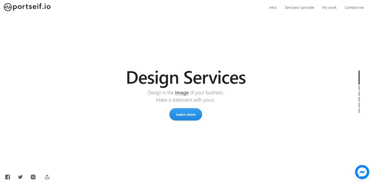
Portseif is a personal portfolio of Chris Seifert. Chris is a talented multi-disciplinary artist who knows a thing or two about design. Therefore, it comes as no surprise that his website is made with chic.
Chris goes for the minimalistic approach, opting in favor of a single-page presentation. He has included only essentials: services, works, client testimonials, and contacts. Along with the hero area, these components pull back the veil from the artist showing him at his best.
Thanks to Slides Framework, Chris has an opportunity to create not just a beautiful, fully responsive website in seconds but also provide each section with its vibe and charisma without ruining everything.
As a result, the hero area with its spacious yet compact design feels modest and elegant. The services section, with its two-column layout and proper formatting, gets straight to the point. Works section with its sortable gallery makes an impression. And contact section includes a form where you can pitch your request. Brilliant. What else do you need when you start your career online? I believe nothing.
I love the Slides Framework as it allows me to create top-notch, professional, and fully mobile responsive websites in seconds. – Chris Seifert
Celis
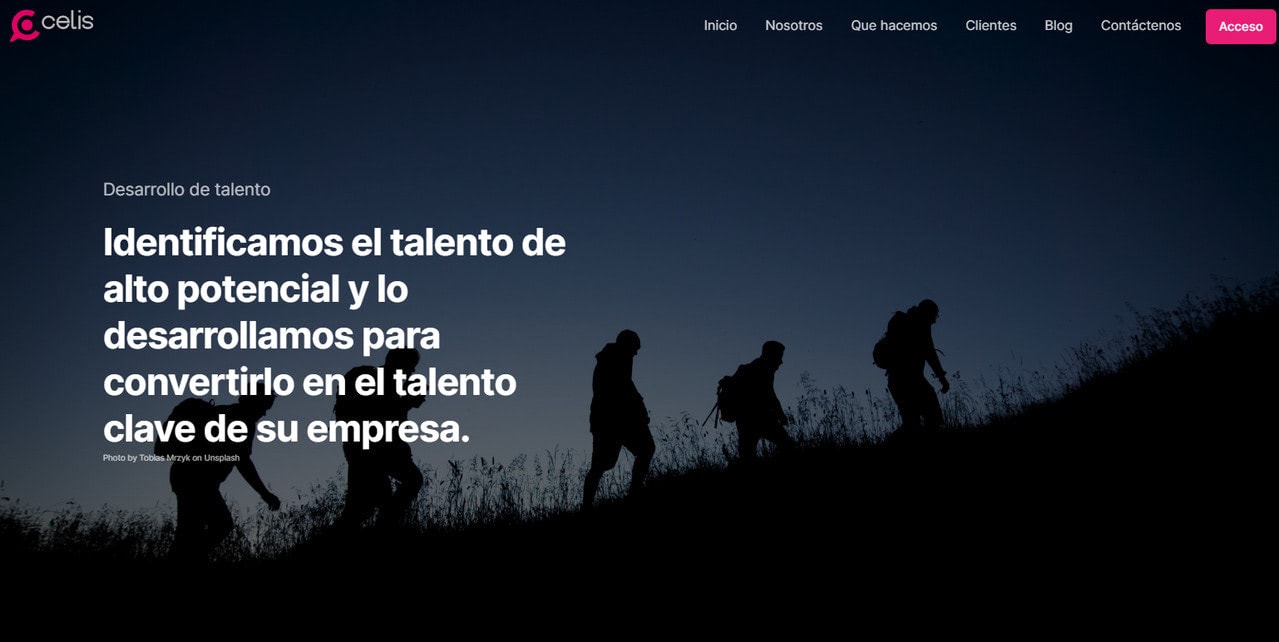
Celis presents a fairly standard web layout. It is linear and sticks to the vertical direction. Each section occupies the entire screen to get the undivided attention and bring more focus to the content. The images are delightfully incorporated, creating a proper atmosphere. There are no extravaganzas or bizarre tricks. Nevertheless, it does not mean that it does not work.
On the contrary, it is precisely what is needed for some serious companies and ventures. The deal is that people are more likely to fall for conventions. Therefore, for many traditional industries, such a trivial website will be more efficient in winning over potential clients.
In Celis’ example, we can see how the common interface can look amazing when made with the help of professional instruments, like Slides Framework. The deal is that Slides offers components that meet the current trends. Therefore, your website, whatever simple or primitive, will never look tedious and outdated. The framework will help to reimagine the traditional approach and make your project look sophisticated even with a standard layout and unpretentious approach.
No Scalpel Vasectomy
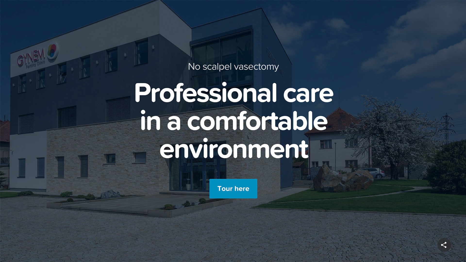
With such a serious name, you expect nothing more than a website with modest design and a businesslike vibe. Indeed, the official website of the Vasectomy clinic has a general atmosphere that fits the company’s sphere of expertise.
Much like the previous example, it sticks to the traditional route, adopting classic approaches. Thus, the landing page has a standard striped layout where sections with images used as backgrounds alternate with the clean and neat ones. Huge typography makes the titles sound loud while a generous amount of white space naturally fixes visitor’s attention to the most critical parts. Thanks to Slides App, whose prime focus lies on content and design, all these can be achieved without any extra manipulations.
What’s more, the team behind “No Scalpel Vasectomy” did not stop at landing page. They have created a fully-fledged website that presents a clinic on every device and every browser flawlessly.
Slides is very powerful and easy to use tool for creating websites. Great work! – Jiri Kutil
Manchester Art Gallery

The team behind the official website of Manchester Art Gallery has used Slides Framework for creating a microsite for one of its exhibitions. Having a bulk of information to cover and deliver in a non-intrusive manner, they have decided to create not just a landing page, but a sterling website with inner pages and structure.
Although the team does not pursue original approaches, still Slides gives them an opportunity to treat information like a work of art that helps to transmit the idea behind the project quite effectively. They have also maintained clean and neat aesthetics to contribute to the overall readability as well as establish some focal points in the reading flow.
Using Slides App, Martin Grimes was managed to create a special place for a special event within minutes.
Using Slides was a great help. We had a lot of information to get across, and the templates helped us conceptualise, simplify, and then develop the content and an information structure. – Martin Grimes
Mucci
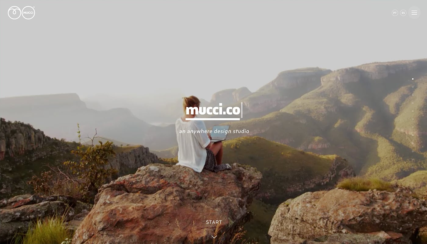
Mucci is a gallery-style website that showcases elements from the designer’s own studio. With the help of Slides the website uses cool hover animations to help encourage clicks on different elements.
Easy to use with a great variety of functions! – André Giacomucci
Moosetank
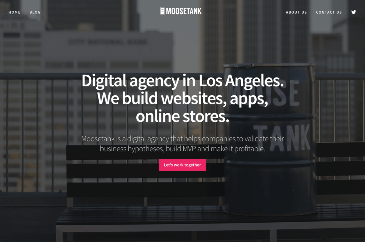
Moosetank is a digital agency that helps companies to validate their business hypotheses, build MVP and make it profitable.
Slides is an awesome solution for web presentations which are necessary for startups at any stage. – Boris Goncharov
Michel Bekleidungsmanufaktur
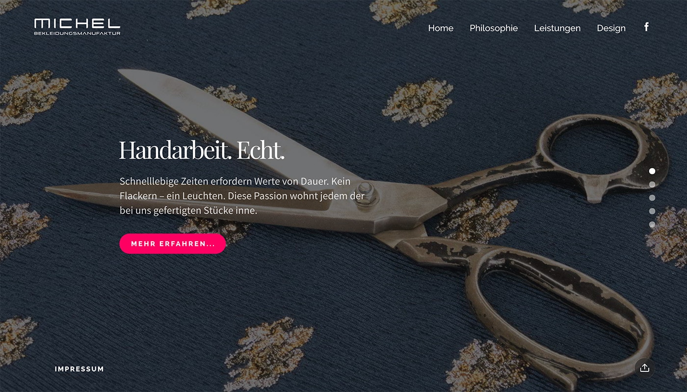
Michel Bekleidungsmanufaktur uses a mix of striking photos and videos to engage users. Each website panel, or “slide,” features a simple animation and text overlay that looks amazing and functions flawlessly. (And Slides Framework is a big part of the reason it all comes together.)
Mount Vernon
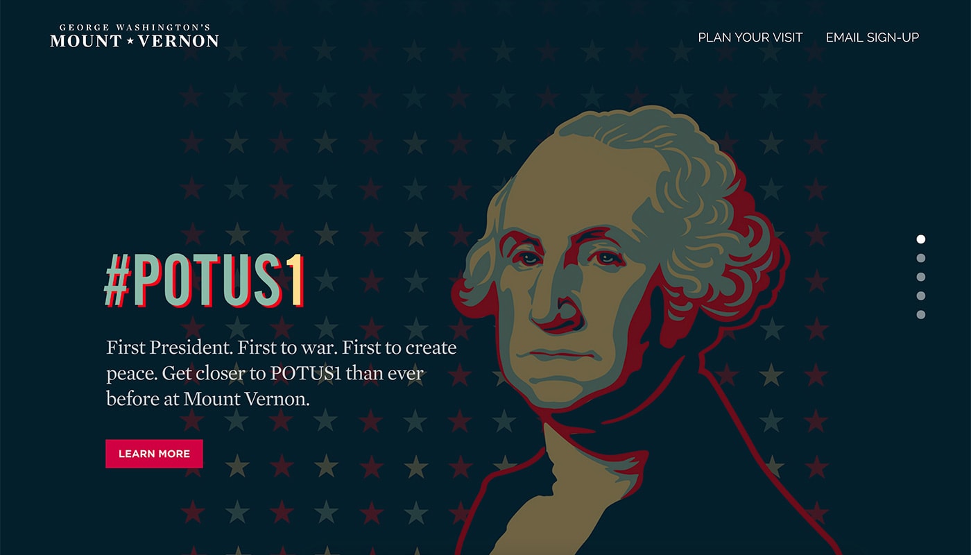
Mount Vernon has a fully integrated design with photos and video, card-style information and a place for visitors to buy tickets or shop online. It’s all the functionality you would want in a website, making Slides a viable option for targeted marketing projects because they can be implemented so quickly.
Slides is extremely easy for us to build out specialized marketing sites. It’s a very clean and customizable display that is mobile friendly and efficient to create new campaigns on the fly. – Matt Briney
Berryvisual
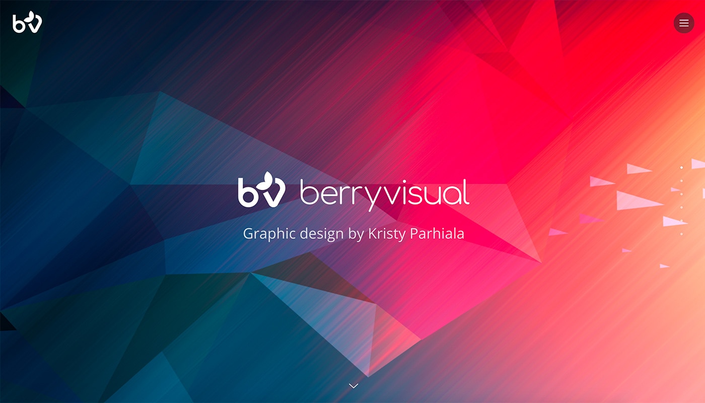
Berry Visual is a simple portfolio website that makes the most of bold color design trends with a striking palette that demands attention. It also features a fun pop-out navigation menu and links for shopping and social media.
I love it. Helps to create a link between full website creation with limited coding knowledge. – Kristy Parhiala
Grottino
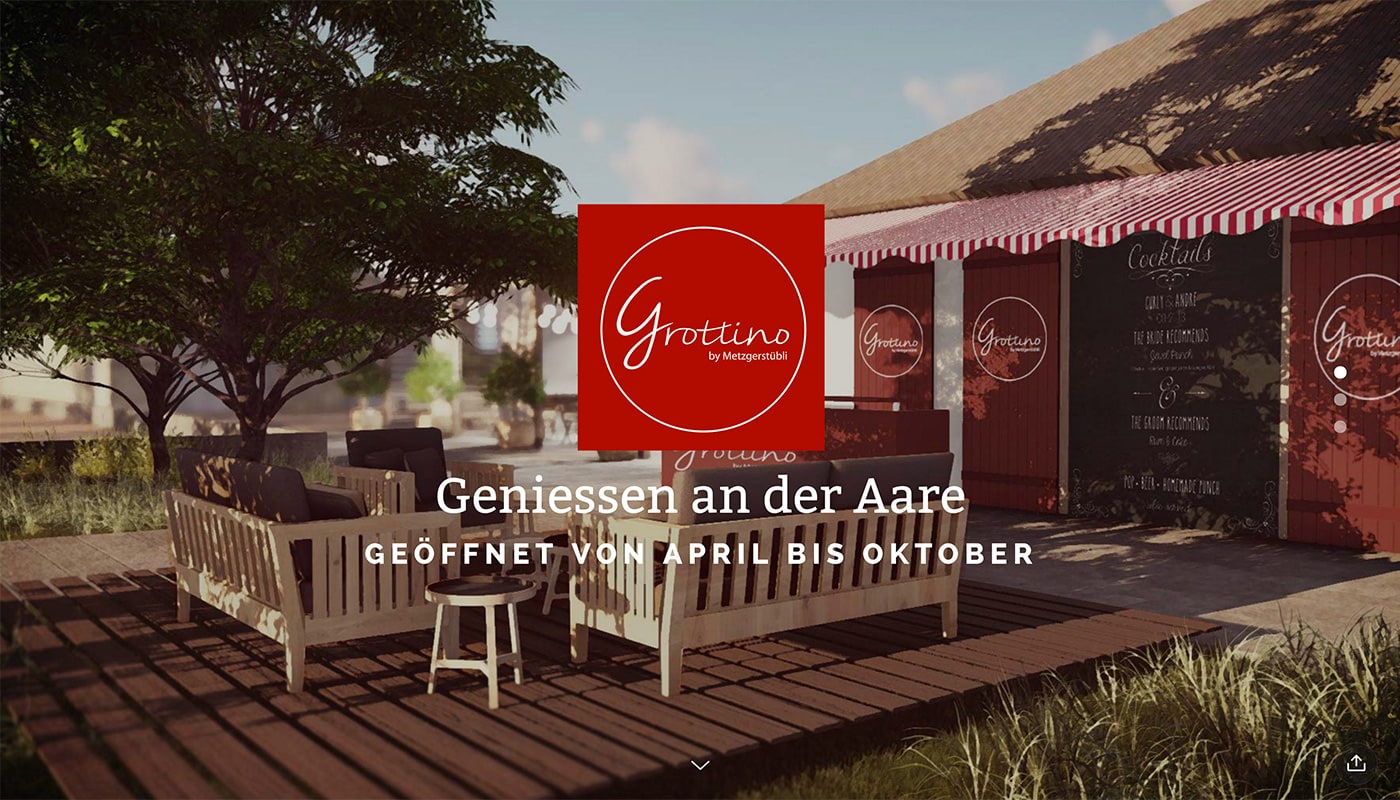
Grottino is a simple one-page design that makes the most of big photography and delightful animation to draw in users. Each of the three slides has a simple text overlay that highlights some of the great typography options available for Slides users.
Geobeat
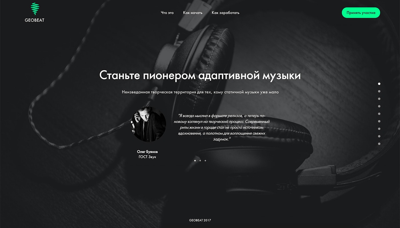
Geobeat features a stylish minimal design and bright color. The design feels almost like an animated slideshow that takes users through the new app and how it works before they decide to download. Using Slides Framework and the sliding, the animated format was a perfect match for the content.
Ikonet
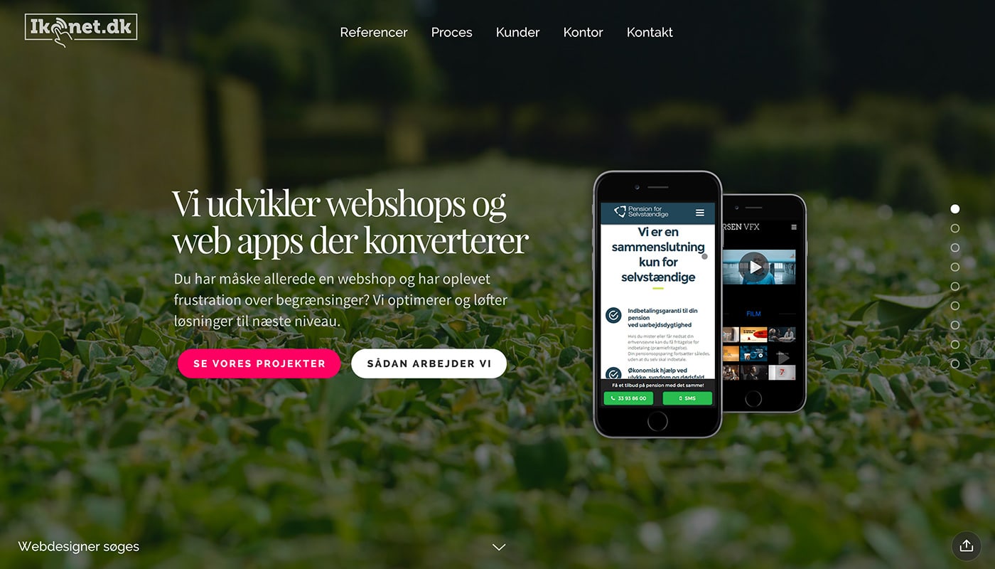
Ikonet makes the most of great animated components within Slides. Each flick of the mouse has a cinemagraphic quality thanks to smooth animation in the foreground, background and between elements.
Great design components – easy code to understand and work with. – Martin Christiansen
Eghovan
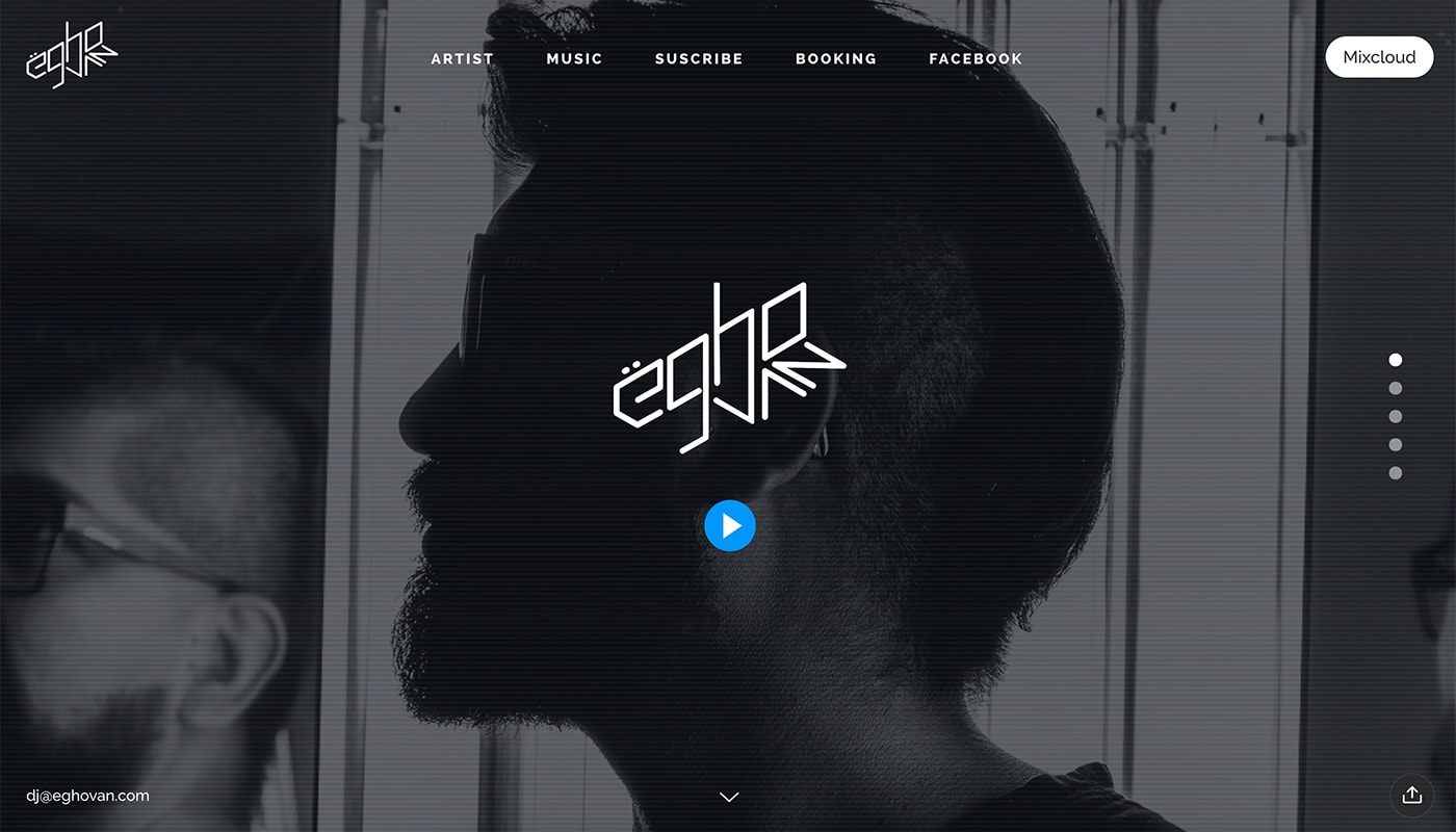
eGhovan brings music to life with a bold display and immersive interactivity between elements. And Slides Framework powers all of the animation (without any coding on the part of the designer).
Brooklyn Beauty Bar
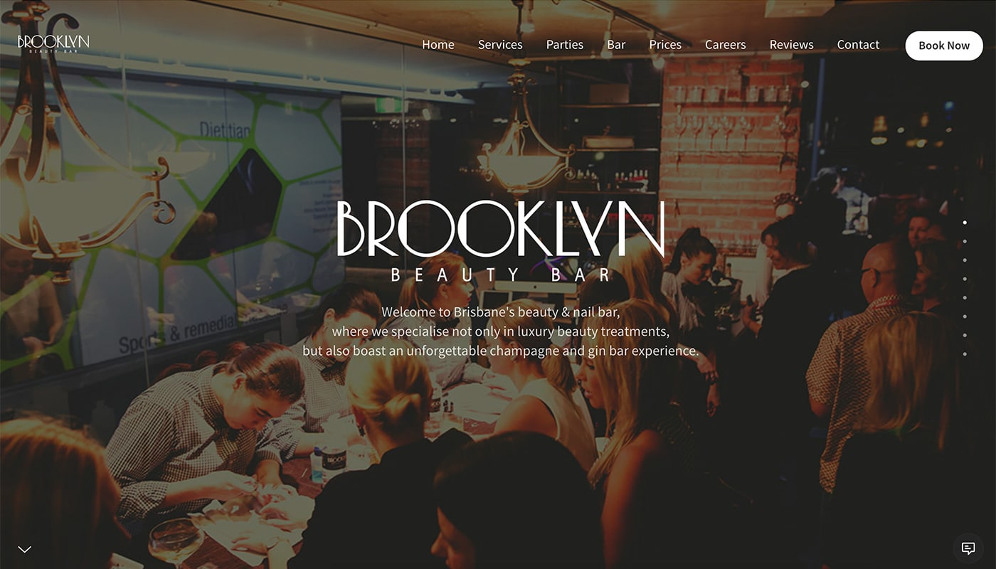
Brooklyn Beauty Bar uses call to action buttons on every slide to encourage user interaction, clicks and even sales. Slides with built-in color overlays make text contrast with the background for improved readability.
The best templating solution ever created! – Phil Diamond
Clippers
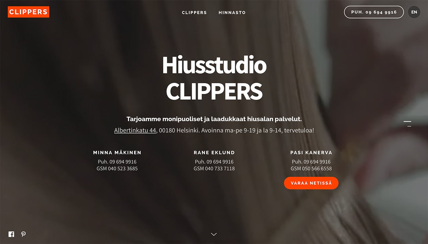
Clippers is one of the more simply designed websites in this showcase, but packs a lot into two “slides.” Visitors get a glimpse of the business in the full screen video and contact information is easy to find.
It’s awesome and saved me a lot of time. – Seppo Sinkkonen
Prestonzeller
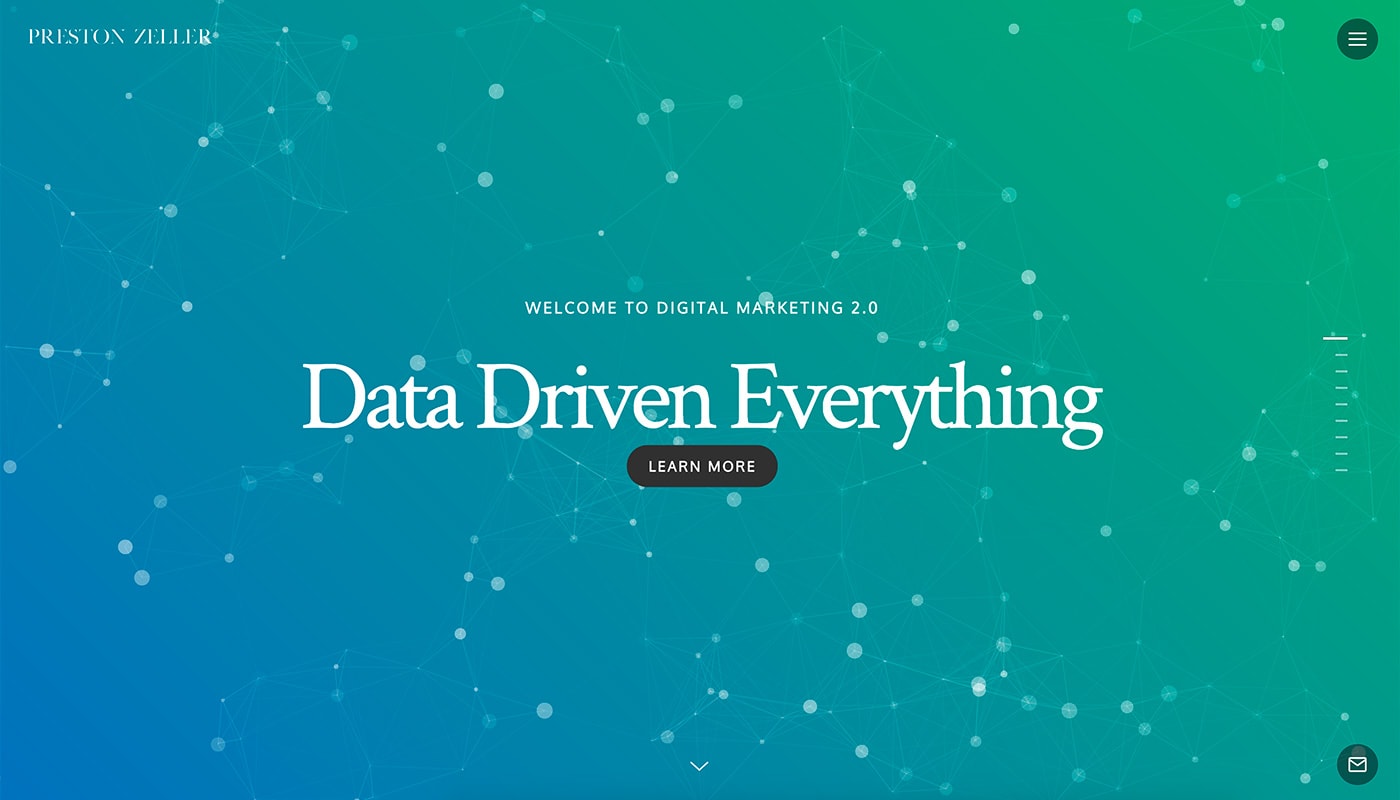
Preston Zeller uses a combination of bold background video, images and text to showcase his marketing portfolio using Slides Framework. Each slide transitions to something equally engaging with a beautiful mash-up of icons and user interface elements.
What a fantastic framework to set up beautiful sites with. Helped elevate my brand quickly and loads fast – Preston Zeller
Rave Train
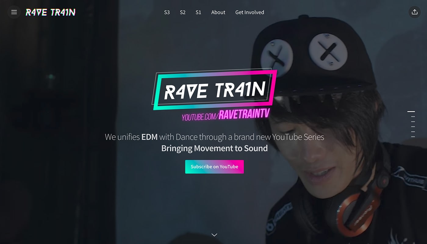
Rave Train showcases a YouTube video series with a fun, fresh modern design. The website shows that users can create pretty much anything with the Slides Framework toolkit … and that no two designs are the same.
Creartelia
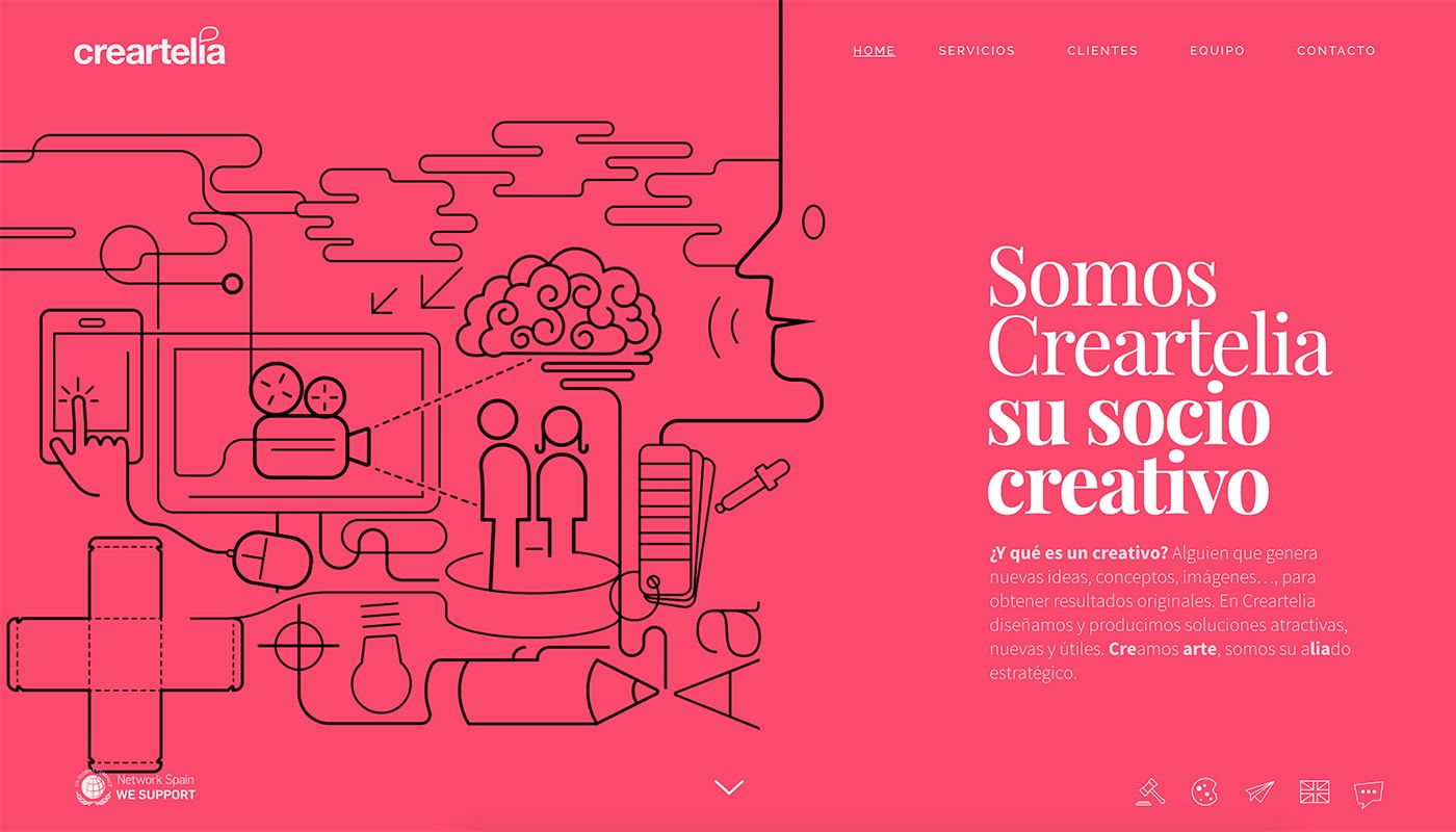
Creartelia takes another approach with a Material Design-inspired concept that uses bold color and simple animation.
Easy to use, beautiful design, clean code and lot of descriptive user manuals, so I could only say I love it. – Pedro M. Rios
Tell
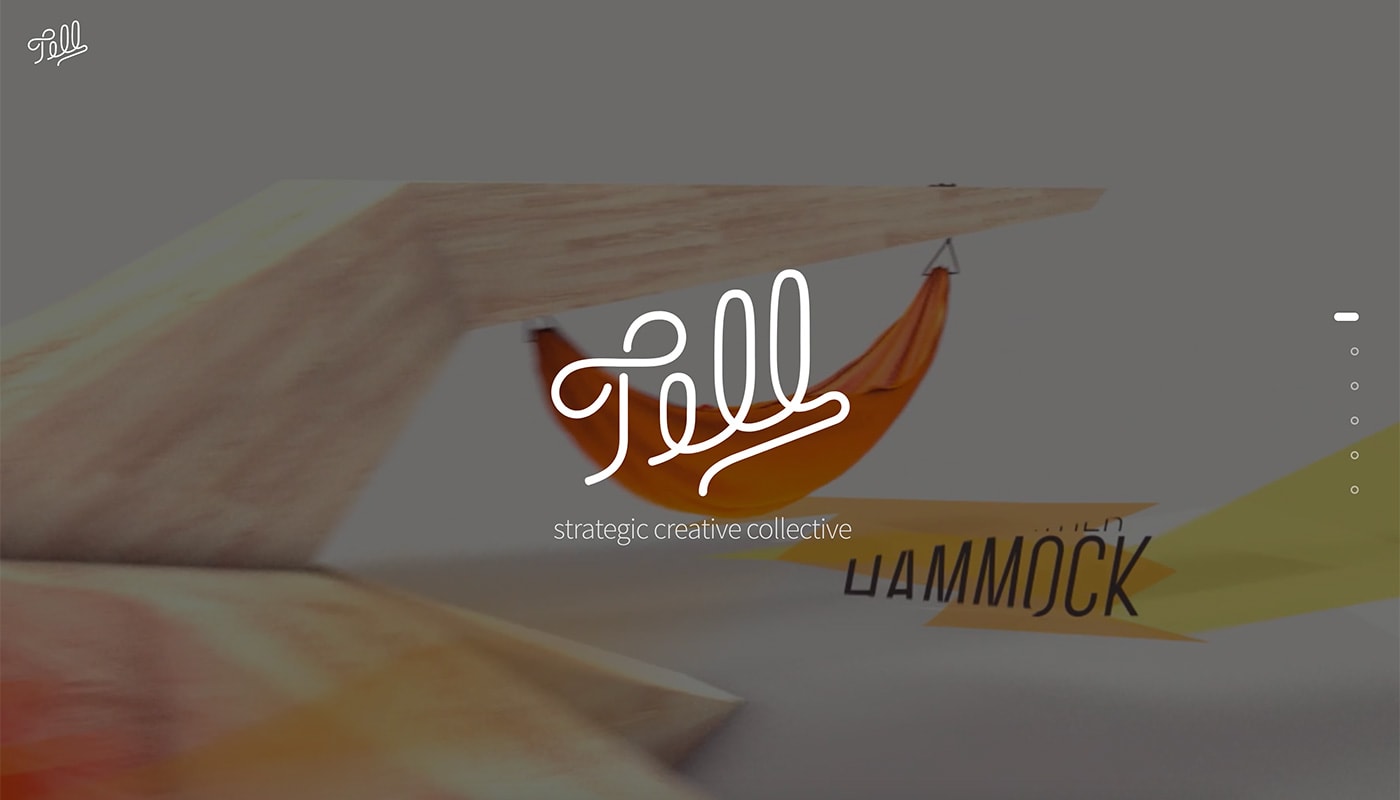
Tell looks almost like a mini movie with full screen video and a simple headline with a delightful typeface that demands attention.
It’s fantastic. It’s worked great for me and my clients alike. – Stewart
inCharge

In Charge uses Slides Framework to create a website that functions almost like an in-person presentation pitch. Each slide showcases different information about the product with related imagery using seamless interactions.
Encounter Festival

Encounter Festival uses a horizontal sliding format to create visual intrigue for an upcoming festival. Sliding panels mix with stunning still images and layers of content for an immersive user experience.
Bimberibon
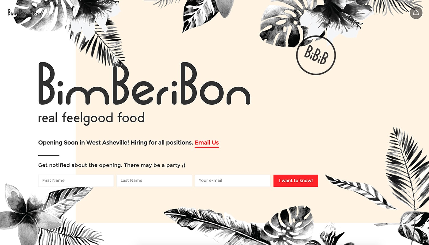
BimBeriBon is an example of how Slides can be the perfect tool to create a simple landing or coming soon page for a business. The design integrates and email signup and when the business opens, the BimBeriBon can launch the full site on Slides as well.
It’s such a cool foundation to start to build something creative with. – Tim Scroggs
Impress
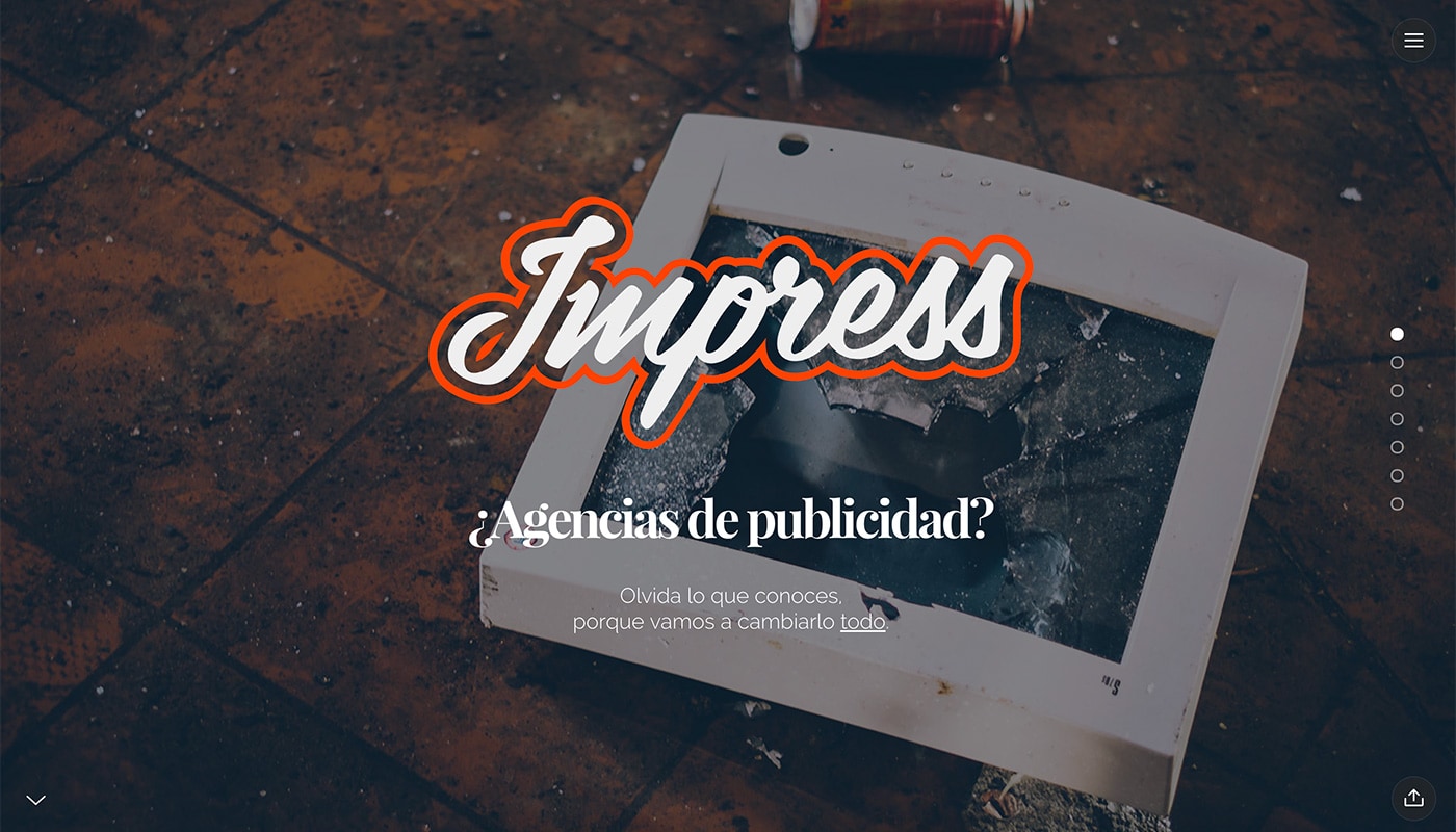
Impress uses two levels of navigation – a hamburger menu and slider bubbles – to ensure that users get everything they need from the photo-heavy design.
I needed my site to be developed asap and didn’t want it to look like “a theme”. Slides app to the rescue, 2 days later the site was on the net, awesome. – Luis Giménez
Wismolabs
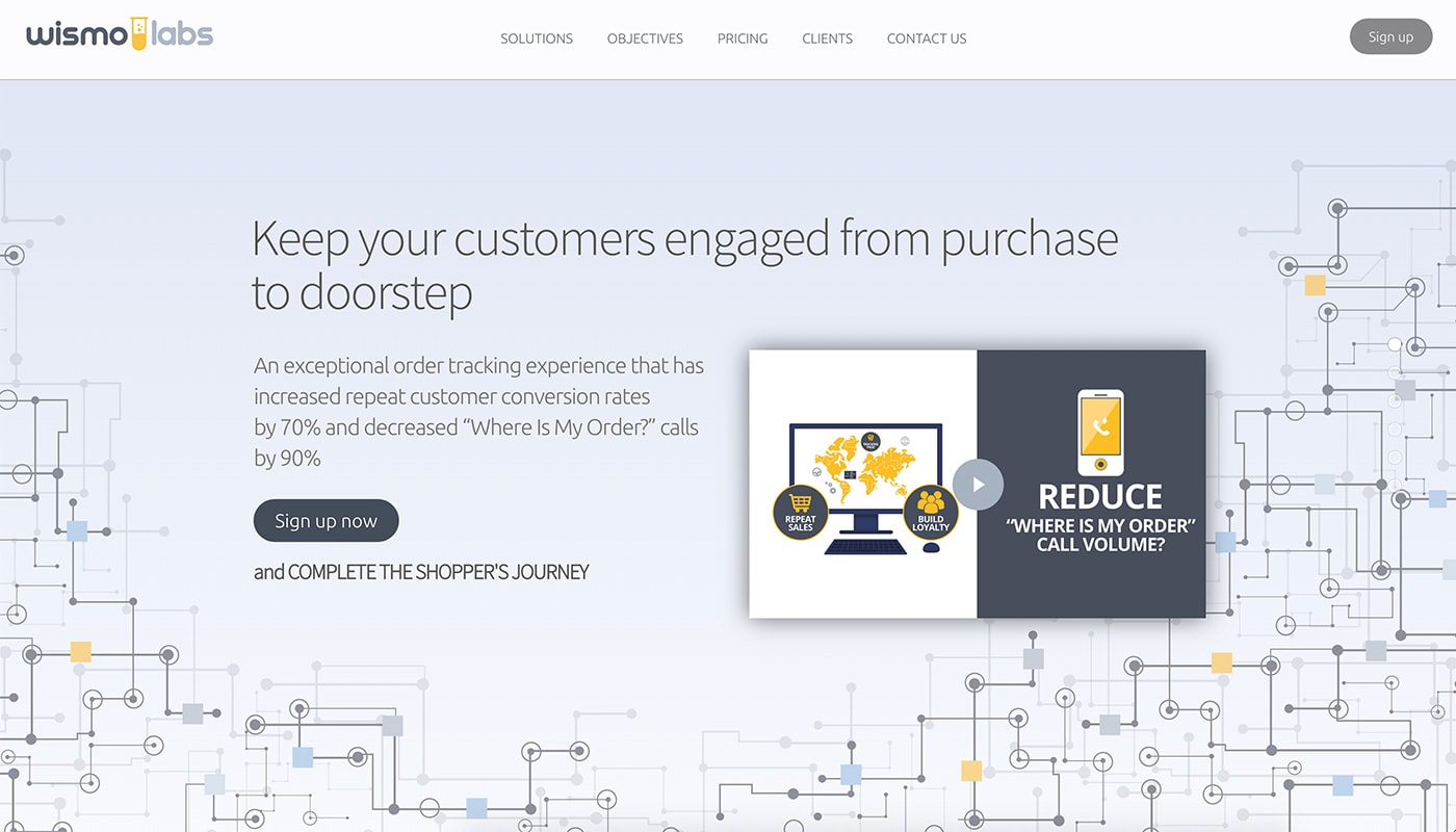
Wismo Labs doesn’t look like a website that’s built using a slide-per-page concept at all. With simple navigation and a streamlined look, the website is robust and includes everything a visitor needs, proving that even site owners that don’t want fancy effects can build a great design on Slides Framework.
Fernando’s Bistro
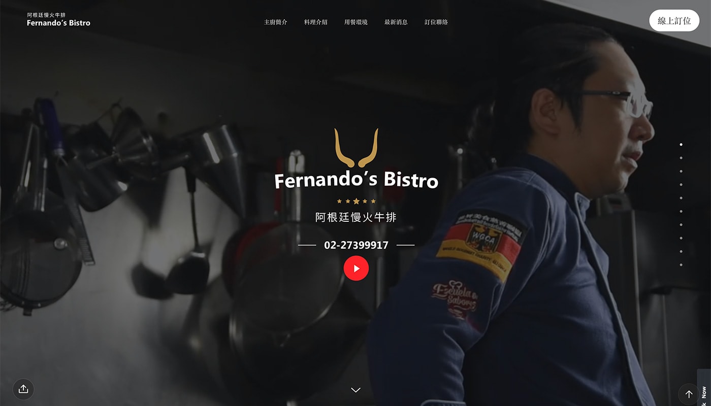
Fernando’s Bistro combines video and smooth transitions to draw users into the design. The color palette, featuring trendy gradients, is a stellar visual component that you must scroll to enjoy.
Trinetic
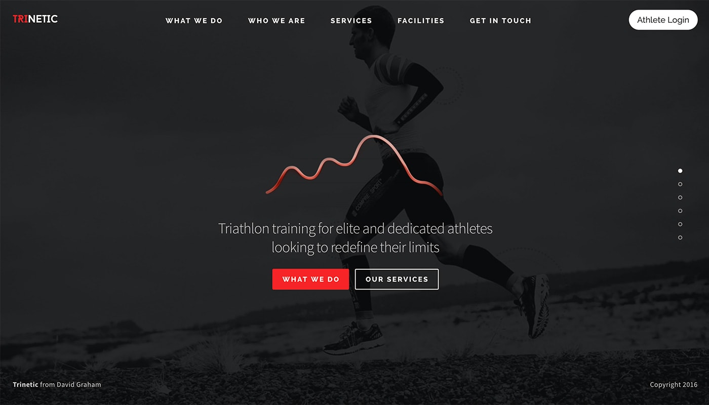
Trinetic embodies the spirit of minimalism with a black and white color outline and bold pops of color throughout. Oversized typography makes everything easy to read pages flow with ease thanks to simple animated transitions.
Climatecon2018
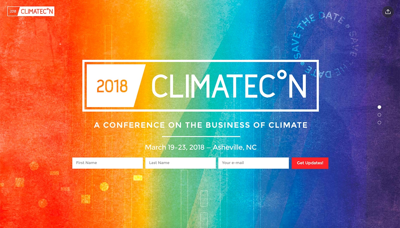
Climatecon put the focus on the words with a bright color background that adds just enough contrast to read each word. One of the best features of this event-based website design is the share button – a Slides Framework feature – to help them spread their message.
Tactile Track
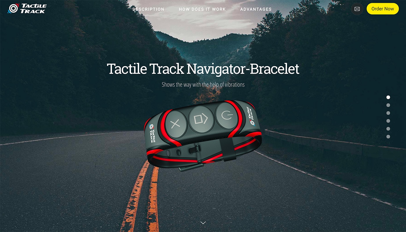
Tactile Track makes the most of layering with a distinct background and foreground layers to showcase the product. Easy to see buttons are another great feature of this website design.
Just More
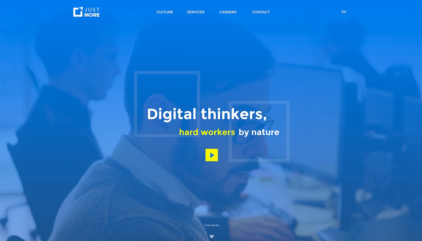
Just More uses color to draw users into the design. After the landing page, the second slide switches to a white background but maintains the blue navigation menu, which is great for usability.
An incredible framework almost good as sliced bread, one of the top tools that we are working with and hoping to use even more. – João Silva
Brandme
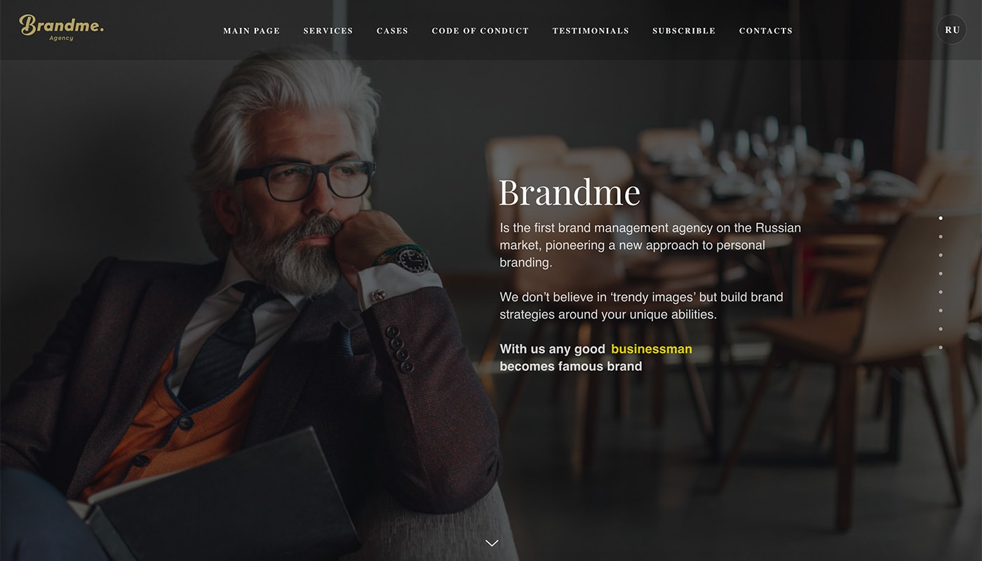
Brandme Agency uses a combination of vertical and horizontal slides to move users through a lot of content. While this might sound confusing, it is clearly organized and easy to manage as a user.
Slides is the amazing framework for presentations, we have a lot of joy using it for prototyping our first site and some presentations. Now we added Django CMS to it and planning to polish mobile view. – Kirill Moskalev
Chris Scholly
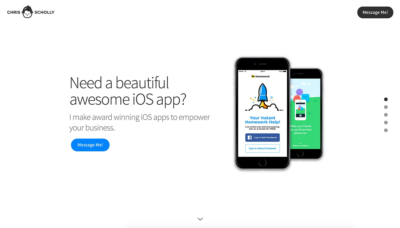
Chris Scholly uses Slides Framework to create a portfolio site that will help drive business. Take special note of the “Hire Me!” button in the top corner. (How do you not click that CTA?)
Goodchat
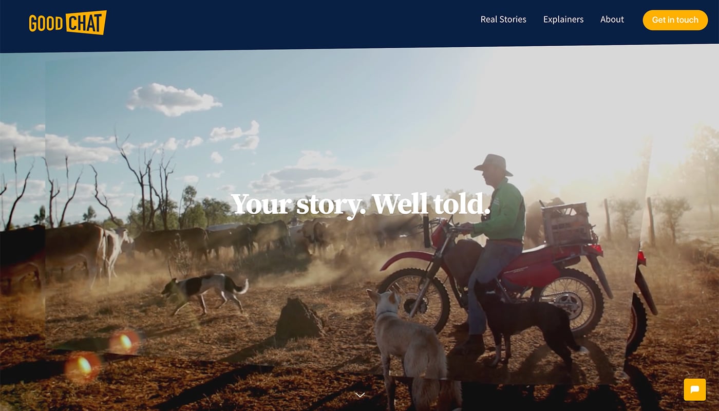
Good Chat TV uses slides to showcase creative programming. We website uses interesting video snippets and cool color combinations to attract attention.
Pedrom Rios
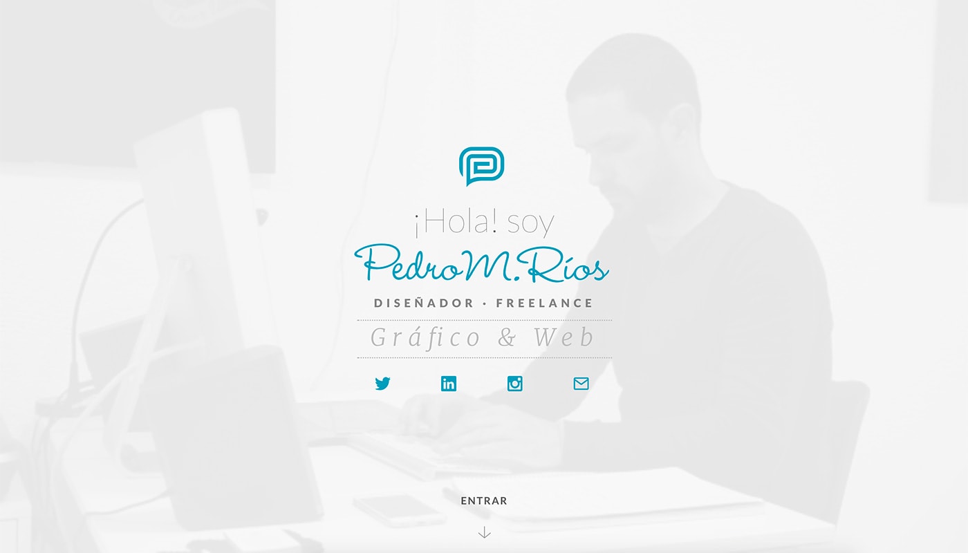
Pedro M. Rios mixes and matches design components, color and great typography in a stunning portfolio site. Every piece fits together seamlessly, thanks to Slides Framework.
Max Bratsun
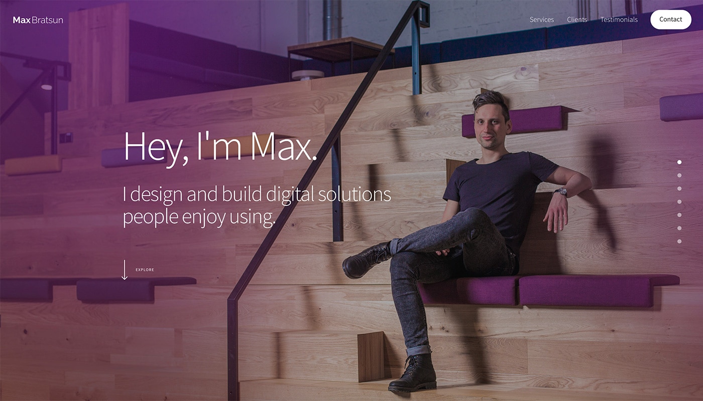
Max Bratsun’s website uses big, clean text to highlight his work. Each page in the design flows and simple animations between elements are a nice touch.
Really love it! Missing fully featured generator with content editing support. Otherwise works great for me and my needs. – Max Bratsunb
Memo Confido
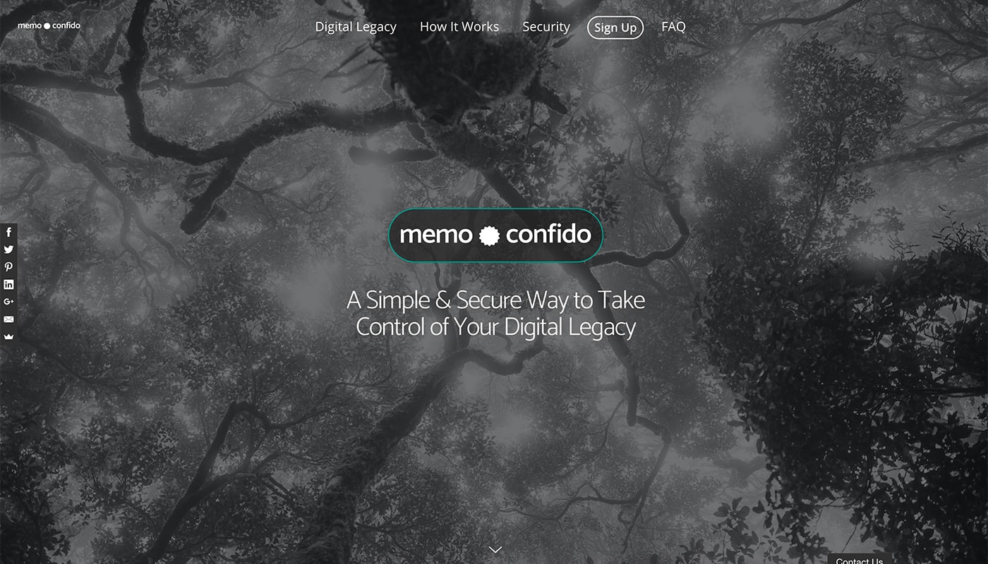
Memo Confido makes the most of scrolling animations to keep users engaged with a content heavy design. Note how each of the buttons look similar even when used in different colors? That’s the kind of detail a well-designed website uses.
Perfect! It helped me create a professional looking landing page in quick time with my let’s say a bit outdated web development skills :-) But you still have all possibilities (compared to other landing page generators). – Daniel Kersten
Stepanek Design
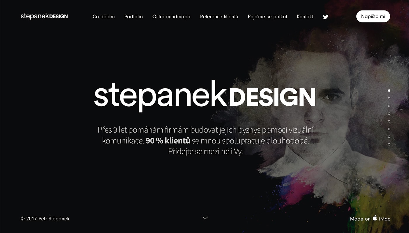
Stepanek Design is another portfolio website with layers of content to showcase work. The static elements in the design are a nice touch with just top layer movement throughout.
Adorable Images
Adorable Images focuses on great photography and user experience to keep you scrolling. The full-screen design is striking and each new slide contains just the right mix of text, images and a call to action to keep users engaged.
Great framework website for designers to create a landing page or website or e-shop. In this example, I was surprised how well I was able to create a rudimentary online store using PayPal Buy buttons directly on the website. – Aaron Lloyd Whitmore
Brianmann
Brian Mann’s minimal design is common for portfolio sites because it gives the work plenty of room. Alternating colors for slides keep the website interesting and encourages clicks.
Makemyweb
Make My Website has a movie-style feel with great images and subtle movement. The website looks so great that you really will want them to make your website, too!
Great framework to really speed up the development process, very flexible as well, and it looks amazing. – Milber Ferreira
Technicolor
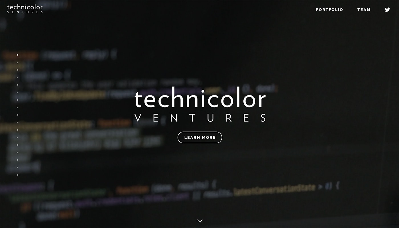
Technicolor Ventures shows that a slide-based website doesn’t have to stop with three or four pages; a lot of slides with moving content can work equally well. One of the best features with the content-heavy design is the scroller on the left so that users can keep up with their progress.
Great for designers comfortable with Sketch or Photoshop and an IDE to design and code a high quality, visually stunning landing page or website. – Aaron Lloyd Whitmore
3arrows
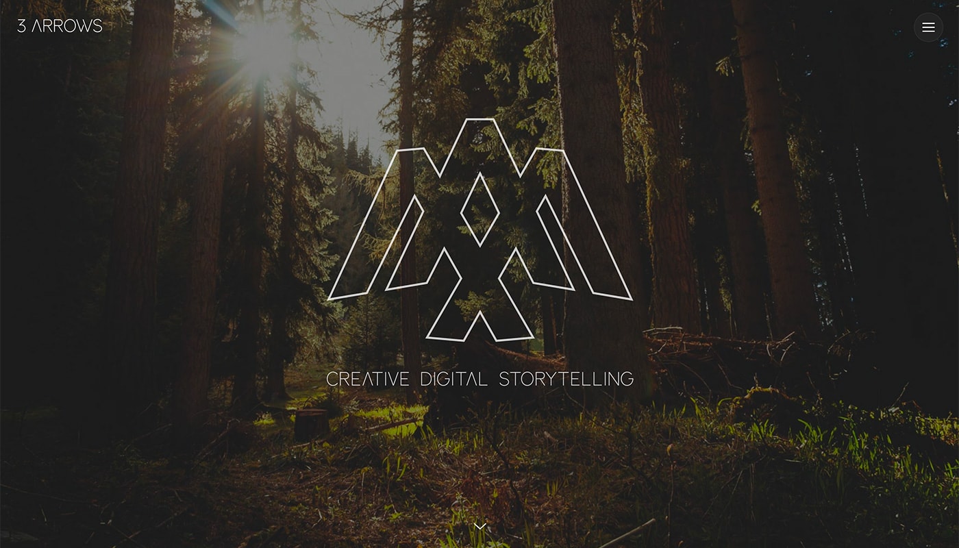
3 Arrows is just fun. Animations contribute to the relaxed, simple and lighthearted feel of the design. Color and interesting typography bring it all together.
I love Slides Framework, it helps me focus on content and design! – David Ballard
Buf Antwerp
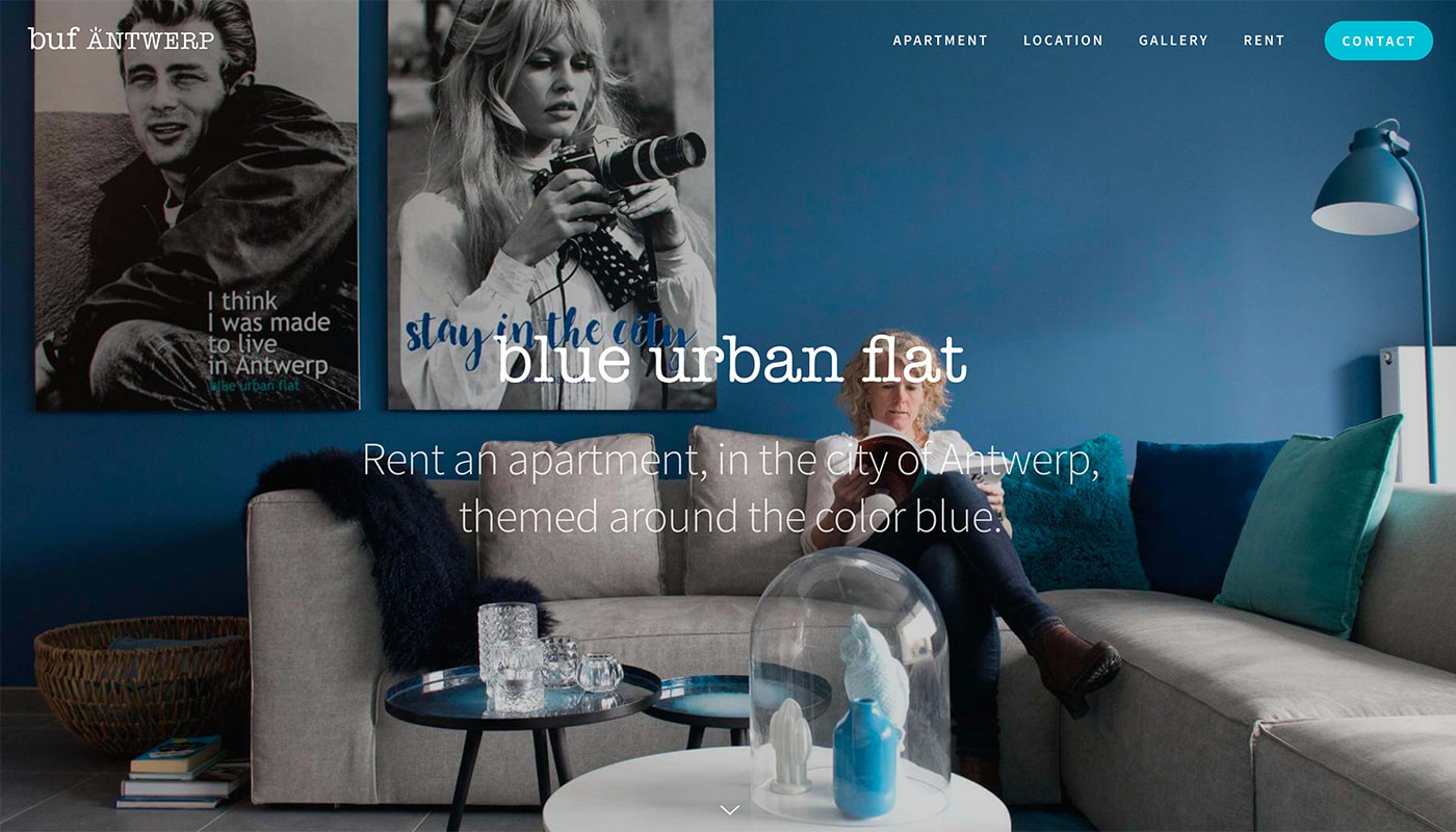
Buf Antwerp shows the beauty and function of Slides Framework for ecommerce. The rental booking site looks great and makes you want to stay in featured properties thanks to a professional design.
Webit365
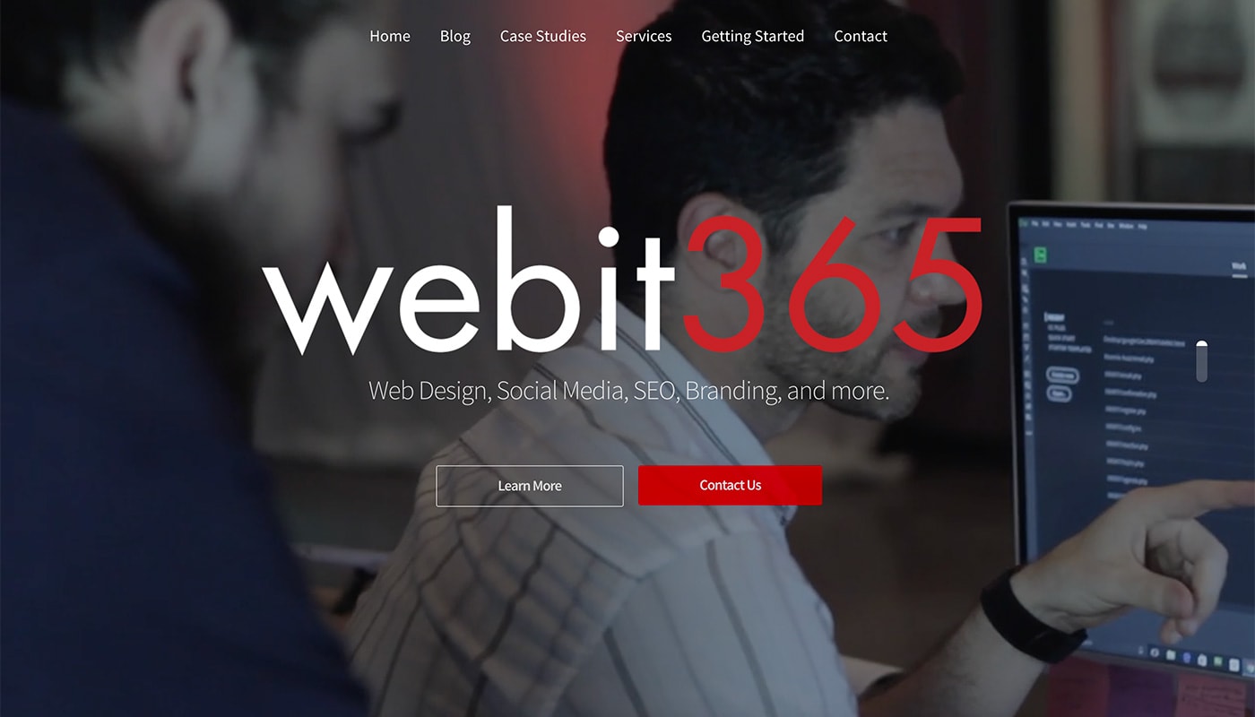
Webit365 uses bold color and type to grab your attention. While the design is simple, it works great and every detail is taken care of.
Love it. Super awesome work you guys have put into it. Wish it was also available as a WordPress theme with drag and drop options on the backend for my co-workers who don’t know much about code. Amazing nonetheless. – Dalton Sutton
Akkurate
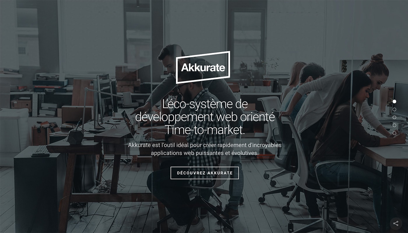
Akkurate uses great images and text to take users through their services, ending with a call to action. The entire website is designed to collect email addresses, and it works effectively.
Nikola

Nikola Vukovic uses Slides Framework to showcase his work as a brain researcher. In addition to cool photos, the clean design of the website makes it easy for users to understand a pretty complex topic. (Clean typography is one effect that drives that charge.)
Medbizmedia
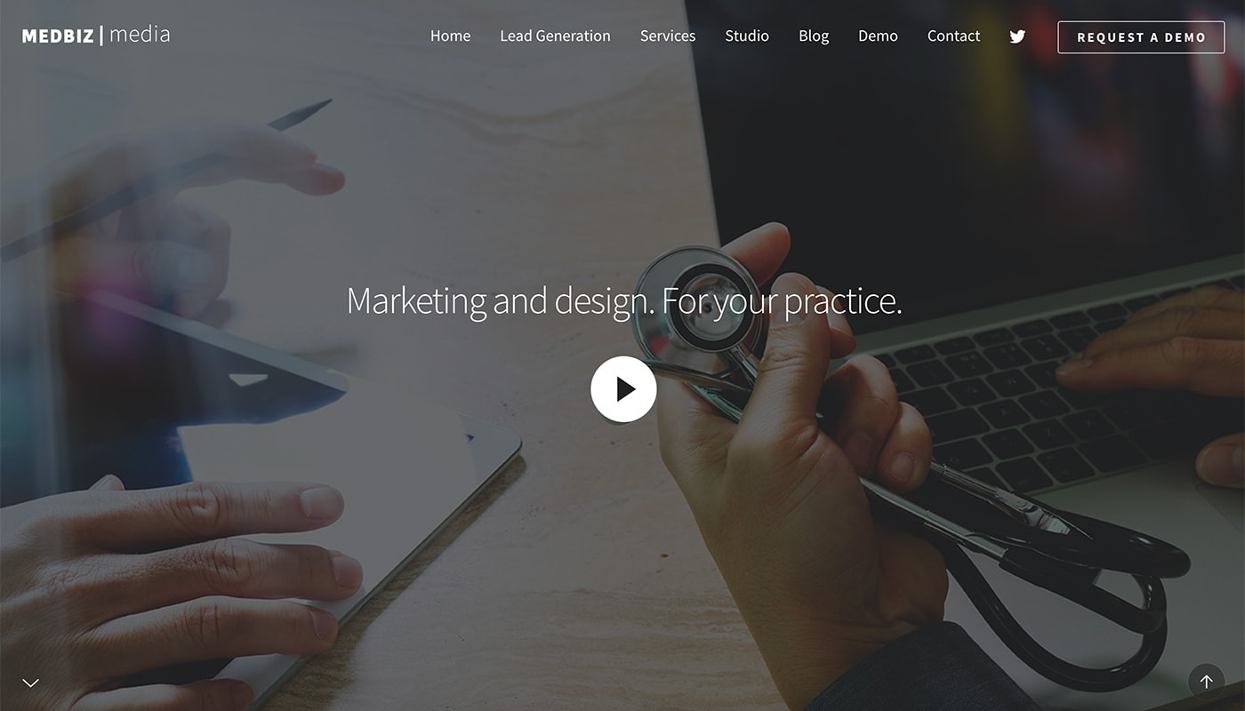
Medbiz Media developed a website design that feels like a sales presentation, and appropriately so. One of the best details in the website design is the small up and down arrows that help guide users through content.
Love it! It’s very organized with a lot of options for customization. Very user-friendly. – Shannon Berg


