A Guide to Figma Component Properties
Last month, during the Config 2022 conference, Figma announced a bunch of exciting new features. One of them is surely the launch of Component Properties, which brings a significant change to the way components are created and managed in Figma.
Before this release, we used variants to create every possible variation of a component and include it into a component set, having the ability to set up a wide range of properties and values combinations (size, color, state, icon visibility, elements positioning, you name it).
Variants are great but the problem comes with larger and more complex projects and design systems, where you could end up with hundreds of variants for a single component, leading to an oversized and hard-to-manage Figma file which can also cause performance issues.
Export Figma Designs to Live Website – No-Code
With Postcards Email Builder you can create and edit email templates online without any coding skills! Includes more than 100 components to help you create custom emails templates faster than ever before.
Free Email BuilderFree Email TemplatesIn Figma, components are reusable, customizable design elements that help to maintain consistency and efficiency across a design project.
Component properties refer to the attributes or characteristics of a component that can be adjusted or manipulated to create variations and instances of that component. Some common properties of a Figma component include:
- Size: The dimensions (width and height) of the component.
- Position: The X and Y coordinates of the component on the canvas.
- Opacity: The transparency level of the component, ranging from 0% (completely transparent) to 100% (completely opaque).
- Fill: The background color, gradient, or image applied to the component.
- Stroke: The border color, width, and style applied to the component.
- Corner Radius: The degree to which the corners of a rectangular component are rounded.
- Constraints: The rules that define how a component resizes or repositions itself when the parent frame is resized.
- Variants: Different versions of a component that share the same base properties but have different values for one or more properties (e.g., different colors, sizes, or states).
When you create instances of a component, you can modify these properties to adapt the instance to your design needs, while still maintaining the link to the main component. This allows you to easily update the base component and have those changes propagate to all instances across your project.
The introduction of component properties brings 3 main advantages to the way components are handled:
- It greatly reduces the number of variants needed for each component, allowing you to have a much leaner design system
- For new designers who join a team and don’t know the existing design system, it will be much easier to understand which parts of a component can be changed
- The components you will create with properties will be closer to the attributes used by front-end developers at the coding stage, which will ultimately lead to a better alignment between design and code
The 3 new component properties
Let’s dive in and see which are the new component properties:
Text property
It allows you to change the text of a layer included in a component directly from the sidebar properties panel, instead of having to click on each individual text layer in the canvas and edit it. This comes in very handy when you need to change the text of multiple components.
Boolean property
It allows you to easily toggle the visibility of a layer within a component, directly from the sidebar panel. Figma does this by letting you set a True or False value to a specific layer, which will make it visible or hidden. Out of the 3 component properties released, this is probably the one that will enable you to significantly cut down the number of variants needed.
Instance swap property
This property allows you to quickly swap an instance within a component, straight from a dropdown menu in the sidebar panel, choosing from all the instances included in a local or shared library.
With Pulsetic you’ll be instantly notified the moment your website, API, or server becomes unavailable. Monitor uptime from multiple global locations and respond to incidents before your users are affected.
Create beautiful status pages in minutes to keep customers informed during outages and build trust with transparent communication.
Start Monitoring for FreeThe most common example is a button with an icon next to the text. Thanks to this property, you can easily swap the icon with other icons included in your library.
Component properties tutorial
In this tutorial, we’ll show off the new Figma component properties by creating a button component that will allow you to easily create many variations just by tweaking the component properties in the sidebar panel.
We’ll be able to:
- Easily swap the icons on the left and on the right
- Change the button text
- Create a button version with the icon on the right, one on the left, one without icons. All of this, while keeping the button spacing nice and tidy thanks to the auto layout settings.
We won’t be using variants in this tutorial, only component properties!
Let’s get started:
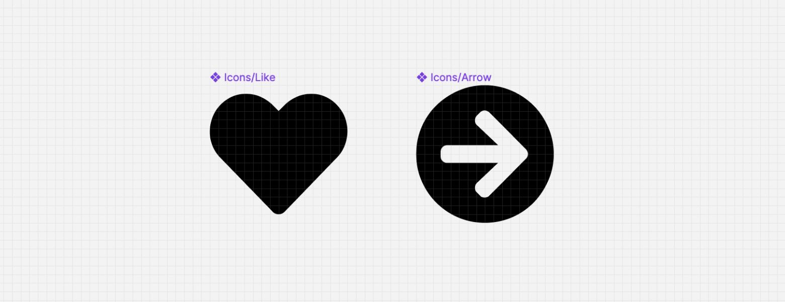
- First of all, let’s add two icons to our file, and create a component for each of them. For this tutorial, we’ll use a heart icon and an arrow icon (if you need a free icon set, head over to UXCrush where you can find tons of them).
- Let’s create a button using the auto layout feature. We can easily do that by creating a text layer and then hitting SHIFT+A with the layer selected.

Figma will create a new frame which will be your button and will adapt its layout automatically depending on the text length and the icons we will add to it.
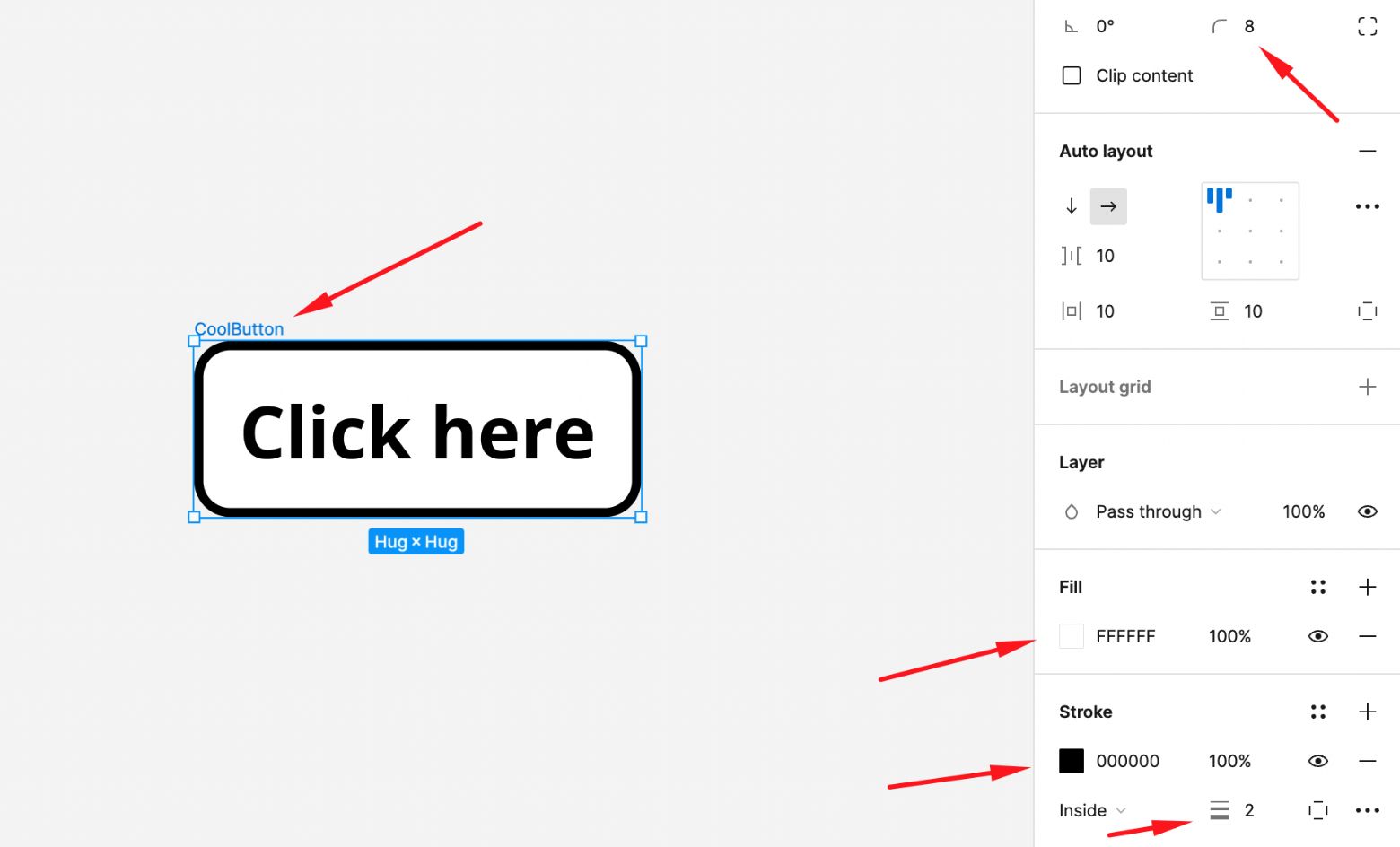
- Let’s rename the frame to “CoolButton”, let’s change the fill to white, add a stroke and change the corner radius.
- Let’s adjust the auto layout spacing values to make it look a bit nicer.

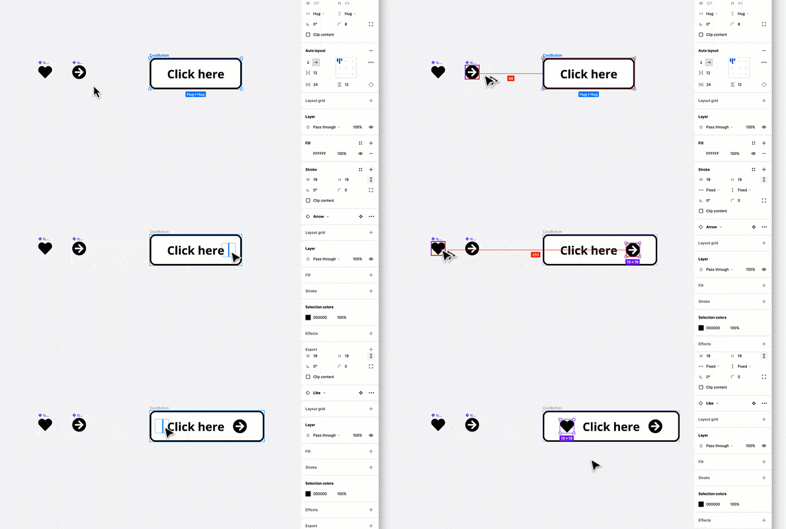
- Now let’s add our icons within the button. One on the left and one on the right. This will allow us to create multiple button variations later on.
To do that, simply drag an instance of each icon component into the button. Auto layout will take care of everything and will position the icons according to the spacing rules we set earlier (Spacing between items: 12 – Horizontal padding: 24).
- Select the button and click on the “Create component” icon at the top to create a component.
We are now ready to enable the component properties!
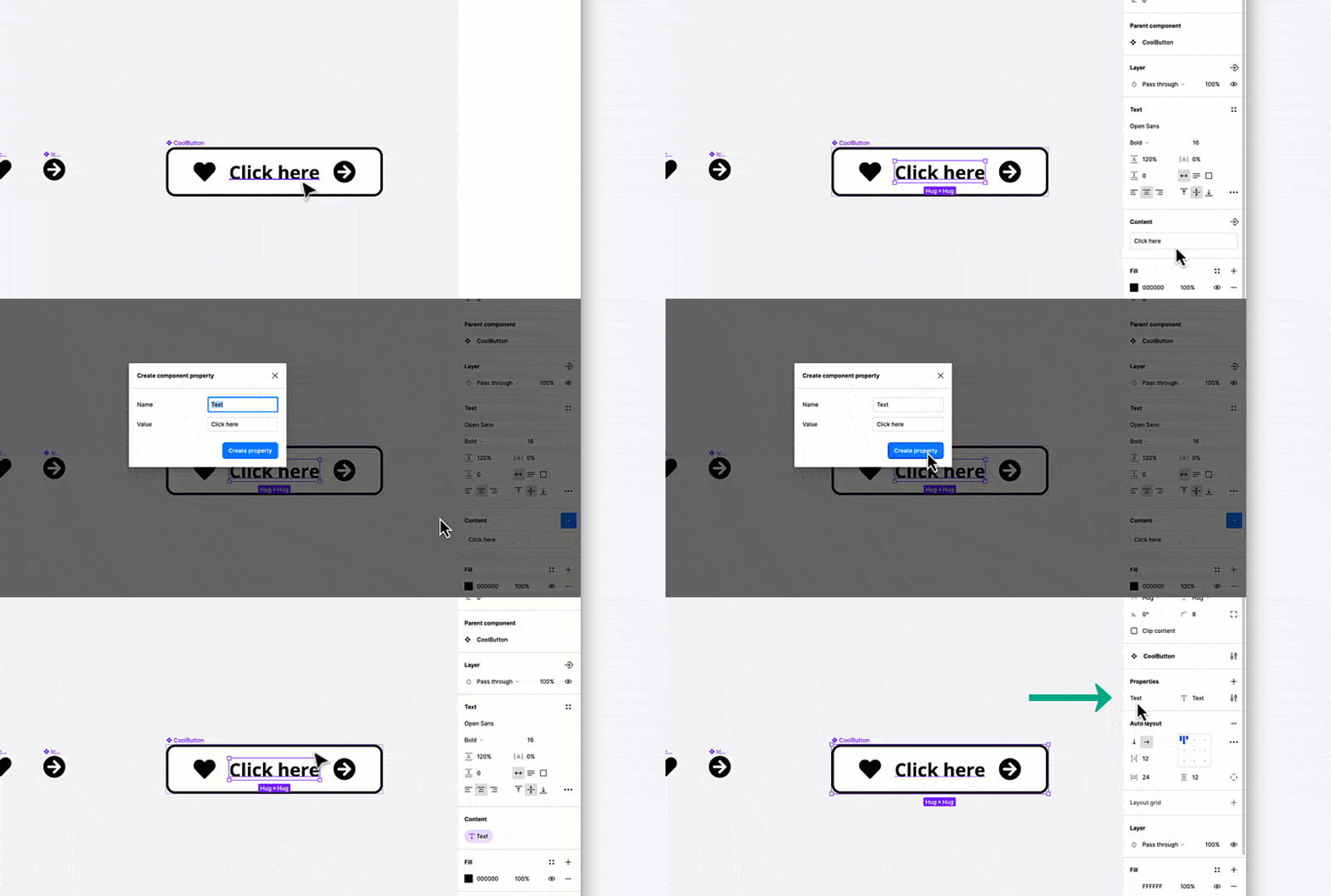
- Let’s start with the “Text property”: select the text layer within the button, then click on the “Create property” icon next to the Content section in the sidebar panel. In the popup that will appear, click on “Create property”.
You will notice that a “Text” property is now visible in the component properties section on the right.
- Now let’s create the “Boolean property” for each of the icons. This will allow us to easily toggle their visibility. Select the heart icon on the left and click on the “Create property” icon next to the Layer section in the sidebar panel. In the popup that will appear, set the property name as “Left icon” and save. Follow the same steps for the right icon and name the property “Right icon”. You will notice that two new “Boolean” properties are now visible in the component properties section on the right.
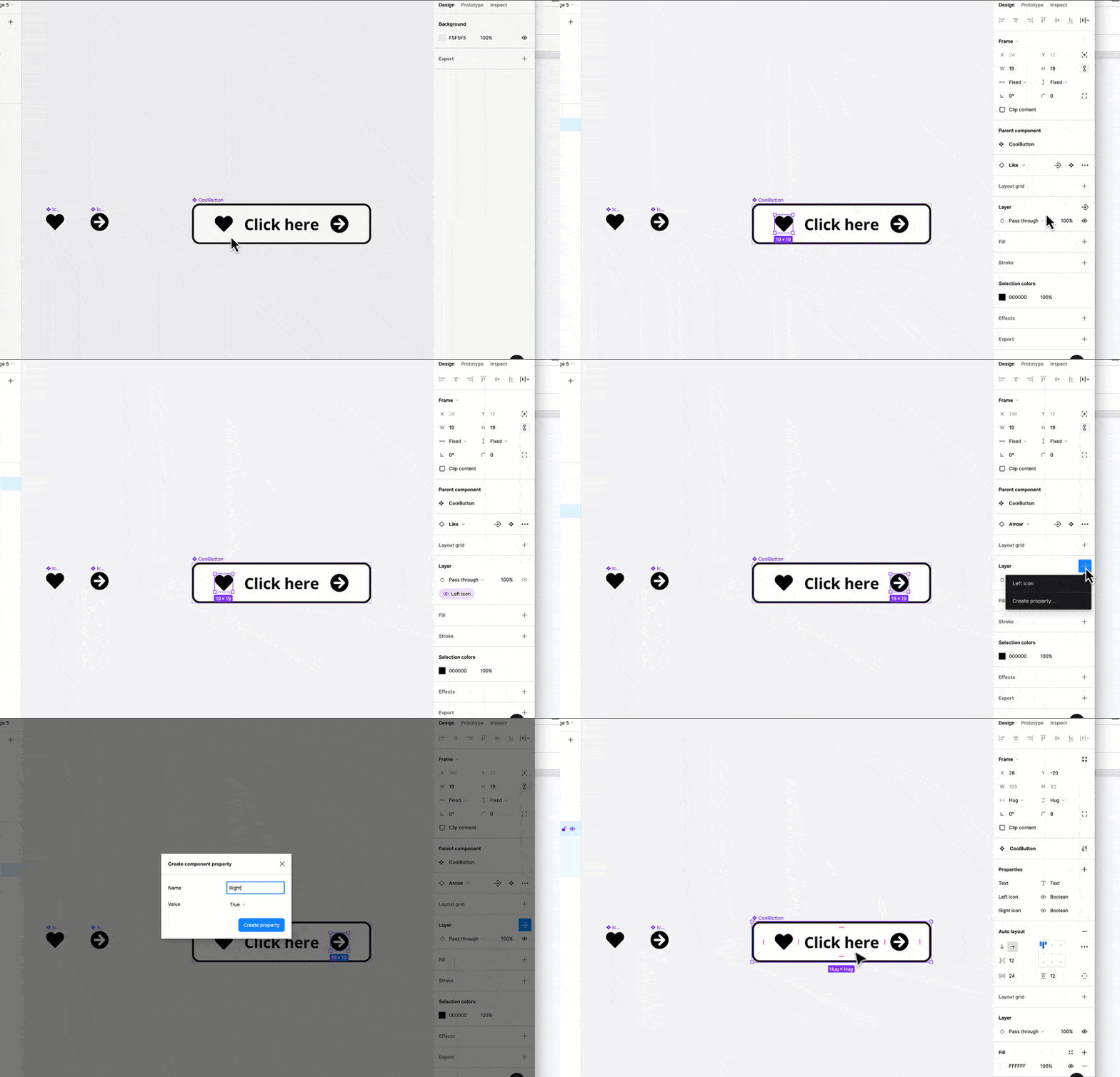
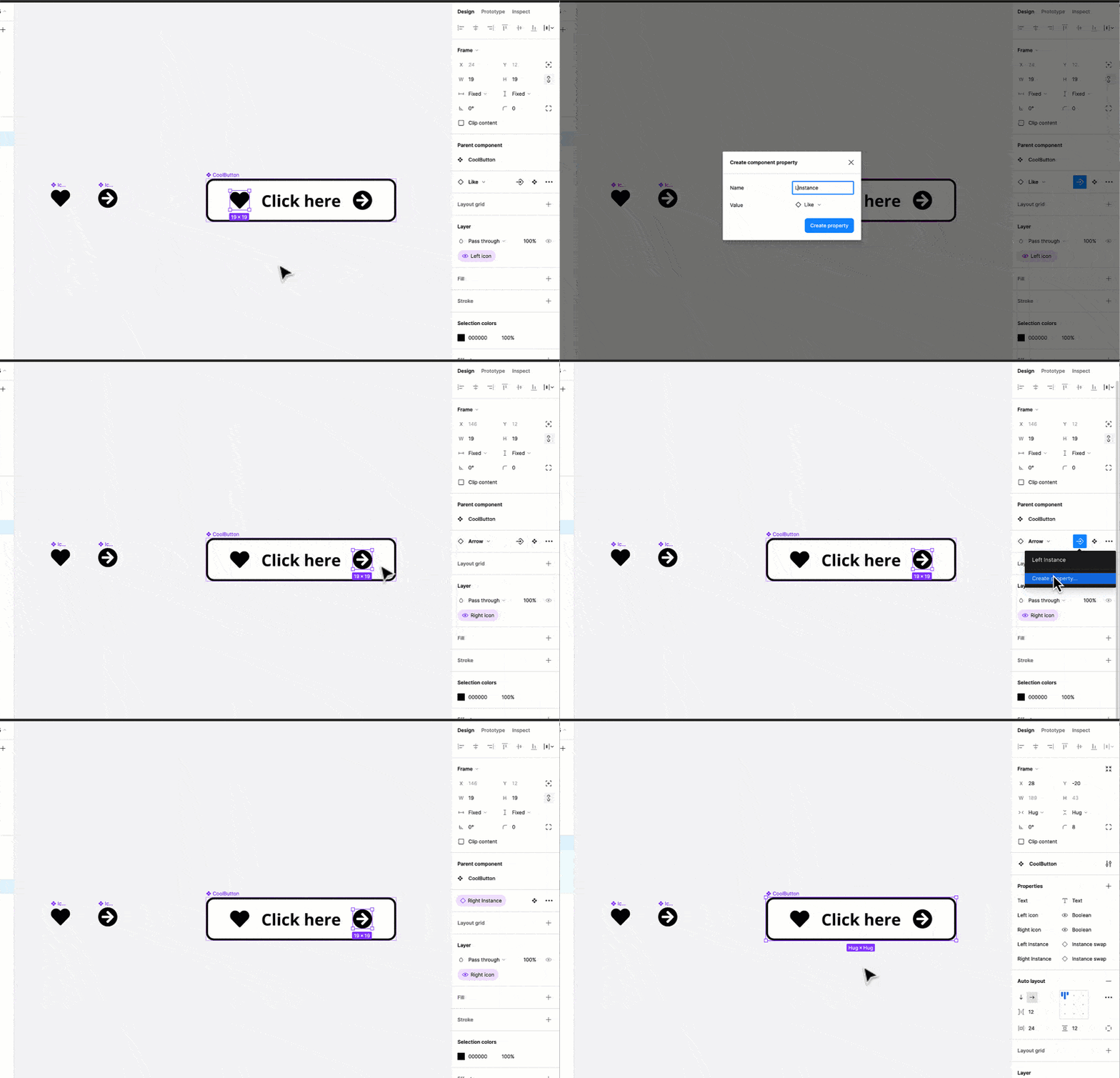
- And finally we can create the “Instance swap property”, also in this case for both of the icons. This will allow us to easily swap the icons within the button. Select the heart icon on the left and click on the “Create property” icon next to the icon name in the sidebar panel. In the popup that will appear, set the property name as “Left instance” and save. Follow the same steps for the right icon and name the property “Right instance”. You will notice that two new “Instance swap” properties are now visible in the component properties section on the right.
- Now that the properties have been set correctly in our button component, we can create a new instance of this button and see how this all works.
As you can see in the image below, once you select the instance of the button (I made it yellow to make it stand out) you can easily tweak the button properties by using the properties panel on the right.
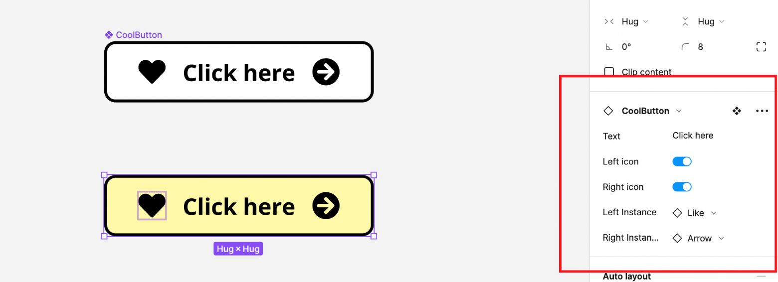
You can quickly change the button text, the icons in use and their visibility, without ever having to use the layers panel on the left.
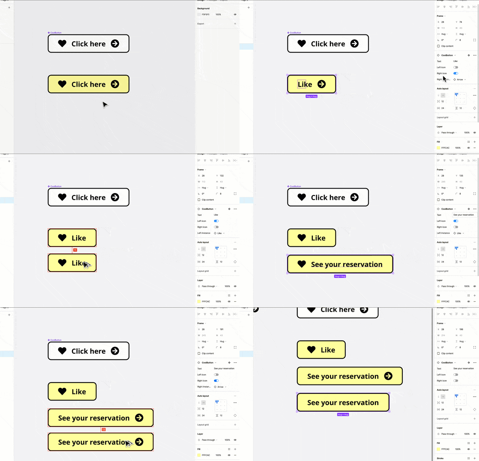
This is a truly remarkable new feature. It might take some time getting used to, but once you are up to speed, you will be able to combine it with the already great Variants feature and create solid components for your design systems.
You can duplicate the Figma file for this tutorial here.


