How to Make an Animated Website That Stands Out: Step-by-Step Guide
You click on a new website.
The page loads, but nothing appears to move.
No indication that a button works, no smooth scrolling flow, and no clue if the page is still loading.
It feels empty, so you leave.
Now, picture a website where a button pops up when you hover, and the page flows with ease. It feels alive, and you want to scroll more.
That’s the power of motion on a website. Animations guide the eyes and make a website feel interactive. This automatically boosts user engagement.
With Postcards Email Builder you can create and edit email templates online without any coding skills! Includes more than 100 components to help you create custom emails templates faster than ever before.
Free Email BuilderFree Email TemplatesIn this step-by-step guide, we’ll show you how to make an animated website from scratch without coding and confusing tools.
What Is Animation In Web Design?
Website animation is any movement or motion you add to a website to make it more interactive and engaging. Instead of a static page where everything sits still, animations bring your website to life.
Take a look at this:
You can see:
- Text fades and slides as you scroll.
- Pages transition smoothly, rather than jumping from one screen to another.
This gives an interactive feel and the visitor doesn’t feel the website is lagging.
So, if you look at different websites of different industries, you’ll notice they use animation in their own style:
- SaaS companies may use it to guide new users through a product or make dashboards feel more engaging.
- E-commerce stores may use hover effects to make products stand out.
- Portfolios and creative websites often use scrolling animations to tell a story.
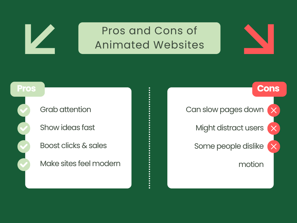
Pros and Cons of Using Website Animations
If you’re wondering if adding animations to your website is really worth it, here’s a list of pros and cons to help you understand:
Key Types of Website Animation
You now know animations can make a website look good. But that’s not just it. They do more than this. They can improve engagement and even boost conversions when done right.
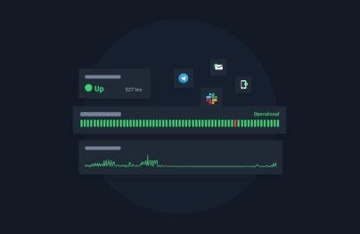
With Pulsetic you’ll be instantly notified the moment your website, API, or server becomes unavailable. Monitor uptime from multiple global locations and respond to incidents before your users are affected.
Create beautiful status pages in minutes to keep customers informed during outages and build trust with transparent communication.
Start Monitoring for FreeWhy?
Because motion guides people’s attention. It shows them what to click and when something has changed. And all of this makes your website feel alive and responsive.
So let’s look at the core types of animations that you can add to your website and make them better:
Micro-interactions in Web Design
Micro-interactions are small, simple animations that make a website feel more interactive. You’ll often see them on buttons and icons.
For example:
- A button changes color when you hover over it.
- A form slides in a “Thank you!” message after submission.
- An error message gives a subtle shake to catch your eye.
These touches are small, but they make a website feel polished and intuitive. Even subtle effects like these can improve interaction rates by as much as 20–30%.
Hero Animations in Web Design
Your hero section is the first thing people see when they come to your website. It’s like your front door. If it feels cluttered, people may not stick around. But a little bit of motion can change that instantly.
So, here’s what to keep in mind when creating a hero animation:
- Draw the eye right away: A soft zoom on your background or a smooth fade-in for your main image is enough to make it feel alive without screaming “look at me!”
- Say what you do: Keep your headline short and clear so people immediately know what your website’s about. You can use a quick rating or testimonial to establish trust immediately.
- Keep things simple: Don’t pack the hero with too much text or too many buttons. The cleaner it feels, the easier it is for someone to figure out what your business is about.
- Make it feel cohesive: Smooth transitions and colors that flow together make everything look intentional, not like you just tossed stuff in.
For example, take a look at Notion’s hero section.
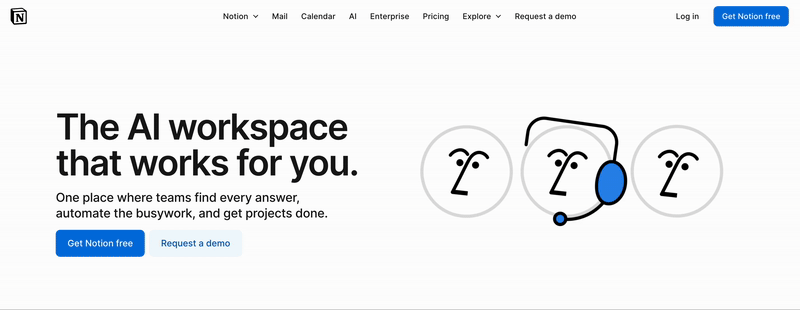
At the top, you’ll notice a clean layout with a subtle animation that draws your attention to the headline. It feels professional and simple.
Scroll-Triggered Effects in Web Design
Scroll-triggered effects animate elements as you move down the page. Instead of loading all at once, content fades in, slides, or animates when it’s time to be seen.
Take a look at this space-themed website built with Wix Studio as an example.
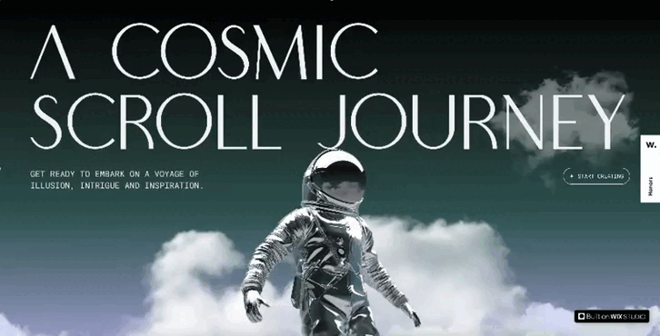
As you scroll, clouds move at different speeds, creating depth and keeping you curious about what’s coming next.
This may look too advanced, but you don’t need to be a JavaScript expert to add these effects. You can use tools like AOS (Animate on Scroll) to do so.
Why?
Because they make it easy to add fade, slide, and zoom effects with only a few lines of setup.
Loading Animations in Web Design
Nobody likes waiting, but loading animations can make the wait feel pleasant. These are small visuals, such as spinners, progress bars, or skeleton screens, that appear while a page or its element loads.
They:
- Reassure users that the page is working
- Make the website feel polished and professional
- Reduce frustration when loading takes a few seconds
Take Figma, for example. They use a simple animated loader when the app is starting up.
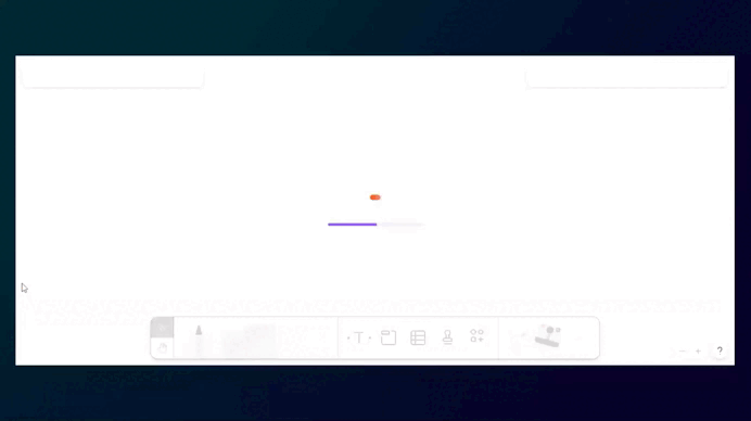
If they didn’t use this, we may assume the page froze and close it.
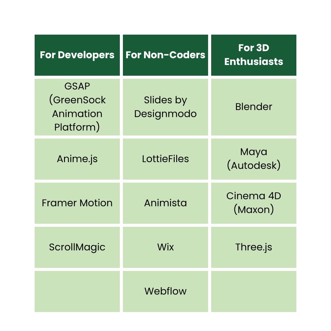
Tools & Libraries for Website Animations
There’s no one right way to add animations to your website. The tool you choose depends on what you’re developing and how comfortable you are with coding.
Here’s a quick list of some of the most popular tool options categorized by skill level:
How to Create Your First Animated Website in 4 Steps
Let’s walk through how you can build and optimize your first animated website even if you’ve never written a line of code.
1. Figure Out What You Want to Do
Before you start using any tool or typing code, stop and think about how you want your animated website to look:
Ask yourself:
- Do I only want to add animations to make my website look cool?
- Or do I want to guide people?
- Are animations going to appear when the page loads, as someone scrolls, or when my visitors hover over something?
Get a paper and sketch a quick layout of your page.
Not sure how to do this?
Draw some boxes, add arrows for movement, and jot down when things should animate. It doesn’t need to be pretty—do it only so you can use it as a rough plan.
2. Decide How You’ll Build It
There’s more than one way to add motion to your website.
But which one’s right?
Well, it depends on how much time you have and how comfortable you are with tech.
Here are four ways to do it:
No-Code (Simple way – for everyone): Use builders like Slides by Designmodo, Webflow, Wix, or Squarespace. You drag, drop, and add animations visually without any coding headaches.
Low-Code (For designers who like to tweak): Tools like Animista and LottieFiles allow you to choose pre-made animations or create simple ones in your preferred style. You only have to copy a small embed code to paste it in.
Full-Code (For developers): If you’re into coding, you can use libraries like GSAP, ScrollMagic, and Three.js because they give complete creative control over custom effects.
AI-Assisted (The new option): AI tools like Claude or Loveable can generate working HTML, CSS, and JavaScript for animations or even create a complete website that you can refine. Their generated website may not meet your expectations completely, but it can save you a ton of time.
3. Start Creating Your Animated Website
Now we’ll show you how to create a fully functional animated website using two of the easiest ways, so even if you’re a beginner, you won’t feel lost.
Option 1: The No-Code Way to Create an Animated Website
We’re using Slides here to show you how to make an animated website without writing a single line of code:
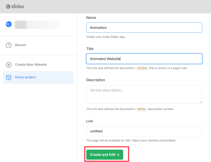
- Go to Designmodo Slides > Open Editor.
- Go to New Page.
- Give a Name and Title to your website and then click Create and Edit.
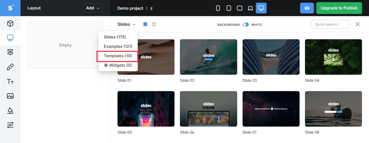
- Now, from the drop-down, select Templates. Here, you’ll see editable, pre-made templates. Choose one and start editing.
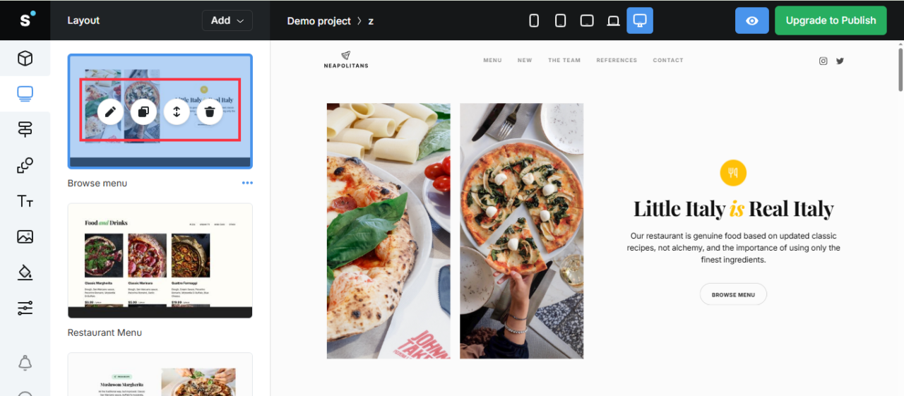
- Once you’ve chosen a template, you can edit each section one by one.
- On the left side, hover over the section and you’ll see multiple options. From here, click on the Pen symbol to start editing.
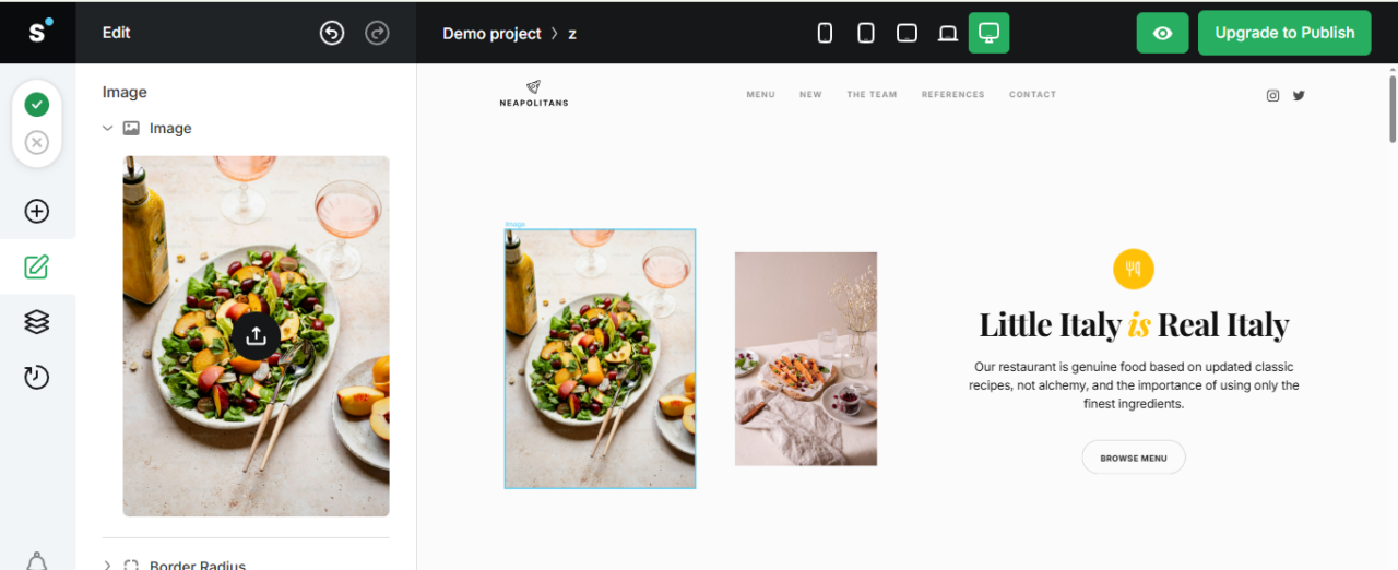
- Now, to change the image, double-click on it. On the left side, you’ll see the upload option.
- Similarly, change the text by double-clicking on it. Remove the old text and replace it with yours.
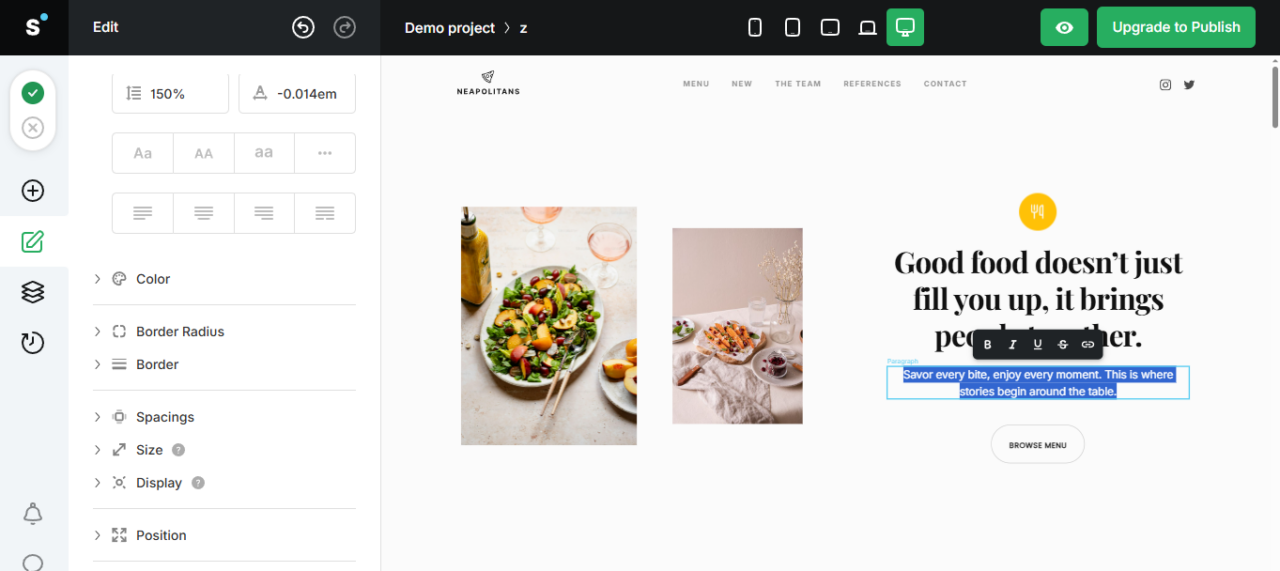
- Now double-click on the button and you’ll see options to animate the button.
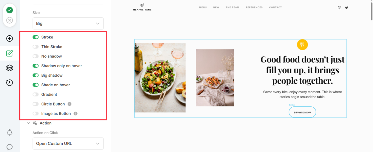
- Once done, test and preview your animations.
- Once you’re done with editing, click the green tick to save the changes.
- Now, click the eye icon to preview your animated website. You can also preview your design on different devices.
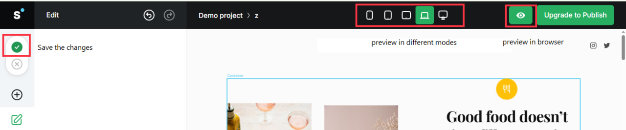
- Once you are satisfied, publish it.
Option 2: The AI-Assisted Approach to Create an Animated Website
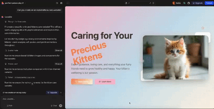
I used Lovable to create a cute kitten animated website in only four steps.
Here’s how you can do it too:
- Go to Lovable and sign up.
- Give a prompt explaining what you want.
- Wait for the AI to generate a fully functional animated website layout for you.
- Now review and reprompt it if you want any changes.
However, please keep in mind that websites created using this type of AI tool may pose some challenges. That’s why I don’t recommend using an AI-assisted approach for complex projects.
4. Launch and Keep Tweaking
Now, once your website is live, see how people interact with it.
Do they scroll further? Click more? Or leave faster?
You can track these insights using Google Analytics 4 (GA4) or any other analytics tool. Then, use that data to identify areas where you need improvement.
Best Animated Website Examples for Inspiration
Now that you know how to create an animated website, here are some live ideas to take inspiration from.
Google Your Plan
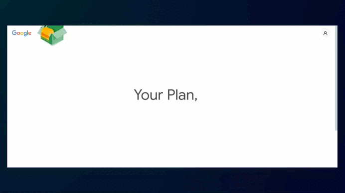
This website, Google Your Plan, is filled with motion that feels playful yet purposeful. It walks you through ways to reduce your impact on food, water, energy, and waste.
As you hover over different areas, bright colors light up and guide you along. You can see that the animations used here make learning interactive, almost like a mini-game.
SVGator: SVG Morph Animation
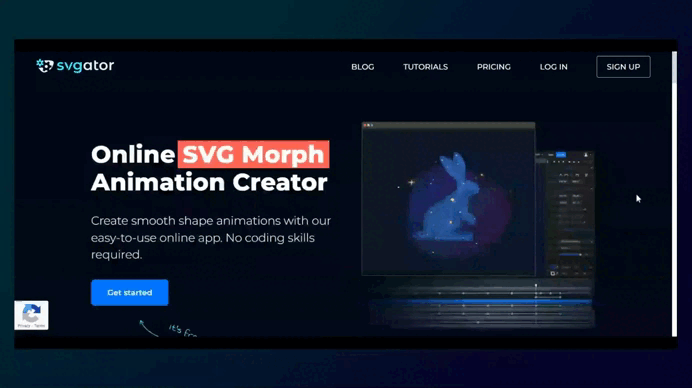
SVGator’s website shows what their tool can do. The whole website contains looping SVG animations: shapes morph, icons change, and everything moves smoothly.
They don’t explain much with words because they don’t need to (I think so). The animations themselves show exactly what their software is capable of.
Stryve
When you visit Stryve’s website, a prominent hero section immediately makes it clear that the website is about hiring.
The animations are smooth and paired with bright colors that guide your eyes as you scroll. It feels alive without being overwhelming, which makes it easy to browse through.
Chirpley
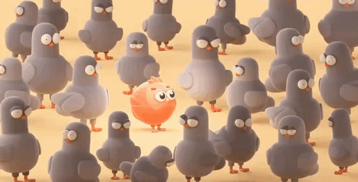
Chirpley’s website is the kind that makes you stop and look for a minute. The 3D animations and bright, cartoon-like style immediately grab your attention.
Their quirky red bird mascot adds personality, and the animations make what could be a pretty technical platform (AI for connecting brands with micro-influencers) feel easy and fun to understand.
Best Practices for Website Animations
Animations can make a website feel more engaging, but only if you use them with purpose.
When they’re done well, they guide people through your website and make it easier to interact with. But when they’re overdone, they can slow your webpages and turn people away.
Here are a few simple rules to keep in mind when adding motion to your site:
- Keep the visuals clean: 38% of people will stop engaging with a website if the visuals or layout don’t look good. And animations won’t save a messy design; they’ll only make the clutter move. So try to keep everything clean and simple, even if you want to add motion.
- Speed is everything: Heavy animations slow pages. And 53% of mobile users leave a website if it takes more than three seconds to load. So, keep your files lightweight and test them on mobile devices before launching.
- Get the timing right: Most interface animations feel smooth when they are between 200 and 500 milliseconds. Faster than that may feel jarring, and slower than that may make your website feel sluggish. Try and see what works for you.
- Make them work for the content: Animations should help people understand what’s happening, like guiding attention to a button. UX consultant Sarah Doody puts it simply: “Animation should serve a purpose. If every single image on the page slides or bounces in, it’s distracting. And for some people, it’s dizzying.”
- Check for accessibility: Some people are sensitive to motion, so follow WCAG guidelines to make sure your animations don’t cause problems for anyone.
Ready to Bring Your Website to Life with Animations?
Start small.
Add one animation. It could be anything, from a button that pops to a smooth scroll effect. These little touches will make your website feel more alive.
Once you’re comfortable, try layering in more effects or experiment with tools like Slides by Designmodo to build a fully animated website.
FAQs
Do Website Animations Affect SEO and Search Rankings?
Yes, but indirectly. Animations themselves don’t hurt SEO, but if they slow down your website, they can negatively impact UX and so Core Web Vitals, which Google uses for rankings.
What’s the Difference Between CSS Animations and JavaScript Animations?
CSS animations are used for simple effects, such as fading, sliding, or animating objects to move slightly. They’re easy to add and require minimal effort.
JavaScript animations are for more advanced effects, such as making elements move when you scroll or click, or creating complex, interactive motions. They give you more control, but you need to be an expert to work with JavaScript.