Website Design Examples for ICO Campaigns
Cryptocurrency, blockchain, ICO. Do these words sound familiar to you? If so, then you probably have some crypto cash in a digital wallet.
It is safe to say that despite all the recent falls and bans, cryptocurrency is still popular. Maybe recent events make it less crowd-pleasing than before Christmas, yet still, it is popular and pretty much in demand. If your enthusiasm about Bitcoin has faded, then it is time to go for another currency or even create your own coin and offer it as a viable alternative.
ICO (Initial Coin Offering) campaigns are baked like hot pancakes. There are hundreds of them. Some are truly successful and promising, whereas others are frauds.
Today we are going to explore ICO campaigns regarding web design. Let’s consider a dozen websites of popular and not-so-popular ICOs to find out what components teams include in their online presentation platforms and what themes they prefer to use. Of course, we are going to omit stuff that is imperative to ICO to exist such as a roadmap, white paper, philosophy and all since this area is out of the scope of this article.
Hero Section
As in any other type of website, a hero area is of crucial importance. It is not just a section that users see first; as a rule, it is the most viewed part. It is a deciding factor as to whether a user stays or leaves. The rule of thumb is to make it informative and attractive. For ICO campaigns, there are several essentials to include:
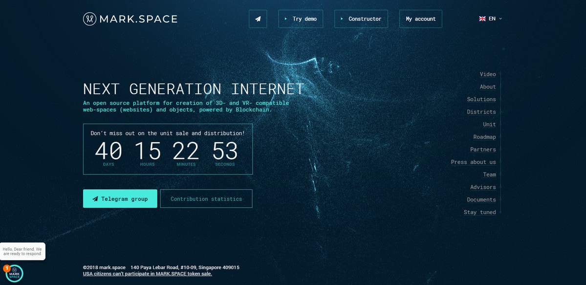
- A short, preferably catchy, description of the campaign like in case of Mark.Space that meets the online audience with a promising title “Next Generation Internet.”
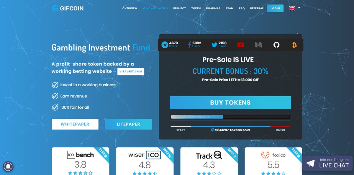
- A pre-sale block such as Gifcoin. Here, the pre-sale block is really hard to miss. It occupies a relatively big part of the screen in the center location.
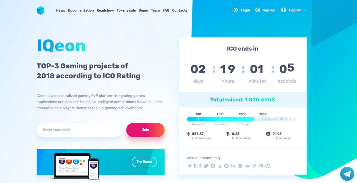
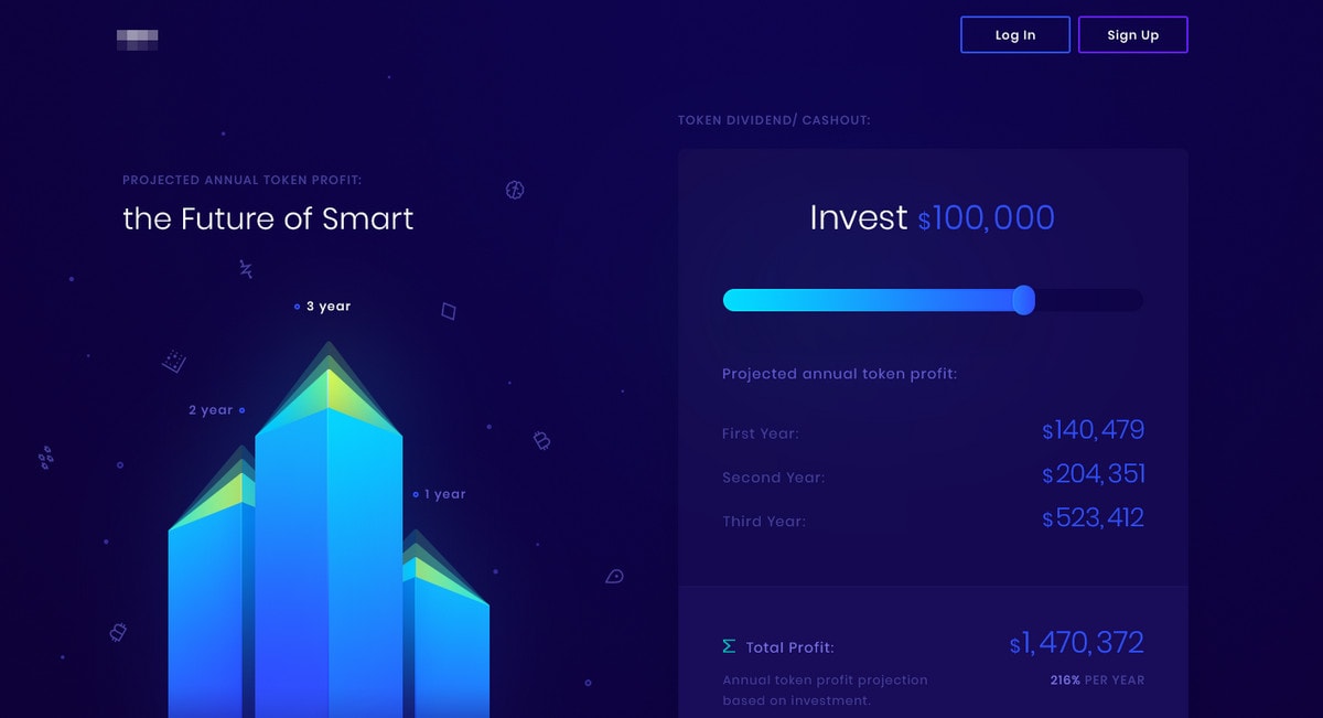
- A counter to show the time left for a release or for ending the sale like in case of Iqeon. Here, it is clear how much time you have to contribute to the campaign.
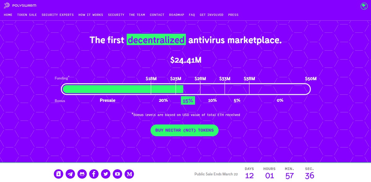
- A percentage bar that shows how much money has been already raised like in case of Polyswarm. Here the indicator is large and shows the goal. The dramatic neon green draws the attention, naturally serving as a focal point.
- A bonus area where you can provide an attractive offer.
- A navigation element with a set of helpful links and social media buttons.
- And last but not least, a call to action. Usually, it is a relatively big rectangle-shaped button that lies beneath the counter and bonus offer, immediately catching the eye.
With so many important things to consider, you may wonder how all these details can exist in harmony in one place and not overwhelm readers.
With Postcards Email Builder you can create and edit email templates online without any coding skills! Includes more than 100 components to help you create custom emails templates faster than ever before.
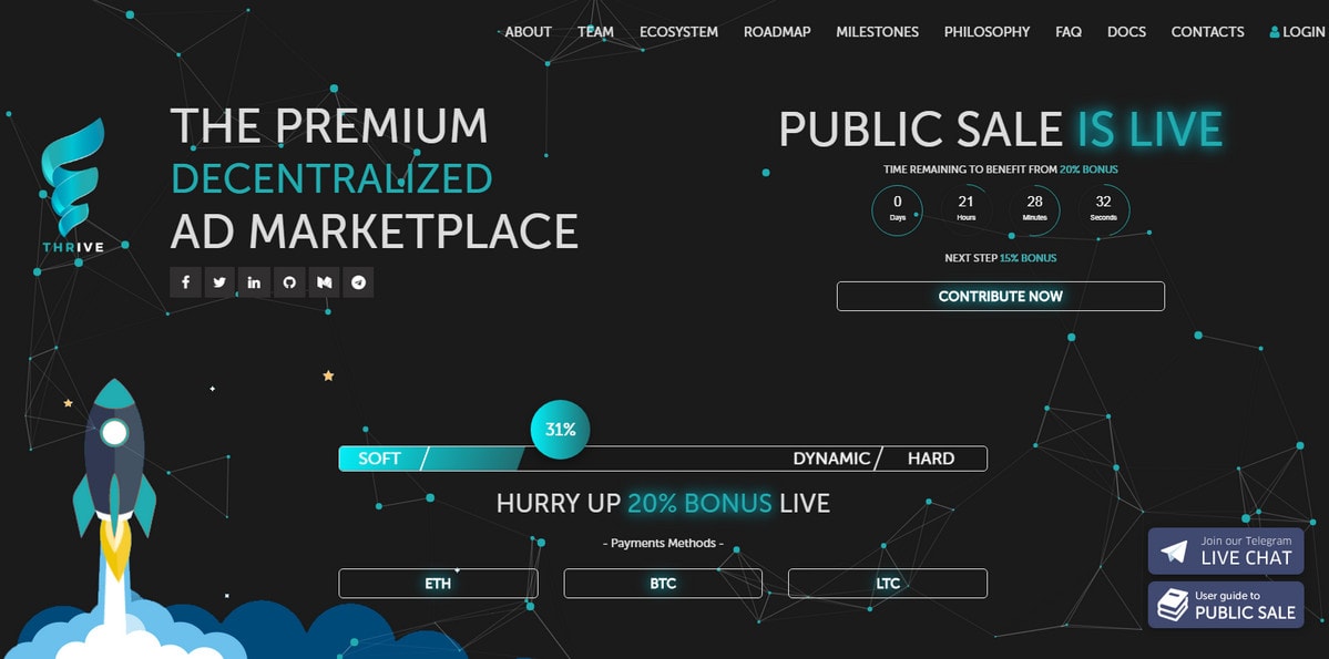
Free Email BuilderFree Email TemplatesTake a look at Ico by Thrivelab. It provides some hints and inspiration. The hero area is a masterpiece. It skillfully balances all the above elements without upsetting harmony. Fragile line style, elegant slim typography, and most importantly a generous amount of white space keep the interface from feeling overloaded and overwhelming.
The design is neither boring nor insipid. The team combines a fancy illustrated approach and tiny dynamic effects, resulting in a clean, neat, professionally-looking website with a modern touch and powerful first impression.
What Else Should You Include on a Front Page?
Introduce yourself and your idea. You can add a section with team members, advisors, partners, roadmap, milestones, philosophy – everything you may find important to potential customers. Include elements and information to establish trust. Examine at Rentberry and Celsius.
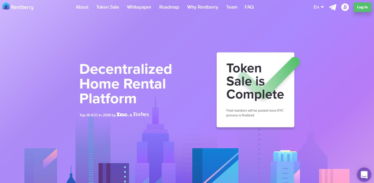
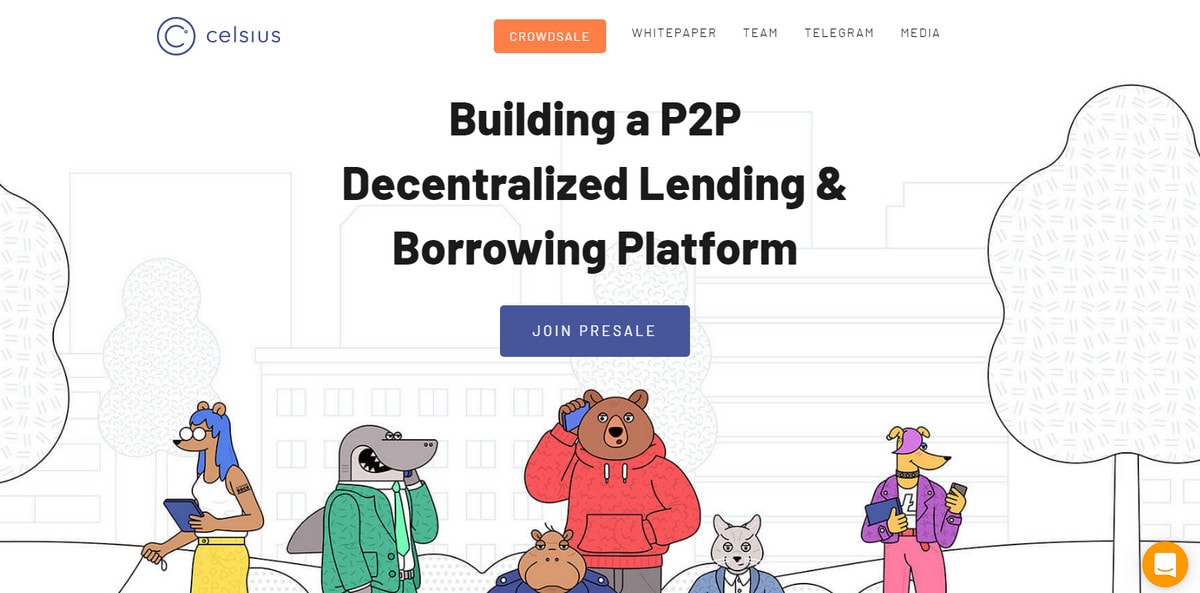
Rentberry’s team is talking about its idea, tokens, what good it can bring to society and results of the pre-sale. Celsius focuses on several important things: goal, advisers and benefits of the coin. Both homepages are informative and inspiring with eye-pleasing designs and businesslike atmosphere. Both websites cover all the vital stuff, making the ICO transparent and clear.
What Theme Should You Choose?
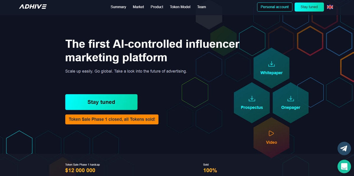
Whether it is just a trend or maybe the notion that “crypto” associates with something artificial, many teams behind ICO campaigns choose high-tech vibes for their websites. Businesslike, sophisticated, digital-like and even a bit mysterious – exactly what is needed for something that no one can fully understand but everyone thinks is something big. Consider Adhive, ICO landing page by uixNinja and ICO landing page by Nida Orhan.
With a honeycomb pattern and gorgeous dark coloring, Adhive exudes an image of refinement and techno. Orange and neon blue naturally place accents giving the integral things extra visual weight.
The concept by uixNinja also includes a dark theme. Beautiful gradients and neon tones make the design feel special and attractive.
Unlike the previous two examples, the concept by Nida Orhan takes on a light coloring scheme with lots of white and blue as a secondary tone. It has a majestic businesslike atmosphere with clean structure and optimal balance between the content and visuals.
With Pulsetic you’ll be instantly notified the moment your website, API, or server becomes unavailable. Monitor uptime from multiple global locations and respond to incidents before your users are affected.
Create beautiful status pages in minutes to keep customers informed during outages and build trust with transparent communication.
Start Monitoring for Free
Conclusion
With the buzz around the cryptocurrency and numerous alluring offerings it is difficult not to behave like Fry and tell everyone to “Shut up and take my money,” but do not get carried away. Besides, maybe buying is not your thing; maybe releasing coins is your path. This tendency is growing into a real trend. And if you have a great idea that will make the world a better place and a professional team of developers at your hand, it is worth a try. We hope our collection has provided you with an idea of how to present your ICO campaign online.
What do you think about ICOs? Do you take part in them? Share your experience with us.


