What in the World Are Microinteractions?
Microinteractions are all around us. Simply put, it’s a specific moment of interaction with a user interface. Let me give you a common example: When a user taps on a button in a mobile app, and the button pulls down a navigation, that’s a microinteraction.
More specifically, microinteractions are the animations and changes of the interface that happen once a user interacts with something, anything. Consider them interactive but informative animations. There are many reasons to use microinteractions. I can give you four right now.
1. Improved Usability Through Microinteractions
The first good thing about microinteractions is improved usability. If the animation of the menu, from the example I gave above, slides down and over the content the user was just looking at, it provides affirmation for the user. This animation lets the user know what’s going on through visual cues.
They now understand that the previous content is still there for them if they choose to exit, that the menu is temporary, so to speak. It helps the user understand the app and its interface a lot better if instead the menu just appeared over the screen like most do by default. The fluidity of the app and the relationship of its content is a lot more evident to a user, new or recurring, with microinteractions.
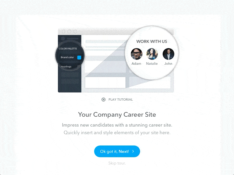
With this walk-through example, the user can expect the content to keep sliding in from the right until they are finished. There is no wait time because of lack of refreshing. The interaction with this walk-through appears more seamless because of the animations. It makes for a mindless walk-through, which is fantastic when users don’t have to think.
Just like in the hypothetical example I gave in the beginning of this section, this microinteraction allows the user to understand that the menu icon will bring out a thin slide of content that you can further interact with. Interacting with the menu icon doesn’t make anything disappear, the content stays the same and it’s a simple affirmation to grasp for novice users of this app.
With Postcards Email Builder you can create and edit email templates online without any coding skills! Includes more than 100 components to help you create custom emails templates faster than ever before.
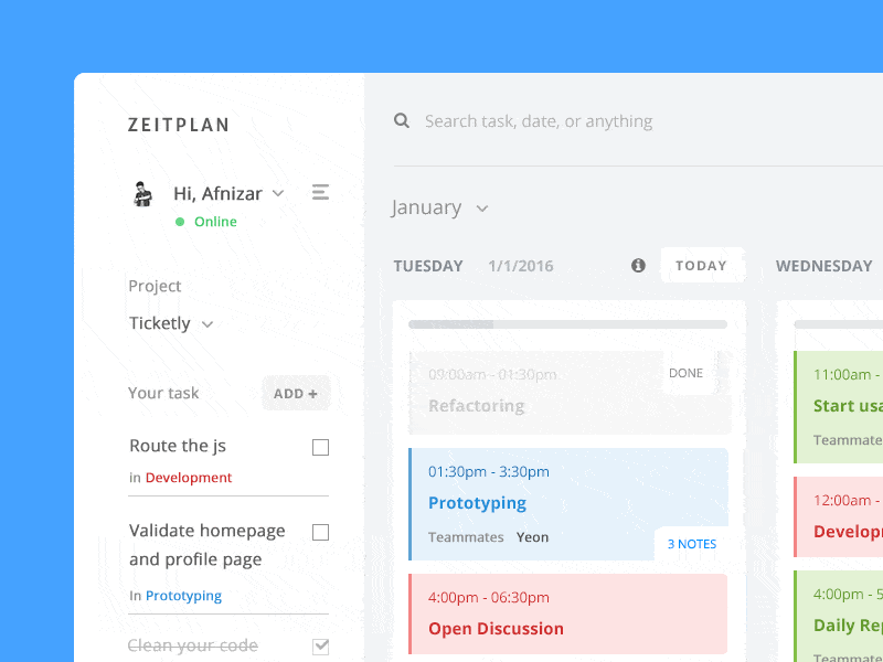
Free Email BuilderFree Email Templates2. Better Branding Through Microinteractions
Microinteractions are a great way to enhance the overall experience of an app. Animations can bring in a lot of personality which enhances the brand experience. Additionally, microinteractions can make the experience of using an app feel easier and more seamless. That’s also great for branding.
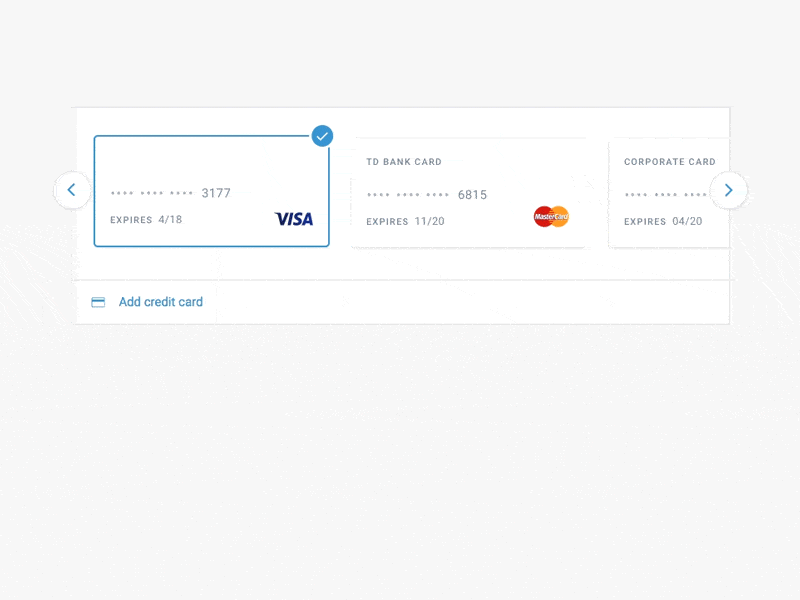
I like this example because the smooth animations of the UI are a nice way to provide users with better branding. It allows the user to edit a credit card that’s in the system without jumping through hoops and getting lost. Such a seamless experience – thanks to beautiful UI and animations – makes for also for a more enjoyable brand experience.
3. Provide Users with Feedback Through Microinteractions
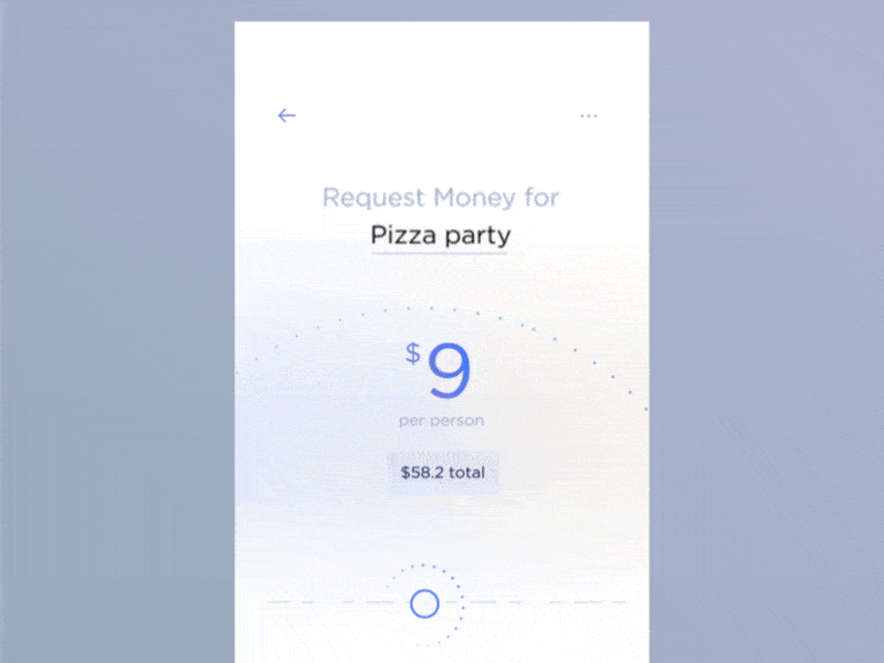
Microinteractions can also help provide feedback to the user. Let’s say a user submitted something in our imaginary app from the previous example. The submit button turns into a loader and then into a message that the submission was successfully made.
The loader is the first point of feedback that the request is being processed. The confirmation is the second form of feedback that it’s been processed successfully. Even if the request ultimately failed and an error or failing message appeared instead of success, that’s still feedback for the user through microinteractions.
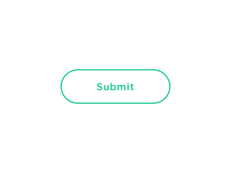
The above microinteraction gif is exactly what I described above. It clearly demonstrates feedback as the app or website is working in the background. There is nothing complicated going on. It’s just clean and straightforward animation transitions. What more could you ask for?
I like this example because it clearly depicts a much easier understanding of using sliders. They can be really hard to navigate sometimes, especially on mobile phones. Yet, this UI smoothly animates the numbers as you’re sliding about. There is absolutely no confusion about the number being selected; this lack of confusion is also due to easy feedback.
The smooth animation allows the user to clearly see what the user’s interaction communicates to the slider and the impact it has on their desired number choice.
4. Give Users a Sense of Control Through Microinteractions
Users need a sense of control. Have you ever been on a website where you click a button or a link and nothing happens for a second or two until the new web page is finally loaded? Isn’t that annoying? It’s annoying because you don’t know what’s going on. You don’t know whether the button is broken. You don’t know if you should click it a few more times. The latter solution can be really bad if it’s a button on a checkout page, for example, whereas it’s more or less harmless with a link to a blog post.
With Pulsetic you’ll be instantly notified the moment your website, API, or server becomes unavailable. Monitor uptime from multiple global locations and respond to incidents before your users are affected.
Create beautiful status pages in minutes to keep customers informed during outages and build trust with transparent communication.
Start Monitoring for FreeAnd it’s terrible user experience, it puts the user out of control. Just like you and me, the user is startled because nothing is happening.
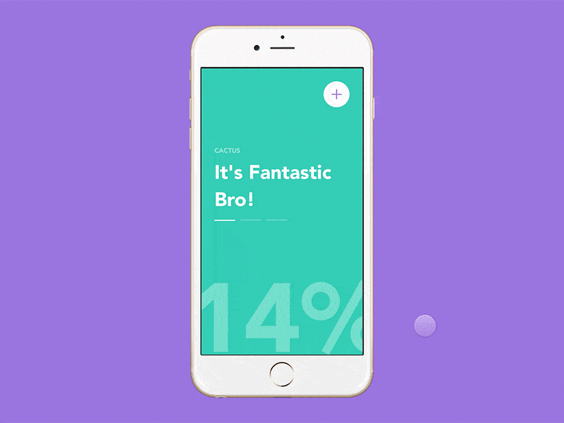
The first microinteraction is the background fade in. It’s fun, different and it adds to the personality of the app. It’s interesting and by no means boring or typical. The background fade in also lets the user know that what they tapped on is opening.
The second microinteraction is of the + changing to an x. It clearly illustrates to the user that you can use the same exact spot on the screen to close the menu that just popped over the screen. The user knows what’s going on, they are in control and are given feedback on their action.
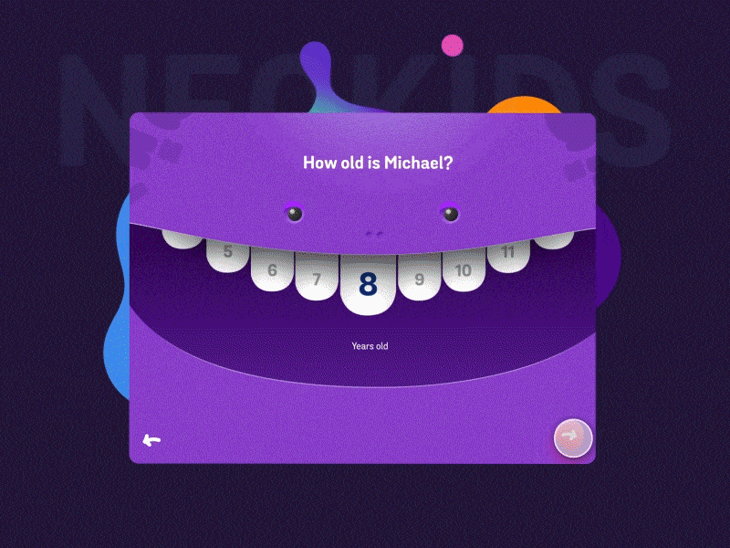
In this onboarding concept, there are many microinteractions to make note of. I’m only going to point out the recurring sliders. Some are teeth, one is a tongue. However, the animations that happen when a user clicks on a different number or slides the tongue are a good way to let the user know their interaction – the click – was effective.
Additionally, take note of the text change when the tongue slides to the left. The text grows big for a split second reaffirming that it’s been selected. The user is never left guessing what’s going on and whether the interaction was effective.
Conclusion
Microinteractions are seemingly unimportant design details that can, in fact, have a positive impact on the user experience.
From improving the branding experience to making sure users are not confused, microinteractions go a long way in establishing strong usability.