The Art of Mixing Fonts in Web Design
Mastering the art of mixing fonts, especially in website design, is quite crucial. There are, literally, thousands of various types that can be easily incorporated into web project, so it is really important to not get excited over such wide diversity and plenty of hidden opportunities, and address the issue with a sober mind. Moreover, using even only one font in a project does not relieve you from circumventing common problems.
The typography, alone, is equally capable of effectively contributing to the design and totally ruining it, so leveraging more than one font in a project sounds quite challenging. Nevertheless, this doesn’t withhold designers from mixing and matching various, sometimes almost unsuitable types in order to build ingenious interfaces that not only look harmonious and balanced, but also creative and sophisticated.
Today we are going to share with you our fresh collection of website designs that can boast of its optimal and creative mix of various fonts. We have included different solutions starting from a simple combination of 2 fonts and ending up with an enthralling blend of 4-5 types.
How to Mix Fonts in Web Design
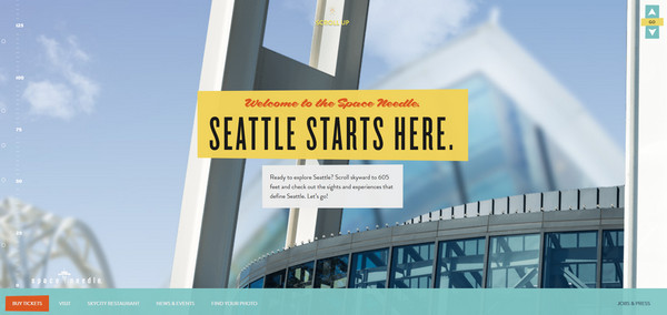
Space Needle – The welcome screen includes several neatly-highlighted statements that are made in different fonts. There are italic, narrow slightly stretched and basic types that wonderfully interact with each other and ideally fit into urban photo background.
ING Direct – The landing page features a lovely and kind night scene that is beautifully bolstered by an excellent fonts choice. The designer has chosen a bold smooth font that easily collaborates with a basic type that is used for content.
With Postcards Email Builder you can create and edit email templates online without any coding skills! Includes more than 100 components to help you create custom emails templates faster than ever before.
Free Email BuilderFree Email Templates
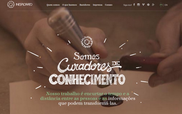
Inesplorato – The magnificent chalk style tagline is not only the centerpiece of the home page that instantly draws attention, but it also echoes perfectly well with an image background, and nicely blends with less artistic font.
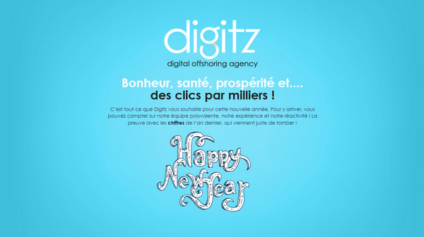
Digitz – The designer experiments with a couple fonts in order to give the front page a modest businesslike appearance, and at the same time, add to it a festive mood.
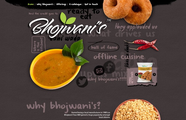
Bhojwani Foods – Here, the website design includes lots of graphics, photos and letterings that are skillfully combined together. Though at first it seems that the interface is chaotically overloaded with data, in fact everything has its own place, where the typography performs a leading role.
Feven Amenu has a neat, spacious and well-balanced online portfolio. The front page includes a tightly packed together salutation that can be easily scanned due to correct choice of fonts. Besides, such approach allows adding an overtone of ingenuity to the interface.
With Startup App and Slides App you can build unlimited websites using the online website editor which includes ready-made designed and coded elements, templates and themes.
Try Startup App Try Slides AppOther Products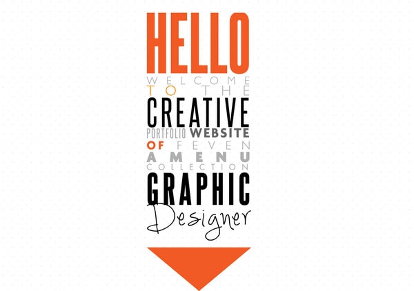
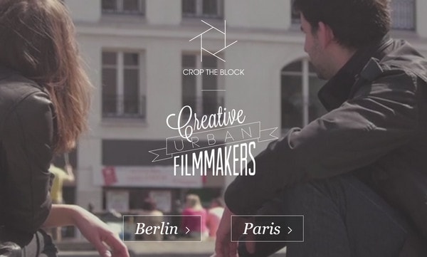
Crop the Block has a refined hero area that instantly conveys an urban atmosphere. The logotype, tagline and CTA buttons nicely stand out from a video background and make the eyes pleasantly flow through them. The font selection is not random; each type tries to support the word to which it is applied.
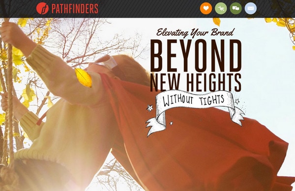
Pathfinders is a creative advertising and marketing agency that has a flawless online portfolio. Every section comprises its own selection of perfectly matched together fonts that are aimed to liven up the content and even decorate the interface.
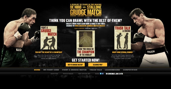
Grudge Match – The designer does a good job of presenting lots of information. Although the data is densely packed together, yet it can be easily perceived mainly thanks to a perfect combination of various font sizes, weights and colors.
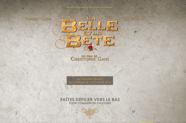
La Belle et la Bete – The front page exhibits a sumptuous ornamental type with a golden touch that is nicely worked into the composition. The designer has wisely chosen the texture for background and secondary fonts in order to laconically complement the movie title.
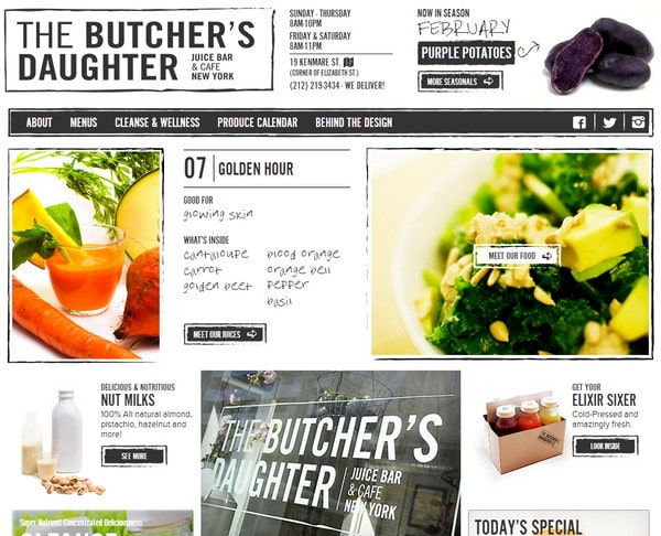
The Butchers Daughter – The website is based on a magazine style layout that nicely combines together visual data and text blocks. The designer also employs several fonts that capably match the tone of the theme.
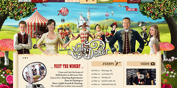
MollyDooker Wines has a truly visually overloaded design that has managed to mix lots of graphics, images, textures and data. However when it comes to the content, it looks quite legible and readable mainly due to well-structured layout, strongly marked widget areas and properly-selected fonts.
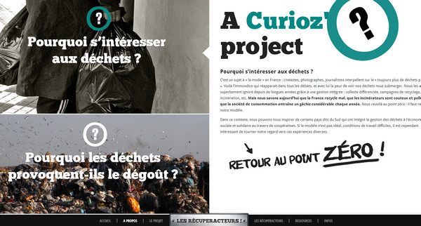
Les Recuperacteurs – The designer utilizes several fonts and experiments with various sizes, styles and color in order to make selected phrases and words look noticeable.
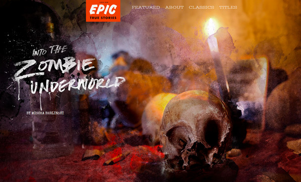
Zombie Underworld – The designer is managed to choose fonts that fit to the design like a glove. The selection falls on 2 different types. The first one has a creepy appearance in order to reinforce the zombie theme, and the second one has a digital style that is aimed to contribute to magazine style layout.
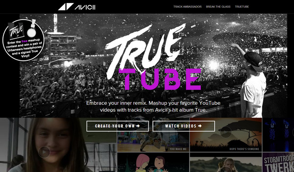
TrueTube – The decorative type with brush strokes feelings applied on the welcome section effectively enhances the artistic musical atmosphere. The other font is used to clearly display content and doesn’t let you get lost in a mass of multimedia data.
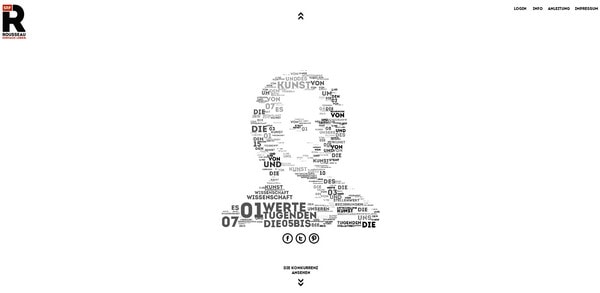
JIR 2012 – The designer takes on a quite old-timey approach of using words made in different sizes in order to construct a face. However, it definitely deserves attention since the designer needs lots of extra skills to “cast bust of a man”.
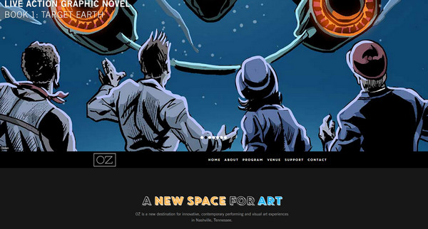
OZ Nashville – The designer skillfully mixes a rough retro style type, which is supplemented by a lovely cosmic appeal, with simple basic font. The first one is intended to add finishing touches to the design.
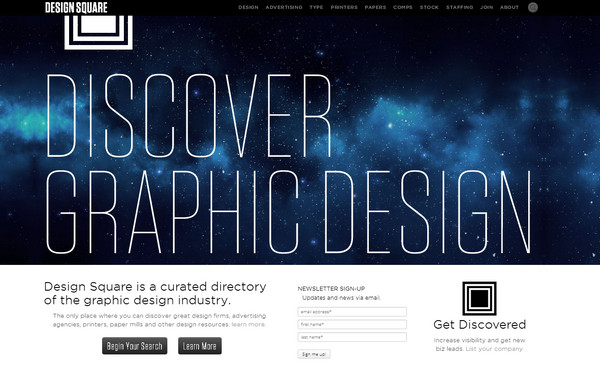
Design SQR – This font selection is never get old. The designer leverages an ultra-narrow elongate font for main tagline, and pairs it with a regular type that effectively sets off the text from a backdrop.
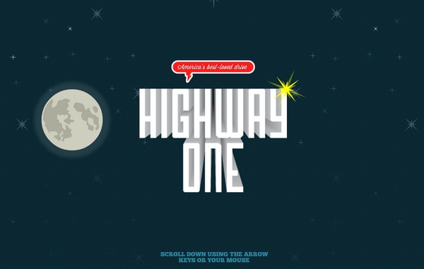
Highway one roadtrip – The website features several fonts that carry out various tasks. Decorative comic style fonts take part in a visual storytelling, efficiently completing the fancy scene; whereas the regular ones are responsible for giving the text a prominent appearance.
Denis Hepting leverages calligraphy font for main captions and regular font for displaying text. It is a wide-spread and time-proven approach that helps to make your design look harmonious and balanced, and at the same time, give you an opportunity to pleasantly highlight necessary information.
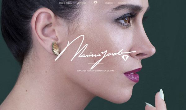
Marina Zardo – Much like the previous example, the website features a combination of basic sharp type and elegant hand-written font. The latter plays a role of signature as well as adds a note of femininity and delicacy to the design.
Conclusion
As a rule, designers leverage 2 or maximum 3 different fonts in their designs. Such amount allows creating enough aesthetics and effectively contributing to the theme, and also helps to avoid a visual clutter that can bring diversity of shapes and forms.
What fonts do you prefer to mix in your design projects? Share with us your thoughts.


