Designing a Portfolio Website with Oversized Typography
The goal of any portfolio site is to showcase your work. That’s a given.
But you also want to sell your work in a way that grabs attention. You can do this with visuals, or by focusing just on content. Or by designing large typography that gets people reading into your site.
Not every portfolio can work with large typography. I typically find this works best on portfolios for developers or writers, but can also work in smaller blurbs for designers too.
Regardless of what type of portfolio you’re building, this post is full of ideas for designing oversized typography that’s guaranteed to keep people engaged and glued to your site.
The Headline Is King
In the SEO world there’s a saying that “content is king”. Generally this is true.
But when talking about a page design I’d argue the headline is king. The very first text the visitor sees will define whether they stick around to keep reading or whether they immediately close the tab.
With Postcards Email Builder you can create and edit email templates online without any coding skills! Includes more than 100 components to help you create custom emails templates faster than ever before.
Free Email BuilderFree Email TemplatesYou should try to design oversized headlines for your site, but not have them too large to overtake your content(ie. your work).
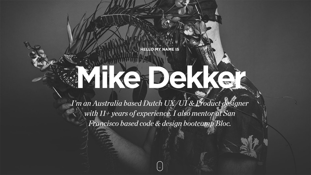
Take a look at Mike Dekker’s site to get an idea of what I mean.
The homepage header does use very large oversized type. This helps to sell the website’s purpose(a personal site with the site owner’s name) along with some details on the site(his description).
Right from the first pageload you should know enough about Mike to decide if you want to dig deeper into his portfolio. With this type of text you need great copywriting skills, but that comes naturally with practice.
Another alternate style is the portfolio of Tobias Ahlin.
This uses various headlines throughout the page to break up the layout and grid structure. You can use big headlines like this when showcasing your work to bring attention to your favorite projects.
I can’t tell you exactly how to structure your page headings. Each portfolio will be different.
But if you go with oversized typography make sure that your heading text is grabbing people’s attention.
With Pulsetic you’ll be instantly notified the moment your website, API, or server becomes unavailable. Monitor uptime from multiple global locations and respond to incidents before your users are affected.
Create beautiful status pages in minutes to keep customers informed during outages and build trust with transparent communication.
Start Monitoring for FreeTry Personal Greetings
One thing I like about copywriting on the web is variety. You can design a stuffy corporate website one day, then go the complete opposite with your personal site the next day.
For example Marc Thomas uses the “personal greeting” style with his oversized header.
This creates a sense of engaging with the viewer and bringing them into a digital conversation.
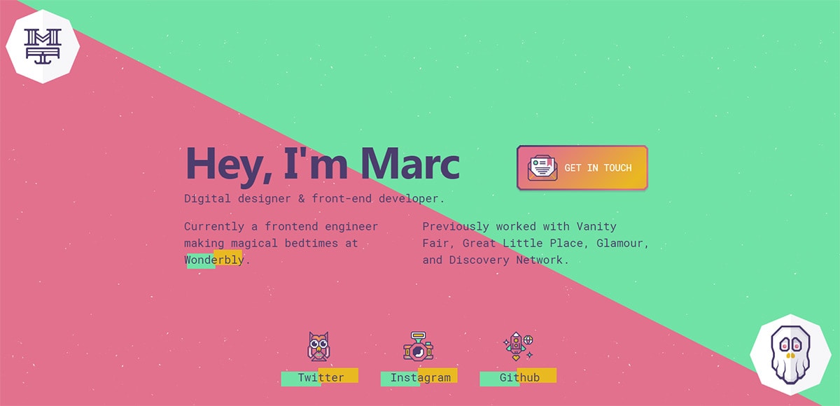
If you can write in a conversational tone then you’ll have no trouble designing these types of headlines.
They grab your attention fast and keep you engaged with the content all the way till the end.
Now Trent Walton has something similar on his site, but instead of a direct greeting it explains more about what he does.
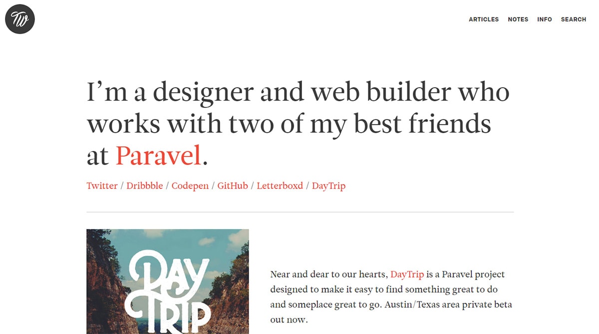
Every time a visitor lands on your site they should know what you do. There’s nothing worse than being confused and annoyed when visiting a portfolio of a company(or person).
My preferred style is to pick either a strong greeting header or a strong intro header. You can do both, of course, but it’s good to make one of those headers stand out above the other.
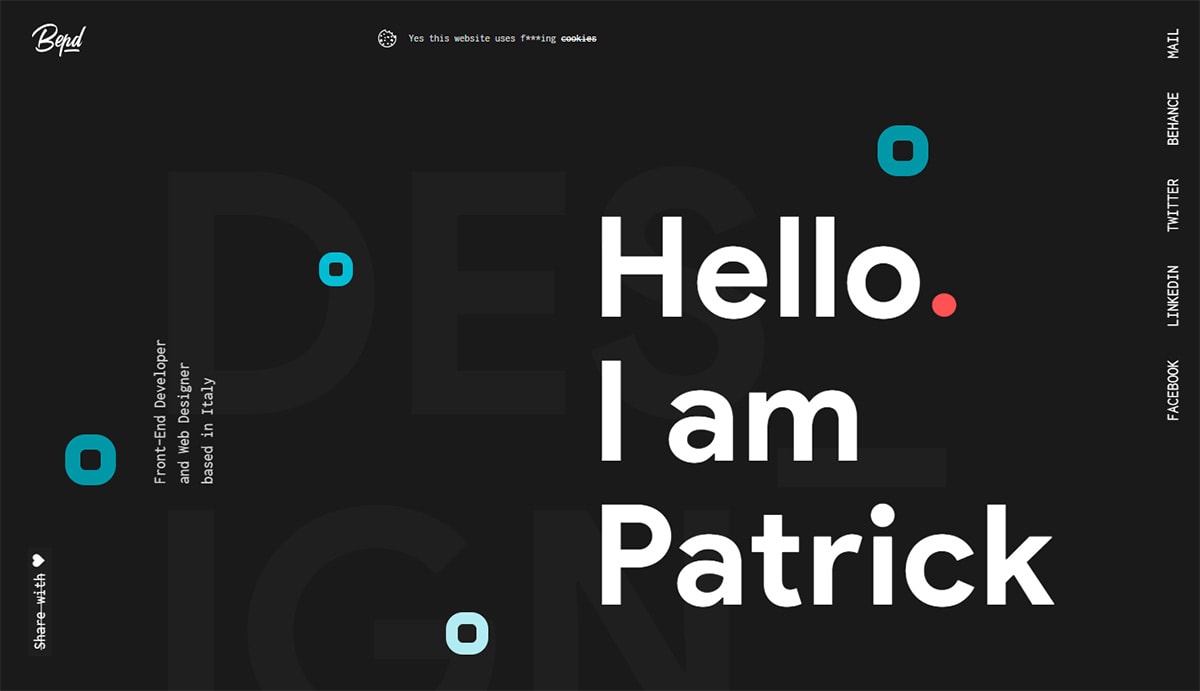
I’m a big fan of Patrick David’s website and his style is superb. The oversized typography is really just one part of the whole composition.
Draw Focus To Your Text
If you have large typography then you’re clearly looking to grab attention. You can do this even better with bright colors, icons, or something that screams “hey look at me!”
The Finch portfolio site is widely known for its fantastic design by Francisco Inchauste.
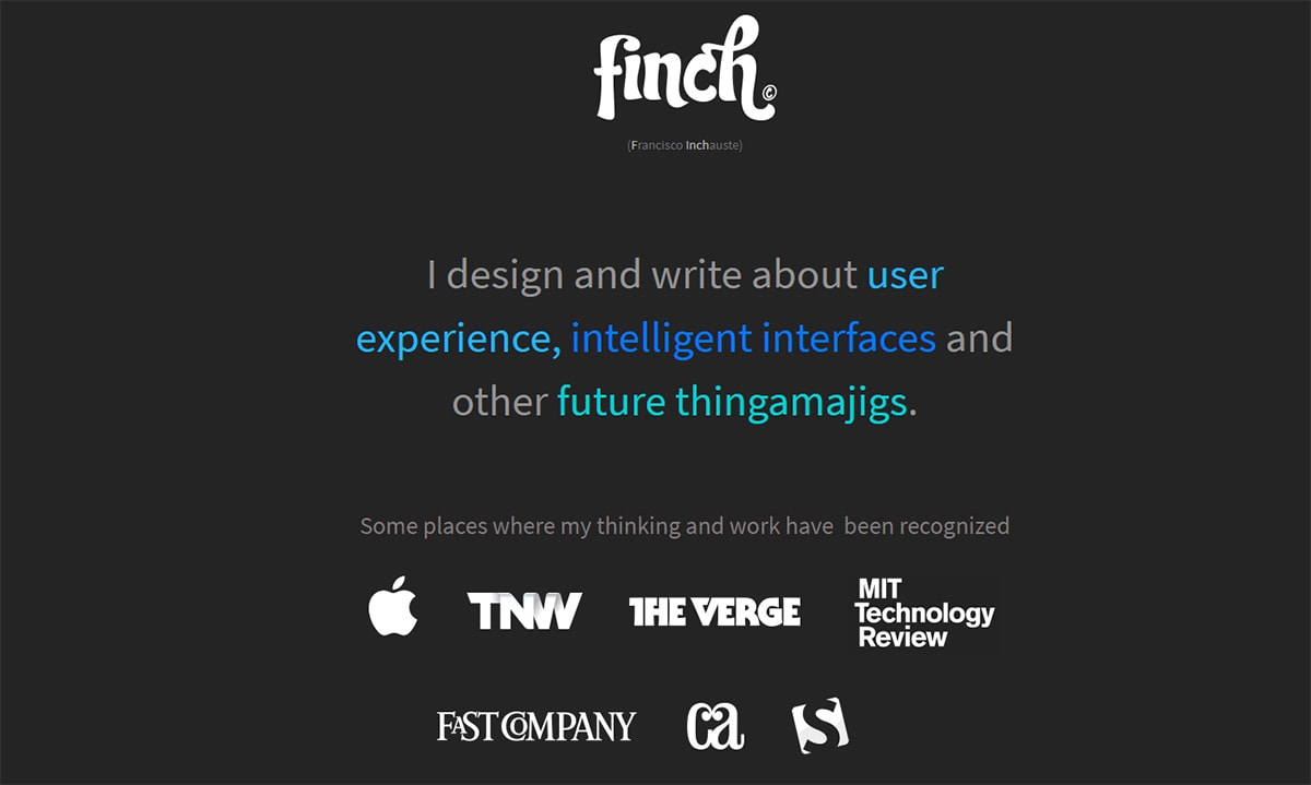
If you look over the text you’ll notice there’s a bunch of type with alternating color schemes. Not to mention the small name label underneath the header actually highlights the different letters in “finch”.
Think about contrast and how it plays a role in your design.
Text size is one way to create contrast. But you can do this through many other means all with basic CSS properties.
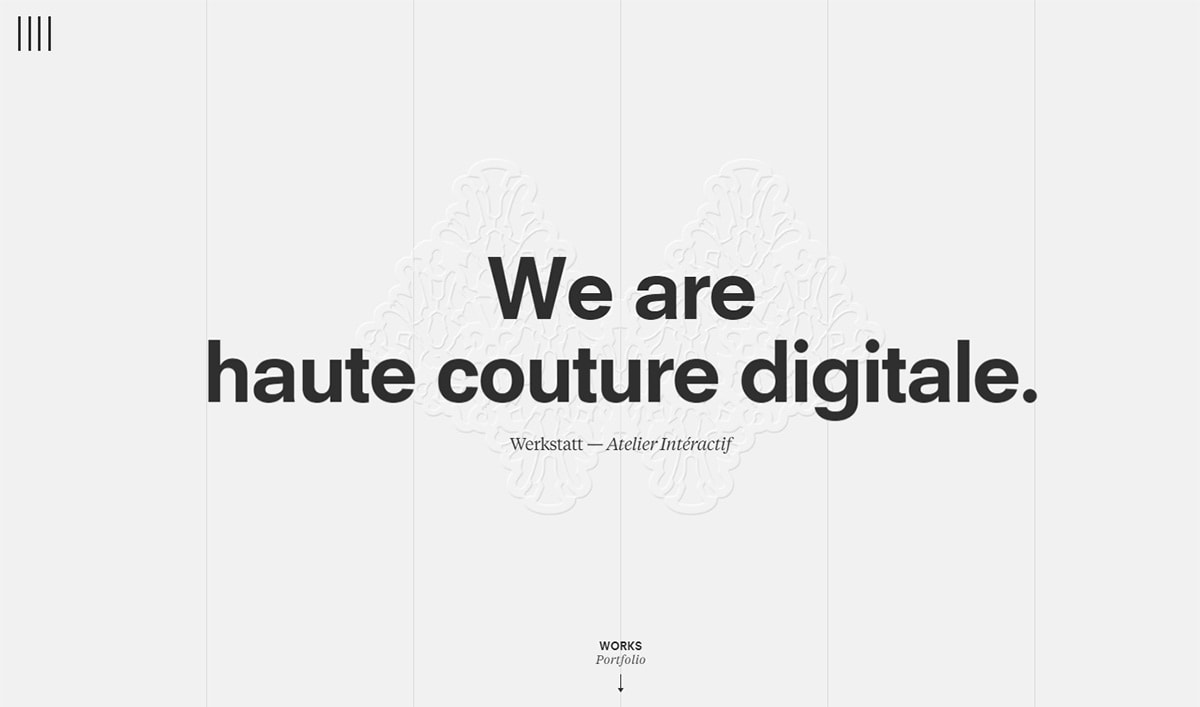
You’ll find a totally different example on the Werkstatt website using animations and sliding panels to grab your attention.
If typography is crucial to your portfolio then try sprucing it up. Even one additional color can go a long way to getting more eyeballs stuck on your site.
Use Larger CTAs
I’ll admit that not every portfolio needs CTA buttons. Yes they are useful for encouraging user actions, and yes they’re pretty simple to add.
But what if you don’t need many user actions? Would a CTA still be worth it?
I say yes, but only if you’re looking for work or want to encourage communication through a contact form. Same goes for anyone with a portfolio who also runs their own newsletter.
The Rareview website uses lots of big spacious buttons for links in their content. You’ll find a bunch of these on the homepage following various case studies.
Most of these designs follow the ghost button trend which is pretty popular nowadays. You can use this similar style if you want to create a minimalist layout for your page.
But I also like the style of Jib and their red CTAs.
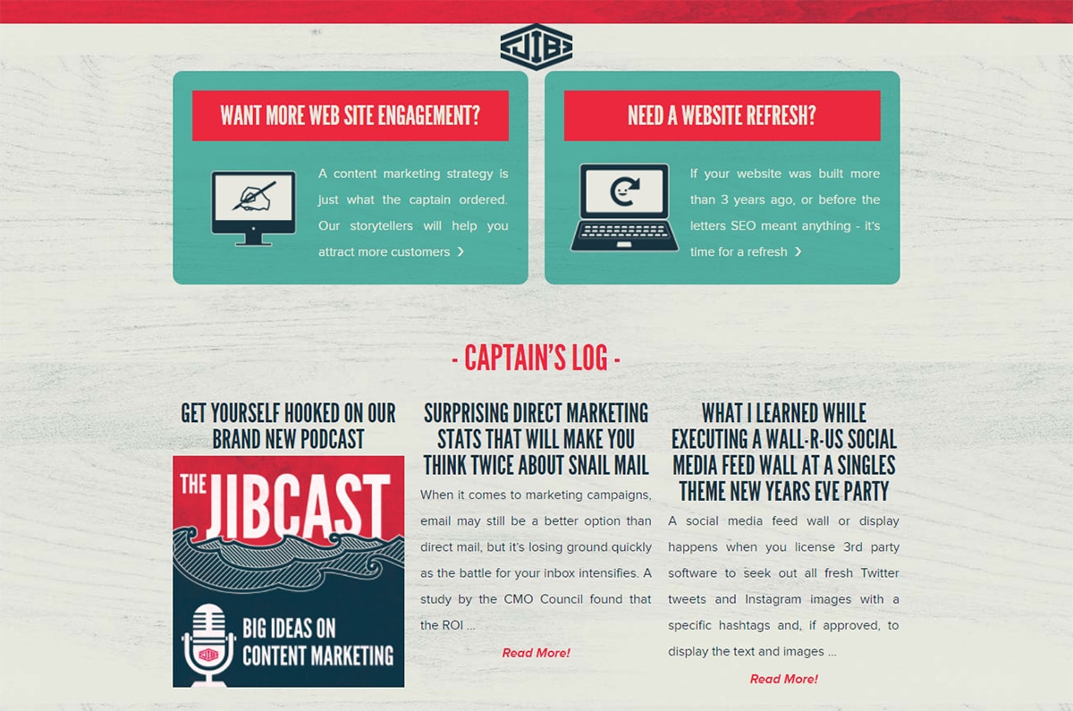
If you scroll down towards the small buttons on “want more engagement?” you’ll notice those buttons jump out right away.
I’d argue Jib could increase leads by changing the button colors to something else unique to the design. It’d be tough to blend in, but usually people are drawn to different colors. That’s how you can combine oversized type with color choices to really up engagement.
Still, their oversized typography has to play a pretty big role in these CTA designs and that may be enough for your portfolio too.
Moving Forward
The key to a great portfolio site is usability and clearly showcasing your work. Text will be a big part to some degree and it’s your choice on how to format that text.
Oversized type will always draw attention so it’s a pretty reasonable style to start with.
Try following these tips on your portfolio site and blend them with your own ideas to see what comes out.


