Parallax Scrolling and Its Usage in Web Design
The parallax effect, also called parallax scrolling, is a special technique used in computer graphics at first, where background images move by the camera slower than foreground images. This is the actual concept where websites with parallax scrolling started. It was widely used in the gaming industry more than 10-15 years ago and it is still used today in different domains.
In the past years, the parallax effect started to be used widely in web design. Its popularity went through the clouds when Nike redesigned its website based on this concept. Their example can be seen in the showcase below the conclusion.
The design concept started to be used because it is actually quite cool. It looks good, it is (still) an original choice and is very successful as well. The effect makes different elements on the page move at different speeds. The background usually changes by scrolling, but it is not always the case.
Parallax Scrolling Examples
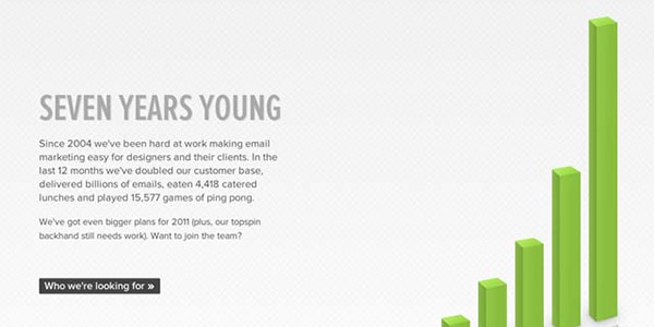
Although this is usually the case, utilizing the parallax scrolling effect doesn’t have to limit you to a fake 3D effect. It can also be used to have different icons, images or other elements moving around the page, growing and shrinking while you browse through the site.
When they see it for the first time, people use to think that the effect is nice. After they start getting a grip of it, they actually understand the parallax scrolling effect is much more than just “nice”.
With Postcards Email Builder you can create and edit email templates online without any coding skills! Includes more than 100 components to help you create custom emails templates faster than ever before.
Free Email BuilderFree Email TemplatesPerformance Issues
Although the effect looks brilliant, there are some downsides to it, such as the performance issues. Back when Nike created their parallax website, it was only possible to develop something like that through the usage of a JavaScript/jQuery, which pretty much made the webpage heavy and slow to load. The performance had to be overseen in order for the website to look good. This means that the “user experience” the website was built for vanished because of the slow loading time. This also proved to be the biggest issue with their web page.
This JavaScript performs heavily because it has to manipulate the position of all the elements throughout the page. While this doesn’t seem like such a big deal, it actually is. The JavaScript has to actually carry out calculations for every pixel of a website which is scrolled. Depending on how fast the user is scrolling, the calculation could even be carried out 100’s of times per each second. And keep in mind that each element on the page needs to be manipulated by the JavaScript in the same time as it carries out these tough calculations. No wonder the parallax effect was not only difficult to implement, but also difficult to load on slow internet connections.
Different developers do not recommend having more than two elements manipulated in the viewport at the same time. Testing on mid-level machines was crucial before releasing such a web page few years ago.
New-age technologies
Although the effect is not easy to do develop either, there are better solutions to it. Since the release of CSS3, creating a parallax scrolling effect got much easier.
The idea behind it is simple. You have all your content on the same page and move through the “sub-pages” with a CSS3 transition. It is basically the concept of the good old “anchor name” tag, only this time there is also a transition applied to it. A good example can be seen in the case below.

As you can notice, all the content is on the same page and moving from one “page” to another happens through a CSS3 transition. It is quite the same effect as the parallax, only infinite times easier for a browser to load.
But there are still some differences if those two effects are compared. It is quite impossible by my knowledge (or at least very difficult in case I missed something) to make elements on the same page move at different speeds while using only CSS3 transitions. This means the exact parallax effect can’t be copied only by CSS3 techniques.
With Startup App and Slides App you can build unlimited websites using the online website editor which includes ready-made designed and coded elements, templates and themes.
Try Startup App Try Slides AppOther ProductsAnd another downside of it is that CSS3 is not supported by all major browsers; at least not yet. This means that for a complete parallax scrolling website, using JavaScript is still the best – and only – solution.
JavaScripts for the effect
Scrolling Parallax jQuery Effect
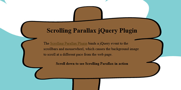
This is a parallax jQuery binding the effect to the scrollbars and mouse wheel. This allows the background image or any other element to scroll at a different rate than the web page, so you can easily create an illusion of depth.
Scrolldeck
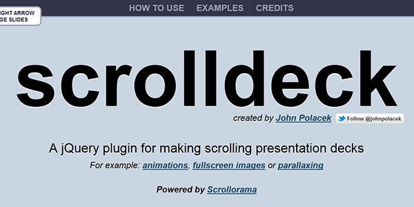
This plugin allows you to easily create scrolling presentations for web purposes using the parallax scrolling effect.
jQuery Scroll Path
This one is actually one of the best ones I could find. It helps you create the same parallax effect on different pre-set paths. Even if I don’t see it very useful in a design, it is most certainly very entertaining to play with.
Parallax Scrolling Tutorials
If you want to learn how to create the parallax scrolling effect yourself, then I gathered here some useful resources from the web.
Parallax Slider with jQuery
Building a Parallax Scrolling Story Framework

Parallax Animated Header Tutorial

Build a Parallax Scrolling Website Interface With jQuery and CSS
Bottom line
Although already quite popular, the parallax scrolling effect is not widely used on the web, probably because of two different reasons: it is difficult to develop from scratch and heavy to load by browsers. And if you go for a more simplified CSS3 version, the experience will not be the same anymore.
While many people praise the creativity of the ones who developed the JavaScript, there is still a lot of time until people will begin using it regularly, as right now it is simply not the perfect time to start featuring it. Even Nike, a company with unlimited amounts of financial resources, decided to go for something else after a period of time, which proves the fact that even if it looks good, it doesn’t necessarily mean it has to be used.
Don’t get me wrong. I am a huge fan of the parallax effect. I even tried to develop my own portfolio based on it. But once I realized it might not be the proper time for it, I’ve decided to drop it. But if you think you are ready to stun everybody with your version of the parallax scrolling website, I would be more than glad to hear about it.
What do you think about this stunning effect? Have you ever used it or planned to use it? Do you consider it is worth going through so many difficult developing stages in order to create such a website?
Examples of Parallax Scrolling in Web Design
Saucony Kinvara 3

Biamar

Whiteboard
Bomb Girls

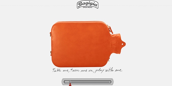
Discover Bagigia
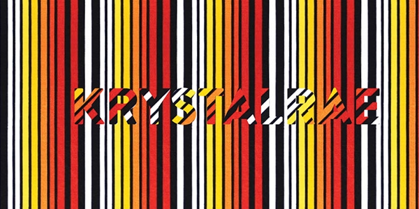
KRYSTALRAE
Anna Safroncik

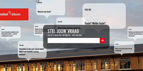
Netlash
Activate

VW
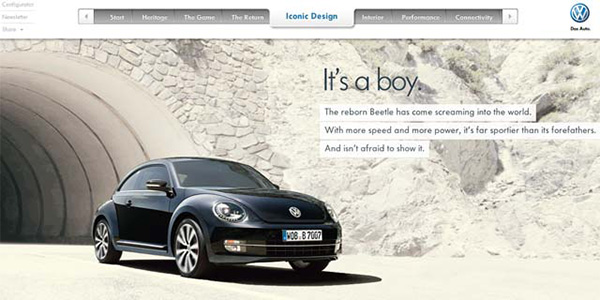
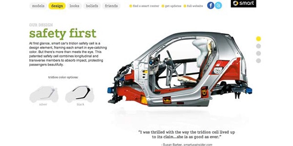
Smart
Laurentius
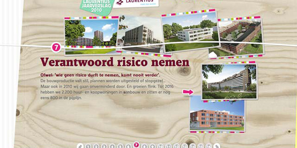
Artofflight

Nike

