Progress Step UI Design Patterns: Tips, Freebies & Code Snippets
Progress steps are great for user experience. You typically find these on signup pages and checkout forms where the user needs to enter data across multiple steps.
Breadcrumbs can also use this progress UI since they flow in a natural hierarchical order. But how can you design a progress bar structure that works for your site?
In the past, we covered progress bars and for this post, I’d like to cover progress steps with design ideas, free graphics, and some free plugins to help you get started.
Protip: Add Text & Labels
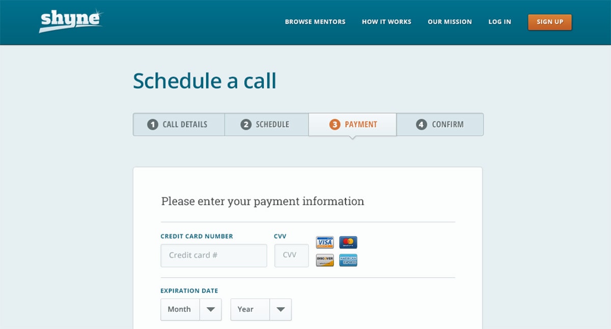
Whenever you design progress steps you always want labels. They’re crucial to defining the interface because users need to know where they are in a process.
The text can be bolded, uppercase, prominent or settled into the background. Just make sure you have some text carefully explaining each step along the way.
With Postcards Email Builder you can create and edit email templates online without any coding skills! Includes more than 100 components to help you create custom emails templates faster than ever before.
Free Email BuilderFree Email TemplatesThe labels can give the user a glimpse into what the whole process may require. This is especially useful for lengthy checkout pages where you wanna keep someone going through ‘till completion.
But there is no magic formula for the perfect label. I aim to keep mine clear, concise, and short(2-3 words max).
Do whatever works best for your site or mobile app. See how much room you have on the page and adjust your design for that.
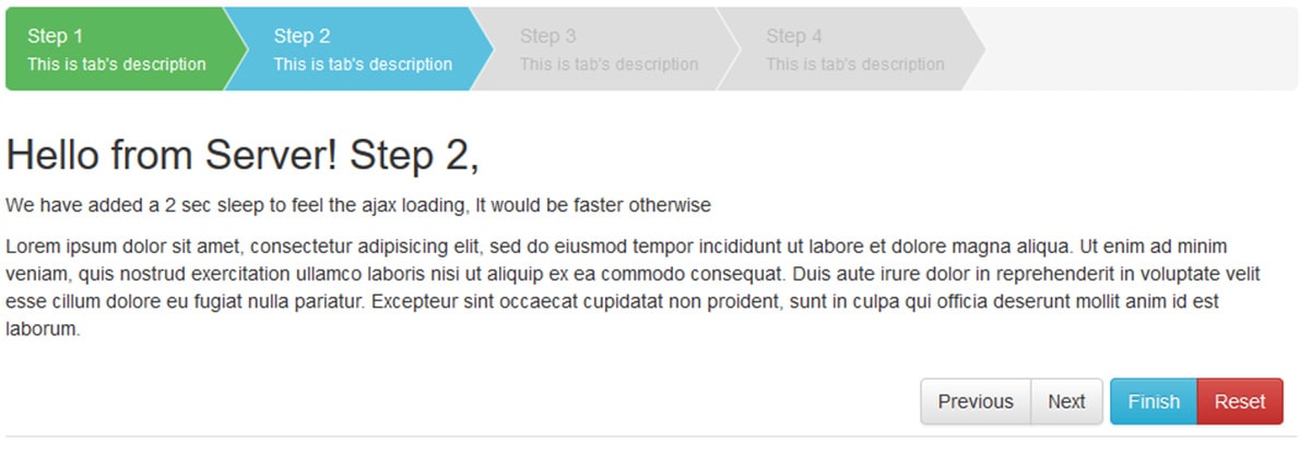
One thing I really like about the design above is the use of the callout arrow. This naturally grabs attention and tells the user exactly where they are in the process.
Icons = Visual Clarity
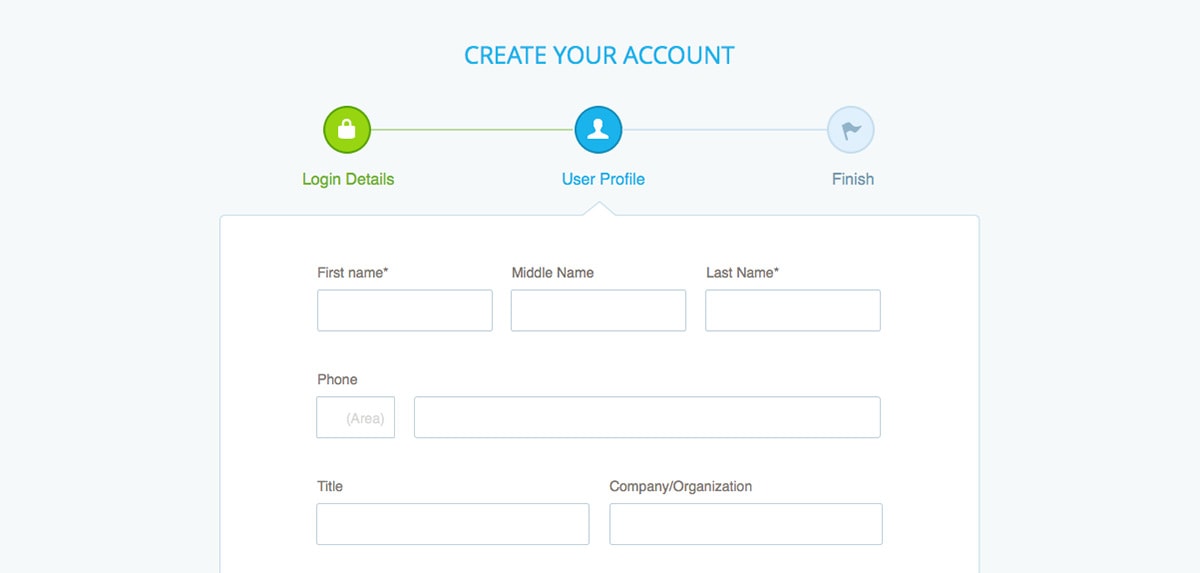
If you’ve got the space in your progress steps try adding some custom icons into the mix.
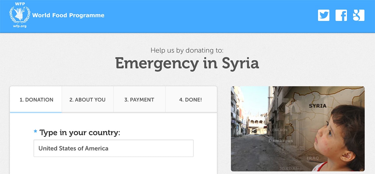
These can be in any style you like from detailed graphics to SVG line icons or anything in between. The goal here is clarity to help the user check at-a-glance where they are in the process.
With Pulsetic you’ll be instantly notified the moment your website, API, or server becomes unavailable. Monitor uptime from multiple global locations and respond to incidents before your users are affected.
Create beautiful status pages in minutes to keep customers informed during outages and build trust with transparent communication.
Start Monitoring for FreeTake this example from designer Tri Nguyen. It relies on custom icons to define the steps in the signup field with labels underneath.
As I mentioned earlier, the text is always good for clarification. But visuals help to sell ideas much faster. That’s why ideally you’d have both in your progress step UI assuming there’s room.
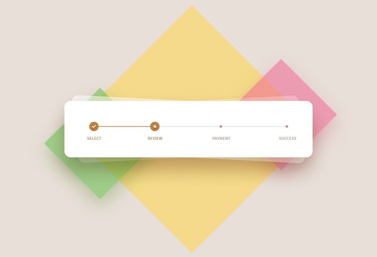
One graphic I like to add is the checkmark icon for completion. Once the user moves past a certain step it’s a good idea to add a checkmark to that part.
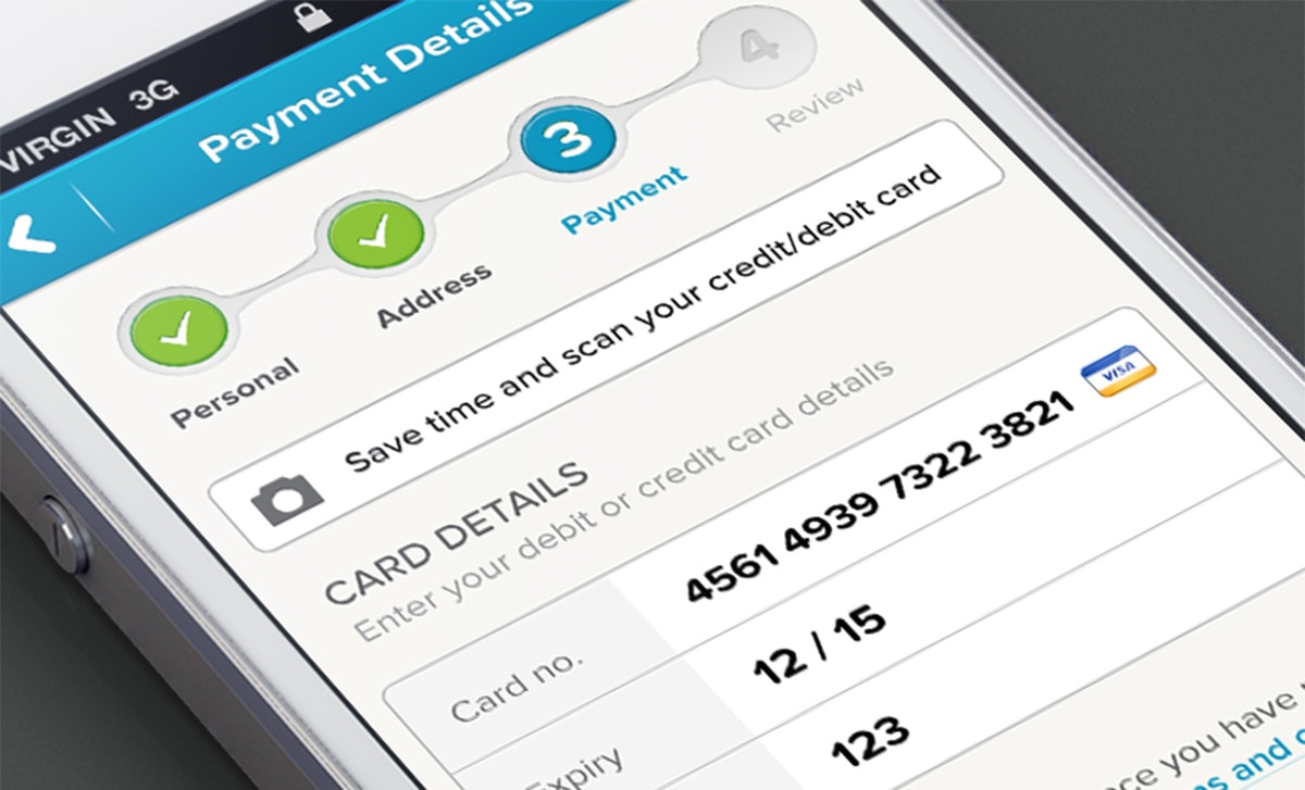
It’s just a visual cue to describe where the user currently resides in the overall flow.
Checkmarks aren’t the only icons that work here, but they are the clearest and simplest to use.
Keep Your Interface Consistent
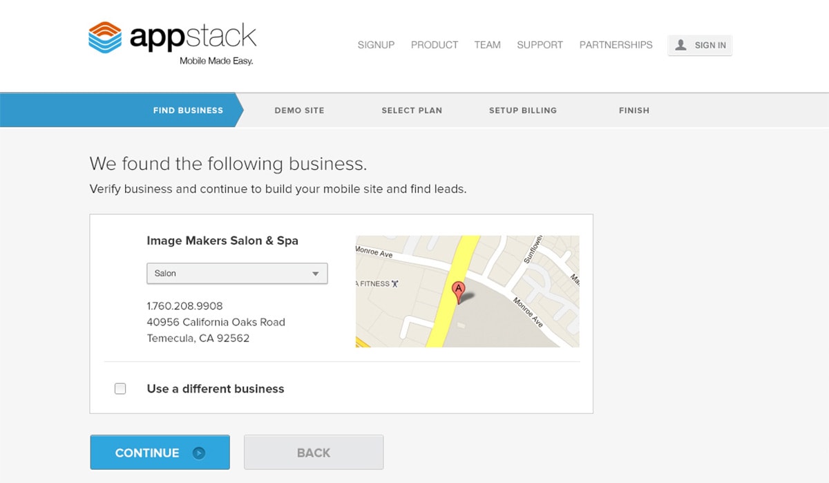
The goal of a progress step UI is to guide the user along a series of pages. You have to think of this as a navigation bar where it stays fixed in the same spot at all times.
Aim for consistency. You don’t need to worry so much about how much space you’re using or how prominently you’re displaying the labels.
Your first and primary goal is to design something that stays consistent and always remains in view. This way the user knows exactly where to glance if they want more information about their progress so far.
And if you design for consistency make sure you keep the same aesthetics along the way.
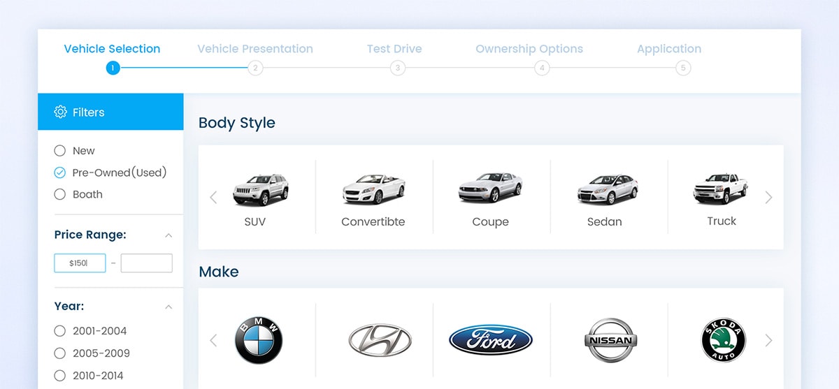
For example, this design by Moinul Ahsan uses a lighter text color for the “future” steps. As the user moves through the form each field will darken and remain consistent page after page.
You can achieve this effect many different ways but the goal is always the same: give enough info to help the user determine how much they’ve completed so far & how much longer before they’re done.
Design Freebies
There’s no reason to start a design from scratch when you have free assets to work with.
Freebies are a designer’s best friend and especially so with custom UIs. Take a look at these free progress step PSDs and see if any can work in your mockups.
A fantastic design by Tahir Yousaf, this keeps the progress bar short and simple.
Basic icons with clear text litter the bar. Also notice the check mark on the completed step, a great indicator of progress at a glance.
Here’s one that’s pretty unique since it focuses on a product checkout. But it can work well for any e-commerce checkout page or even a mobile app UI.
The free PSD is attached to the Dribbble shot and it should be accessible even without an account.
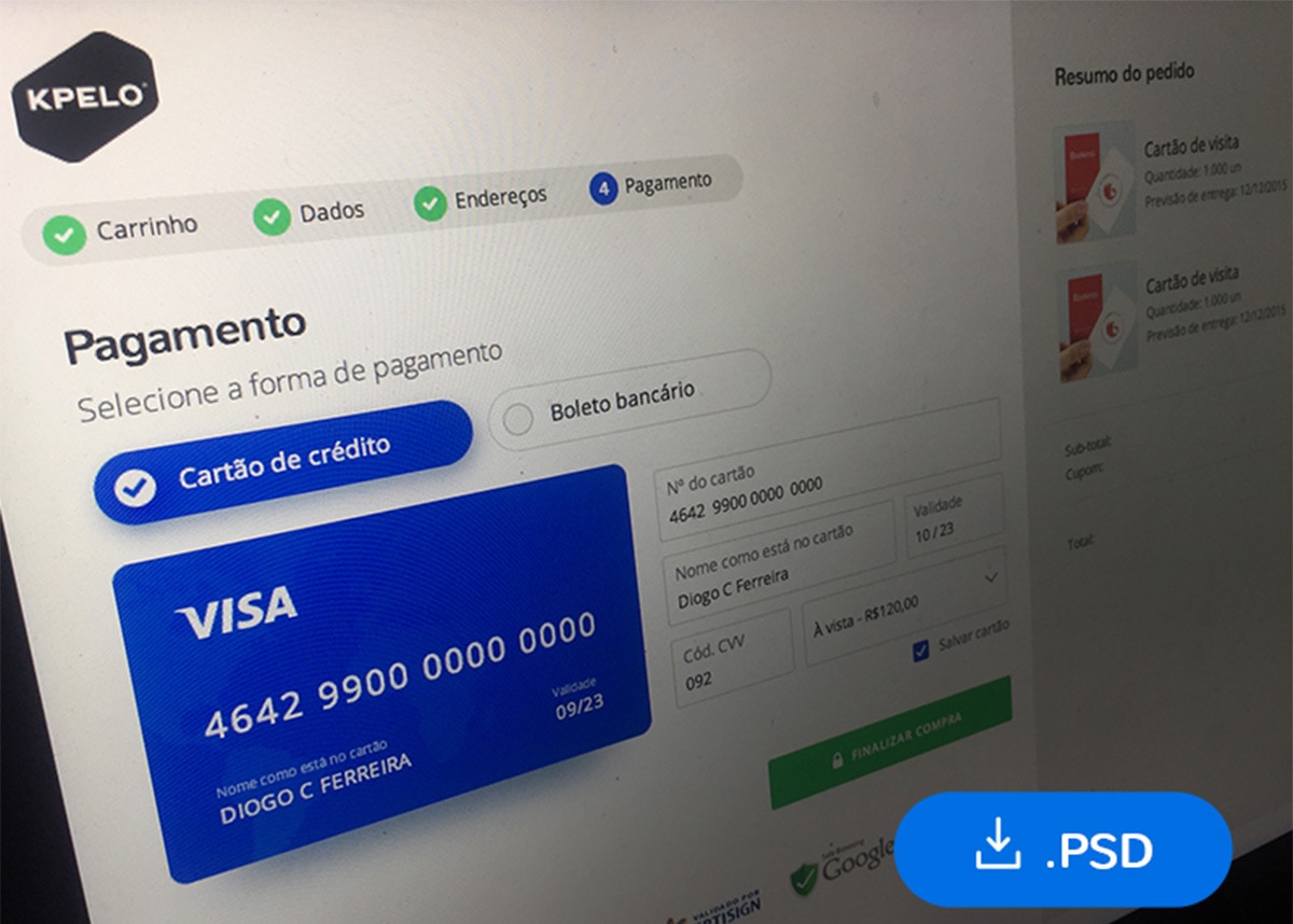
Sometimes you’ll just want a simple checkout page with very simple checkout steps.
That’s exactly what you get in this freebie designed by Diogo Kpelo. It comes as a PSD and offers a pragmatic UI to design progress steps for an online shop.
Earlier I mentioned line icons because they’re so easy to fit into any site. With this freebie you get a few line icons mixed into a fantastic checkout page.
The forms are super easy to redesign and you can even swap the line icons to suit whatever you need. A great starting template for any progress step UI.
Code Snippets & Plugins
Free graphics are awesome but they’re just the first stage. Once you create a mockup you’ll want to code that into a working webpage.
Some designers prefer to start with code, others like to work with the design first and build on top of that. These plugins can save you a bunch of time once you get to the coding phase.
jQuery Steps
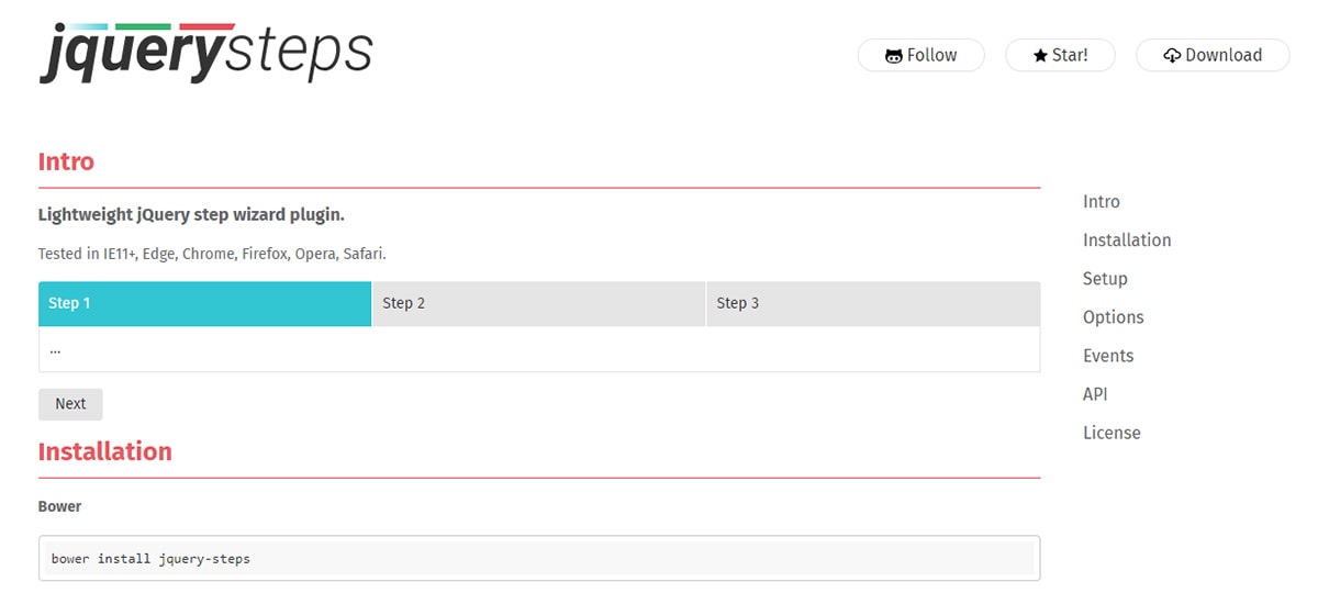
The newer jQuery Steps plugin was first released in 2017 and has since gained a huge following.
It’s one of the few progress step plugins out there and definitely one of the best. Installation is a breeze and it’s by far one of the simplest ways to get a progress bar onto any website.
SmartWizard
If you need something a little more technical then take a look at the SmartWizard plugin. This was designed for jQuery + Bootstrap 4 so it only works on the BS framework.
Anyone using the BS4 framework can save a bunch of time with SmartWizard. Of course, it won’t be useful to everyone but have a look at the main page if you’re interested.
Progress Step
One other plugin I wanna mention is progressStep.js. It’s built on top of jQuery and supports a bunch of killer features.
But this does take a bit of work to customize since it comes with a lot of options.
Everything you need can be found on the main GitHub page so have a look there and try it out if you’re curious.
Now if you don’t want a full plugin and would rather use snippets then you’ll have to do some digging. Thankfully there’s a bunch of little snippets out there and I’ve listed a few of my personal faves below:
- Progress Wizard
- Multi-Step Form
- Progress Steps in Bootstrap
If you do a search in CodePen you’ll find a bunch more too.
Wrapping Up
The progress step UI is a fast-growing trend with a focus on usability first. By simplifying the interface and clarifying the whole checkout/signup process you can relieve anxiety and encourage users to complete your whole form.
I hope these examples & resources give you enough to get started building your own sweet progress UI bar.
And feel free to search around the web to gather more ideas cause there’s a lot out there.
