Compact and Elegant Side Menus in Website Designs
Last summer we published the article dedicated to use of vivid vertical navigations in mobile apps, and surprise-surprise, during this period of time this solution has managed to migrate into website design, carving out its own distinctive niche. Nowadays you can stumble upon various types of websites that has adopted this fresh approach. So it’s not surprising, that numerous designers concur that the slide out menu is a brand new trend of 2014. And today we are going to look at it more closely by exploring its different implementations.
Actually, side menus have a quite long history. Briefly, at first they have appeared in apps, then on popular social media websites such as Facebook or Twitter, after that in mobile app interfaces, and today on regular websites. They have become really handy solutions for modern long one-page and parallax-based websites. Different creative online portfolios and photography templates are also obsessed with this approach. Versatility, density and convenience inherent to side menus effectively contribute to its popularity.
So, let’s go through our list of impressive examples of using compact and elegant side menus in website design.
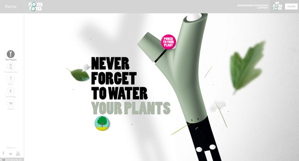
Parrot has a beautiful organic vibe that is laconically supported by light color palette. Since the website is built upon vertical parallax, the developer wisely leverages a static side menu that serves as a perfect match for this design.
Michael Ngo has a clean and modest online portfolio that is also based on a light coloring. The interface conveys a feeling of purity and openness where the side menu looks extremely appropriate and matchless even despite of having a quite plain appearance.
With Postcards Email Builder you can create and edit email templates online without any coding skills! Includes more than 100 components to help you create custom emails templates faster than ever before.
Free Email BuilderFree Email Templates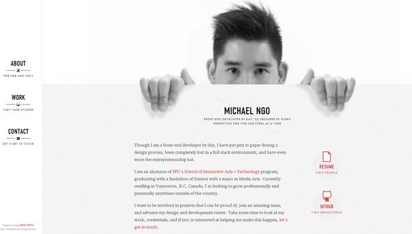
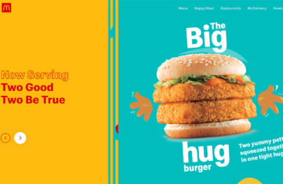
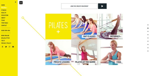
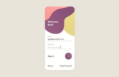
Create Pilates – The website strongly relies on its garish color scheme that skillfully utilizes bright yellow hue. It goes well with a prime white color and is aimed to set a positive atmosphere. The huge full-height side menu on the left nicely interacts with the rest design, immediately drawing attention to navigation.
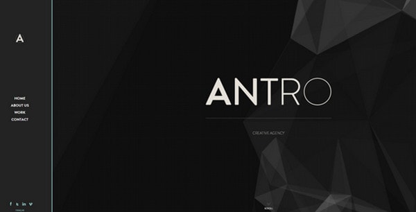
Antro – Unlike several previous examples, this website is defined by enigmatic dark color scheme that effectively collaborates with a white casual type and is aimed to produce a strong impression. The side menu looks roomy and elegant thanks to tiny font and lack of unnecessary content.
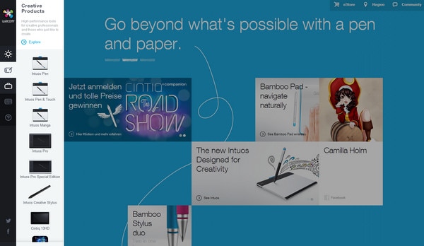
Wacom has a double side menu that reveals its submenus via another vertical panel. The menu makes use of a traditional black and white combo and regular intelligible icons that altogether echoes perfectly well with a main bright layout with a lovely Metro 8 vibe.
Wanda Print’s official website also employs a dual menu, which this time takes up a half of layout. It looks quite subtle and delicate due to lots of free space, neat typography and optimal contrast between background and foreground.
With Pulsetic you’ll be instantly notified the moment your website, API, or server becomes unavailable. Monitor uptime from multiple global locations and respond to incidents before your users are affected.
Create beautiful status pages in minutes to keep customers informed during outages and build trust with transparent communication.
Start Monitoring for Free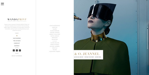
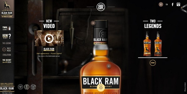
Black Ram Whisky has definitely a distinctive design that immediately gets the users’ attention. It easily impresses on visitors a sense of refinement through its offbeat, a bit enigmatic appearance. The typography-based, quite narrow side menu serves as a perfect complement to the design.
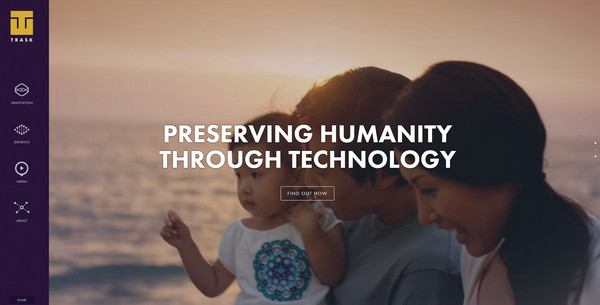
Trask Industries – The website is intended to create a strong visual impact by filling the landing page with various huge photo-based links. The modest small side menu with a lovely set of animated glyphs and soft coloring ably intensifies the whole composition.
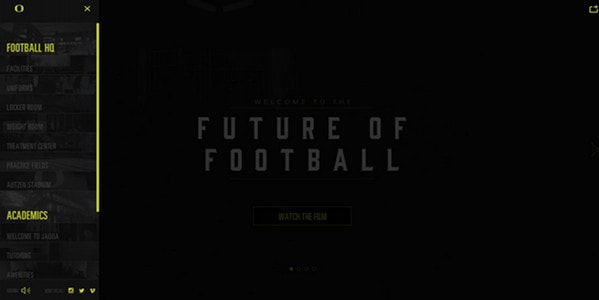
Welcome to the future of football – This is a complex interactive website that welcomes visitors with a sophisticated dark front page. The designer skillfully employs yellow as a secondary color in order to capably put some emphases. Although the side menu looks a bit illegibly and blends with an environment, it is still managed to dish up the navigation quite well.
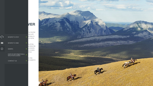
Travel Alberta – The designer also takes on a fresh approach of double menu that is able to compactly arrange lots of helpful data. The menu is based on a slide out technique that pleasantly reveals all the inner structure. The black and white solid color backdrops effectively offset the text of the main picturesque background.
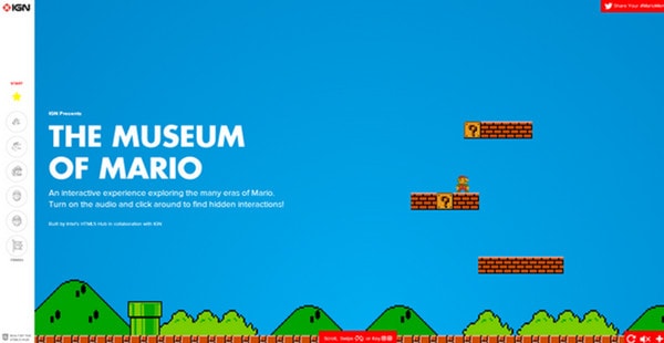
Mario IGN – This interactive website serves as a tribute to a classy old-school game “Mario”. The main layout is divided into 2 parts. The first one is reserved for ultra-narrow menu and the second one is aimed to displaying famous scenes. The side menu has a clean background and recognizable characters as navigation items.
Martina Sperl has a photo-based landing page that utilizes a vertical scrolling technique for showcasing its artworks. In this case, the clean neat side menu on a right side plays a functional role making the design user-friendly and handy to explore.
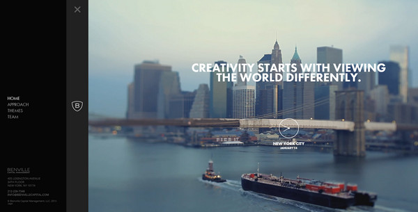
Bienville Capital Management – The website employs a slide out menu that contrasts starkly with a main interactive background. The designer has wisely chosen traditional color combination that is capable of ably diverting attention from real-time videos.
CFYE Magazine – There are lots of pink and white that definitely foster positive atmosphere. The tile style layout of side menu naturally echoes with a main layout. The main navigation is well-structured and includes all required elements.
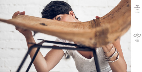
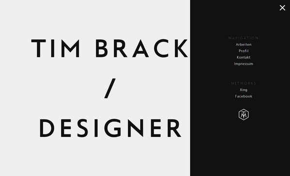
Tim Brack has a clean, open and polished online portfolio that focuses users’ attention on owner’s masterpieces. The huge rough wide block with navigation that showily slides out from a right side effectively contributes to the theme.
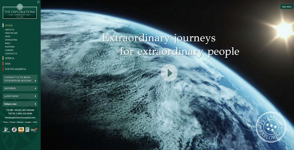
The Explorations Company – Here, the side menu looks a bit primitively, however this is really sufficient for fulfilling its purposes. It displays lots of necessary information without which the smooth exploration of a website will be impossible, and since the designer needs to showcase a whole bunch of data, he has quite professionally solved this issue.
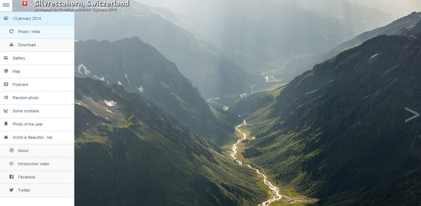
World is beautiful – The designer makes use of a side menu that leverages a concept of a drop-down layout. The solution presents all navigation at a glance. The light coloring of the sidebar laconically connects menu with the rest graphics and design.
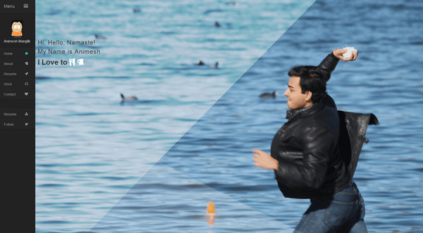
Animesh Manglik has also preferred a trendy approach of a slide out menu. As a result, its online portfolio got an ideal navigation that pleasantly accompanies every section.
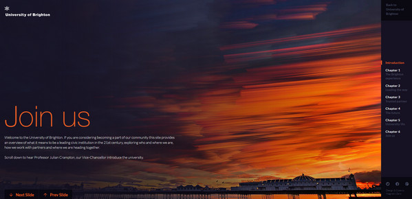
University of Brighton quite creatively introduces its establishment by means of transforming the website into enthralling interactive book with chapters and contents. The latter is represented as a static side menu, which plays a leading role for regular users.
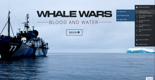
Whale Wars by Animal Planet – The full screen image slider is a centerpiece of its front page, so it’s not surprising that the designer has decided to make the navigation quite modest, plain and almost imperceptible. Menu slides out and expands after clicking on a special icon.
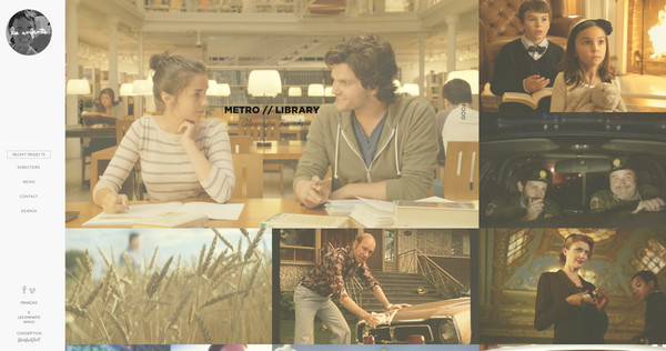
Les Enfants – The website utilizes a grid style layout in order to display various scenes from a movie. The elegant light side menu wonderfully matches the tone of a project.
Conclusion
They can be static, animated, expandable, double or even hidden behind a simple glyph; there are various realizations of side menus. Like any basic navigation they also play a crucial role in a website by supplying users with an optimal way of exploring sections and subpages without diverting attention from chief visual aspects.
What do you think about this new trend in website design? Do you like it or not? Why?

