10 Original Ways to Slide Out a Menu in Web Design
The slide out menu came to life right with as a popular option for mobile applications. Not only was it a nifty solution to gracefully flow the main menu into the small interface, but it was the only valid, rational and practical one. It covered all the navigational links and did not overwhelm visitors nor ruin the aesthetics. It was a clever idea. It was also as a prelude to another colossal trend – the use of hamburger menu buttons.
This inseparable tandem of the slide out menu and hamburger button was one of those rare cases when the solution that was initially designed for small-sized interfaces was successfully adapted to bigger ones. That was quite unexpected.
Since having at our disposal more than 1024 pixels from side to side, there was no need to make such sacrifices. The classic, time-tested top nav bar that was elegantly stretched across the entire width of the screen did its job perfectly well. There was no evident urge to hide navigation. At first, this trend seemed to be an extravagance that let the website easily stand out. However, the situation changed when making a first impression came to the forefront, becoming a major obsession. Hero areas, thrilling video backgrounds, high-end animations, spectacular splash screens and VR require undivided attention; so slide out menus transformed into a valid alternative to traditional navs.
They have stayed relevant. What’s more, as is often the case, they’ve gotten a “facelift,” becoming more sophisticated and enthralling. Let’s explore 10 original ways of enriching a slide out menu to perfectly fit them into our colorful and interactive web reality.
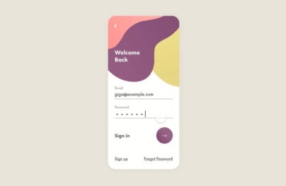
Stay Static, Yet Fun
No one pushes you to make slide out menu as interactive as the entire website. It can be a sort of an island of static serenity with some small alluring stylistic features, like Save Smart.
Here, the menu goes with the central retro-inspired aesthetics. It is static, but the whimsical font, vibrant coloring and few tiny effects give the solution an engaging and playful note.
With Postcards Email Builder you can create and edit email templates online without any coding skills! Includes more than 100 components to help you create custom emails templates faster than ever before.
Free Email BuilderFree Email Templates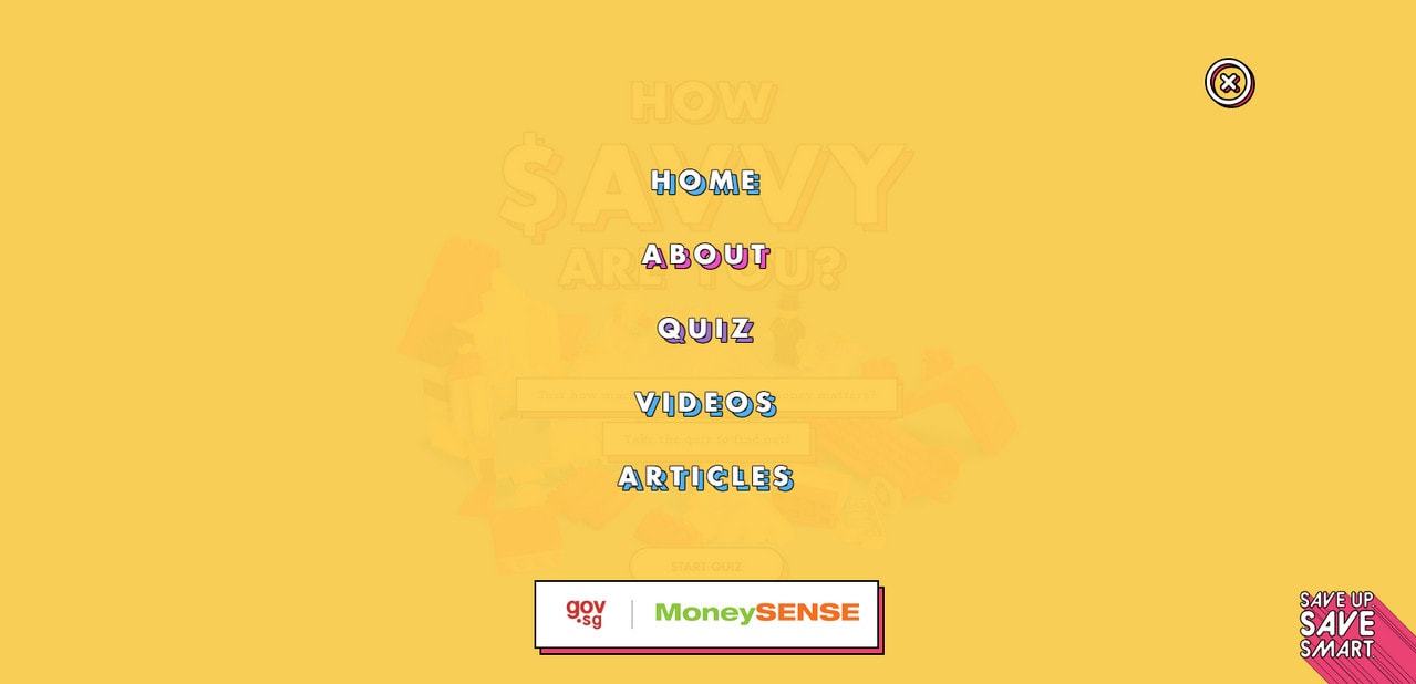
Stay Static, Yet Fashionable
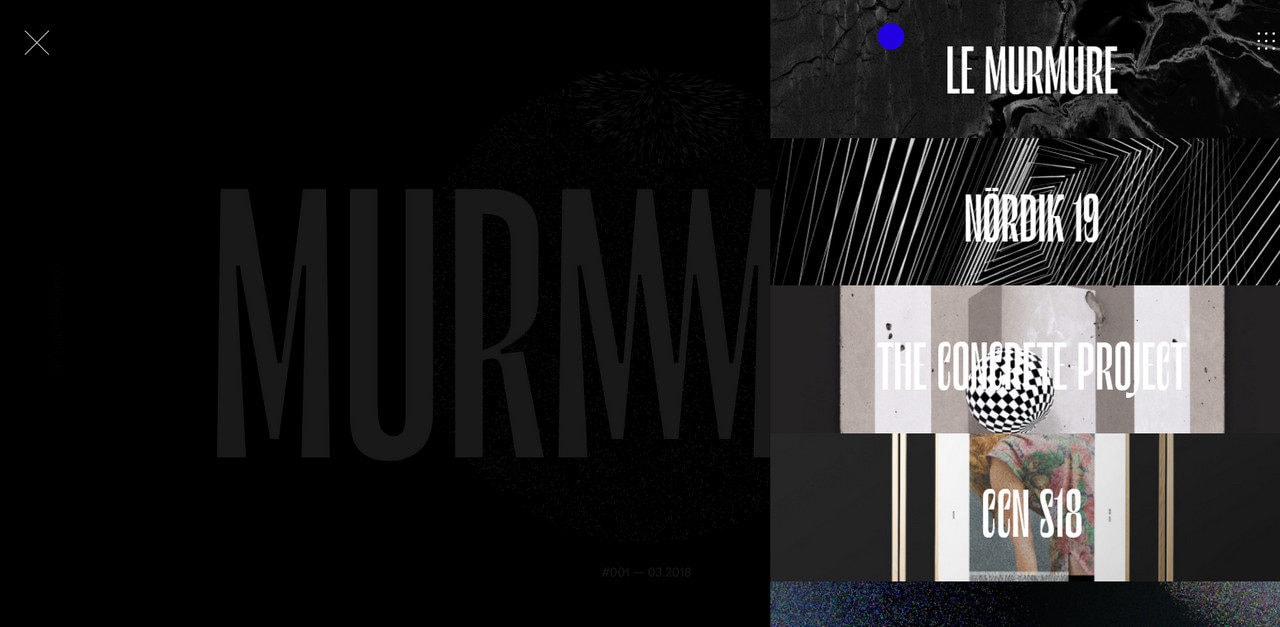
If the playful atmosphere is not an option, then go for a stylish, more fashionable look. In that case, relatively big images stacked, dark coloring and elegant fonts are your allies. Murmure gave us this solution. The team deploys a slide out menu as a quick exhibition of prominent portfolio works that — thanks to a chic atmosphere — looks classy and nifty.
Stay Static, Yet Big
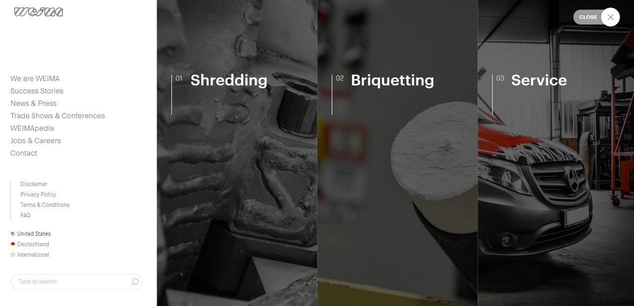
For those who think you can never have enough of visual content, Weima’s slide out menu is a perfect example. It bets on a visual data yet saves room for some traditional text content. The section is divided into four even columns. The first is clean, neat and plain. Links are carefully arranged and easily reached.
The other three are based on full-height image backdrops that provide extra insights into the company’s sphere of expertise. The solution is simple yet powerful.
Add An Enticing Accompanying Effect
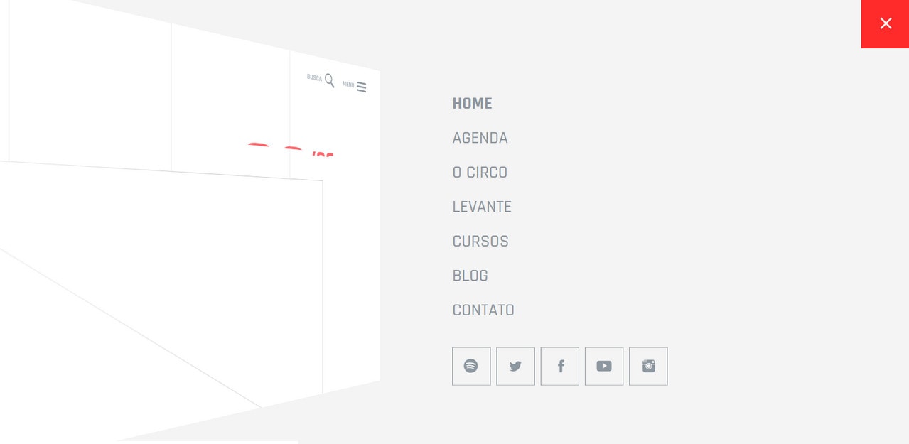
The team behind Circo Voador keeps things extremely simple, and still the slide out menu strikes the eye. They chose a clean and pure display for the navigation but skillfully spiced it up with a lovely accompanying effect. As a result, the menu brings about a subtle, refined impression with a businesslike vibe.
Take Up the Whole Space
One of the biggest advantages of using a slide out menu is that you get an extra “screen” at your disposal. Make the most out of it as Power Digital Marketing did. They entice people to act with a clever combination of standard textual navigation and crafty visual background.
Opting for an underlying grid structure, they embrace all navigation links including the submenus and support each vital section with a complementary background. Again, the solution is simple yet effective.
Use Strong Accompanying Materials
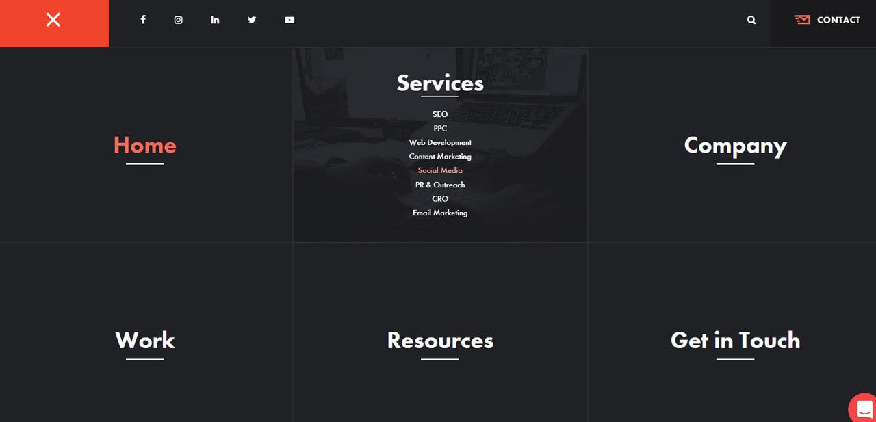
A misconception is that the slide out menu is only for a small amount of information; in fact, you are limited just by your imagination. You can include as many links and visual materials as you want, the key feature lies in the quality of accompanying data. Consider MEAT Agency. At first glance, the menu does not differ from the others; however, give it a try. There are five distinctive menu items.
Each one has additional information. For example, the “contact us” link has a map; “portfolio” features several works, and “services” reveals two agency main directions.
With Pulsetic you’ll be instantly notified the moment your website, API, or server becomes unavailable. Monitor uptime from multiple global locations and respond to incidents before your users are affected.
Create beautiful status pages in minutes to keep customers informed during outages and build trust with transparent communication.
Start Monitoring for Free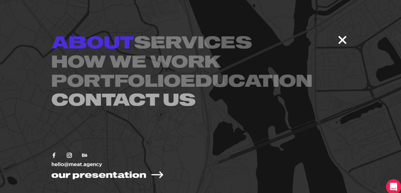
Play With Visual Content
To make the previous approach even more alluring and preserve cleanliness and organization, you can play with visual content and enrich it with trendy tricks. Consider Rouge on Blue. The team enhanced the whole look with gorgeous coloring, gradients and elegant typography. The menu is informative and impressive.
Use an Animated Background
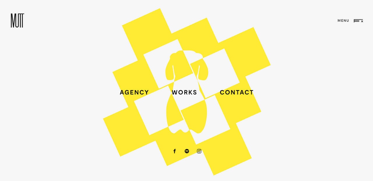
An animated background is an ideal variant for minimal navigation menus like Mutt Agency. Here, they have only three common links: agency, works and contact. Since the website bets on interactivity and dynamic content, predictably the slide out menu follows the same theme and echoes the general aesthetics by using a range of eccentric abstract animations on the background. As a result, users get a coherent user experience throughout the entire website.
Make the Slide Out Panel a Second Hero Area
Prolong the effect produced by the hero area by doubling it using the slide out menu. Consider DJNR Interactive as a representative example. Here, the navigation looks like a real hero area that nicely echoes with the home screen.
It has a fantastic background infused with outstanding particle animation, a stylish menu with vertical rhythm and a marvelous high-tech vibe.

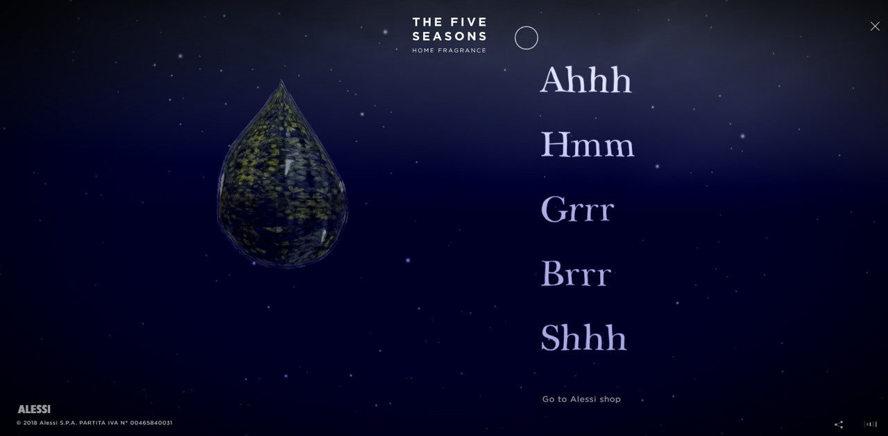
Continue your enthralling experience even in the smallest corners of the interface. While in some cases navigation is an island of serenity, there are some situations when it can be another page of a book your users read. It can be a perfect linkage between various chapters of a storytelling experience.
Take a look at The Five Seasons. The slide out menu is an intermediate tool that provides a fantastic gateway for other sections thereby making the experience consistent and enduring.
Wrap Up
If you think that slide-out menus are boring, then you are wrong. Consider them as a sterling playground for experimentation and showing off your creativity.
Use a slide-out to prolong and secure the impression that the home screen produces by stirring up interest even in such a small part of a website as the menu panel.
You might also want to read:

