Ripped in Half: Websites with 2-Column Layouts
It is quite difficult to break away from a standard grid structure, with a system of well-organized columns and rows placed at regular intervals to provide a stable and responsive framework for multimedia and content.
Sometimes the foundation is entirely invisible; sometimes it is shown in all its glory, without cuts. However, some situations can benefit from a grid’s boxy and sharp feeling such as magazines or blogs, but others can find this structure to be boring.
In order to avoid such outcome, designers try to come up with unique solutions, such as splitting websites into two equal parts that look refreshing and intriguing. What’s more, being charged with a modular scrolling or fantastic illustrations, the two-column layout can work for various projects, help them to avoid sliding into visual chaos and provide a charming twist. The potential is vast.
Today, we are going to showcase website designs that are ripped in half.
Two-Column Website Examples
Masi Tupungato

The front page balances plenty of lush pictures. Using the entire browser screen and being well-organized through a robust layout, image-based navigation does not overwhelm users, naturally conveys the beauty of the place and seizes attention.
With Postcards Email Builder you can create and edit email templates online without any coding skills! Includes more than 100 components to help you create custom emails templates faster than ever before.
Free Email BuilderFree Email TemplatesStudio Meta
Studio Meta hits the audience right away by getting straight to the point. The website welcomes users with a gallery of work done presented in a well-organized manner that looks consistent across various devices. The two-column body allows neatly demonstrating portfolio pieces without overpowering visitors.
Portfolio of Cihat Turhan
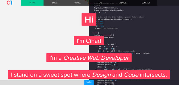
Cihat Turhan portfolio is based on an unusual background that symbolizes an intersection of design and code. This is exactly what is needed to naturally bolster the tagline, enhance the theme and add to the front page a nice zest. The only drawback is that the website experiences some problems in displaying in tablets and mobile devices.
Wreck’s Valentines
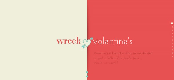
Since Valentine’s Day involves two people, it is not surprising that the landing page of a website dedicated to this charming holiday is broken into two equal parts. While the left block remains stationary, the right is used for moving through the project. For better user experience, the latter is driven by a standard scrolling technique.
Formlets
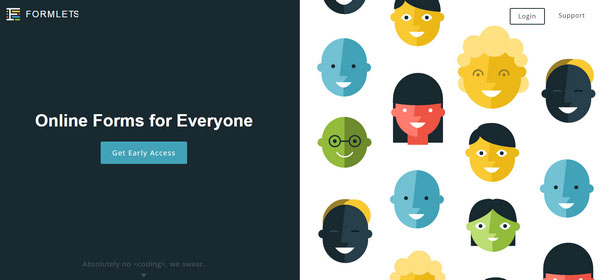
The home page of Formlets, a vibrant fully illustrated website that uses flat style to its advantage, is carefully split into halves. The team unobtrusively directs attention toward the call-to-action button, and at the same time establishes a friendly atmosphere with a funny, colorful backdrop on the right.
With Pulsetic you’ll be instantly notified the moment your website, API, or server becomes unavailable. Monitor uptime from multiple global locations and respond to incidents before your users are affected.
Create beautiful status pages in minutes to keep customers informed during outages and build trust with transparent communication.
Start Monitoring for FreeStolen Girlfriends Club
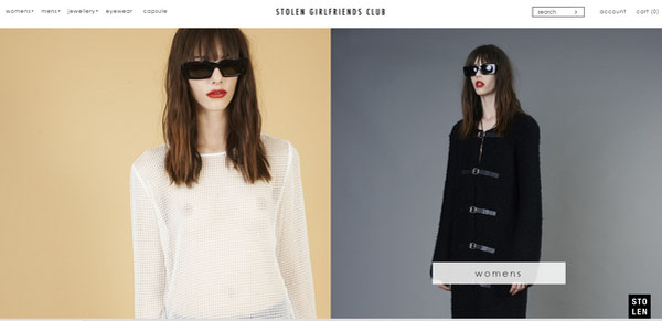
Stolen Girlfriends Club skillfully employs the two-column body in order to take the chief navigation throughout the e-store to the next level. As a result, it is managed to reveal all main links to the inner structure, vividly demonstrate the new collection and boost informativeness and appeal of each link.
World of Warships
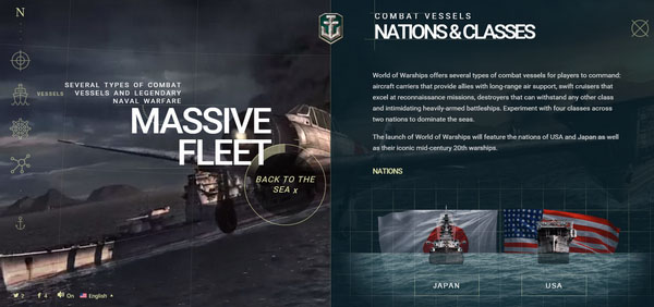
Here a two-column layout for inner pages, which balances visuals and copy, is a smart solution. Although there is plenty to admire, the well-balanced structure gives the main navigation a dominant position and saves users from getting lost.
Nicolas Tarier
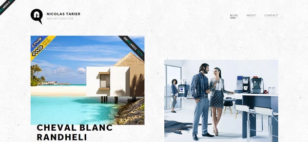
Nicolas Tarier has a clean and minimal online portfolio that instantly reflects his personality. The front page is populated with works that are dished out in a pleasant and attractive manner. Thanks to a slightly unbalanced layout, the page gets a lovely dynamic feeling and easily maintains focus on key elements.
Spotify Valentines
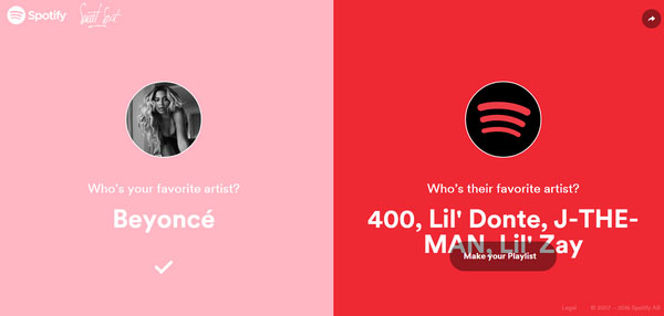
Even some massive portals are powerless to resist the attraction of Valentine’s Day. Thus, Spotify offers the online audience a small yet captivating quiz. Using a corresponding color palette that instantly sets the proper mood, the website has been ripped in half in order to vividly display your choice and choice of your beloved artist.
Sparked
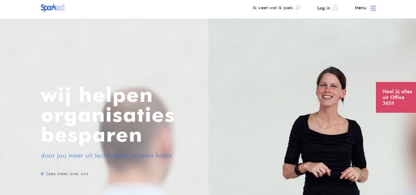
Sparked includes plenty of images that are neatly packed into a well-organized grid style layout. As a result, the home page looks neat and informative. The “Welcome” section is divided into two parts in order to effectively highlight important features.
Project 360
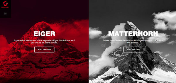
Project 360 utilizes a two-column body supported by a color differentiation in order to clearly demonstrate two possible options. Since the website is based on a series of spectacular images that create the overall aesthetics, such solution was quite reasonable.
Elite Model Agency

The official website of Elite Model Agency has a pretty simple landing page that features a straightforward navigation. Although everything is quite primitive, yet gorgeous thanks to professionally-made photos, monochromatic coloring and lopsided two-column body, the page has an appealing and exquisite appearance.
Taphome
Taphome splits the “service” section into two parts in order to reveal its potential through balanced tandem of data blocks and complementary images. Moreover, the subpage looks excellent on both widescreens and small tablets.
Brandts
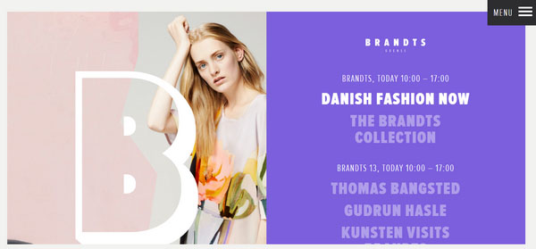
Brandts has ripped the home page in half to seize an opportunity to clearly show a series of fantastic images, and at the same time, keep focus on the vital things placed on a static right side. What’s more, the landing page features only a two-column body and a standard footer thereby covering only necessary information.
Pauw

While the landing page of Pauw fits the minimalist design that does not miss a chance to shed the light on items from a brand-new collection, the rest of the layout opt in favor of more traditional grid structure that harmonizes a ton of spectacular visuals. Although the version for smaller screens (including tablets, phablets and phones) features a basic modular solution, the version for desktops is strictly based on a two-column body.
Nightcal
In order to not bombard the online audience with plenty of data at once, the online portfolio of Nightcal is ripped in half. In such a way, the website displays content in non-intrusive manner and shows the staff without overwhelming users.
Nicolas Bussiere
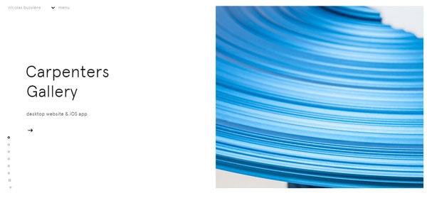
Much like the previous example, the home page is broken so that the left side remains steady in order to present data, and the right is used as a vertical slider that demonstrates corresponding images. The website is organized to naturally direct users toward information.
Blondy

The website creates order out of chaos. By successfully adopted the solution of splitting the home page, the designer provides a clean and neat appearance that does not overpower users with multimedia and naturally highlights important things.
Eurovision

Although vertical division into two equal parts is used only on the landing page and only in demonstration purposes, it clearly shows a startling contrast between artists that took part in the competition, making the project extremely intriguing.
So Creative
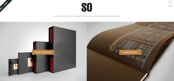
Here ripping the page in half was entirely predictable. The two-column layout used to show off portfolio pieces allows concentrating the whole attention on images and easily distinguishing them one from another.
Conclusion
It is vital to keep everything organized and visually appealing. Although a grid structure is the best choice it can sometimes become slightly boring. Full-screen, two-column layouts that are used on absolutely different projects are quite another story. They look like a fresh and add zest to UI.

