How to Conduct a Usability Heuristic Evaluation
User experience works best when it’s incorporated into every stage of product development, starting from idea to development and testing. But usually things don’t happen that way and user experience specialists have to face the challenge of optimizing the existing product to become what we call “user friendly.” Well, better late than never. UX optimization of an established website also has its pros and cons. You have more actual user data and statistics to build the user research on, but on the other hand there will certainly be some resistance to change, especially when you get to “kill their darlings.”
As a user experience specialist you are free to choose the method of research and even go beyond traditional tools, but today I’d like to go back to the basics and talk about heuristic evaluation.

What is Heuristic Evaluation?
“Heuristic evaluation involves having a small set of evaluators examine the interface and judge its compliance with recognized usability principles (the “heuristics”).” — Jakob Nielsen
In other words, heuristic evaluation is a process where evaluators, aka user experience specialists, go through the interface of a website, perform various tasks in order to identify usability issues that need to be fixed for a smoother user experience.
According to one of the founders of user experience discipline, Jakob Nielsen, heuristic evaluation is most effective when a number of evaluators inspect the interface independently and then summarize their findings. The reason is that the more UX specialist are involved, the more usability issues may be uncovered.
With Postcards Email Builder you can create and edit email templates online without any coding skills! Includes more than 100 components to help you create custom emails templates faster than ever before.
Free Email BuilderFree Email TemplatesThis is surely true, but what I think is that a single UX expert is capable of identifying the most crucial usability problems and if you’re low on budget, this might be a compelling option.
Heuristic evaluation as a user experience research method has its advantages and disadvantages.
- It’s relatively fast and easy, as compared to other UX research methods. It gives a quick overview of the website usability and highlights the main issues that may be hurting the UX.
- Heuristic evaluation is efficient in terms of the value it provides and the resources it requires. It is more affordable than some other UX research methods (like eye tracking studies, large scale user interviews, etc).
- Since heuristic evaluation doesn’t involve user testing and user behavior analysis, it lacks “proof” and may sometimes feel rather subjective.
- It is quite difficult to find and hire an experienced UX specialist, who possesses enough skills and expertise to conduct the evaluation.
Heuristic Evaluation Step-by-Step
1. Define the scope
Heuristic evaluation, like any other UX research, has some kind of goal which needs to be clearly defined and stated to the evaluators. You need to decide what exactly needs to be inspected. Is it the whole website or just the sign up process? You could identify a set of tasks that evaluators need to perform to uncover usability issues. Each of the evaluators need to understand the goal of the project and desired deliverables to avoid any miscommunication.
2. Know the users
Heuristic evaluation is quite different from user testing, but it has to involve user data. Here’s how. When evaluators inspect the interface they must adopt the same point of view and goals of the intended user. It is crucial to have a clear understanding of the target audience and their needs, so if you have previously developed user personas they would come in handy. If not, you need to do some basic user research to know who is using your product and why. Otherwise the usability heuristic evaluation will lack user focus and be less effective.

3. Decide on the set of usability heuristics
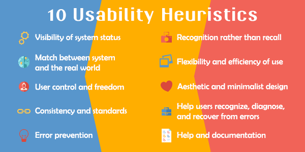
Usability heuristics are basically well-known usability principles that may be applied to any website or other digital interface. These principles are defined by usability experts but are not really mandatory. There is no rule of thumb which usability heuristics to use in an evaluation, however, there is a generally acknowledged set of heuristics introduced by Jakob Nielsen back in 1995 that are still valid and applicable.
- Visibility of system status. Users should always feel in control of the situation and be informed of what is going on. E.g. is the page still loading or it’s done?
- Match between system and the real world. Every element of the interface should be consistent with user expectations and intuitive behavior. E.g. an envelope icon shouldn’t stand for add-to-bag action.
- User control and freedom. Make your user feel at ease and confident by providing “emergency exits” and alternative routes.
- Consistency and standards. Be consistent in everything (design elements, microcopy, etc). Make sure the same button doesn’t perform different actions.
- Error prevention. Do your best to keep users from making a mistake. Eliminate any interface element that may cause confusion and lead to an error.
- Recognition rather than recall. Never rely on user’s memory.
- Flexibility and efficiency of use. The interface must be easy to navigate and shouldn’t require too much effort on user’s side.
- Aesthetic and minimalist design. Have less clutter and more focus on the content.
- Help users recognize, diagnose, and recover from errors. Explain the error in a friendly voice and suggest further actions to recover from the error. Never let your user feel frustrated.
- Help and documentation. Make sure to have all important information and FAQ in place.

4. Evaluate the experience and identify usability issues
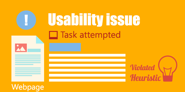
Evaluators go through the interface and perform predefined tasks independently. When they come across a usability issue, they record it on a form along with the task attempted, the page on which they’ve encountered the problem and the heuristic that is violated. E.g. a sign-up form requiring a password submission doesn’t clearly state which symbols cannot be used in a password, while after submitting the form it shows an error message asking to remove some invalid symbols. The evaluator records this usability issue and marks the heuristic: Error prevention.
With Startup App and Slides App you can build unlimited websites using the online website editor which includes ready-made designed and coded elements, templates and themes.
Try Startup App Try Slides AppOther ProductsEvaluators are welcome to explore and inspect the interface beyond the predefined tasks, if they feel it’s worthwhile.

5. Analyze and present the results
After all of participating UX experts have finished the evaluation, the results are summarized to eliminate duplicate problems and come up with a short list of usability issues that need to be fixed. Some evaluators use severity ratings to highlight the importance of each individual problem and prioritize them. Severity ratings are defined based on the frequency, impact and persistence of the issue.
Heuristic evaluation results are usually presented in the form of a report, describing the method of research, the evaluation process and heuristics, as well as a shortlist of detailed usability issues along with recommendations to fix them.
Closing Thoughts
Heuristic evaluation is a powerful way to identify major usability issues in a short period of time. It can be used as a starting point for further usability testing and user research to understand some of the issues in more detail. You can even develop your own set of heuristics, based on your experience and user data, which can then be applied to new feature designs, product updates, etc.


