The 4 Essential UX Documents Every Designer Needs
When it comes to UX documentation, wireframes and prototypes are certainly among the most important.
But that’s just the beginning. We’ve actually found four other documents to be extremely practical for everyday design. What sets these four apart is that they help designers understand the users, and that more than anything determines the design’s success.
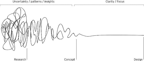
Photo credit: Rosenfeld Media.
In this article we’ll explain why these easily skipped “supplementals” are really “essentials.” To learn about 25 helpful design documents and processes, check out the free Guide to UX Design Process & Documentation.
1. Persona
We’ll start with the most telling of user documentation: the persona.
With Postcards Email Builder you can create and edit email templates online without any coding skills! Includes more than 100 components to help you create custom emails templates faster than ever before.
Free Email BuilderFree Email TemplatesYour personas (limit them to 2-5) go beyond your target demographics. They are fictional personalities based on research which act as a placeholder for your ideal user during the design process. Personas include personal details more descriptive than age or income. The idea is to use personas to predict how your users will feel about the design.
In this role, personas have been proven to drastically improve the final user experience.
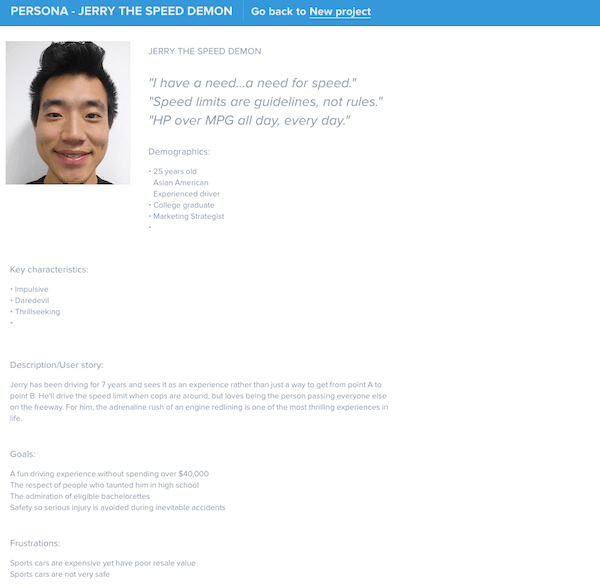
Source: Persona Tool
The key to a persona’s effectiveness is in the research.
As described in The Guide to Usability Testing, this research typically includes both qualitative and quantitative testing. Qualitative research like user interviews, field studies, or even a diary study are the best way to understand your user’s thought processes. Quantitative tests like analytics or surveys will complement the more abstract results with cold, hard facts.

Photo credit: Nicholas Wang.
With Startup App and Slides App you can build unlimited websites using the online website editor which includes ready-made designed and coded elements, templates and themes.
Try Startup App Try Slides AppOther ProductsOnce you have your research, you’re able to construct an actual persona document. While the sections vary, we recommend each persona (as shown above from our template in UXPin) contain the following:
- Photo — Almost every persona includes an image, usually a stock photo. Giving your persona a face greatly helps in thinking of them as a real persona. Choose a realistic photo, so leave out any celebrities.
- Profile — Basically, you’ll want to put all the general demographic information here — name, age, etc.
- Personality — There is a lot of diversity in this category, depending on the company. It could be a detailed narrative delving into their psyche, or nothing more than a few keyword characteristics like “intelligent” and “ambitious.”
- Platforms — Which platforms do your personas use? How familiar are they with each? Which do they prefer and avoid? This is a great place to solidify their webographics.
- Goals (Motivations) — Here’s where you include the 3 goals discussed in the tips section: life goals, experience goals, and end goals. Remember that end goals are the most important.
- Influences — What other brands and products influence this persona? This will factor heavily into their expectations of your site, personal preferences, and decision-making/behavior.
- Likes & Dislikes — Another way to flesh out the persona, this section can be a practical quick-reference guide to optimizing your design for a specific user. Make a list of elements the user would appreciate, and another list of items that would frustrate or annoy them.
- Personal Quotes/Mottos — While completely optional, including some personal quotes and life mottos will help you get inside the head of your persona, and therefore your users.
When personas are created correctly, it feels like having an extra person in the room to lean on for design decisions.
2. Empathy Map
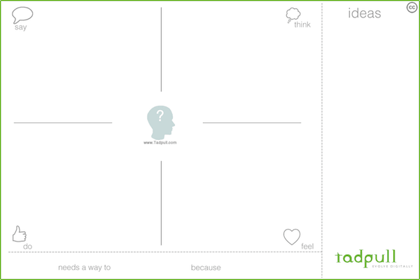
Like lightweight versions of personas, empathy maps can be made more quickly and easily in case you’re short on time or resources. Empathy maps strip away the personalities of the persona, and focus only on how the user feels in a given situation.
Source: Tadpull
Tadpull describes the best process for making one, and includes this free template to help you get started.
- Setup – Collect a group of test users, or assign a persona to each participant on your team. Then, give each one a separate color of Post-It note.
- Pose Questions – Ask a series of seemingly obvious questions, such as “Why do you use this or that site,” or “How do you choose which site to use.” These questions should always be open-ended.
- Map Notes – As the answers roll in, scribble your notes and thoughts on your chosen color of Post-It. Apply notes to the appropriate section of the map.
- Weed Through Ideas – Go through all the notes and leave only the best and most useful ones.
- Take a Break – Allow the notes and ideas to ruminate for a day or two. Try hanging the empathy map in a common space like the break room so it’s not completely forgotten.
- Define Goal – See the area on the bottom that says “_______ needs a way to _______ because _______.” Now that you have some insights, fill that in for your target users. Pay special attention to the “because” part, as that will spark critical thinking about why you’re designing.
At UXPin, we actually upload empathy maps into our own design app so everyone can comment and fill in details. If you use Slack or any other collaborative tool, the same trick works.
3. User Scenario
If your personas are the characters of a story, then user scenarios are the plot.
User scenarios revolve around a goal – let’s say ordering a overnight gift for Mother’s Day – and how your user accomplishes it. The facts include where they click, how long it takes, even their emotional responses throughout. Foretelling the user’s processes has lots of obvious advantages to UX and UI design.
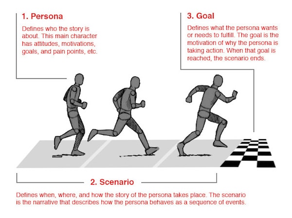
Shlomo Goltz. “A Close Look at Personas: What They Are and How They Work (Part 1).”
User scenarios can come in several varieties. For example, your scenario could list out all the technical details, such as a step-by-step list of all the pages the user visited (and how long they spent on each). Another option is to focus more on the feelings of the user, in which case the scenario will read more like a story than a data sheet.
Regardless of which type you decide works best for you, when building your scenario, consider these factors surrounding your user:
- Behavior – What idiosyncrasies does your user have when interacting with websites? Do they log in right away or when necessary? Are they looking at other websites simultaneously?
- Motivation – Why does your user want to accomplish this goal? How badly? What are they willing to put up with?
- Environment – Is the user at work, at home, or on the go? Are they using a computer, smartphone, or other mobile device? Are there any outside distractions?
- External Factors – How fast is the Internet connection? Are they under an oppressive time constraint, or can they take their time?
Most important, try visualizing your user trying to accomplish their goal. As always, the more thorough your initial persona creation, the more accurate the user scenario will be.
One final piece of advice on scenarios – don’t waste time plotting out every conceivable task. Stick only to the most important ones, and these will give you a better idea of the processes for the less common ones later.
To learn more, check out this excellent guide from UX For the Masses complete with steps and examples.
4. Customer Journey Map
The customer journey map is similar to a user scenario, except it ranges from before and after the experience (not just during). This allows designers to get a fuller context of their product – after all, a user’s experiences begins before they even start using the product and ends later than when they’re finished with it.
The customer journey map draws on the information compiled in your personas, empathy maps, and user scenarios. It’s just a matter of combining the user’s personality (persona) with how they’re interacting with your site (user scenario). Each stage will offer different emotional progressions.
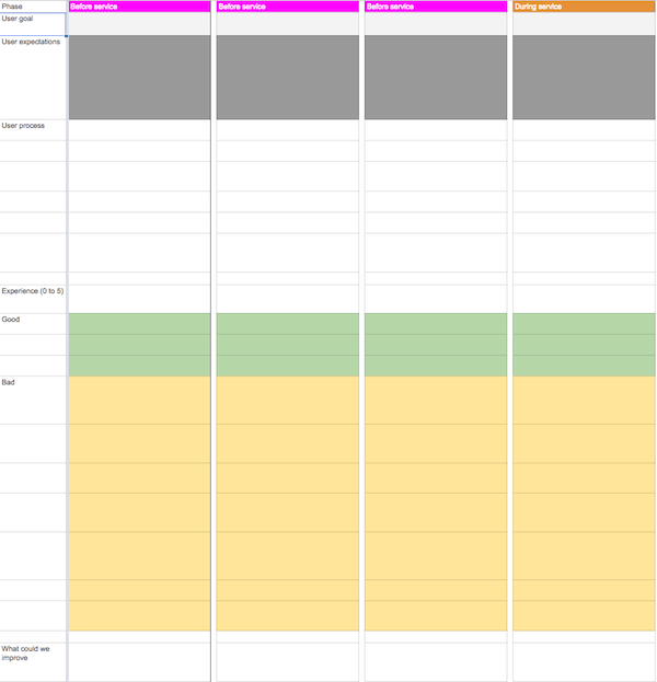
Source: UXPin
In general, a customer journey map can be written in a chart format, like this template (shown above) that we ourselves use at UXPin. For each individual stage of the process, make sure you cover the following areas concerning the user:
- Goal – What do they hope to accomplish in this phase?
- Expectations – What does the user think will happen? What ideas are they bringing into their experience, whether justified or not?
- Process –- How do they hope to accomplish their goal? What are they actually doing?
- Rating of Experience – How would the user rate each phase of their experience?
- The Good – What does the user like about this phase? What works well?
- The Bad – What doesn’t the user like about this phase? Where did problems arise?
- Improvements – Based on all the previous information, how can you make the user’s experience better?
The amount of detail depends on your company’s size. Smaller companies will want to keep it light, as designers are probably already working closely with the product team. Larger companies can afford to flesh this out more, to ensure the information communicates across departments.
Customer journey maps can even work as a kind of “design audit.” It can be used effectively in anticipating issues before the design process, but also in addressing or analyzing issues in an existing system.
Conclusion
If you’re a designer new to a company, ask if these documents exist as soon as possible. If they don’t, work towards creating them. With these four documents, you can truly understand how the user and the product fit together.
You’ll never design blindly again.


