How to Validate Forms with Bootstrap 5
Form validation is one of the most critical factors when it comes to collecting information and preventing web form misuse.
Apart from saving you from possible cyber-attacks, form validation also protects your website from poor form entries. During form submission with validation, the user will be given the option to modify data fields that contain invalid data before submitting.
In general, you need form validation as a security measure since invalidated form data is one of the main sources of website security vulnerabilities.

Startup: Free Bootstrap Builder
Forms are fully supported in Bootstrap 5. Most of the components are mainly used to make the forms look clean and responsive which can be used with any screen size. While Bootstrap 5 forms automatically receive the correct formatting via given classes, when it comes to form validation you need to set up some extra classes and some JavaScript in order to take advantage of its contemporary validation support right out of the box.
In this article, I will show you how you can use Bootstrap 5 form validation to showcase some decent actionable feedback on form data fields such as textbox, select, checkbox, radio button along with some other available bootstrap’s form fields upon form submission. We will use JavaScript to disable form submissions if there are invalid fields entered.
With Postcards Email Builder you can create and edit email templates online without any coding skills! Includes more than 100 components to help you create custom emails templates faster than ever before.
Free Email BuilderFree Email TemplatesNote: HTML 5 has its own validation means, but it has limitations especially when it comes to browser support. One of the noticeable limitations is the lack of customization when it comes to handling error messages which you will need to find a way to get sorted. Fortunately, Bootstrap 5 has contemporary form validation styles at hand.
How Bootstrap Form Validation Works
Bootstrap 5 comes with super easy to use, yet powerful validation styles for input fields. These validation styles are used to showcase some form styles and messages, both errors and success states for form fields, and can be triggered when you submit the actual form.
Supported HTML Elements
Bootstrap 5 validation styles can be used on the following HTML elements including up to one .form-control class in input groups.
- <input>
- <select>
- <textarea>
For the input element, you can use Bootstrap 5 validation styles on commonly used tags such as textbox, radio button, checkbox, and file element tag.
Bootstrap 5 form validation basically has two states: error and success. These are represented by the following semantic classes.
- .is-invalid: Error
- .is-valid: Success
Let’s take a look at the code to render these two validation states:
<div class="col-md-4">
   <label for="validationSuccess" class="form-label text-success">Input with success</label>
   <input type="text" class="form-control is-valid" id="validationSuccess" required>
</div>
<div class="col-md-4">
   <label for="validationError" class="form-label text-danger">Input with error</label>
   <input type="text" class="form-control is-invalid" id="validationError" required>
</div>
The markup that you see above is very similar to usual inputs with the addition of a few CSS classes to apply the proper state look and feel.
Let’s go over code you need to be aware of:
With Pulsetic you’ll be instantly notified the moment your website, API, or server becomes unavailable. Monitor uptime from multiple global locations and respond to incidents before your users are affected.
Create beautiful status pages in minutes to keep customers informed during outages and build trust with transparent communication.
Start Monitoring for Free- The first input is the success state. The input field needs to have a class called .is-valid added to it.
- The second input is the error state. The input field needs to have a class called .is-invalid added to it.
- Notice each input has an icon to the right edge of it. These icons are automatically added when you include the required bootstrap CSS files.
- Each <label> tag has a class .text-success and .text-danger added to it. These are not required in form validation but these are for demonstration purposes only to color the label to match the state color.
Let’s take a look at how these validation inputs should look in the browser:
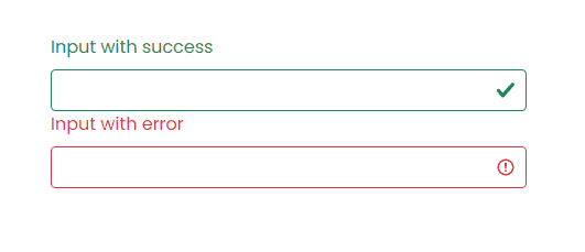
Next, let’s see how form validation messages work with Bootstrap 5 form validation at a very basic level. Bootstrap 5 form validation also provides two states for form validation messages similar to input validation above: error and success.
These are represented by the following semantic classes.
- .invalid-feedback: Error
- .valid-feedback: Success
Let’s take a look at the code to render these two validation messages states:
<div class="col-md-4">
   <label for="validationSuccess" class="form-label text-success">Input with success</label>
   <input type="text" class="form-control is-valid" id="validationSuccess" required>
   <div class="valid-feedback">
      This is a success state form validation message!
   </div>
</div>
<div class="col-md-4">
<label for="validationError" class="form-label text-danger">Input with error</label>
<input type="text" class="form-control is-invalid" id="validationError" required>
<div class="invalid-feedback">
   This is an error state form validation message!
</div>
Let’s go over code you need to be aware of:
- The div with a class .valid-feedback is the form validation message success.
- The div with a class .invalid-feedback is the form validation message error.
- Each class stated above needs to be used together below the input field and then bootstrap with the help of JavaScript will determine which one to show based on user entry upon form submission. More on this later.
Let’s take a look at how these validation inputs should look in the browser:
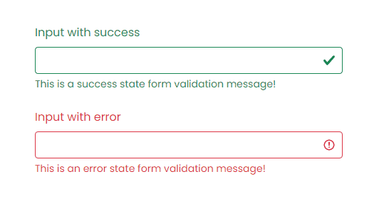
As seen above, the inputs and form validation messages are colored to match their state. Additionally, notice that we used .is-valid and .is-invalid to match the state for a particular validation.
However, with Bootstrap along with the use of JavaScript upon form submission, you don’t need to imperatively put these two classes on each data field. Bootstrap will handle it for you accordingly. Bootstrap form validation is applied using CSS’s two pseudo-classes, :valid and:invalid. Bootstrap out looked these classes’ styles which is usually applied with the use of .was-validated class in the <form> tag. The .is-valid and .is-invalid classes may still be used instead of the pseudo-classes for server-side validation. Please take note that if you will use these classes on server-side validation you don’t need to add .was-validated class.
Validation Style Using Tooltips
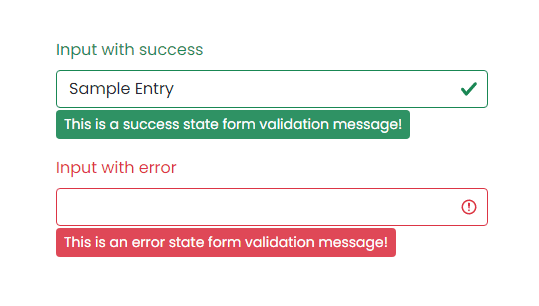
Bootstrap also comes with tooltip styles for its contemporary validation styles. Tooltip or infotip is a common user interface element where in hovering over an element, a pop up box displays the required information for that specific element but in this case, it would be the validation message.
For the tooltip validation feature to work you need to use .valid-tooltip or .invalid-tooltip class to match the state for a particular validation style and form validation message instead of using .valid-feedback and .invalid-feedback. Additionally, you need to have a parent element with position: relative style for tooltip positioning.
The code below is identical to the code above but this time using tooltip as it’s contemporary validation style.
<div class="col-md-4 position-relative">
   <label for="validationSuccess" class="form-label text-success">Input with success</label>
   <input type="text" class="form-control" value="Samuel Norton" required>
   <div class="valid-tooltip">
      This is a success state form validation message!
   </div>
</div>
<div class="col-md-4 position-relative">
   <label for="validationError" class="form-label text-danger">Input with error</label>
   <input type="text" class="form-control" id="validationError" required>
   <div class="invalid-tooltip">
      This is an error state form validation message!
   </div>
</div>
Let’s take a look at how these validation inputs should look in the browser:
Using JavaScript
Now let’s see how JavaScript can help our bootstrap validation styles prevent any invalid submissions from the users.
First, take a look at the following markup:
<form class="row g-3 requires-validation" novalidate>
   <div class="col-md-12">
      <label for="username" class="form-label">Username:</label>
      <input type="text" class="form-control" id="username" required>
      <div class="valid-feedback">
         Username looks good!
      </div>
      <div class="invalid-feedback">
         Username is required!
      </div>
   </div>
   <div class="col-md-12">
      <label for="password" class="form-label">Password:</label>
      <input type="text" class="form-control" id="password" required>
      <div class="valid-feedback">
         Password looks good!
      </div>
      <div class="invalid-feedback">
         Password is required!
      </div>
   </div>
   <div class="col-12">
      <button class="btn btn-primary" type="submit">Login</button>
   </div>
</form>
Let’s take a look closer at the markup above:
- The form tag has a novalidate boolean attribute. This prevents the browser default feedback tooltips without the occlusion of access to the form validation APIs in JavaScript.
- We did not include the .is-valid and .is-invalid classes on each data field. Bootstrap’s :invalid and :valid styles will apply it to the form controls with the use of JavaScript.
- We added a .requires-validation class inside the form tag. This is not a semantic class from bootstrap. You can rename it to whatever class name you prefer. The purpose of this class is to help JavaScript fetch all the form elements to apply custom bootstrap validation styles accordingly (more on this later).
- On each data field or inputs, we added the required attribute at the end. This simply states that a particular data field must be filled out before submitting the form.
- Again, we use .valid-feedback and .invalid-feedback at the bottom of each data field. The div with a class .valid-feedback is the Bootstrap form validation message success Wherein, the div with a class .invalid-feedback is the form validation message error state.
Next, let’s add the JavaScript code to disable form submissions if there are invalid fields when the user submits the form:
<script>
(function () {
'use strict'
const forms = document.querySelectorAll('.requires-validation')
Array.from(forms)
  .forEach(function (form) {
    form.addEventListener('submit', function (event) {
  	if (!form.checkValidity()) {
        event.preventDefault()
        event.stopPropagation()
  	}

      form.classList.add('was-validated')
	}, false)
  })
})()
</script>
The JavaScript code above simply gets all forms via querySelectorAll method and returns a static NodeList which represents a list of the document’s elements using the .requires-validation class.
Next, for each one of the Bootstrap forms found, the JavaScript code will add an EventListener that will be called whenever the specified event is delivered and that is submitted. So whenever a user submits the form, form.checkValidity() will be called out. This method verifies whether the data field has any constraints and fulfills the given constraints. If it fails, the browser simply fires an invalid event and returns false.
So if it fails, it will call both of the following JavaScript methods:
- preventDefault() – a method that will simply prevent the default event to be taken as it normally would be. In this case the submission of the form.
- stopPropagation() – a method that prevents further propagation (bubbling up) of the current event.
Finally, it will add .was-validated class in the form tag to show the form validation state and messages.
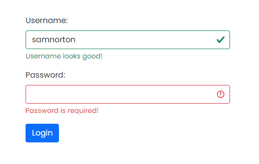
Bootstrap scopes the :invalid and :valid styles to parent .was-validated class when it is applied to the form. You can actually put the .was-validated class to the form tag even without the help of JavaScript but that will automatically show the form validation states and messages even before the user submits the form. However, having JavaScript to take care of the form submission and validation event will give you a more secure contemporary validation process on the client-side.
Let’s take a look at how this should look in the browser:
Putting It All Together
Now to put this all together, let’s create a simple registration page and see how we can apply Bootstrap 5 contemporary validation styles on each data field.
Below is the markup.
<div class="form-body">
   <div class="row">
      <div class="form-holder">
         <div class="form-content">
            <div class="form-items">
               <h3>Register Today</h3>
               <p>Fill in the data below.</p>
               <form class="requires-validation" novalidate>
                  <div class="col-md-12">
                     <input class="form-control" type="text" name="name" placeholder="Full Name" required>
                     <div class="valid-feedback">Username field is valid!</div>
                     <div class="invalid-feedback">Username field cannot be blank!</div>
                  </div>
                  <div class="col-md-12">
                     <input class="form-control" type="email" name="email" placeholder="E-mail Address" required>
                     <div class="valid-feedback">Email field is valid!</div>
                     <div class="invalid-feedback">Email field cannot be blank!</div>
                  </div>
                  <div class="col-md-12">
                     <select class="form-select mt-3" required>
                        <option selected disabled value="">Position</option>
                        <option value="jweb">Junior Web Developer</option>
                        <option value="sweb">Senior Web Developer</option>
                        <option value="pmanager">Project Manager</option>
                     </select>
                     <div class="valid-feedback">You selected a position!</div>
                     <div class="invalid-feedback">Please select a position!</div>
                  </div>
                  <div class="col-md-12">
                     <input class="form-control" type="password" name="password" placeholder="Password" required>
                     <div class="valid-feedback">Password field is valid!</div>
                     <div class="invalid-feedback">Password field cannot be blank!</div>
                  </div>
                  <div class="col-md-12 mt-3">
                     <label class="mb-3 mr-1" for="gender">Gender: </label>
                     <input type="radio" class="btn-check" name="gender" id="male" autocomplete="off" required>
                     <label class="btn btn-sm btn-outline-secondary" for="male">Male</label>
                     <input type="radio" class="btn-check" name="gender" id="female" autocomplete="off" required>
                     <label class="btn btn-sm btn-outline-secondary" for="female">Female</label>
                     <input type="radio" class="btn-check" name="gender" id="secret" autocomplete="off" required>
                     <label class="btn btn-sm btn-outline-secondary" for="secret">Secret</label>
                     <div class="valid-feedback mv-up">You selected a gender!</div>
                     <div class="invalid-feedback mv-up">Please select a gender!</div>
                  </div>
                  <div class="form-check">
                     <input class="form-check-input" type="checkbox" value="" id="invalidCheck" required>
                     <label class="form-check-label">I confirm that all data are correct</label>
                     <div class="invalid-feedback">Please confirm that the entered data are all correct!</div>
                  </div>
                  <div class="form-button mt-3">
                     <button id="submit" type="submit" class="btn btn-primary">Register</button>
                  </div>
               </form>
            </div>
         </div>
      </div>
   </div>
</div>
Next, I’ve added CSS to customize the look and feel of our form.
@import url('https://fonts.googleapis.com/css2?family=Poppins:wght@300;400;500;700;900&display=swap');
*,
body {
	font-family: 'Poppins', sans-serif;
	font-weight: 400;
	-webkit-font-smoothing: antialiased;
	text-rendering: optimizeLegibility;
	-moz-osx-font-smoothing: grayscale;
}

html,
body {
	height: 100%;
	background-color: #152733;
	overflow: hidden;
}

.form-holder {
	display: flex;
	flex-direction: column;
	justify-content: center;
	align-items: center;
	text-align: center;
	min-height: 100vh;
}

.form-holder .form-content {
	position: relative;
	text-align: center;
	display: -webkit-box;
	display: -moz-box;
	display: -ms-flexbox;
	display: -webkit-flex;
	display: flex;
	-webkit-justify-content: center;
	justify-content: center;
	-webkit-align-items: center;
	align-items: center;
	padding: 60px;
}

.form-content .form-items {
	border: 3px solid #fff;
	padding: 40px;
	display: inline-block;
	width: 100%;
	min-width: 540px;
	-webkit-border-radius: 10px;
	-moz-border-radius: 10px;
	border-radius: 10px;
	text-align: left;
	-webkit-transition: all 0.4s ease;
	transition: all 0.4s ease;
}

.form-content h3 {
	color: #fff;
	text-align: left;
	font-size: 28px;
	font-weight: 600;
	margin-bottom: 5px;
}

.form-content h3.form-title {
	margin-bottom: 30px;
}

.form-content p {
	color: #fff;
	text-align: left;
	font-size: 17px;
	font-weight: 300;
	line-height: 20px;
	margin-bottom: 30px;
}

.form-content label,
.was-validated .form-check-input:invalid~.form-check-label,
.was-validated .form-check-input:valid~.form-check-label {
	color: #fff;
}

.form-content input[type=text],
.form-content input[type=password],
.form-content input[type=email],
.form-content select {
	width: 100%;
	padding: 9px 20px;
	text-align: left;
	border: 0;
	outline: 0;
	border-radius: 6px;
	background-color: #fff;
	font-size: 15px;
	font-weight: 300;
	color: #8D8D8D;
	-webkit-transition: all 0.3s ease;
	transition: all 0.3s ease;
	margin-top: 16px;
}

.btn-primary {
	background-color: #6C757D;
	outline: none;
	border: 0px;
	box-shadow: none;
}

.btn-primary:hover,
.btn-primary:focus,
.btn-primary:active {
	background-color: #495056;
	outline: none !important;
	border: none !important;
	box-shadow: none;
}

.form-content textarea {
	position: static !important;
	width: 100%;
	padding: 8px 20px;
	border-radius: 6px;
	text-align: left;
	background-color: #fff;
	border: 0;
	font-size: 15px;
	font-weight: 300;
	color: #8D8D8D;
	outline: none;
	resize: none;
	height: 120px;
	-webkit-transition: none;
	transition: none;
	margin-bottom: 14px;
}

.form-content textarea:hover,
.form-content textarea:focus {
	border: 0;
	background-color: #ebeff8;
	color: #8D8D8D;
}

.mv-up {
	margin-top: -9px !important;
	margin-bottom: 8px !important;
}

.invalid-feedback {
	color: #ff606e;
}

.valid-feedback {
	color: #2acc80;
}
Finally, we will use the same JavaScript code above to prevent the user from submitting empty fields as well as to show the validation states and form validation message styles.
I’ve compiled the code below on Codepen. Feel free to modify it and play around.
<p class="codepen" data-height="665" data-theme-id="dark" data-default-tab="html,result" data-user="samnorton" data-slug-hash="oNYajYM" style="height: 265px; box-sizing: border-box; display: flex; align-items: center; justify-content: center; border: 2px solid; margin: 1em 0; padding: 1em;" data-pen-title="Registration Form (Bootstrap 5 Validation)">
  <span>See the Pen
  Registration Form (Bootstrap 5 Validation)
  on CodePen.</span>
</p>
<script async src="https://cpwebassets.codepen.io/assets/embed/ei.js"></script>
Wrapping Up
Building websites and even applications today is a lot more challenging and time-consuming than it used to be. Using Bootstrap 5 contemporary form validation methods and styles will provide you an easy way, but valuable and actionable feedback to your users out of the box without worrying too much about styles.
The best part is that you can still customize the Bootstrap form validation message, including the styles to your liking without reinventing the wheel.
