Creating a 3D Button in CSS3
Difficulty: Beginner
Estimated Completion Time: 30 mins
Today I want to show you how to use some of the awesome new features in CSS3 to create an animated, three-dimensional button. To start off, we care about creating a fun experience that works to its full potential in the browsers that support it, but degrades gracefully in the browsers that don’t. In other words, if it isn’t fully supported, it shouldn’t look or behave as if it’s broken.

Let’s jump right in by adding a link that we will turn into our button. You could do this using an <input> or <button>, but I’m going to use an <a> element.
<a href="#" class="button">Press Me</a>
Now we can start adding CSS. I’ll start with some quick styling to get our basic button shape and color.
body {
font-family: Helvetica, Arial, sans-serif;
background: #d6d6d6;
text-align: center;
padding: 50px 0px;
}
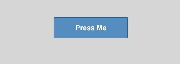
.button {
display: inline-block;
text-decoration: none;
color: #fff;
font-weight: bold;
background-color: #538fbe;
padding: 20px 70px;
font-size: 24px;
border: 1px solid #2d6898;
}
There is nothing fancy there, just a nice large button styled with some vanilla CSS. Now let’s use a little CSS3 to add some new style, starting with gradients.
With Postcards Email Builder you can create and edit email templates online without any coding skills! Includes more than 100 components to help you create custom emails templates faster than ever before.
Free Email BuilderFree Email TemplatesCSS3 Gradients
The syntax for CSS3 gradients can be a bit overwhelming at first, so for this tutorial we’ll use a code generator to make the gradient. Go to this CSS3 Gradient generator (or another one that you find through Google) and set two color stops to 0 and 100 using the bottom slider.
Then use these colors to create your gradient: #609bcb and #4a85b5. The most common mistake new designers make with gradients is to make them too obvious. We just want to add a subtle rounded effect, nothing more.
That will generate a code snippet that you can paste into your .button style. It will include styles for all the different browsers, with vendor prefixes. Here’s mine:
.button {
	display: inline-block;
	text-decoration: none;
	color: #fff;
	font-weight: bold;
	background-color: #538fbe;
	padding: 20px 70px;
	font-size: 24px;
	border: 1px solid #2d6898;
	background-image: linear-gradient(bottom, rgb(73,132,180) 0%, rgb(97,155,203) 100%);
	background-image: -o-linear-gradient(bottom, rgb(73,132,180) 0%, rgb(97,155,203) 100%);
	background-image: -moz-linear-gradient(bottom, rgb(73,132,180) 0%, rgb(97,155,203) 100%);
	background-image: -webkit-linear-gradient(bottom, rgb(73,132,180) 0%, rgb(97,155,203) 100%);
	background-image: -ms-linear-gradient(bottom, rgb(73,132,180) 0%, rgb(97,155,203) 100%);

	background-image: -webkit-gradient(
		linear,
		left bottom,
		left top,
		color-stop(0, rgb(73,132,180)),
		color-stop(1, rgb(97,155,203))
	);
}
Next we should add a :hover style. I like to have buttons brighten slightly on :hover. To do that, make another gradient where both stops are a little brighter than the first one. Then add that to the .button:hover pseudo-class.
.button:hover {
	background-image: linear-gradient(bottom, rgb(79,142,191) 0%, rgb(102,166,214) 100%);
	background-image: -o-linear-gradient(bottom, rgb(79,142,191) 0%, rgb(102,166,214) 100%);
	background-image: -moz-linear-gradient(bottom, rgb(79,142,191) 0%, rgb(102,166,214) 100%);
	background-image: -webkit-linear-gradient(bottom, rgb(79,142,191) 0%, rgb(102,166,214) 100%);
	background-image: -ms-linear-gradient(bottom, rgb(79,142,191) 0%, rgb(102,166,214) 100%);

	background-image: -webkit-gradient(
		linear,
		left bottom,
		left top,
		color-stop(0, rgb(79,142,191)),
		color-stop(1, rgb(102,166,214))
	);
}

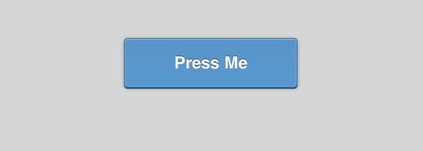
Those sharp edges look a bit dangerous. Let’s round them using the border-radius property.
	-webkit-border-radius: 5px;
	-moz-border-radius: 5px;
	border-radius: 5px;
Those three lines will get us rounded corners with a 5px radius. Don’t make the corner radius too large or it will start to look strange. Again, we are going for subtle details. Note that we have browser prefixes for -webkit- and -moz-. That will get us the look we want in older versions of those browsers, and the plain border-radius property is put at the end.
With Pulsetic you’ll be instantly notified the moment your website, API, or server becomes unavailable. Monitor uptime from multiple global locations and respond to incidents before your users are affected.
Create beautiful status pages in minutes to keep customers informed during outages and build trust with transparent communication.
Start Monitoring for FreeIntroducing Shadows
To make the text feel like it is a part of the button I want to use a text shadow to make it look recessed. We’ll be relying on CSS shadows a lot to style this button, so pay close attention here. All CSS shadows follow the same format. Here is an example:
text-shadow: 0px -1px 0px rgba(0,0,0,.5);
Written another way that is this:
text-shadow: x-offset y-offset blur color;
Note that there is just a space between each of the values. These simple properties allow you to create all kinds of great effects. The code above is what we will add to our button to give the text a recessed look.
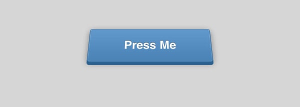
Now using box shadows, which follow the same syntax, I want to add some more detail. First we’ll add a 3D effect.
	-webkit-box-shadow: 0px 6px 0px #2b638f;
	-moz-box-shadow: 0px 6px 0px #2b638f;
	box-shadow: 0px 6px 0px #2b638f;
Now the solid shadow makes the button look like it is really raised up from the background. But to add to the effect we need an actual shadow that would be cast from the button onto the surrounding background. Luckily for us, we can add multiple shadows by adding a comma between each shadow, like this:
	-webkit-box-shadow: 0px 6px 0px #2b638f, 0px 3px 15px rgba(0,0,0,.4);
	-moz-box-shadow: 0px 6px 0px #2b638f, 0px 3px 15px rgba(0,0,0,.4);
	box-shadow: 0px 6px 0px #2b638f, 0px 3px 15px rgba(0,0,0,.4);
So that second shadow has an x-offset of 0, a y offset of 3px, and a blur of 15px. The RGBa color lets us use a transparency in our shadows. This is really important for making the shadow look natural.

And Even More Shadows
You may not normally think of using box shadows for creating highlights, but they work really well for it. Box-shadow accepts a value of inset which will make the shadow come into the element, rather than sticking out. An inset shadow looks like this:
box-shadow: inset 0px 1px 0px rgba(255,255,255,.3);
I am using a partially transparent white to create a nice highlight along the top edge of the button. I want one more shadow/highlight to give everything a nice crisp outline all the way around. Note that this one has a blur:
box-shadow: inset 0px 0px 3px rgba(255,255,255,.5);
For all these shadows to work they need to be in a single declaration like this:
	-webkit-box-shadow: 0px 6px 0px #2b638f, 0px 3px 15px rgba(0,0,0,.4), inset 0px 1px 0px rgba(255,255,255,.3), inset 0px 0px 3px rgba(255,255,255,.5);
	-moz-box-shadow: 0px 6px 0px #2b638f, 0px 3px 15px rgba(0,0,0,.4), inset 0px 1px 0px rgba(255,255,255,.3), inset 0px 0px 3px rgba(255,255,255,.5);
	box-shadow: 0px 6px 0px #2b638f, 0px 3px 15px rgba(0,0,0,.4), inset 0px 1px 0px rgba(255,255,255,.3), inset 0px 0px 3px rgba(255,255,255,.5);
That looks complicated, but it is just four shadows separated by commas, then repeated twice for different browsers.
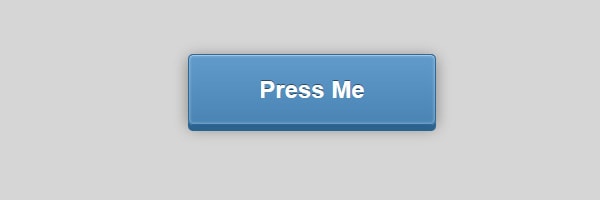
Our code up to this point looks like this:
.button {
	display: inline-block;
	text-decoration: none;
	color: #fff;
	font-weight: bold;
	background-color: #538fbe;
	padding: 20px 70px;
	font-size: 24px;
	border: 1px solid #2d6898;
	background-image: linear-gradient(bottom, rgb(73,132,180) 0%, rgb(97,155,203) 100%);
	background-image: -o-linear-gradient(bottom, rgb(73,132,180) 0%, rgb(97,155,203) 100%);
	background-image: -moz-linear-gradient(bottom, rgb(73,132,180) 0%, rgb(97,155,203) 100%);
	background-image: -webkit-linear-gradient(bottom, rgb(73,132,180) 0%, rgb(97,155,203) 100%);
	background-image: -ms-linear-gradient(bottom, rgb(73,132,180) 0%, rgb(97,155,203) 100%);

	background-image: -webkit-gradient(
		linear,
		left bottom,
		left top,
		color-stop(0, rgb(73,132,180)),
		color-stop(1, rgb(97,155,203))
	);
	-webkit-border-radius: 5px;
	-moz-border-radius: 5px;
	border-radius: 5px;
	text-shadow: 0px -1px 0px rgba(0,0,0,.5);
	-webkit-box-shadow: 0px 6px 0px #2b638f, 0px 3px 15px rgba(0,0,0,.4), inset 0px 1px 0px rgba(255,255,255,.3), inset 0px 0px 3px rgba(255,255,255,.5);
	-moz-box-shadow: 0px 6px 0px #2b638f, 0px 3px 15px rgba(0,0,0,.4), inset 0px 1px 0px rgba(255,255,255,.3), inset 0px 0px 3px rgba(255,255,255,.5);
	box-shadow: 0px 6px 0px #2b638f, 0px 3px 15px rgba(0,0,0,.4), inset 0px 1px 0px rgba(255,255,255,.3), inset 0px 0px 3px rgba(255,255,255,.5);
}
Press Me
That’s a sharp-looking button, but what happens when we press it? Well, nothing right now. It looks like it should press into the page, so let’s create that effect.
First, when the button is pressed I want the background gradient to change. I created a subtle gradient that is the reverse of our standard one, meaning that the darker value is on top and the lighter value is on the bottom.
.button:active {
	background-image: linear-gradient(bottom, rgb(88,154,204) 0%, rgb(90,150,199) 100%);
	background-image: -o-linear-gradient(bottom, rgb(88,154,204) 0%, rgb(90,150,199) 100%);
	background-image: -moz-linear-gradient(bottom, rgb(88,154,204) 0%, rgb(90,150,199) 100%);
	background-image: -webkit-linear-gradient(bottom, rgb(88,154,204) 0%, rgb(90,150,199) 100%);
	background-image: -ms-linear-gradient(bottom, rgb(88,154,204) 0%, rgb(90,150,199) 100%);

	background-image: -webkit-gradient(
		linear,
		left bottom,
		left top,
		color-stop(0, rgb(88,154,204)),
		color-stop(1, rgb(90,150,199))
	);
}
Next we need to rework both of the shadows that come out from the button. Our solid bottom shadow needs to shorten so that the button looks pressed. Then the blurred shadow needs to become smaller, since a shorter button would cast a smaller shadow.
-webkit-box-shadow: 0px 2px 0px #2b638f, 0px 1px 6px rgba(0,0,0,.4), inset 0px 1px 0px rgba(255,255,255,.3), inset 0px 0px 3px rgba(255,255,255,.5);
-moz-box-shadow: 0px 2px 0px #2b638f, 0px 1px 6px rgba(0,0,0,.4), inset 0px 1px 0px rgba(255,255,255,.3), inset 0px 0px 3px rgba(255,255,255,.5);
box-shadow: 0px 2px 0px #2b638f, 0px 1px 6px rgba(0,0,0,.4), inset 0px 1px 0px rgba(255,255,255,.3), inset 0px 0px 3px rgba(255,255,255,.5);
Look at the first two shadows in each declaration to get an idea of how they changed. The last two inset shadows are still the same.
Moving the Button
We also need to move the button down by the same number of pixels that we shortened our shadow (in this case 4px). Otherwise, it will look like the shadow got shorter rather than the button being pressed down. To do this we are going to use the transform property.
    -webkit-transform: translate(0, 4px);
    -moz-transform: translate(0, 4px);
    transform: translate(0, 4px);
This will move the button down 4px when pressed. If you want to read more about transforms, start with this 24Ways article.
Adding Animation
Now if you press the button it will push down, but it happens instantly. We can easily animate between these two positions using CSS3 transitions. On our main button style go back and add the following:
	-webkit-transition: all .1s ease-in-out;
	-moz-transition: all .2s ease-in-out;
	transition: all .2s ease-in-out;
That will automatically animate both our box shadows and the transform position. That’s the “all” keyword. The .2s means that I want the entire animation to take .2 seconds. And finally ease-in-out refers to the timing of the animation.
Now the button presses down smoothly and animates back up when you release your mouse. And of course the browsers that don’t support it won’t know what they are missing.
More 3D
We can make this even more interesting by taking advantage of 3D transforms. To do that we first need to add perspective to the parent element, in this case the body attribute:
body {
	…
	-webkit-perspective: 400;
}
Since this is still experimental, I am just going to add this support to webkit browsers for now.
Now for the .button add the following:
.button {
	…
	-webkit-transform: rotateX(20deg);
}
Now the button really looks three dimensional. But we need to also add rotateX(20deg) to the :active state of the button. The final code should look like this:
    -webkit-transform: translate(0, 4px) rotateX(20deg);
    -moz-transform: translate(0, 4px);
    transform: translate(0, 4px);
With that you are done!
Source Files


