Interesting Navigation Examples in Website Design
Easy and effective navigation menus effectively contribute to the user experience and improve search. Today, we are going to examine some interesting, original and even pioneering navigation solutions that are truly attention-grabbing and memorable. Some of which will be more complex than what you expect from common navigation concepts.
The originality of this idea is not the only reason why we have decided to draw such a list. The majority of the examples involves use of advanced techniques to make our collection inspirational, informative and cognitive.
Jova
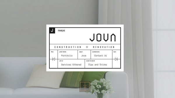
Jova has a clean, neat, well-balanced and properly-structured navigation menu.
Straight thin lines, grid layout, black and white color scheme and crisp and sharp typography produces a truly elegant appearance with a charming geometry note that goes perfectly with a light backdrop.
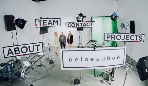
Beloesuhoe
With Postcards Email Builder you can create and edit email templates online without any coding skills! Includes more than 100 components to help you create custom emails templates faster than ever before.
Free Email BuilderFree Email TemplatesThe team skillfully goes for a quite ingenious solution that instantly strikes the eye. At first sight, it may seem that this is a basic image background, however red pulsating dots that accompany menu titles suggest that everything is not so simple as it seems. Actually, the menu items are interactive, so you can just click on the pointer and go to the page that you need.
This is a quite interesting solution that is based on virtual reality.
First Person
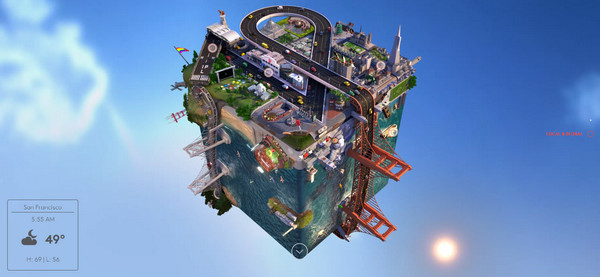
First Person features a sophisticated, surreal cubic scene with a carefully-executed perspective that’s intriguing. What’s more, the object has two variations: Day and Night. Though, of course, this is not a main navigation, it is just a component that is intended to draw you in, however the idea as well as a highly-detailed execution bolstered by dynamic effects is absolutely fantastic and matchless.
Mint Design Company
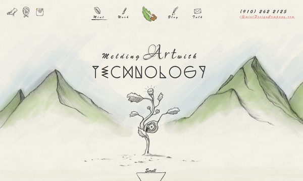
Mint Design Company has an incredible design. The website features hand-drawn illustrations that are brought to life through animation. As befits such artistic projects, all elements including navigation are made in one manner and style. Each menu item has two interpretations including sketchy and colorful version where the transition between them is enlivened by a pleasant effect.
Vive Latino
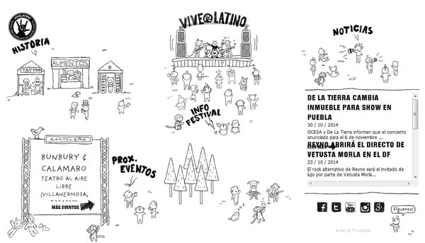
Here the team also leverages doodles in order to make the landing page stand out from the crowd. Clean monochromatic coloring along with hand-written typography and dozens of moving tiny characters not only are managed to establish the energizing festival atmosphere but also serve as a kind of main navigation that looks pretty motivational.
With Startup App and Slides App you can build unlimited websites using the online website editor which includes ready-made designed and coded elements, templates and themes.
Try Startup App Try Slides AppOther ProductsPete Nottage
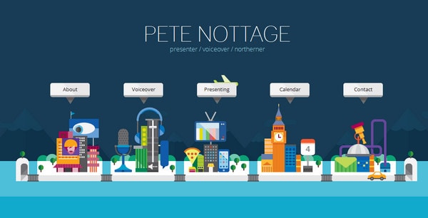
The online portfolio of Pete Nottage is marked by a riot of colors that gives the website an air of creativity and positivity. The urban scene that is composed from vibrant flat style elements is nothing but a main navigation that is a kind of playground.
Not only has the developer added various dynamic elements such as moving cars and yachts but he also let you remove components of the composition just by clicking on it. This is an engaging and amusing solution.
Mathilde Jacon
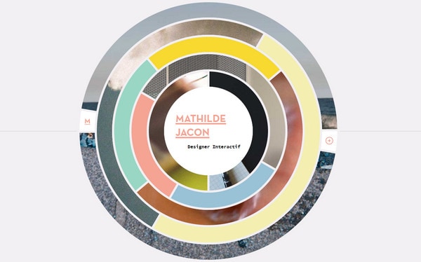
The front page of Mathilde Jacon’s portfolio features one component — an exceptional interactive circular navigation that is interesting to examine. Here, the most part is reserved for the navigation through the portfolio; each segment is an individual link.
Moira Young
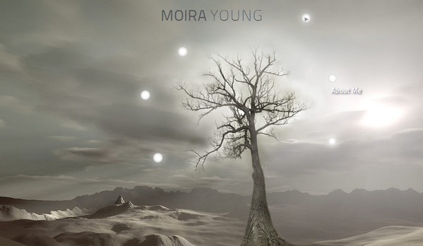
Moira Young’s website radiates of elegance and subtlety due to its refined landing page with a strong natural motif. The navigation is not as obvious as usual; each link is hidden under a smoothly vibrating light dot near the tree.
Bancolombia
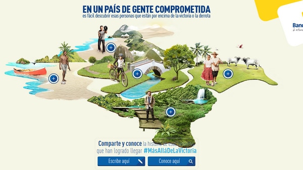
Much like the previous example, the home page features a landscape that is populated with dynamic elements. However, I must mention that it demands a flash player, which makes it quite irrelevant in the era of HTML5.
Nat-Ant
The realization of minimalism is worth attention. It touches design aspects as well as the whole structure. Just take a look at this clean, almost pure landing page with lots of whitespace that includes only several components that are elegantly scattered throughout the page. They represent portfolio pieces in a quite unusual manner.
Love Carmen Rose
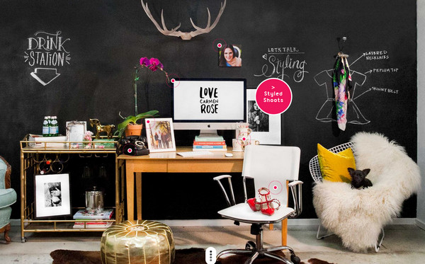
Love Carmen Rose’s online portfolio has a touch of personality that manifests itself through a well-thought-out complex image backdrop. Moreover, it plays a role of unobtrusive navigation tool. The “welcome” section looks positively intricate.
Orillo
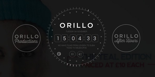
Orillo welcomes visitors with a exquisite line-style control center. Neat and elegant, it allows users to do lots of things as well as navigate through the project. Unfortunately, the mobile and tablet versions have an alternative landing page; to get the full experience visit the desktop version.
OK Kid
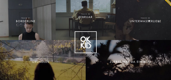
OK Kid gets the most out of advanced solutions with engaging full-screen video-based navigation. The team strongly relies on the visual impact that does not let them down.
The Colors of Motion
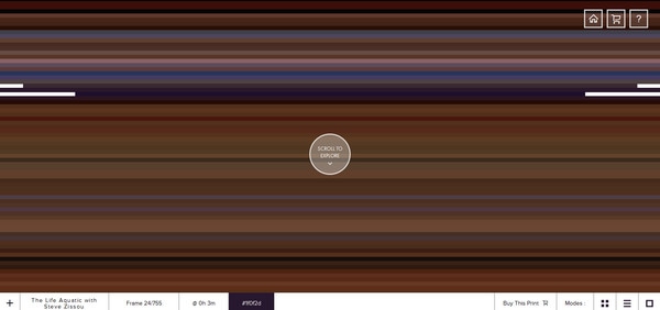
The Colors of Motion takes you on a lovely journey through classic American dramas. The website includes a truly original and alluring navigation through film episodes. It does not have any identification marks, it features only a colorful series of ultra-thin stripes or squares that lead to frames.
HelloNicolas
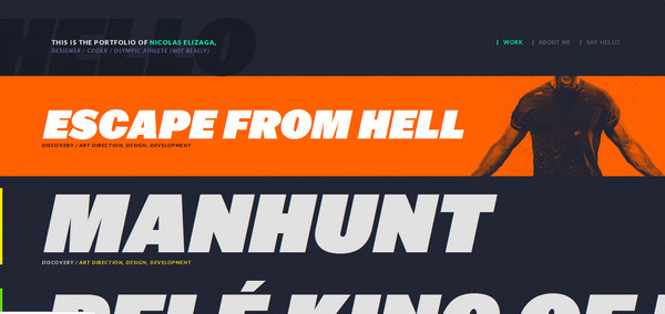
The online portfolio focuses users’ attention on the work from the first seconds. The artist has adapted a fresh solution that involves demonstration of portfolio items in a visually-appealing manner. The layout is broken into relatively wide, full-screen vibrant interactive stripes, each of which showily characterizes a selected work.
Grimouville
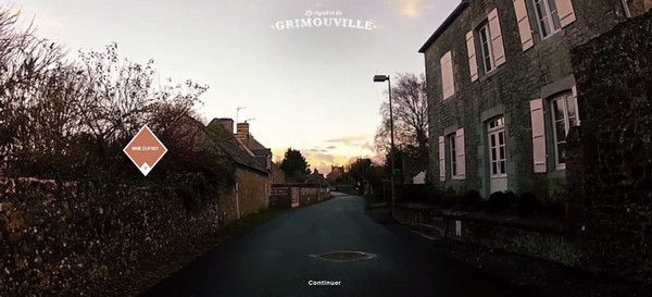
Want to take a brief yet memorable trip through Grimouville? Then visit this top notch website. It allows you actually to walk the streets of the city supplied with some interesting interactive elements along the way.
Leidgens Piscines
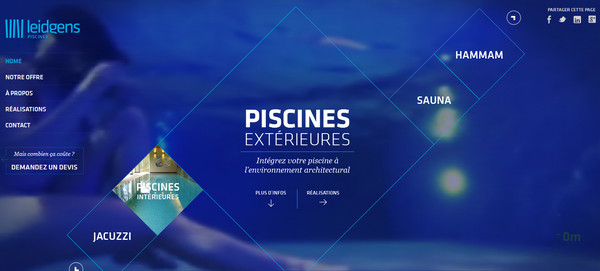
The front page owes its memorable appearance to two fundamental components: spectacular video backdrop that sets the tone and navigation that lets you explore the project more productively. Extra navigation placed in the center fits like a glove thanks to its delicate line-style look; each rhombus features an accompanying short video that supports the title.
Soppo
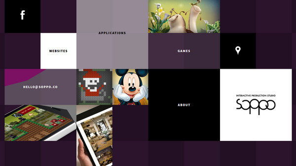
Soppo has a lovely boxy vibe that is achieved through a grid-based navigation menu. The developer harmoniously mixes solid color blocks and image-based blocks, providing each one with a direction-aware effect.
Visit Brazil
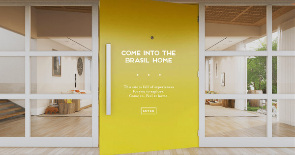
Visit Brazil is a truly conceptual website that justifies the nameplate. It lets you find out about the country with an interactive excursion through the house, where various elements tell their own stories.
Alexandru Nastase
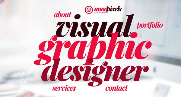
Alexandru Nastase skillfully makes use of typography, giving the front page a quite straightforward appearance with a lovely zest. While the heart of the page is marked by a densely-packed title, the navigation items are neatly scattered around it, shaping one form.
Conclusion
Unorthodox and unhackneyed navigation solutions are always able to catch attention and excite interest in users. They can transform a primitive website into a masterpiece.
However, it is vital to know when to stop since the possibility of getting to the desired page/section without hustle and bustle has always been the number one priority for users, no matter how intriguing and unusual your navigation looks.


