How to Create Accordion Menu in Pure CSS3

Difficulty: Intermediate
Estimated Completion Time: 30 mins
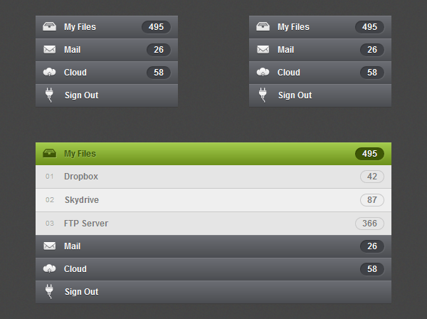
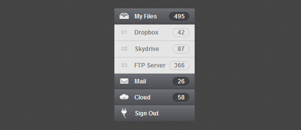
In this tutorial we will learn how to create an accordion menu in pure CSS3. As we will create it with CSS this will only work on browsers and devices that support the :target pseudo-class selector.
Step 1 – HTML Markup
Create an unordered list with an anchor tag and a span tag. Add a different id for each list item and link to this id with the anchor tag. To be able to style and open the accordion when we click on it we need to use the :target selector. The target selector will only work if we will have a link that points to an id and when we click on that link the id becomes the target element. And with this way we are able to make the sub menu links visible.
<ul class="sub-menu">
    <li><a href="#one"><em>01</em> Dropbox <span>42</span></a></li>
    <li><a href="#two"><em>02</em> Skydrive <span>87</span></a></li>
    <li><a href="#three"><em>03</em> FTP Server <span>366</span></a></li>
</ul>

First of all we’ll add some reset styles to the menu to clear the margins, paddings, etc.
.accordion,
.accordion ul,
.accordion li,
.accordion a,
.accordion span {
	margin: 0;
	padding: 0;
	border: none;
	outline: none;
}

.accordion li {
	list-style: none;
}
Now let’s style the menu links. We will add a CSS3 gradient, some shadows and more basic styles for font, etc.
With Postcards Email Builder you can create and edit email templates online without any coding skills! Includes more than 100 components to help you create custom emails templates faster than ever before.
Free Email BuilderFree Email TemplatesThe menu will not have a fixed width. It will take the entire width of his parent, so if you want to give it a 300px width just create a div and give it the width that you want. In order to prevent layout issues we will give it a minimum width of 160px (110px width + 50px padding).
.accordion li > a {
	display: block;
	position: relative;
	min-width: 110px;
	padding: 0 10px 0 40px;

	color: #fdfdfd;
	font: bold 12px/32px Arial, sans-serif;
	text-decoration: none;
	text-shadow: 0px 1px 0px rgba(0,0,0, .35);

	background: #6c6e74;
	background: -moz-linear-gradient(top,  #6c6e74 0%, #4b4d51 100%);
	background: -webkit-gradient(linear, left top, left bottom, color-stop(0%,#6c6e74), color-stop(100%,#4b4d51));
	background: -webkit-linear-gradient(top,  #6c6e74 0%,#4b4d51 100%);
	background: -o-linear-gradient(top,  #6c6e74 0%,#4b4d51 100%);
	background: -ms-linear-gradient(top,  #6c6e74 0%,#4b4d51 100%);
	background: linear-gradient(top,  #6c6e74 0%,#4b4d51 100%);

	-webkit-box-shadow: inset 0px 1px 0px 0px rgba(255,255,255, .1), 0px 1px 0px 0px rgba(0,0,0, .1);
	-moz-box-shadow: inset 0px 1px 0px 0px rgba(255,255,255, .1), 0px 1px 0px 0px rgba(0,0,0, .1);
	box-shadow: inset 0px 1px 0px 0px rgba(255,255,255, .1), 0px 1px 0px 0px rgba(0,0,0, .1);
}
To style the span that will contain some numbers we’ll give a gray background color, some shadows and rounded corners.
.accordion li > a span {
	display: block;
	position: absolute;
	top: 7px;
	right: 0;
	padding: 0 10px;
	margin-right: 10px;

	font: normal bold 12px/18px Arial, sans-serif;
	background: #404247;

	-webkit-border-radius: 15px;
	-moz-border-radius: 15px;
	border-radius: 15px;

	-webkit-box-shadow: inset 1px 1px 1px rgba(0,0,0, .2), 1px 1px 1px rgba(255,255,255, .1);
	-moz-box-shadow: inset 1px 1px 1px rgba(0,0,0, .2), 1px 1px 1px rgba(255,255,255, .1);
	box-shadow: inset 1px 1px 1px rgba(0,0,0, .2), 1px 1px 1px rgba(255,255,255, .1);
}

Step 3 – Icons
To insert the icons we will use the :before selector, this selector inserts content before the selected element. So this way we are able to insert the icons and position theme.
The icons images that we will use have 24px width and 24px height. So we’ll position them on top left and add some margins to center the icons properly.
.accordion > li > a:before {
	position: absolute;
	top: 0;
	left: 0;
	content: '';
	width: 24px;
	height: 24px;
	margin: 4px 8px;

	background-repeat: no-repeat;
	background-image: url(../img/icons.png);
	background-position: 0px 0px;
}
I’ve created a sprite image that contains all the icons (normal and hover state). The advantage of using sprites is that we are able to load all the icons at the same time (fewer requests) and as we only have one image that contain all icons the size will be inferior.
If you want to learn more about image sprites I recommend you to read this.
.accordion li.files > a:before { background-position: 0px 0px; }
.accordion li.files:hover > a:before,
.accordion li.files:target > a:before { background-position: 0px -24px; }

.accordion li.mail > a:before { background-position: -24px 0px; }
.accordion li.mail:hover > a:before,
.accordion li.mail:target > a:before { background-position: -24px -24px; }

.accordion li.cloud > a:before { background-position: -48px 0px; }
.accordion li.cloud:hover > a:before,
.accordion li.cloud:target > a:before { background-position: -48px -24px; }

.accordion li.sign > a:before { background-position: -72px 0px; }
.accordion li.sign:hover > a:before,
.accordion li.sign:target > a:before { background-position: -72px -24px; }

With Pulsetic you’ll be instantly notified the moment your website, API, or server becomes unavailable. Monitor uptime from multiple global locations and respond to incidents before your users are affected.
Create beautiful status pages in minutes to keep customers informed during outages and build trust with transparent communication.
Start Monitoring for FreeHTML
To create the sub menus add another unordered list with the class of sub-menu inside of the list item that you want to have sub menus.
<li id="one" class="files">
    <a href="#one">My Files<span>495</span></a>
    <ul class="sub-menu">
        <li><a href="#"><em>01</em> Dropbox<span>42</span></a></li>
        <li><a href="#"><em>02</em> Skydrive<span>87</span></a></li>
        <li><a href="#"><em>03</em> FTP Server<span>366</span></a></li>
    </ul>
</li>
CSS Styles
The styles of the sub menu links are almost the same. We’ll only change the colors, shadows, etc. We also have added an “em” tag that will contain some enumeration.
.sub-menu li a {
	color: #797979;
	text-shadow: 1px 1px 0px rgba(255,255,255, .2);

	background: #e5e5e5;
	border-bottom: 1px solid #c9c9c9;

	-webkit-box-shadow: inset 0px 1px 0px 0px rgba(255,255,255, .1), 0px 1px 0px 0px rgba(0,0,0, .1);
	-moz-box-shadow: inset 0px 1px 0px 0px rgba(255,255,255, .1), 0px 1px 0px 0px rgba(0,0,0, .1);
	box-shadow: inset 0px 1px 0px 0px rgba(255,255,255, .1), 0px 1px 0px 0px rgba(0,0,0, .1);
}

.sub-menu li:last-child a { border: none; }

.sub-menu li > a span {
	color: #797979;
	text-shadow: 1px 1px 0px rgba(255,255,255, .2);
	background: transparent;
	border: 1px solid #c9c9c9;

	-webkit-box-shadow: none;
	-moz-box-shadow: none;
	box-shadow: none;
}

.sub-menu em {
	position: absolute;
	top: 0;
	left: 0;
	margin-left: 14px;
	color: #a6a6a6;
	font: normal 10px/32px Arial, sans-serif;
}

Step 5 – Hover and Active states
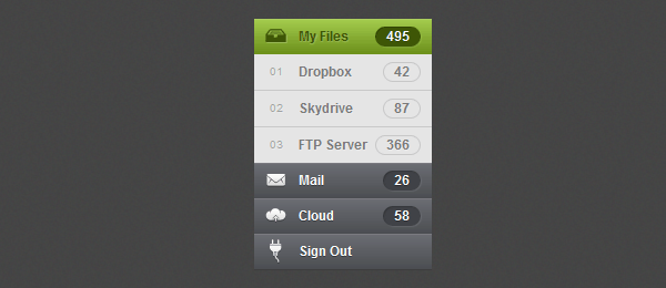
For the hover and the currently active link state we will change the gradient to a green one and also change the styles of the “span” to green. As in Futurico UI this accordion uses a pattern I have added it. You can choose if you want to use the pattern or the CSS3 green gradient. For the sub-menu hover state only change the background color to a brighter one.
.accordion > li:hover > a,
.accordion > li:target > a {
	color: #3e5706;
	text-shadow: 1px 1px 1px rgba(255,255,255, .2);

	/*background: url(../img/active.png) repeat-x;*/
	background: #a5cd4e;
	background: -moz-linear-gradient(top,  #a5cd4e 0%, #6b8f1a 100%);
	background: -webkit-gradient(linear, left top, left bottom, color-stop(0%,#a5cd4e), color-stop(100%,#6b8f1a));
	background: -webkit-linear-gradient(top,  #a5cd4e 0%,#6b8f1a 100%);
	background: -o-linear-gradient(top,  #a5cd4e 0%,#6b8f1a 100%);
	background: -ms-linear-gradient(top,  #a5cd4e 0%,#6b8f1a 100%);
	background: linear-gradient(top,  #a5cd4e 0%,#6b8f1a 100%);
}

.accordion > li:hover > a span,
.accordion > li:target > a span {
	color: #fdfdfd;
	text-shadow: 0px 1px 0px rgba(0,0,0, .35);
	background: #3e5706;
}

.sub-menu li:hover a { background: #efefef; }

We’ll give 0px height to the sub menu to hide it and also add a transition slide effect. In order to make the slide transition work we need to give a fixed height to the sub menu. So if you want to add a different number of links to each sub menu you need to add a different height to each sub menu according to how many links you have. As I only have three links I use 98px height, if you want to make it automatic add a 100% height value but the slide effect will not work.
.accordion li > .sub-menu {
	height: 0;
	overflow: hidden;

	-webkit-transition: all .2s ease-in-out;
	-moz-transition: all .2s ease-in-out;
	-o-transition: all .2s ease-in-out;
	-ms-transition: all .2s ease-in-out;
	transition: all .2s ease-in-out;
}

.accordion li:target > .sub-menu {
	height: 98px;
}
Conclusion
We have finished this Pure CSS3 Accordion Menu. Hope you like it and don’t forget to live some feedback or any question you have in the comments.


