Beautiful Examples of iPhone Application Website Designs
Apple is known to be a stickler for perfectionism that affects every aspects of its industry, and design is no exception. Its official website is a shining example of minimalism, neatness and highly attention to details which at one time generated a lot of followers and extended their influence over a great deal of artists. Also, such a thirst for a nonpareil significantly reflects on website designs that are aimed to promote iOS applications.
Generally iPhone application websites have rather simple structure that includes only necessary information provided in brief manner and couple of demonstrative images. So to speak, they are just original landing pages, rarely standard websites with inner pages. But they have one thing in common; most of such websites are truly creative and sophisticated web projects that attract users with their unconventional approaches executed in relatively tiny space. Furthermore, intense competition that plays a significant role in this sphere adds a note of piquancy, thereby obligating developers to create something exceptional, appealing and different from others.
You can see it for yourself; just take a look at our fresh collection that represents snorting iPhone application website designs.
iPhone App Website Designs
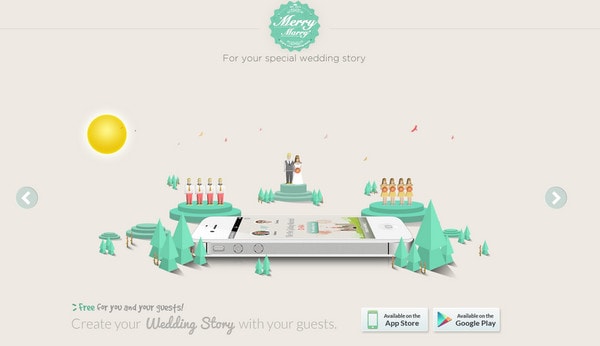
MerryMarry attracts users with clean and accurate image slider; each slide includes white iPhone mockup that is engaged in different scenes.
Overgram has a slightly movable, darkened grid-based background that is full of vibrant photos.
With Postcards Email Builder you can create and edit email templates online without any coding skills! Includes more than 100 components to help you create custom emails templates faster than ever before.
Free Email BuilderFree Email Templates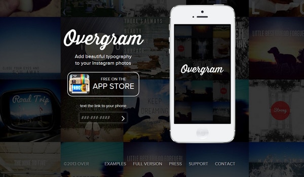
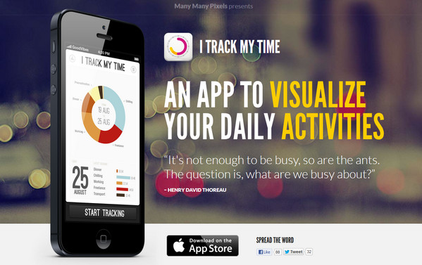
iTrackMyTime utilizes sweet bokeh effect in order to put emphasis on foreground elements.
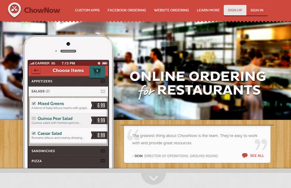
ChowNow links website and application designs by means of a same color scheme, ribbons and use of soothing red header.
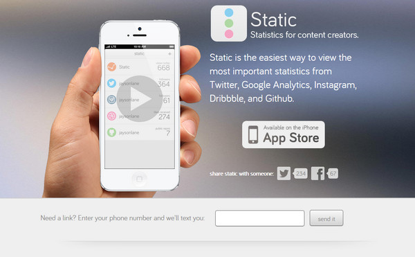
Static for iPhone incorporates loads of iPhone mockups in order to make every section comprehensive and descriptive, clearly demonstrating an app working process.
MealKick makes use of various textures along with noised background that are duplicated in app interface; also blurred image in a slider section perfectly fits into composition.
With Pulsetic you’ll be instantly notified the moment your website, API, or server becomes unavailable. Monitor uptime from multiple global locations and respond to incidents before your users are affected.
Create beautiful status pages in minutes to keep customers informed during outages and build trust with transparent communication.
Start Monitoring for Free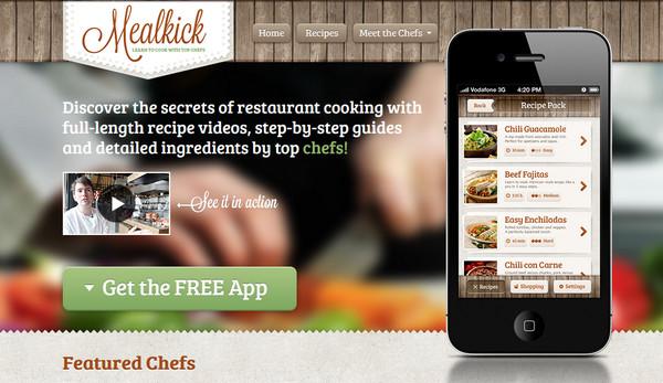
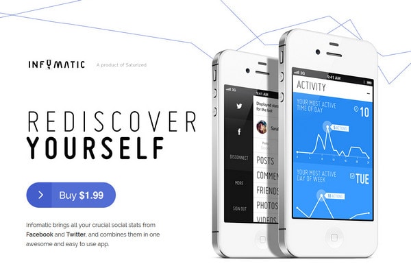
Infomatic recreates a sense of purity and neatness by means of almost blank website outward.
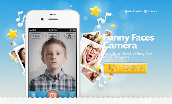
Funny Faces Camera has a cheerful and frisky vibe thanks to sky-like background with a bunch of glossy graphics and fun digital photo collage.
Gethyapp is a fairly plain one-page website with a blue as a core color. Simple typography and bold icons make it looks accurate and clear.
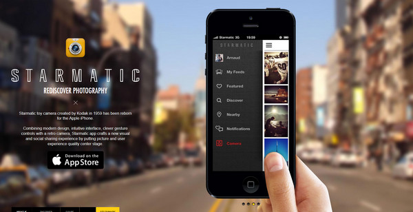
Starmatic takes on minimal approach using appealing, slightly blurred full-screen photo background, bold typography and relatively small text block.
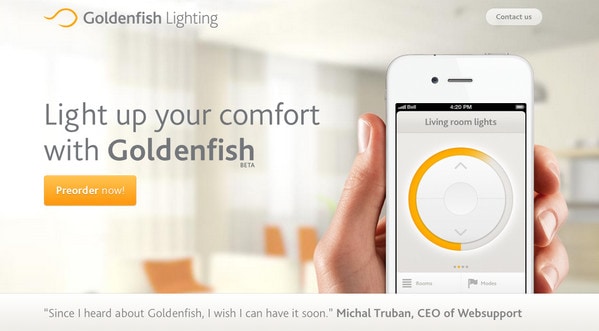
Goldenfish Lighting bets on white and orange color palette, evoking positive feelings and making website look warm and friendly.
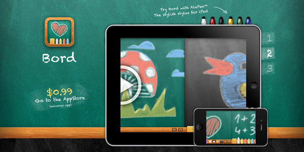
Bord plays strongly on heavy textures, harmoniously combining together different chalkboard patterns.
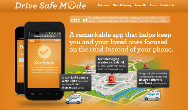
Drive Safe Mode – Despite the use of orange color which is mainly associated with positive emotions, application is aimed to increase awareness of really big problem on the road, focusing users’ attention on elucidating illustration and tagline.
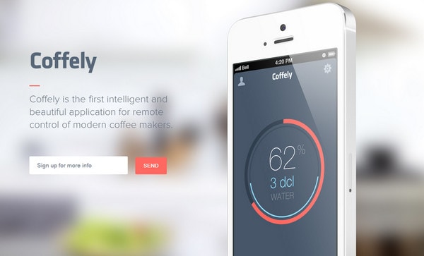
Coffely uses trendy, strongly blurred background, ¾ iPhone view, and seamless typography that all together bring a note of elegance and subtlety.
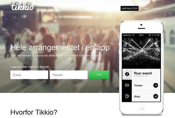
Tikkio looks modern and sophisticated through luminous photo background, bold white typography and neatly organized content section.
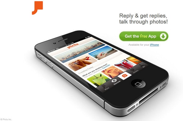
Piictu is another nice example of minimal landing page that includes only device for which was made application and several words about program assignment.
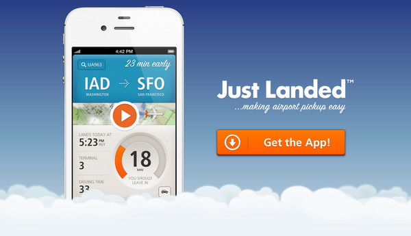
Just Landed makes its header literally to soar in the clouds, thereby visually connecting design and a main purpose of an application.
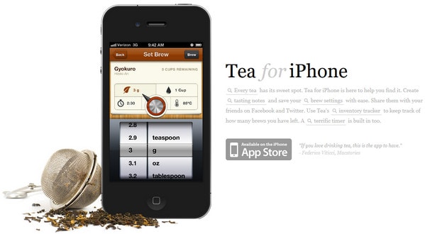
Tea for iPhone skillfully representing program name, explaining its purpose by means of application screenshot that is enclosed in cell-phone mockup.
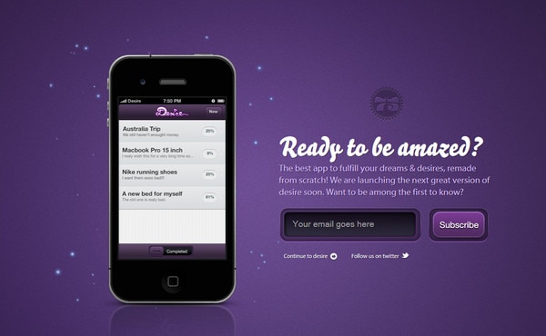
Desire App is a vibrant one-colored website that ably implements violet color, adding charming effect by means of small animation.
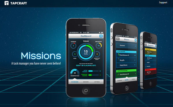
Missions mimics military hi-tech style, employing dark blue color scheme, solemn app interfaces and background with perspective effect.
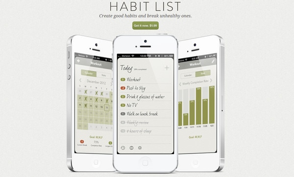
Habit List has a neat, light design with grey color in mind, and heavily noised background. It welcomes potential customers with large-scale iPhones that show application in action.
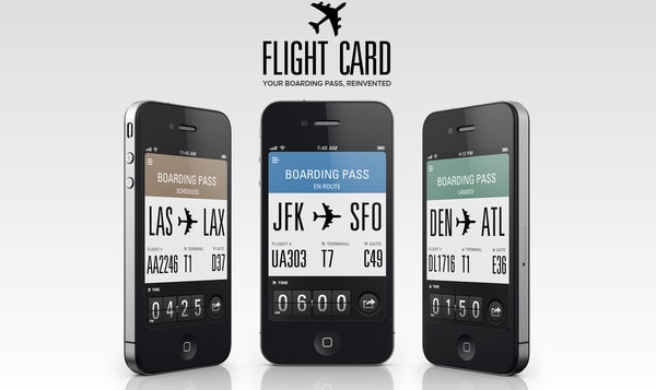
Flight Card also features trio of iPhones, demonstrating application in different angles.
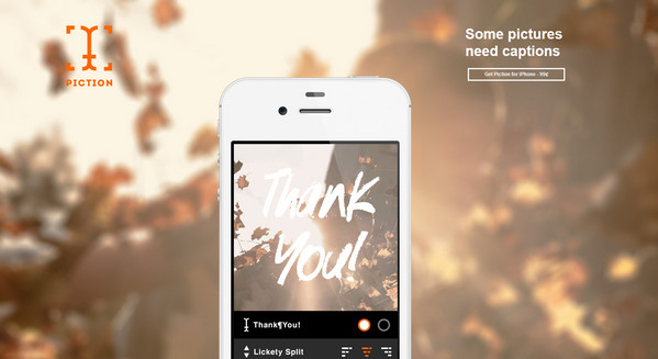
Piction includes only landing page with brief app presentation. Shining photo background adds to design a bit of joy and make iPhone template stand out.
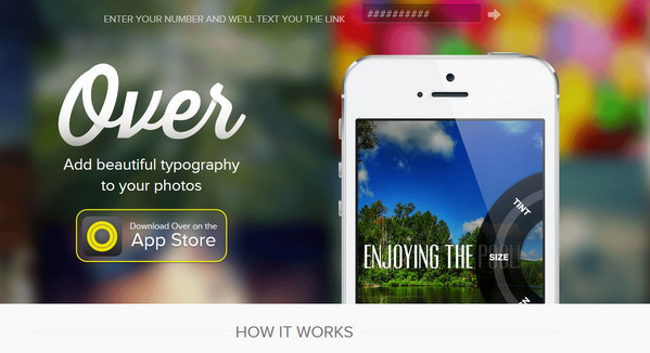
Over focuses attention mainly on header that involves vivid blurred header background, light strong type, and iPhone with app interface. While the rest part of a website remains plain and flat.
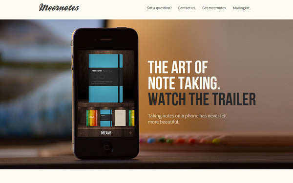
Meernotes equates an iPhone to essential stationery by using a shot on which mobile device is pushed to the front while other office implements are deliberately vague.
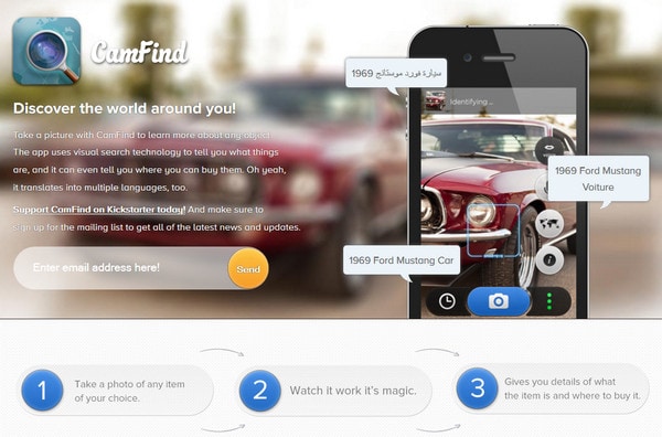
CamFind makes full use of a powerful, most viewed part of a website – header, including as many information as possibly, thus shedding a light on different possibilities of a program.
Reflection
As a rule, when you want to demonstrate or advertise a product, first of all, you have to show for what it is intended. And since a majority of iOS applications implies an iPhone, it’s not surprising, that website designers include mockup of this device into every landing page. All the more so descriptive representation of program’s working process with detailed and, at the same time, attractive screenshots can bring positive effect; and as a consequence to get more people to buy this product.
Should every iOS app website design include iPhone mockup? Or maybe such approach is a hackneyed? Is minimal approach that usually dominates in such websites appropriate? What example do you find most appealing?


