Hot Navigation Design Patterns for Mobile
Once someone starts using your application, they need to know where to go and how to get there at any point. If they can’t navigate through your application easily, you’ll quickly lose them.
Thus, designing effective navigation in your mobile application is crucial. But there are some basic considerations you need to remember before diving into menus, action bars, pop-ups, buttons, arrows, links, and so forth.
Once you understand your mobile application’s architecture and organization, you’re ready to think about navigation design. And there are several things to consider when doing so:
- Accessibility – The navigation of your mobile application is arguably the most important part of any view so make it accessible, with the most important elements as prominent as possible without detracting from the content itself.
- Meaningfulness – Make menus, action bars, pop-ups, buttons, arrows, links and other navigation elements clear so users know what to do and, just as important, where they will be taken. Don’t get fancy with this because users don’t want to guess.
- Understandability – If you want to get more advanced with navigation (e.g. linking images, allowing for swiping or other gesture-based navigation, or accessing hidden menus), make sure you’re both consistent in your implementation so users get familiar with the patterns you’ve designed, but also add any additional information (e.g. a light arrow, some text, or change in color or highlighting) to catch the user’s eye and educate them in subtle ways. Don’t give them ” Mystery Meat Navigation.”
- Prevalence – Your navigation should appear in every view of your mobile application in some form. While you don’t need to have identical navigation, the basic structure should be the same throughout the application, with slight changes being contextually relevant.
An Overview of The Patterns
Keeping in mind the design objectives above, here’s an overview of the design patterns we’ve detailed in this article and at even greater length in our e-book, Mobile UI Design Patterns 2014:
- Walkthroughs & Coach Marks
- Overflow Menus
- Sliders
- Content-Based Navigation
- Morphing Controls
- “Sticky” Fixed Navigation
- Vertical Navigation
- Popovers
- Slideouts, Sidebars & Drawers
- Links to Everything
- Advanced Scrollbars
- Swipe Views
1. Walkthroughs & Coach Marks
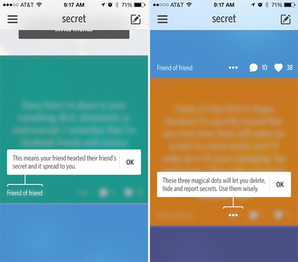
Secret
With Postcards Email Builder you can create and edit email templates online without any coding skills! Includes more than 100 components to help you create custom emails templates faster than ever before.
Free Email BuilderFree Email TemplatesProblem
The user wants to know how to use the different features of the application.
Solution
Design a walkthrough or tutorial that demonstrates how each function works. A lot of apps have begun using this technique to show users around when they first launch and there are two basic ways of doing this. Some apps, like Secret or YouTube, go the route of overlay instructions, highlighting important parts of the UI with “coach marks” to explain what they do.
Alternatively, some apps like Carousel and Duolingo use the first launch to show a slideshow that walks users through the entire experience, effectively explaining what the user can accomplish with the app. This walkthrough is also a great time to collect important information that goes beyond simple registrations, much like a setup wizard. The importance of this pattern cannot be stressed enough for any mobile application that isn’t immediately intuitive because the more a user knows about your product, the more reasons they’ll have to come back.
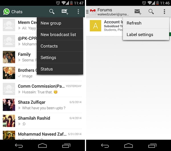
Whatsapp, Gmail
Problem
Users want quick access to additional options or actions they can perform.
Solution
Hide extra options and buttons in an overflow menu so that they don’t clutter the main interface. Overflow menus are extensively used in Android to stow away options and menu items in the action bar that aren’t often used but are relevant to the current context. Apps like Whatsapp and Gmail use it for menu items like refresh and setting a status – added features of the app that user’s should have quick access to, but would otherwise get in the way if put in more prominent positions. RelateIQ let’s you hold down main menu items to see submenus for faster navigation to views.
3. Sliders
With Startup App and Slides App you can build unlimited websites using the online website editor which includes ready-made designed and coded elements, templates and themes.
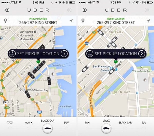
Try Startup App Try Slides AppOther ProductsUber
Problem
Users want to seamlessly move between options.
Solution
Make transitions between selections obvious and easy with the swipe of a finger. Uber lets you toggle between four types of ride services seamlessly by dragging a slider side-to-side. In this UI design pattern, they even zoom in and out to give you a similar level of density of cars nearby so you can see an acceptable number of options automatically.
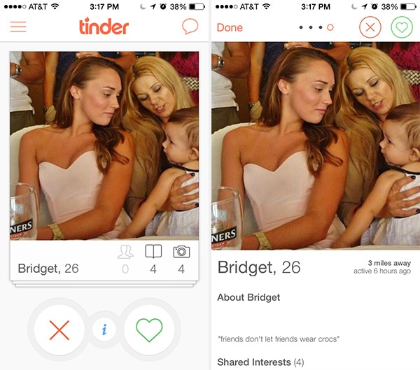

Tinder
Problem
Users want to explore details of specific content easily and intuitively.
Solution
Make transitions between overview and detail states seamless. Tinder and 9Gag have made this seamlessly responsive. In Tinder, this UI design pattern lets you toggle between 2 states of a user’s profile simply by clicking on the main picture in each view. But they go one step further. If you swipe through pictures in the detailed view of a user profile then click on the picture to go back to to the basic view, it stays on the picture you clicked on. This creates an extremely fluid and intuitive user experience and flow.
5. Morphing Controls
Problem
The user wants to perform different types of actions, but there’s limited screen real estate to show all these controls.
Solution
Replace buttons and on-screen controls with alternative functionality. Depending on what the user is currently doing, the UI could entirely replace an element with another, e.g. “do” and “undo” or “add” and “delete.” This makes sense when the alternating actions are related in some way.
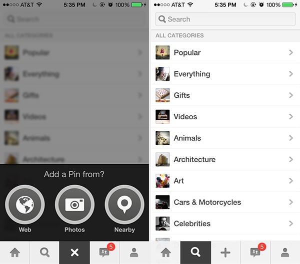
Pinterest and Spotify let you know you can cancel adding a pin or following an album, respectively, by transforming the “+” into an “x” button. This UI design pattern saves real estate, makes undoing any action quick and clean, and is an overall playful solution.
Dropbox
Problem
The user wants to have access to the menus anytime while in the application.
Solution
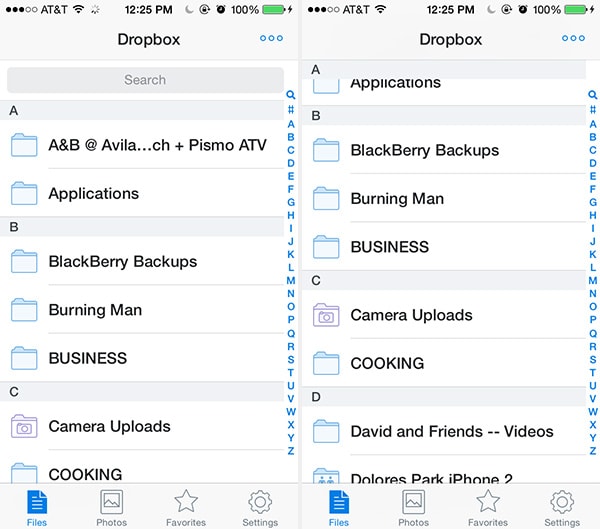
The top, side, or bottom navigation stays in place while a page is scrolled. In some cases, headings from sub-sections may also become fixed while scrolling and replace or be appended to the existing fixed navigation. Address books are a great example where each alphabetical section (“a”, “b”, “c”, etc.) stick below the top navigation when you scroll past that section header. Photo galleries and file folders tend to utilize this same design pattern. In other cases, menus disappear when scrolling in one direction and become fixed when you scroll in the other direction. Pinterest is a great example of that where the menu disappears at the bottom when scrolling up and appears when scrolling down. This is different from an action bar (a pattern that’s used heavily in Android) to store commonly used app functions.
Facebook, Spotify
Problem
The user needs a way to navigate between different sections of the app, but there’s limited space to show this information.
Solution
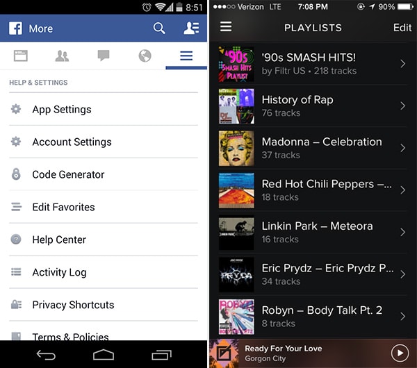
Important sections of the UI are presented in a list, which the user can scroll through to get what they want. Scrolling in this way is a standard mobile gesture, so it makes sense for apps to adopt this for their navigation layout. This also leaves the header and footer of the UI free for more “universal” navigation, such as action bars. You’ll see varying implementations of vertical navigation across all kinds of apps ranging from music players like Spotify to newsreaders like Yahoo! Digest.
8. Popovers
TED, Dropbox
Problem
The user wants to view relevant information without losing their current place in the UI.
Solution
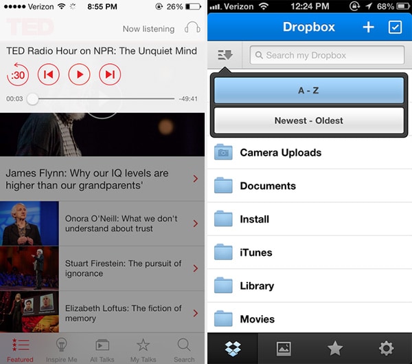
Show important notifications and additional information in popovers. This UI pattern has the advantage of providing a lightweight and straightforward way of viewing additional information or taking a particular action, but they do so without pulling the user out of their current activity. The official TED app puts playback control in a popover with the background faded out so that the user is always aware that this quick interaction with the player is not going to interfere with their browsing through other content.
Dropbox and Kindle also place controls in a popover. The popover UI pattern is important for actions like these because they are being performed on the data and this way users always know what these controls apply to. With the content still visible in the background, the user can tweak sorting options or change the font size without having to go back and forth between the views – it all happens right there. Popovers and modal windows can also be used to display important notifications or notices where it’s essential to get the user’s attention because dismissing them requires a tap or swipe. For example, Secret and Swarm use a popover to explain what will happen if the user continues with their action.
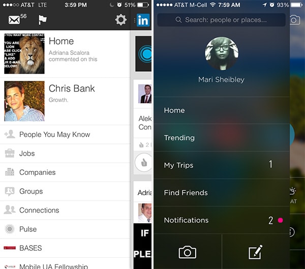
LinkedIn, Gogobot
Problem
The user needs a way to navigate between different sections of the app without being distracted in each individual section.
Solution
A secondary section of the application — such as navigation, chat, settings, user profiles, etc. — is tucked away in a collapsible panel hidden under the main section when it is not needed. When accessed, it usually either moves the main section aside or slides over it. Since the slideout is in a separate layer from the main content in the application, there’s a lot of flexibility in terms of how content can be laid out inside the drawer – icons, text, and even simple controls are viable options to provide quick access to important actions here.
Often times, the drawer can be hidden under a “hamburger menu” or a simple arrow that indicates there’s more content there. It’s an easy way to hide all the less important things in a “side drawer” and not worry about how a mobile application should distill the most important information. Instead, you only have to focus on how to distill the most important information in each view that’s accessible from the side drawer. We’ve included a wireframe example of this design pattern below using UXPin.
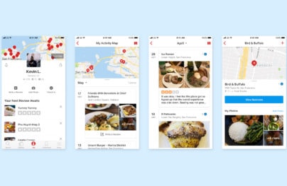
10. Links to Everything
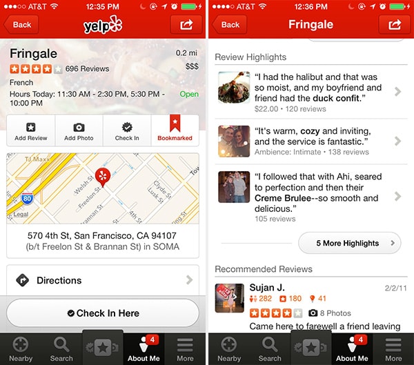
Yelp
Problem
The user needs a consistent way of navigating through content without being distracted by additional content.
Solution
Most or all user content within the app is linked, giving users the freedom to explore and find the exact information they’re looking for without hitting dead-ends or being distracted by a litany of hyperlinked text, additional buttons, calls to action, etc. that you would normally see on a website. If they want to interact with a piece of content in the app, odds are that they can tap on it and go to a new view for more detailed experience. For example, in Yelp, users have lots of options – they can tap on the buttons across the bottom or instead explore by tapping on the content itself, like maps or comments. This makes for an easier navigational pattern than, say, Flipboard, with endless ways you can swipe, tap, x-out, undo, and go-back, as you navigate through it, digital magazine.
We’ve included a wireframe example of this design pattern above using UXPin.
11. Advanced Scrollbars
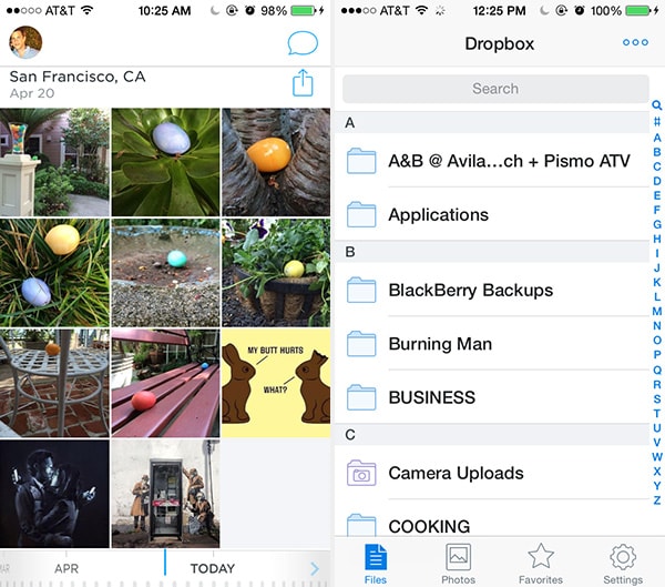
Carousel, Dropbox
Problem
The user needs to see their current position in the context of an entire content set, or move to a specific section of a long list or gallery more quickly.
Solution
Beyond scrolling with a swipe gesture, mobile lists and galleries often have a scroll bar that is persistent or temporarily appears when scrolling. Often, the scroll bar is complemented by a scrolling index — dates, alphabetical letters, categories, locations, etc. With index scrolling, a scroll indicator is typically persistent so it appears even when the user isn’t scrolling. Touching or dragging it causes the current section to pop up in a prominent way. However, the scroll bar and index can be coupled and only appear during scrolling to save extra screen real estate and reduce distractions. In cases where scrolling and indexing are even more critical, the scroll bar is more likely to be more prominent and persistent.
For example, in Carousel, we not only have a visible scrollbar, but a power scrollbar at the bottom so you can blaze through your 1 million hosted photos with ease. As user-generated content, feeds, groups, lists, etc. keep growing, we’ll see even more innovative UI design patterns that allow users to find what they’re looking for beyond search and scroll bars.
12. Swipe Views
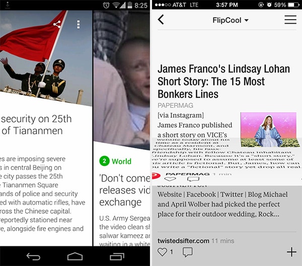
Yahoo! Digest, Flipboard
Problem
The user wants to navigate from one piece of content to the next without having to go back to the index.
Solution
Allow users to move from item to item by swiping through content. This pattern should be familiar from browsing through photo albums, but more and more apps are starting to implement this for their content as well, like Yahoo! Digest and Flipboard. This helps maintain the immersive experience for users when they can simply swipe through content. This pattern can also be used for an organizational purpose, separating different section of the app into “tabs” that the user can access by swiping. When implementing this pattern it’s also a good idea to think about how well the interface shows its ability to be swiped.
Keep track of where your users are supposed to navigate, whether they ever view the navigation elements, how often they navigate to certain areas of the application, where they’re coming from and going to in the application (i.e. the user flow) and so on. Keep rearranging, re-sequencing, re-sizing, and tweaking those navigation elements until you get more of the desired actions. And, of course, think deeply about how the user is actually using your mobile application when they’re trying to get to certain parts of the application – make sure you’re not missing something obvious.
For a deeper look at how some of the hottest companies are implementing new and existing navigation design patterns as well as 45+ other patterns, check out UXPin’s new e-book, Mobile UI Design Patterns 2014. Use what you need and scrap the rest – but make sure to tailor them to solve your own problems and, most importantly, those of your users.


 siter.io
 pulsetic.com
 static.app
 mailpost.io