Responsive CSS Keyframe Animations
I know I am not alone in the pure love and happiness I feel towards CSS animations. I also know I am not alone in the love and happiness I feel towards my mobile phone. Yet, the joyful experience of using a site with animations is often absent on mobile. If our goal is to create the best user experience possible, and we acknowledge that animations enrich this experience, we need to make sure that we deliver regardless of the device being used.
There is much less space on a mobile for animations to utilize, and some of us (read: me) have a big clumsy thumb that may at times hide the animation completely. The limitations of animations on mobile can seem pretty discouraging, but we can’t put all our attention into creating desktop animations and not address mobile viewing. In doing so we are cheapening the experience of a large percentage of users.
Communicating Through Animations
We can also go beyond simply transitioning colors and sizing with these animations. It doesn’t have to be an ultimately irrelevant event. We can use fun animations as a tool for communicating with our users. The user can have fun, while still viewing something of purpose. We have gotten their attention, now what do we want to tell them?
Mobile First Animations
Just as we do with building a site, we need to develop our animations mobile first. This forces us to narrow down and focus on what we are trying to say. Creating responsive animations will allow us to build different experiences that each respect the limitations of various devices. However, even with these differences the animations have to say the same thing. Each screen provides us with new limitations (yes, even desktop) and we will overcome those limitations with responsive design.
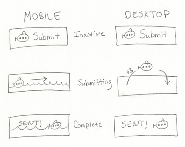
It’s about the message, respecting limitations, and having fun. To demonstrate this concept we will be creating animations for a SUBmit button. Our mobile animations will stay within the boundaries of the button. Our desktop animations will dare to go beyond the button and utilize some of that glorious space we now have. First thing’s first, let’s sketch this out.
With Postcards Email Builder you can create and edit email templates online without any coding skills! Includes more than 100 components to help you create custom emails templates faster than ever before.
Free Email BuilderFree Email TemplatesOur movements here convey three different stages for the user: inactive, submitting, and complete. Through these animations we are communicating with the user throughout the submission process. The two are very different, but say the same thing. Our message is consistent, our brand’s fun image is consistent, and we are now known for bringing a good time regardless of screen size.
Let’s take a look at our button’s demo before we dive (ha) into the @keyframes. Our button has one set of animations on screens smaller than 800px, and a different set of animations on screens larger than 800px. The button will reset as you change your screen size to prepare for the next animation.

Mobile Keyframes
We will communicate a “submitting”, or “processing”, state by having our water appear to raise half way up the button and then have the submarine drive to the opposite side once the button is clicked. The text swap will be achieved with an animation as well. We are telling the user “hey, thanks for clicking, we are submitting your data”.
To do all this we will set up three different @keyframes.
@keyframes submerge {
  to {
    transform: translateY(-50px);
  }
}

@keyframes drive {
  to {
    transform: translateX(140px);
  }
}

@keyframes sent {
  to {
    opacity: 1;
  }
}
In the above @keyframes commands we have brought our water level up, moved our submarine across the button, and finally, made our “sent” text appear to signal completion.
Mobile Limitations
When we assign these animations we need to consider other limitations on mobile other than space, such as my big clumsy thumb I was talking about earlier. When our users push this button their finger or thumb is in the way at first. Any animation that starts right away is likely to be missed. Keeping this in mind, our timing-functions within our animation assignments will be important. We will declare delays and set up completion times that respect lingering thumbs as well as our “processing” animation time needed.
The animations are subtle, but not so subtle that our point is lost or that it would be missed if the user is walking, for example, and we don’t have their full attention. We have successfully displayed our inactive, submitting, and completed states without using additional space, and we are having fun doing it. Not a bad start.
With Pulsetic you’ll be instantly notified the moment your website, API, or server becomes unavailable. Monitor uptime from multiple global locations and respond to incidents before your users are affected.
Create beautiful status pages in minutes to keep customers informed during outages and build trust with transparent communication.
Start Monitoring for FreeDesktop Keyframes
Now, on to our desktop animations. Let’s get a little splashier here. We want our sub to raise out of the button with a splash, move to the right, and reenter the button with another splash. The sub will then reside on the right side of the button. As with mobile, these animations will complete within 4s. Our button’s overall appearance looks fun and that’s what we will deliver. Let’s take a look at each of the @keyframes involved.
The star of the show, the submarine, is positioned on the left side of the button. We want it to move up, over, and then down. And stay. It’s going to jump out of the water, so that is exactly what we will call this @keyframes.
@keyframes jump {
  25% {
    transform: translateY(-90px) rotate(-40deg);
  }
  75% {
    transform: translateY(-90px) translateX(150px) rotate(40deg);
  }
  100% {
    transform: translateY(0) translateX(150px);
  }
}
For our splashing water effect we will want our droplets, which are currently invisible, to briefly appear. We will do this with a @keyframes that changes its opacity.
@keyframes water-splash {
  0% {
    opacity: 0;
  }
  50% {
    opacity: 1;
  }
  100% {
    opacity: 0;
  }
}
Halfway through our animation the water droplets will be completely visible, but then disappear again as the animation completes. We don’t want these guys sticking around for the party, just to make a brief appearance. We will target our second splash with an additional class, move it right, and then add an animation delay of 2s to give the submarine time to get to that side. Our “sent” text will then appear as it did on our mobile view to signal our completion state.
Desktop Limitations
Our main limitations here are based on the message we created with our mobile animations. We have been clear in using our animations to convey different states for a submission process, so that’s exactly what we had to do with the desktop animations as well. The main differences being in how our sub used the space it has available, and how quickly we got it moving. We let our sub stretch its propeller a bit, which it and our user’s eyeballs thank us for.
SUBmission Accomplished
We have managed to communicate the same thing two different ways. The message and experience are consistent across screen sizes. This concept, of course, is not restricted to moving an adorable submarine. Each animation we create on our sites needs to be developed first for mobile. Omitting animations from smaller screens, or having an animation that is not respectful of the limitations of its screen size is going to compromise your message, your brand, and the user’s experience.
Our animations here are responsive and all our users are now happy and frantically submitting data to watch our submarine dance. Except, you know, no actual data in this instance. We have also successfully used CSS animations as a form of communication, not just a flashy effect.
Happy responsive SUBmitting!

Source files


