How to Mockup Responsive Websites in Sketch App
It’s quite normal to build websites with responsive viewports and it’s been that way for a while now. Of course, not every website needs to be responsive, but it’s common courtesy to offer it to your mobile visitors if you have them.
But how do we create mockup designs for responsive websites?
Sketch App
Sketch App by Bohemian Coding is a Mac Application for user interface designers that either don’t code, or are more comfortable working on code separately in a code editor and having unlimited choices as to which tools and services they can use. You can, however, right-click on a layer and copy the CSS styles to the clipboard, so it’s not completely devoid of a development workflow.

For that reason, I think that Sketch is the ultimate tool for designing responsive interfaces. Lets take a look at some of the ways in which we can cut our responsive workflow time in half.
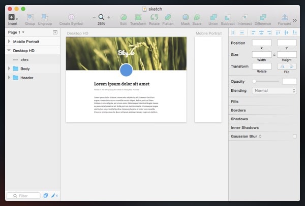
Creating mobile artboards
In this tutorial I’ll be using a .sketch template that I’ve already made. It was used to mockup a real website, so I’ve trimmed it down a little and removed the mobile artboard so that we can recreate it using the elements from our desktop artboard. Sketch App has a number of features to help facilitate the concept of reusing elements and styles, which is very useful for mocking up responsive designs.
With Postcards Email Builder you can create and edit email templates online without any coding skills! Includes more than 100 components to help you create custom emails templates faster than ever before.
Free Email BuilderFree Email TemplatesCan’t we just copy and paste elements into a mobile artboard?
Well, yes, you can. But depending on the level of mobile-optimisation that needs to be enforced, you could make life a lot easier for yourself by using Shared Styles, Text Styles and Symbols. Press “A” to create an artboard and select Responsive Web Design → Desktop HD, and then repeat this step again and choose Responsive Web Design → Mobile Portrait.
Since I’m only using my .sketch mockup to steer you in the right direction, this won’t be a step-by-step tutorial, so feel free to create your own layers and style them according to your own needs. I’ll start with Shared Styles; these are useful if you want to replicate a layer’s styles but change the size of it.
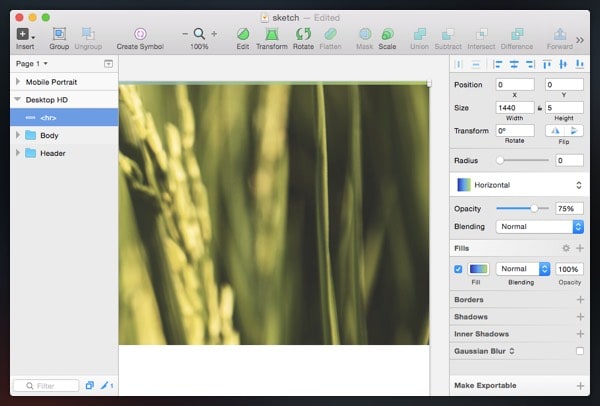
First, select the layer you want to replicate. In my case it’s the multi-coloured horizontal line at top of the mockup. It’s Opacity is 75% and it’s been filled with a Linear Gradient – those are the styles that will remain consistent throughout both artboards, but the width, however, will need to be adjusted if it’s to fit inside the viewport of the mobile artboard. Shared Styles is the way forward because it achieves exactly that – all the necessary styles, but with the ability to set custom sizes. Perfect for responsive design.
In the sidebar on the right (The Inspector), there’s a dropdown box that says “No Shared Style”; select it, “Create New Shared Style”, and type in a name for it. If you’re familiar with CSS, think of it as like naming a reusable class.
Now click on the mobile artboard. Press “R” to initiate a Rectangle shape and draw it out, click on the Shared Styles dropdown again, and select the new shared style. What you should have now is a new rectangle with completely different dimensions (in my case 320px x 5px), but with the same styles.
With Startup App and Slides App you can build unlimited websites using the online website editor which includes ready-made designed and coded elements, templates and themes.
Try Startup App Try Slides AppOther Products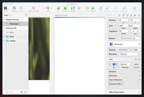
If I decided that I wanted to change the background colour of this horizontal element, I could now do so freely, because they’re both sharing the same styles and would update together.
Symbols
Symbols are quite similar to Shared Styles, but instead they’re applied to Groups of layers and they cannot be width/height-independent. If you change the dimensions of a layer within a Symbol Group, that layer will change within all of the other Symbols too. Let me show you an example.
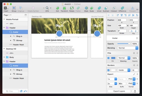
I want to copy over the entire header in my desktop artboard to the mobile artboard, so I’ve located the group that contains all of the necessary layers (in the layers sidebar – left), created a Symbol (the same way we did Shared Styles), and used Duplicate (CMD + D) to make a copy of the Symbol. After that, I’ve used CMD + Opt + Up to move it into the mobile artboard. As you can see from the screenshot below, all Shared Styles and Symbols appear purple in the layer tree.
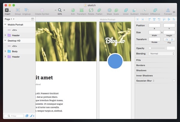
Now that I’ve seen the avatar (the blue circle) in a mobile viewport, I’ve decided that I want to make it a little smaller; not only for mobile, but for desktop too. I’m not looking to work extensively with media queries when I develop this website later on, so this is designed with “one size fits all” in mind.
Press CMD while clicking a layer inside a group to click-through the group and select the layer directly. After that, The Inspector will let you change the width and height of this layer. Make sure the tiny “lock” icon is activated so that we can maintain the correct aspect ratio when changing the dimensions of it. In my case the avatar on both artboards will resize on the fly because they are linked as a Symbol.
Text Styles
In this final exercise we’ll explore Text Styles – these are almost identical to Shared Styles, only instead they apply to text layers. It’s important to remember that each block of text needs to have its own layer so that individual Text Styles can be applied to them; this is especially useful for creating style guides in a separate artboard before you start designing at all.
After that, fresh text layers can have Text Styles applied to them within seconds. Designers who make icons, user interface kits and other design resources often make use of Symbols and Text Styles in Sketch App, allowing us to use those design resources on the fly, rather than having to duplicate and move layers between artboards every time we want replicate a style.
After declaring the Text Styles and using “T” to insert text into the mobile artboard, I’ve encountered two issues.
Can you spot what they are?
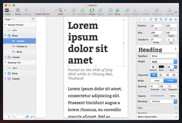
- Maybe the heading is too big and the font size could be reduced
- Also, the “Post Data” needs more line spacing
Issue #2 is an easy one. I’ve increased the line spacing using The Inspector, and this hasn’t effected the desktop artboard at all. Because this section only ever appears on a single line in the desktop mockup, I hadn’t noticed the bad line spacing until the mobile artboard compressed it. Problem solved.
Issue #1 is a little more difficult. It’s obvious that the font size is too big for mobile reading, but if we alter it, it too will change in the desktop artboard…and that’s not what we want.
Inside The Inspector, select the dropdown box that indicates which Text Style is applied and choose “No Text Style”. You’ll notice that the text itself doesn’t change, which is blissfully convenient. Simply alter the text styles in The Inspector (in my case I’ve reduced the font size to something more mobile-optimal) and create a new text style. You can apply this same technique to Shared Styles and Symbols as well.
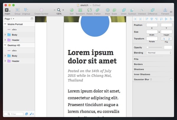
Here’s the final result of my example.
Conclusion
Prototyping and mocking up is an important step in any design workflow, but it shouldn’t have to be time-consuming or inefficient. Shared Styles, Text Styles and Symbols are not there to make Sketch App look more impressive; they’re very useful and sometimes overlooked. Save the most-used elements of your mockups so that you can use them again. Save yourself time.
Bonus advice
- Organise your mockups
When you create a new artboard or duplicate an existing one, it automatically appears about 100px to the right, and what you’re left with after creating a few artboards is a long row of mockups. There’s a much better way to organise that. If you click on an artboard, you can change the X and Y units to move the artboard around as if it were simply another layer.
Not only can we keep the abundance of mockups neat and tidy, but there should be some order too. The best way might be to have desktop mockups on the left and mobile mockups on the right, and then have each new screen on a new row. That will save you from having to scroll left, right, up and down continuously. You’ll want the artboards close enough so that you can observe the changes in both mockups when you edit a style or symbol.
For really big adventures you can even create entirely new “Pages”; and the best thing about those is that your Shared Styles, Text Styles and Symbols still work there too. Pages are created and deleted in the layers sidebar on the left. Generally, I like to like to create a new Page for every webpage, which could be a blog article mockup, home-page mockup, sign-up form mockup, or anything along those lines.
- Don’t use styles and symbols for everything
I know they’re awesome, but they’re best saved for elements that you know you’ll use over and over, otherwise you’re not really saving time. You don’t need a Shared Style for the copyright notice for example. Most importantly, you should make sure that you’re creating the best user experience imaginable for mobile devices, and not reusing styles because it’s easier than making new ones (as I demonstrated with the heading in the Text Styles step).
- Work styles and symbols to your advantage early-on
Prototyping starts with experimentation. Don’t convert all of your common elements to styles after finishing your first artboard; instead, design for both desktop and mobile side-by-side and constantly swap out fonts for bolder choices and experiment with font sizes. Use Shared Styles, Text Styles and Symbols to your advantage and make document-wide changes on the fly. The ability to make more iterations in a certain timeframe will ultimately result in more experimentation, better results, and in a shorter space of time.
- Download Sketch Mirror and test on real mobile devices
Sketch Mirror is a companion application for Sketch App that’s available on the iOS App Store for $4.99, and it allows you to simultaneously mirror your mockups to any iOS device so that you can see how they look on mobile.
You can tether as many iDevices as you like and they will all live–update as soon as you make a change. You can even swipe to access an adjacent artboard, which makes organising them even the more necessary. So as long as your iDevice and Mac are on the same Wi-Fi network, click the Sketch Mirror icon in the Sketch App menu bar and you’ll be all set to test your brilliant designs on mobile devices.


 siter.io
 pulsetic.com
 static.app
 mailpost.io