Typography: Anatomy of a Letterform
Typography has deeply ingrained in our lives: it is on our phones, in books, on websites, in instruction booklets, and even on shop displays and walls on the street. Not only does it deliver the message, but it also expresses different moods, atmospheres, and emotions. It is a very powerful and multifunctional tool. However, although it is a hard nut to crack, it still does not mean you have to be a professional designer to handle it.
Read Now: Typography Cheat Sheet [Infographic]
Even though this area of study is extensive and requires basic designer skills and meticulous attention to the tiniest details, to manage it efficiently and benefit from the type choice, all you need to do is familiarize yourself with typography definition and its basic principles.
Figma to Website in One Click and No-Code
Let us walk through all the key moments, lift the lid on essentials, address the benefits of good typeface choice, make a good case for the importance of typography, and even refill your toolset with some beautiful free fonts that are ideal for projects this year.
With Postcards Email Builder you can create and edit email templates online without any coding skills! Includes more than 100 components to help you create custom emails templates faster than ever before.
Free Email BuilderFree Email TemplatesFirst things first – what is typography, and why is it important.
What is Typography?
According to Wikipedia, typography is the art and technique of arranging type. It is applied to the symbols’ style, arrangement, and appearance, including letters and digits. Its task is to make written language legible, readable, and appealing. Font style, appearance, and structure are fundamental aspects of typography design used to elicit certain emotions and deliver specific messages.
While initially, the typeface was associated only with print media, today, it is a crucial element of the digital world. Thanks to embedding functions in CSS that allow using any typeface and massive libraries with free and premium solutions, we witness an explosion of the art of typography. The area is exponentially expanding. Even though we are already spoilt with choice, designers still come up with new ideas and options that we have never seen before.
Typography Anatomy: Step-by-Step Instructions
Typography is the art and technique of arranging type to create visually appealing and legible text. Understanding the anatomy of typography is crucial for graphic designers, web designers, and anyone working with text. This guide will provide you with step-by-step instructions for identifying and working with the various parts of typefaces.
Step 1: Get familiar with the basic terminology
- Typeface: A set of characters, including letters, numbers, and symbols, that share a common design or style.
- Font: A specific size, weight, and style of a typeface.
Step 2: Understand the main parts of a letter
- Baseline: The invisible line on which all characters sit.
- Cap-height: The height of uppercase letters from the baseline to the top of the letter.
- X-height: The height of lowercase letters from the baseline to the top of the letters, excluding ascenders and descenders.
- Ascender: The part of a lowercase letter that extends above the x-height.
- Descender: The part of a lowercase letter that extends below the baseline.
Step 3: Identify the different strokes in a letter
- Stem: The main, vertical stroke in a letter.
- Crossbar: The horizontal stroke that connects two stems or other parts of a letter.
- Arm: The horizontal or diagonal stroke that doesn’t connect to another stroke or stem.
- Leg: The diagonal or vertical stroke that is connected at one end but free at the other.
- Tail: The decorative stroke that extends from the leg or descender in certain letters.
Step 4: Recognize typeface classifications
With Pulsetic you’ll be instantly notified the moment your website, API, or server becomes unavailable. Monitor uptime from multiple global locations and respond to incidents before your users are affected.
Create beautiful status pages in minutes to keep customers informed during outages and build trust with transparent communication.
Start Monitoring for Free- Serif: Typeface with small decorative strokes, called serifs, at the ends of character strokes.
- Sans-serif: Typeface without serifs.
- Script: Typeface that resembles handwriting, often with connecting strokes between letters.
- Display: Typeface designed for larger sizes, typically used for headlines and titles.
Step 5: Learn the various typographic measurements
- Point: A unit of measurement in typography (1 point = 1/72 inch).
- Pica: Another unit of measurement in typography (1 pica = 12 points).
- Leading: The vertical space between lines of text.
- Kerning: The horizontal space between individual characters.
- Tracking: The overall spacing between characters in a block of text.
Step 6: Apply typographic principles in design
- Hierarchy: Use different typefaces, sizes, and styles to create visual hierarchy and guide the reader’s eye.
- Alignment: Align your text to create a clean and organized layout.
- Contrast: Use contrasting typefaces, weights, or colors to create emphasis and visual interest.
- Legibility: Choose typefaces and sizes that are easy to read, keeping in mind the intended medium and audience.
- White space: Utilize white space to give your text room to breathe and improve overall readability.
By following this guide and understanding the anatomy of typography, you’ll be better equipped to create visually appealing and legible text designs. Always consider your audience and medium when selecting typefaces and applying typographic principles, and never be afraid to experiment
Types of Typography
There are thousands of typefaces in the wild. Each one can be classified into five primary groups: serif, sans serif, script, monospaced, and display. On top of that, dozens of fonts become self-defining. Based on the Vox system – the historical and descriptive nomenclature first published in 1954 that is still widely accepted as a standard – you can define other types of typography inside general groups. For instance,
- Among Serif Type Styles: Old Style, Transitional, Neoclassical, Slab.
- Among Sans Serif Type Styles: Grotesque, Square, Geometric.
- Among Script Type Styles: Formal, Casual, Calligraphic.
- Among Display Type Styles: Grunge, Psychedelic, Vintage, Graffiti.
This classification system helps identify, choose and combine typefaces to display text, put accents, emphasize essential details, and create mood in a harmonious way.
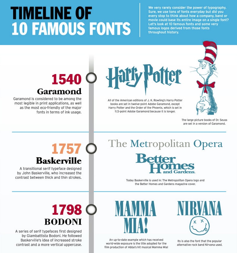
Timeline of 10 Famous Fonts – Infographic
Why is Typography important?
Typography is not just about choosing the beautiful font to display text and create a mood for the project. It is much more than that. It underlies the success of every project. The deal is, much like color, typeface styles used in a design have a significant impact on the way a user perceives that design.
Typography design is one of those things that people see and understand first on your website, mobile app, or print media. Therefore, it plays a vital role in producing the first impression, creating a general atmosphere, and conveying a message.
What’s more, according to studies, the font’s selection directly affects the reader’s reaction to and perception of the article. For example, people subconsciously prefer fonts like Arial, Verdana, and Comic Sans. Therefore, text set in one of these typefaces may better affect users than others, allowing you to run digital marketing campaigns more effectively.
That is not all. The right typography design does many important things, such as:
- establish a strong visual hierarchy;
- provide a graphic balance;
- set the overall tone;
- make a design look aesthetic and pleasing;
- guide and inform your users;
- communicate with the audience;
- facilitate audience engagement;
- optimize readability;
- improve accessibility;
- ensure an excellent user experience;
- enhance the website’s personality;
- build brand recognition;
- carry your brand forward;
- make art, design, or interface visually stimulating and memorable;
- hold the attention of the readers;
- reinforce the message of the text;
- influence decision making.
To sum up, typography is not only for displaying text; it is a tool for prettifying interfaces, establishing mood, and, of course, realizing marketing strategies. It can easily break your polished website and scare away all your customers, leaving you with nothing. And on the contrary, when well done, it can take your project to the next level, instill trust, increase conversions and generate revenue. Therefore, typography is increasingly important.
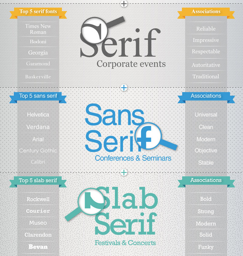
The Psychology of Fonts – Infographic
Essential Elements of Typography
Before moving to the anatomy of typography, where we will break characters into molecules covering their vital parts and constituents, we are going to dive into the essential typographical design elements to understand better such things as
- Hierarchy,
- Contrast,
- Consistency,
- Alignment,
- Color,
- White space.
Basics: Difference between Font and Typeface, and Main Ways to Style Text
Let us define the difference between font and typeface for starters since, quite often, people treat these terms as synonymous, but in fact, they are not. So, who is who?
The font is a graphical representation of text character that gives a much deeper notion about the symbol. It refers to the weights, widths, and styles that constitute a typeface. As a rule, the font is a collection of letters, numbers, punctuation, and other symbols. It includes a basic set of characters and alternate characters (non-standard variation of characters). So, it is more a specific term.
The typeface is a family of related fonts, which comprises a myriad of characters of varying sizes and weights. It makes up a complete set of types. So, it is more a general term.
In modern typography terminology, these terms are pretty close and related, so it is not punishable to use them interchangeably. However, you should know the difference between them for the sake of clarity.
Ways to Style Text
There are two basic ways to style typeface: italic and bold.
Italic style is a slanted version of a typeface that slants from left to right. It is used mainly inside the text to emphasize separate words, like words in different languages or reference links.
Bold style is an overweight version of a typeface that has more visual weight than the regular one. As a rule, designers use it for headlines or important words inside the text or buttons.
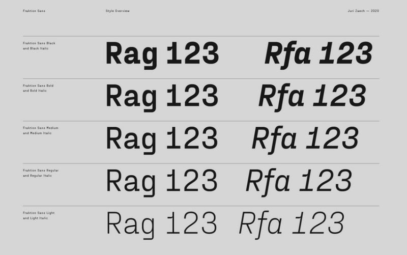
Style overview by Juri Zaech
Hierarchy
You cannot create a well-balanced and visually appealing design without a well-thought-out and carefully established hierarchy. It is crucial for the design and ipso facto typography. It performs such vital tasks as:
- it helps readers identify the context of the text without even having to think about it consciously;
- It provides readers with the ability to quickly consume large amounts of information by making it easily scannable and quickly digestible;
- It efficiently deals with short attention spans that people have these days by providing memorable and impactful visual cues and focal points;
- It creates a clear distinction between text and headlines, giving you a chance to emphasize essential elements without reinventing the wheel;
- It provides readers with a quick way of locating the relevant information;
- It defines organization and direction, creating order out of chaos.
In practice, the hierarchy can be created using sizing, color, contrast, and alignment. However, it also manifests through headings of various levels, subheadings, and paragraphs when it comes to typography. Generally, designers use no more than three different levels of typography, where each one has its designation:
- The first level of typography is for making an impression. It usually reinforces the hero area or homepage.
- The second one is for headings or breaking text into chunks that help navigate smoothly across the page.
- The third one is for body copy. While two previous options can be bold and daring, this one should stay neutral to provide viewers with the best readability ever.
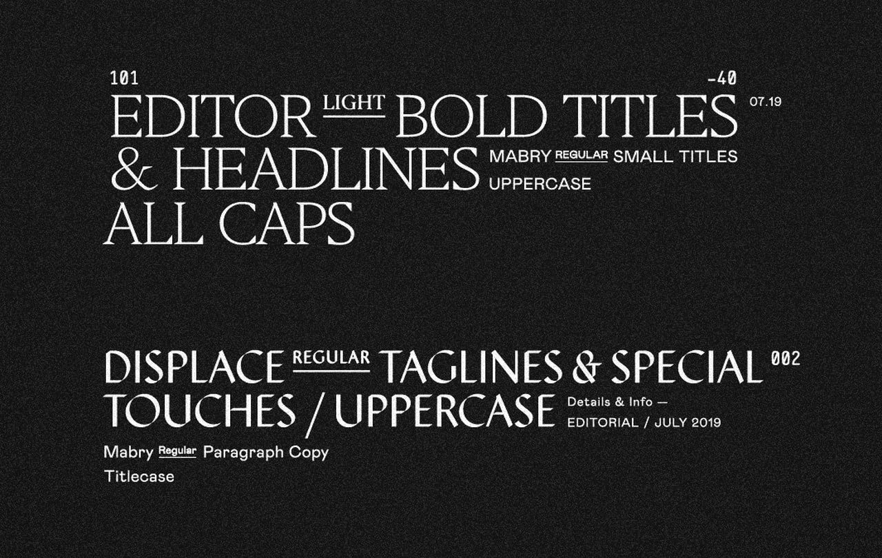
Type Hierarchy by Soul Twin Studio
Contrast
Much like hierarchy, contrast is a powerful tool that can do magic with design and message. There are five primary areas of its use:
- First, it is used to provide visitors with the optimal readability experience. Regardless of the typeface, whether neutral or extravagant, the perfect contrast will ensure every letter looks legible and stands against the background.
- Second, it is used to throw a spotlight on crucial details. It helps to set priorities by giving some elements greater visual weight.
- Third, it improves scanning through the text. It is not a secret that people prefer to skim rather than read. You cannot miss these scanners. Your message should reach all your users. One way to do this is to use contrast realized through font size, color, and styles. It will bring the critical information to the fore providing all visitors with instant value and keeping them on the project longer.
- Fourth, it is used to make text meaningful. The more visual weight text has, the more important it looks.
- Fifth, it is used to reinforce a sense of urgency, warning, etc.
- Finally, it is used to make your text look interesting, visually appealing, and attention-grabbing. The well-done contrast may easily play a decorative role. It can enhance overall aesthetics and give some unique zest to the design.
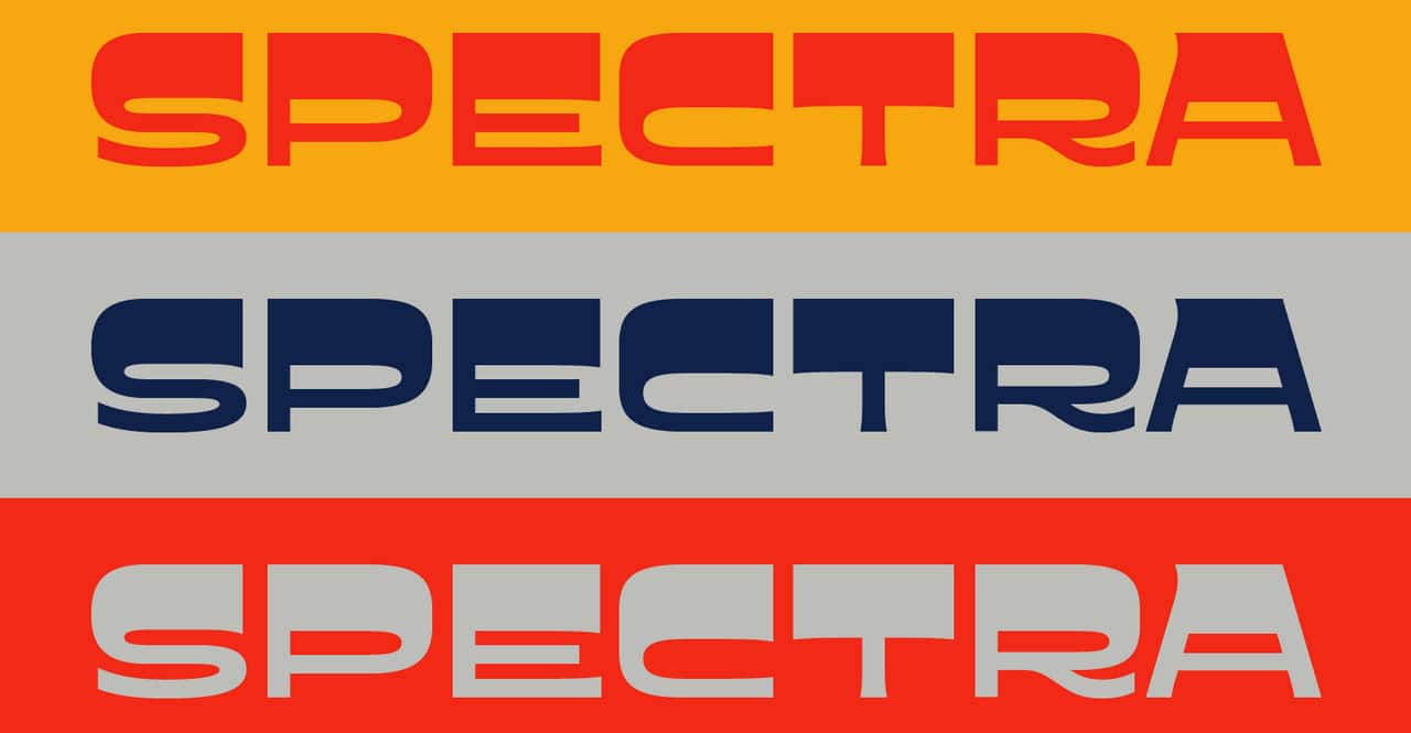
Spectra 2020 by Dingbat Co.
Consistency
Whatever grand idea you have in mind, first and foremost, make sure you maintain consistency for your viewers. Otherwise, you will create room for failure.
Inconsistent use of typography design, even within the small project, may cause confusion and frustration. No one likes that. People should see patterns to feel comfortable exploring your content. If they do not see them, they will leave. As a result, you will start to lose your loyal fans and reduce your chance to onboard more prospects.
The rule of thumb, stick to your guns. Use the same font styles and establish a consistent hierarchy throughout the place.
Alignment
People tend to believe that alignment is only about arranging text to the left or right side. At some point, it is true. However, this term means much more than simply moving a block of text to either side of the layout or evenly spreading it across the page.
In fact, alignment is a process of unifying text, graphics, and other user interface elements, such as images, videos, sliders, etc., to achieve compositional harmony.
At a minimum, good alignment requires from you to ensure such important things as:
- equal space, size, and distances between each element;
- consistency in margins and paddings;
- alignment between header (especially brand elements like logotype) and body copy.
When it comes to typography, traditionally, you can align the font in four ways: right, left, centered, and justified. Thanks to modern features in CSS, now you can align text whichever way you want. However, it is important not to sacrifice the primary purpose of the text alignment, aka reinforcing the harmony and securing good readability.
Some good tips on how not to screw up alignment in your project:
- Do not overuse center alignment. According to studies, people find center-aligned typography frustrating.
- Use hanging alignment for details that do not have the same weight as text, such as icons or bullet lists.
- Stick to conventions. For example, avoid using right alignment for body text when display content to people who read from left to right.
- Remember about edge alignment.
- Avoid imbalance.
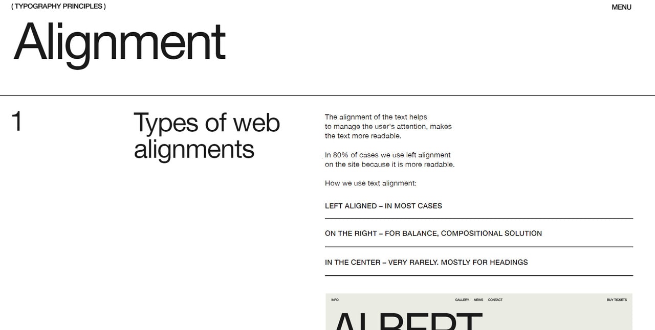
Color
Much like typography, color is the first thing that people notice. According to stats, more than 65% of users are visual learners. Therefore, the right choice of color and typeface can result in a powerful duet that heavily influences the user’s perception of the message and brand within the first seconds.
What is more, let us be honest, typeface cannot exist without color. Color makes it visible literally, and that is not all. The proper hue can easily improve the legibility of characters, make the text stand out from the crowd, and even create the proper tone for the message. In addition, studies show that color has the capability to trigger shopping behavior, meaning it stands behind high conversions. Therefore, you cannot take it lightly. You need to put lots of thought when choosing the right hues for your typography design.
Five basic rules may help you in this matter:
- Use no more than three colors.
- Stay neutral when it comes to large chunks of text.
- Use bold colors only for headings or focal points.
- Ensure contrast.
- Pay attention to conventions.
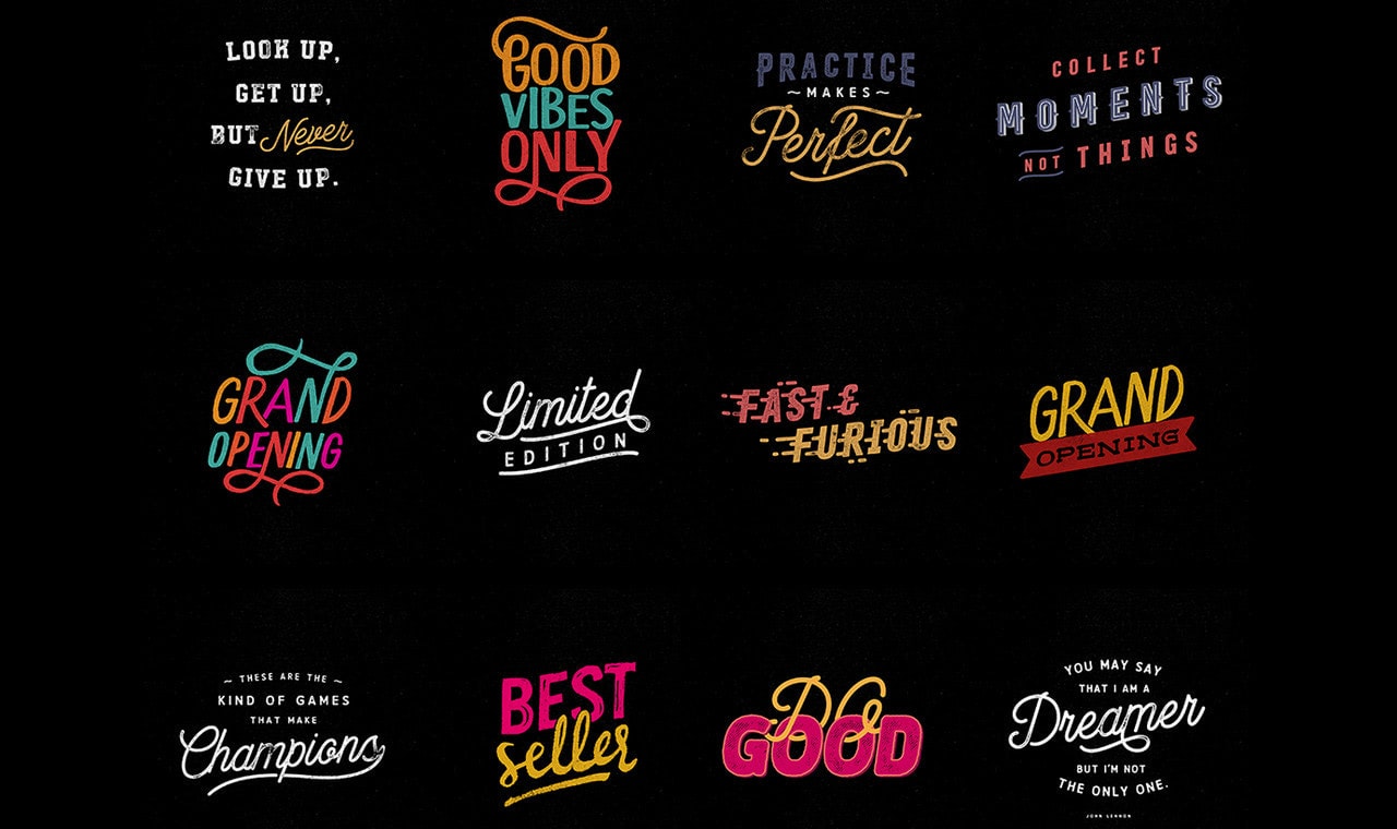
Over Types by Andrew Footit
Whitespace
Last but not least.
Whitespace is one of the most underestimated elements of design. Quite often, people consider the use of white space as wasted space. However, it is quite the opposite. The proper use of white space ensures an excellent user experience and a great readability experience. It helps to balance design elements and better organize content to improve the visual communication experience.
Whitespace is a general term. Do not take it literally: it is not only white. It can be any color or even a texture or background image. It refers to the space around the text, letters, graphics, objects, etc. It includes margins, paddings, and blank spaces.
When it comes to typography design, we need to consider the micro white space. It can be found between lines and paragraphs, characters, grid elements, etc. It has a direct impact on content legibility that influences the user’s reading speed and comprehension.
For example, if micro white space is too small, the text will look too tight and dense; so, it will be difficult to make out letters and ipso facto understand the meaning. If it is too big, people will read the text more slowly, which may cause frustration and loss of attention and interest.
Therefore, it is crucial to find your Zen in the micro white space universe.
Where to start? Perfect these five different areas: paragraph spacing, space between lines, line-length, letter spacing, and space around numbers.
- Paragraph spacing. Paragraph spacing gives the eye a visual break, makes text readable, and ensures comfortable reading flow. It also shows that the new idea is to be introduced to keep user’s interests alive. The minimum paragraph spacing lies in the range between 0.75x and 1.25x of the type size.
- Space between lines. If there is no enough space between lines, the text will look clumsy and dense. This will drastically worsen readability and user experience. If there is too much space between lines, it may also confuse and frustrate readers. It is vital to get this space right. The golden rule is, set line-height to 1.5x of the original font size.
- Line-length. Both desktop and mobile users may be frustrated by poorly chosen line length. The deal is if the line length is short, there will be many blank spaces that make the design feel imbalanced and disharmonized. This will also cause more total lines of text that make mobile users scroll deep down. If this parameter is too long, the line can be wrapped in a way that may confuse users. Therefore, ideally, the line length for mobile users should be set to 40 to 60 characters per line, whereas for desktop, it should be 120 characters per line.
- Letter-spacing. Mastering letter spacing is a true challenge since some letters are wide, whereas others are narrow. Add more space between letters, and you end up with a barely readable word. Reduce the amount of space, and your letters will be illegible. Therefore, you need to strike the perfect balance. Some sound advice on letter-spacing:
- Add letter spacing to uppercase text;
- Add letter spacing to small uppercase text;
- Increase letter spacing for small text that is under 16px;
- Play with tracking. Spread or make the word tighter to accomplish a look that has even edges.
- Space around numbers. Much like with letter-spacing, the problem lies in the fact that some numbers are wide, whereas others are narrow. However, they should look harmonious and perfectly aligned. Therefore, ensure there is enough space between individual digits so that a long number seems well balanced and agreeable.
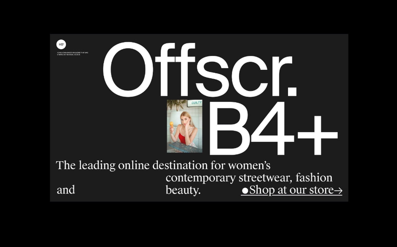
Offscr by Hrvoje Grubisic
The Anatomy of Typography
The anatomy of typography is an area of study that gives you basic knowledge of letters and their integral parts. It helps to educate your eye to recognize the underlying structure of various designs.
Understanding the fundamental principles and concepts of typography is the first step to being a successful typographer. The most basic component of typography is the letter, and each letter of the alphabet is distinguished by its unique shape or letterform.
Read Now: Typography Cheat Sheet [Infographic]
Primarily the design classes which I took in college were based on anatomy and terminology of type. It’s not difficult to recognize serifs, descenders, ascenders but simultaneously it’s true that for one class one has to learn nearly 100 definitions and terms. Undoubtedly it’s necessary to possess some basic knowledge of the terminologies before we step into the arena of type. It can be puzzling if we discuss about type using informal terms like thingies, slants and squiggles.
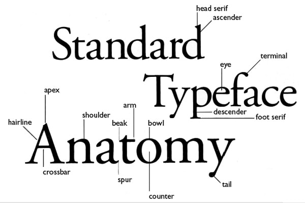
1. Baseline

Majority of the characters sit on this imaginary horizontal line.
2. Cap height
The capline or cap height is another imaginary line wherein the heights of all the capital letters are marked in a typeface. However one has to keep in mind that the cap height is below the maximum height of the typeface.
3. Crossbar
The crossbar is a stroke that connects 2 lines in capital letterforms of “A” and “H”. Again a cross stroke implies a horizontal stroke that does not connect two lines, for example, the lower case of “f” or “t”.
4. Serif

It is the name assigned to the finishing strokes at the tops and bottoms of some typefaces. There is a lot to discuss serifs when we would learn about typeface distinctions.
5. Mean line
The mean line better is known as midline is another imaginary horizontal line that marks the top edges of the lower case letters. You go wrong if you go by the literal definition of the term “mean line” because it actually doesn’t imply the central line between the baseline and the cap height.
6. Bowl
It is nothing but the rounded curve that covers the negative space in a letter form. Consider, for example, it can be easily viewed in the following letters “I”, “e”, “D”, “o” and “g”.
7. Descender

Descender happens to be the bottom part of the lowercase letter (like “g”, “j”, “p”, “q”, “y” etc) that usually goes below the baseline of a typeface. Some other features that particularly extend below this baseline comprise of the old style numerals typefaces. These specific numerals were basically thought to mix appropriately with the lowercase roman numbers. If used within the body of the text they really look good and beautiful.
8. Counter
Counter refers to the negative space within a letter, particularly if you consider letters like “A”, “o” and “P” etc where the counter is fully enclosed. In letters like “G”, “u” and “c” the non enclosed negative space is reflected and they are also called counters.
9. Stem
The main vertical or diagonal stroke depicted in a letterform is known as Stem. They consists of the vertical parts of the letters like “I” and “H” and also simultaneously all the strokes in the letter “W”.
10. Tittle
The title is defined as the dot above the lowercase “j” and “i”.
11. Terminal
The terminal is the culmination point of the stroke or stem that has no serif.
12. Ascender
It is an extension that goes above the meanline and is generally found in some lowercase letters. These letters are, “b”, “d”, “f”, “h”, “k”, “l” and “t”.
13. Leg
Legs are the lower angled strokes which you can see in the letters “K”, “R” and “Q”. They are also known as tails.
14. Ligature
This addition of two characters to create another character is called ligature. They are commonly seen in serif faces .It is present to give space between certain characters and give the characters an aesthetic imprint.
15. X-height
The space that exists in the vertical direction for the lowercase “x” in any typeface is known as X-Height. It is the distance the baseline and mean line of the body of characters in lowercase form. The X-Height is very important in the context of font shapes as the fonts with greater X-heights are easier to read.

Typographic parts of a glyph: 1) x-height; 2) ascender line; 3) apex; 4) baseline; 5) ascender; 6) crossbar; 7) stem; 8) serif; 9) leg; 10) bowl; 11) counter; 12) collar; 13) loop; 14) ear; 15) tie; 16) horizontal bar; 17) arm; 18) vertical bar; 19) cap height; 20) descender line.
Rules for Choosing the Right Typography for Project
The prime purpose of web typography is to make it easy for users to read the presented information. Readability should never suffer from your design decisions and stylistic preferences. However, it does not mean you should stick to one boring typeface that provides legibility for characters, and that is all. You can easily benefit from some unique fonts, including extravagant display options, and still obtain good results or even more. To make typography design work for you, bear in mind these general rules:
- Understand the difference between typefaces. For example, one of the most popular pairs often confused is the serif and sans-serif typeface styles. Although the names are self-explanatory, people often forget that the serif is the stroke given to the end of a character’s main horizontal and vertical lines. Know your tools to make fully informed decisions.
- Use serif and sans serif typefaces for body copy since they allow for more comfortable reading at length. They guide the eye smoothly from character to character, making them ideal for long-form printed works. However, there is a catch. Some time-proven fonts in those groups may not fit your marketing campaigns, target audience, and even brand. For example, although Times New Roman is a ubiquitous typeface that everyone knows and is used to, it can give the impression of apathy or cheapness, making the reading experience boring and dull. If your company deals with luxury items, it can ruin everything. Therefore, make sure even the time-proven font speaks to your audience on behalf of your brand.
- If you want to pair fonts together, pick typefaces that have a similar x-height, the caps, lower cases, and formal geometry, or use those that complement each other visually. If in doubt about mixing and matching, go for a time-proven pair of a serif font and sans-serif font. The great thing is, you can put the main body text in a serif font and your title in a sans-serif font, or vice-versa. They still work perfectly. Alternatively, you can use some online tools that help to combine fonts effectively.
- Use script and display typefaces only for headlines.
- Do not use neutral and time-proven options to impress. Though, you can use them to lay a concrete foundation to let your imagination run wild. They can be perfect for creating animated or colored typefaces that are incredibly popular these days.
- Never use more than three fonts. Three different options are enough to add diversity to the design, make an impression with headlines, provide good readability for long texts, and even set focus on crucial details.
- Keep decorative fonts to a minimum. Plateresque designs, especially in digital expanses where people are constantly fed with bright images and videos, will easily scare your users away, producing a negative impression about your brand. Therefore, make sure you use decorative fonts, especially big and loud ones, only when it is necessary.
On top of that, to choose the right typography for your project, you need to answer these five crucial questions:
- What personality do you want to instill into your headings, subheadings, and text? Each font has its character and vibe. Each one represents different moods and effects. And each one adds its voice to the conversation. Some of them feel friendly; some feel high-end, while others may feel even juvenile. To reinforce the general atmosphere of the project, you need to take this into account. Define the core traits of your brand, design, and theme and pick typefaces that reflect these traits the best.
- What tone your message have? Whatever message you want to deliver, remember about its tone since it can make a huge difference. If you are going to sound serious or need to deliver a message to a serious crowd, you may benefit from less decorative and stylized options. In contrast, projects with friendly and cheerful ambiance or those that target children may benefit from bold and extravagant solutions.
- What audience will see this typeface? To narrow down the choices, it is vital to understand your audience and their preferences. If it is a young crowd, you can go for some bold and even whimsical solutions; if you aim at the older group, you need to stick to traditional or neutral options.
- Does it serve its primary purpose? As we all know, typeface may perform different roles in the interface depending on your goal and project. However, there is one that is crucial for every project – provide legible, readable, and accessible content to the crowd. Therefore, make sure the typeface looks legible without strain, and the characters are distinct enough, especially those that are set in display fonts.
- Is typeface web browser friendly? Believe it or not, but poorly chosen typeface may worsen the overall performance, increase load time that frustrates people, and serves as the main reason for abandoning your website. Therefore, choose a safe typeface and never download more character sets than you need to. Also, make sure it is responsive.
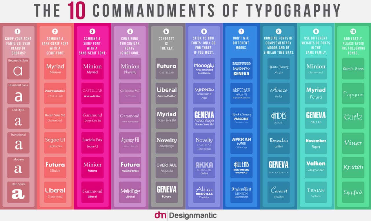
The 10 Commandments of Typography
Last but not least.
When you seek the best typography design for your future project, especially when it comes to digital media (websites, mobile applications, infographics, email designs, etc.), you need to do A/B tests.
The deal is constant tests are the best way to find the perfect font not only for your brand and project but also for the audience. Therefore, put in action different options, gather feedback, analyze the performance and results of marketing campaigns, and get a clearer insight into what works for your brand and resonates the best with the target market.
5 Free Typefaces to Try
From theory to practice, the time has come to refill your toolset with some exceptional free fonts that will make any design look grandiose this year.
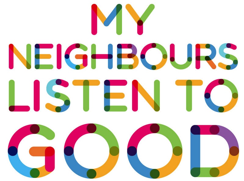
Multicolore – Color Font
Color fonts are the next evolutionary step for typography that has put the fun back into the lettering. These vibrant, joyful, and sometimes whimsical SVG-based solutions have a transformative effect on digital and print design. They make interfaces and arts look exceptional without much effort.
Color fonts use not only colors but also gradients and even textures. Each typeface has a fallback so that browsers that do not support this technology can use a basic yet still well-styled version of standard OpenType vector font.
They feel like a breath of fresh air after decades of clean, flat designs and neutral solutions. If you are thrilled with this new round of evolution and want to try it on your next project, check out Multicolore.
Multicolore is a typical multicolored font that is available free of charge. It is a display typeface, so it is ideal for making headlines and the hero area memorable. It features the Latin and Cyrillic alphabet along with digits and some popular punctuation marks. It is available in two formats: .otf and .ttf.
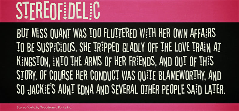
Stereofidelic – Font with Alternating Baselines
One of the simplest ways to give headlines outside of box feel is to play with the baseline. When applied to caps letters, uneven sizing creates a new dimension and gives the entire word or group of words a unique appeal. Alternating the cap height and baselines of capitalized letters creates a variety that catches an eye and produces quite an impression. Many artists adopt this technique coming up with incredible results. Though, that’s not all. They also play with the thickness of letters and axes to reinforce the effect.
To try this trend at home, check out Stereofidelic. It is the perfect tool for creating headlines with alternating baselines since it already has this effect. It is fun, buoyant, narrow, and intriguing. It instantly draws attention, coming as a perfect option for highlighting headings and messages in the hero area. Unlike Multicolore, it has only a Latin-based alphabet. So take this into account.
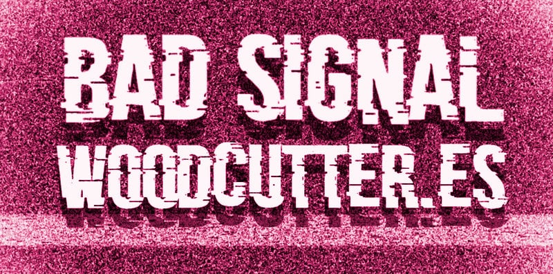
Bad Signal – Distorted Font
Distorted fonts are also one of the most popular solutions these days. With their sharpest edges and rebel soul, they just could not help but win over viewers with an irresistible bad boy attitude.
They go perfectly well with tech-inspired interfaces, devilish concepts, and, of course, dark interfaces that are increasingly popular.
If your next project is bound for the dark side, either literally or metaphorically, you can try Bad Signal. Not only does it look distorted, but it also has a powerful glitch flair. It features a primary and alternate set of Latin-based alphabet, essential punctuation marks, and, of course, digits.
It is so powerful and sharp that it is available only for personal use. The commercial projects should pay for such a brutish attitude.

Mandalore – Elegant Cosmic Font with Space Western flair
Although we said goodbye to the Grogu last year, this is still not the end. Disney has recently revealed that the Star Wars universe would expand in ways that no one could have foreseen. Therefore, we are going to enjoy some cosmic fonts with space Western flair pretty much soon. A whole galaxy of possibilities will open before us, so why not grab this opportunity beforehand and align our projects to be ready for all bombshells coming our way.
The perfect place to start is to use Mandalore font. As the title hints, this font was hugely inspired by the Mandalorian logo. It looks sharp, intriguing, and adventurous. It has a Latin alphabet, digits, and essential punctuation marks. It comes in different styles: Regular, Italic, Semi-Italic, Condensed, and some others. Note, free for personal use only.
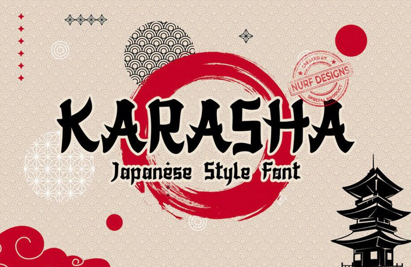
Karasha – Japanese-style Typeface
We all admire Japanese website designs sometimes. They are so unique, refreshing, and invigorating. Therefore, this is not surprising that we want to use some of their traits in our western arts. And we have already done this.
The vertical rhythm that is a characteristic trait of Eastern interfaces rules the roost for several years in a row in the web design sphere. How about taking this trend a little bit further by employing elegant and inspiring Japanese-style typefaces to deliver the message.
If you want to join this mainstream, an excellent place to start is to use Karasha, gorgeous Japanese-style font. It will freshen up your design and give it a lovely appeal of the Land of the Rising Sun. It includes 236 characters and 214 glyphs, covering primary and extended sets of Latin letters and general punctuation. Free for personal use only.
5 Places to Download Fonts for Free
If these five fonts are not enough for you, you can always browse online libraries of typefaces to find other options.
To help you in this matter, we are going to end our guide to typography definition with a shortlist of places where you can find both freemium and premium typefaces. Some of them are large platforms that are constantly updated by both amateurs and professionals, while others are small side projects where you can find some unique options from gifted designers who know a thing or two about good typography.
- Dafont. It is one of the most popular archives on the web, where you can find a free font for every occasion. Although amateurs make some of them, nevertheless there are still many professional options.
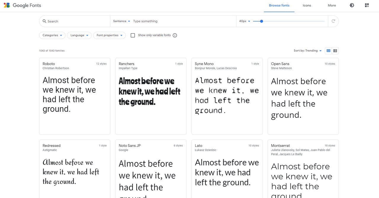
- Google Fonts. It is a massive collection of free fonts that can be used in your projects without sacrificing performance. The great thing is, all these fonts are web-safe.
- 1001Fonts. Do not judge a platform by its cover. It has not 1001 but 10001 fonts in its collection. Starting with regular options and ending with modern display versions, there is a sheer diversity of typefaces.
- Fontspace. The library features almost 40000 fonts available in TrueType and OpenType formats. As for diversity, it is enormous.
- FontSquirell. This side project boasts of high-quality hand-selected typefaces that are all available for commercial projects. Along with some typical typefaces, you can find some unique solutions.
Conclusion
While content is a king, typography is its loyal servant. It has a massive influence on your brand’s perception and efficient delivery of the message. When well done, it can enhance readability, improve user experience, reinforce visual communication with the customers, amplify the meaning of the message and even adorn design. Therefore, familiarizing yourself with typography definition, terminology and basics is incredibly important.
This knowledge will make it easier to communicate about typefaces and their characteristics, tell one typeface from another even when the difference is minor, give you a base to make an informed decision and even provide a solid foundation for coming up with your font.
Although this area of study is extensive; nevertheless, thanks to this basic knowledge, everyone can handle it and even have fun with it being bold, creative, and individual.
