The Ultimate UX Design of: the Sign-Up Form
A typical sign-up form contains a couple of form fields (it seems like the most popular number nowadays is 3: e-mail, password and a peculiar “repeat password”) and a button. Is there anything to design in this minimalistic structure? Isn’t it too simple to focus on?
Unfortunately, many non-designers and some designers think exactly this way. If it’s visually simple (and tiny!), it shouldn’t be designed, as it would be a waste of time, right? Completely wrong.
I once tried to explain it to a stubborn design layman, who just couldn’t believe that if somebody visited a website and clicked on a huge button on the homepage which said “Sign Up”, they would suddenly leave the simple form without registering. “How come?” – he asked, “They’ve already decided to sign up… it’s just impossible they will be scared by three inputs”.
Well… pretty often they are. I showed him our data from Google Analytics. At that time 23% of people who clicked the huge button on the homepage were leaving the form, with three fields, without registering. 23% is a lot. Almost a quarter of the people were getting scared of the form.
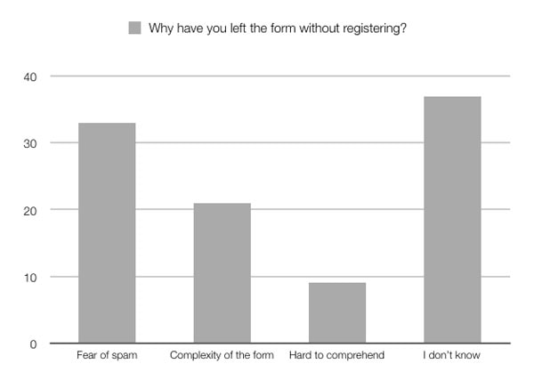
I ran a quick study to grasp the reasons that cause people to leave my sign-up form. 70 people were nice enough to fill in a short questionnaire with open-ended questions. To my surprise, 33% of them pointed out “the fear of being spammed” as the main reason they always think twice before typing in their e-mail address anywhere. The complexity of the form (often considered unnecessary) and reluctance to waste time came in strong second place with 21%.
With Postcards Email Builder you can create and edit email templates online without any coding skills! Includes more than 100 components to help you create custom emails templates faster than ever before.
Free Email BuilderFree Email TemplatesStudying dozens of sign-up forms made me realize that a lot of them fail due to these unfortunate errors. They’re far from being bullet-proof.
Let’s learn how to create a perfect sign-up form! We’ll go through a couple of examples and best practices, then by simply focusing on: safety, clear explanation, minimal form and engaging copy, we’ll create our own perfect pattern.
Let’s go!
Each example used below can be uploaded directly to UXPin – The UX Design App.
Safety
Let’s consider, in the first place, what the reasons are for using a sign-up form. I’d say they are as follows:
- Keeping the sensitive data of users safe (e.g. Mint, UXPin…)
- Recognizing users as owners of certain data (e.g. Facebook)
- Limiting access to a certain part of your service (e.g. any intranet)
- Gathering user data for marketing reasons
Bearing this in mind, consider how a user might feel when confronted by a sign-up form. Most of the reasons behind a sign-up form might be really unclear for the average Internet user. What we don’t understand automatically scares us; no wonder then that many people leave our forms full of doubt and fear of fraud.
In most scenarios, you’re the one benefiting from the presence of the form, so the responsibility of spreading the feeling of safety among your users is definitely yours.
Strangely enough, most sign-up forms just fail to address this problem. Not indicating that typing in your e-mail address is a safe step, might force your users-to-be to reconsider the whole registration process. Would you risk it?
With Pulsetic you’ll be instantly notified the moment your website, API, or server becomes unavailable. Monitor uptime from multiple global locations and respond to incidents before your users are affected.
Create beautiful status pages in minutes to keep customers informed during outages and build trust with transparent communication.
Start Monitoring for FreeOne of the rare good examples of sign-up form design is Mint’s form.
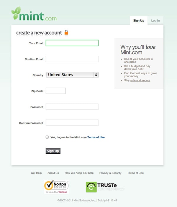
Mint.com’s form is a great example of caring about the feeling of safety
Mint uses visual stimulation (a lock icon) to indicate that the whole process is safe. Norton’s and TRUSTe’s badges add an additional feeling of security to the form.
Mind that Mint also repeats the benefits that you’ll get by signing up. The usage of emotional language (“Why you’ll love Mint.com”) creates a feeling of intimacy and emotional attachment. That’s exactly what’s needed to destroy any doubts people can have about the service at this step in the process.
Download a wireframing template of Mint.com
(you’ll be redirected to UXPin App)
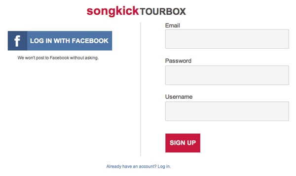
Another interesting example of reinforcing the feeling of safety might be observed in Songkick’s sign-up form. Songkick uses a very popular pattern of a social sign-in accompanying the classic sign-up form.
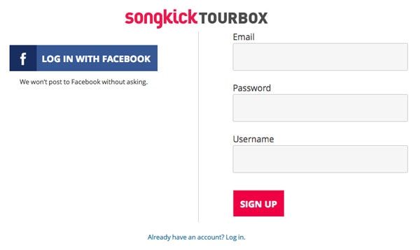
Songkick sign-up form provides a nice pattern of a social sign-in
A social sign-in, if done right, is an extremely powerful idea. It saves time and trouble. However, it can also beef up the feeling of danger. In the case of social services, spam won’t only hurt users e-mail inboxes but also their friends. That’s nasty. The indication of safety is an absolutely crucial thing in this type of registration process.
Songkick did a tiny, but powerful thing. They clearly stated that they “won’t post on Facebook without asking”. Of course they ask their users for a great deal of trust since it’s just a statement, but still, at least they address the fear in their customers’ minds and have a decent, soothing, answer for it.
If something might scare your customers – don’t hide, stand up and fight.
Download a wireframe template of Songkick’s sign-up form (you’ll be redirected to UXPin App)
Explain
Following the pattern of “safety-enhancing” content, let’s consider another underestimated, but vastly important trick when it comes to increasing the conversion and user-friendliness of a sign-up form.
Explanation.
The whole concept of signing up is somehow artificial. It hardly has its equivalent in “the offline world”, therefore it’s not self-explanatory. We ask people to provide data in a format that we find convenient or safe and pretty often we don’t explain the reason behind it, or we don’t even inform about what format we expect.
How many times did you see forms that let you know that your password was too short, or didn’t contain any numbers? Too often. Information about the format of the password should be stated upfront.
Take a look at Github’s sign-up form.
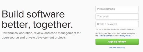
Github’s form lets people know about password format before submission of the form
The form isn’t a star. It’s rather OK (though I don’t get why they use labels inside form fields and a “pick a username” field in this part of the process). The thing that’s really great is the tip about the password: “tip: use at least one number and at least 7 characters”. This can really save time and trouble for users. Most services put this kind of information inside the error message when the password typed in is too short or doesn’t contain a number – that’s not a user-friendly solution.
Add Github’s wireframing template to your collection (you’ll be redirected to UXPin App)
Facebook follows the same pattern of explanation when it comes to the untypical form field of date of birth. They know most of their users will find it a strange question about their date of birth right on the sign-up form, so they decided to write a short explanation under the link “Why do I need to provide my date of birth?” Great move.
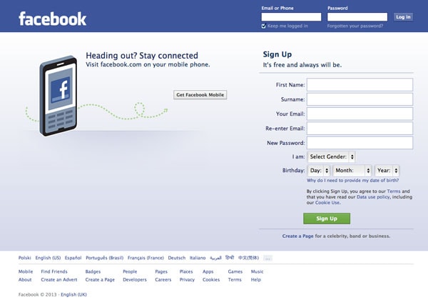
Facebook’s Sign-Up Form’s got a couple of clever ideas.
Take a close look at Facebook’s labels in the form. Can you see the label “New Password”? That’s a great example of taking care for safety in an unobtrusive way. Facebook suggest that you should make up a new password, not use the same pattern you used in dozens of other places. That’s a clever design.
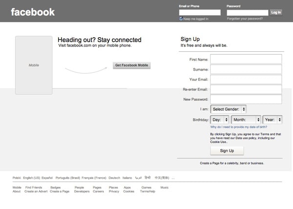
Add the Facebook Sign-Up Form Wireframing Template to your Collection
Do it for them
When you’re designing a sign-up form, you need to:
- Eliminate the fear of spam
- Make the form easy to comprehend
- Eliminate unnecessary complexity
The efficiency of your form lies pretty close to its overall simplicity. You don’t want to force your users-to-be to spend/waste 10 minutes gazing at your sign-up form. You want them to type in some data and register in a couple of seconds.
That’s why the best sign-up forms I know do a lot of things for their users.
Take a look at Hunch’s form. They encourage you to sign in using your Facebook or Twitter account (“Why be old-fashioned?”) to save you some time and effort. Direct informal language builds a friendly situation.
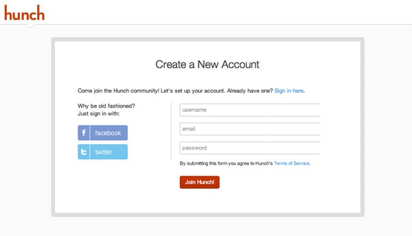
Hunch’s social sign-in saves time and effort
If you confused the Sign-Up and Sign-In form and you already have your account (that’s often the case!) – Hunch provide you with a visible option to go to the right form. That’s an excellent pattern.
Download Hunch’s Sign-Up form Wireframe Template
One of my favorite sign-up forms was designed by an amazing team at Podio. Podio have two sign-up forms that are an exemplification of their mastery of the art of doing things for their users.
The first form used on the homepage is a shortcut. One field, four icons (with a suitable explanation). Nothing to be scared of. A visually appealing form that looks as easy as 1, 2, 3.

Podio’s mini sign-up form. Simplicity at its best.
This Sign-Up form certainly cannot be taken as a pure waste of time. Typing in your e-mail or choosing a suitable social sign-in option can’t take more than 10 seconds. That’s an impressive concept.

Download Podio’s mini sign-up form Wireframing Template
The larger version of the form is even better. Simplicity intertwined with clarity and persuasive techniques shows the extensive knowledge of Podio’s designers.
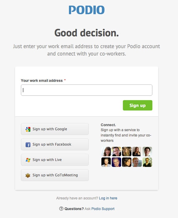
Podio main Sign-up form
It’s still just one field, but the social sign-in options are more straightforward. Mind that they didn’t go with the Facebook/Twitter standard, but rather tried to address the needs of their professional targets (GoToMeeting!)
The micro-copy of the form is just great. The “Good decision” headline builds a positive frame around the whole registration process. I simply love it. Podio also uses a social proof with a strong visual incentive. You can see that there are people who use Podio. If it works for them, it’ll probably also work for you, right?
The only thing that keeps Podio from perfection is the classic omission of the “asterisk”.
First of all, if there’s only one field, it has to be required. Secondly, if we’re putting an asterisk next to a form label, it should be explained.
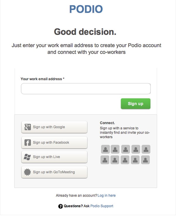
Add Podio Sign-up form to your collection in UXPin
Copy counts
From the example of Podio’s sign-up form we could see how much great copy helps in the process of designing a sign-up form. The dangers of the registration process might be eliminated by smart, emotional, copy that continues the process of selling the product during the registration process.
Basecamp mastered this technique by using a social proof technique (“Last week 7087 companies signed up for Basecamp to manage their project. Today it’s your turn”) visualized with a picture of their real customer. That’s a powerful solution.
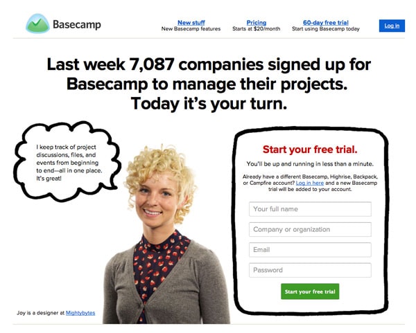
Basecamp’s persuasive Sign-Up Form
They also indicate strongly that the sign-up process is simple and quick “You’ll be up and running in less than a minute,” and they make sure that if you have an account, you won’t be bothered by the form (“Log in here”).
This is by far the most persuasive form I’ve ever seen.
Download Basecamp’s Sign-Up Form Wireframing Template
Great copy should go all the way down to the tiniest details. A call-to-action might be a small thing, but it matters a lot. To my surprise, most of the forms go with a standard “Start your free trial”, “Sign up for free”. A great example of a context-aware call-to-action is represented by Tumblr’s sign-up form.
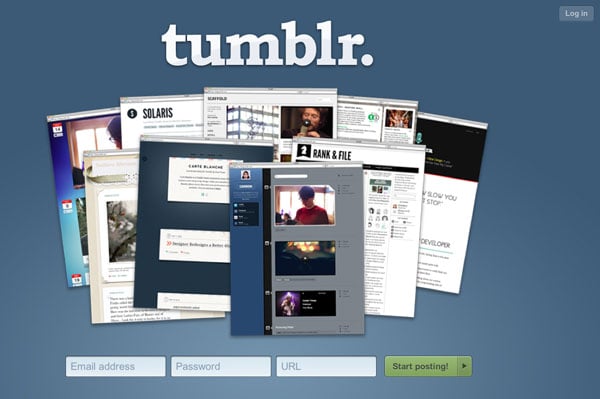
Tumblr’s Sign up form
Tumblr’s call-to-action simply says “Start posting!” It’s highly encouraging and way more accurate than standard options.
However, a call-to-action is a sensitive element of any form. It should be thoroughly a/b tested.
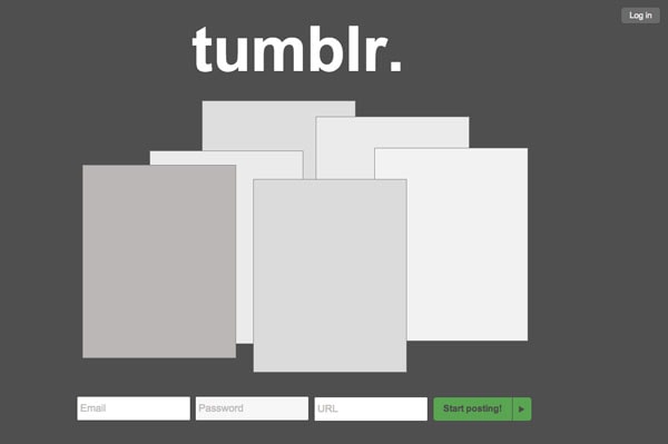
Download Tumblr’s Sign-Up Form Wireframing Template
Step-by-Step Tutorial
Let’s use the knowledge that we’ve gathered above and go through the process of designing a perfect Sign-Up Form, shall we?
I’m using UXPin – The UX Design App to quickly create this user interface, but to recreate each step you can use your own weapon of choice.
1. Basic Structure
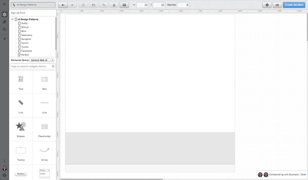
I’m setting up a canvas for myself. Since I already have some idea about the whole interface, I know that my content will probably be locked in 3 boxes, each representing important information.
2. Headline and mine division

I’m adding a headline, trying to build a positive emotional frame around the whole process. That’s somehow addressing the idea of Podio’s form. I’m also setting up a subheadline with a link to a log-in form.
The whole form will be divided into two important steps, which are separated from each other by the line.
3. The form
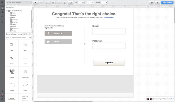
I’m adding a simple social sign-in and a two-field standard sign-up form. My call-to-action is rather generic, but if it was a sign-up form of a real service, I’d try to come up with something context-aware (like in the Tumblr example mentioned above).
I’m continuing to form a rather relaxed micro-copy. To encourage people to sign in with Facebook or Twitter, I’m stating that it can save time spent typing.
4. Safety
To increase the feeling of safety during the registration process, I’m informing users about our policies and rules:
- We don’t spam our users’ e-mails
- We don’t publish anything on our users’ Facebook and Twitter profiles without permission
- We suggest adding a long password for safety reasons
- The account can be canceled without any problems
These types of statement ensure users about our good intentions and general honesty.
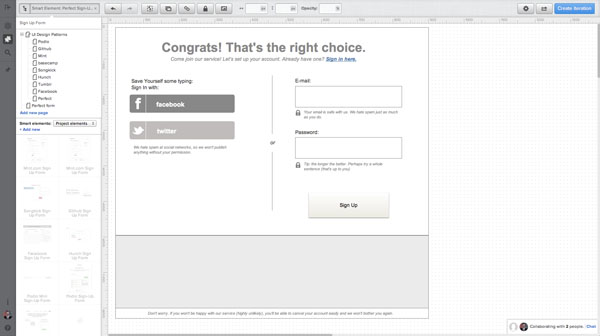
5. Check password
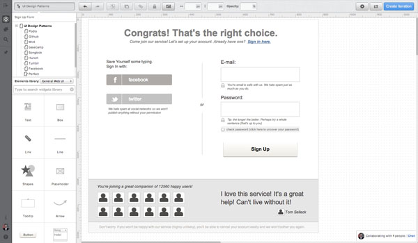
I’m a huge fan of the “check password” pattern. I think the “repeat password” field went way too far. Initially provided to ensure that people won’t make a mistake in their password, it can be easily replaced by a checkbox “check password”.
Why force people to type in their password twice when we can simply give them the option to check the password with one click.
Finally, I’m adding a social proof. I treat it as a safety belt. In case of any doubts of additional proof that this service is safe, popular and well received by thousands of people.