Vertical Navigation Implementation of Side Menu in Mobile Apps
Side menu is nothing new: various website designs and desktop applications include sidebar menus in order to make users’ experience more convenient and interface more comprehensive and user-friendly. Although mobile apps are more accustomed to conventional horizontal navigation (since the small size of a screen dictates its own rules), there are good examples of app designs that offer amazing, ably-executed side menus which are not inferior in functionality and interaction to its confrere.
Thanks to the powers of the fertile imagination of designers, side menus not only look modern, stylish and sophisticated, they also provide users with a detailed stack of links, search bar and even extra features. Such a realization is able both to complement design and to bring extra benefits.
Today we represent a fresh collection of different, remarkable mobile app interfaces that comprise elegant and nifty side menus.
Filp Menu by Boris Valusek is based on a vivid, solid color background and smooth elegant type. The offbeat menu mainly fascinates users with its amazing and realistic flip animation.
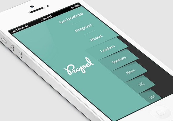
Responsive Side menu by Tamerlan Soziev. Designer elaborately decorates side menu with subtle shadows and gradients giving the navigation a lively 3-dimensional feeling.
With Postcards Email Builder you can create and edit email templates online without any coding skills! Includes more than 100 components to help you create custom emails templates faster than ever before.
Free Email BuilderFree Email Templates
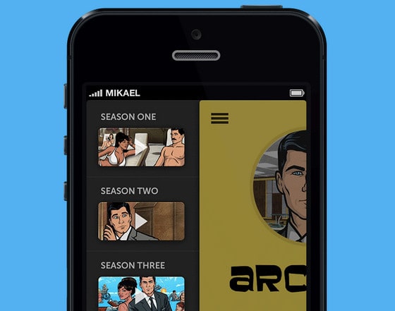
iPhone App by Mikael includes dark side menu with original animation that is aimed to demonstrate a set of video miniatures. Designer leverages muted monochrome background that goes well with illustrated video images.
Lister by Fabio Basile has an open, crisp, modern design which is bolstered by vibrant pixel-perfect icons, soft coloring and accurate execution.
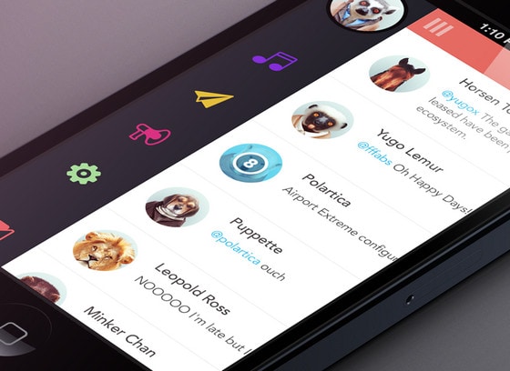
Side Menu by Zane David has a beautiful circular vibe. Blue and yellow nicely collaborate with legible dark background.

MuscTube Menu by Isaac Sanchez capably recreates a sense of comprehensive and truly organized application. Grid layout along with rather contrasting coloring and white regular font gives strong visual impact.
With Startup App and Slides App you can build unlimited websites using the online website editor which includes ready-made designed and coded elements, templates and themes.
Try Startup App Try Slides AppOther Products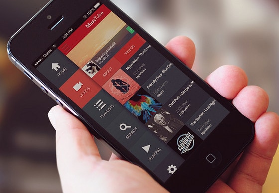
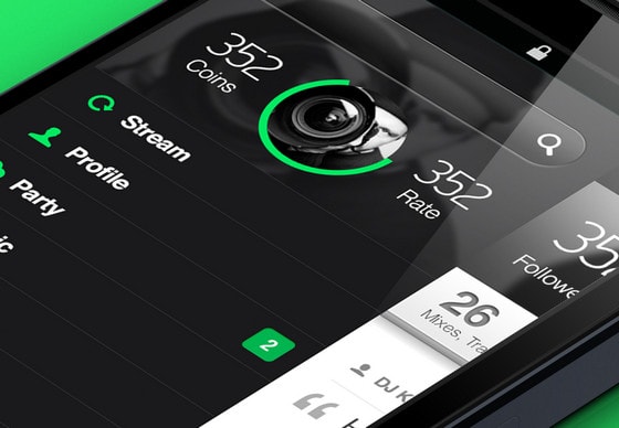
Party Phone menu screen by Dim Alex has a solid dark interface with wonderful injections of bright green color. Narrow type and glossy elements add to app extra zest.
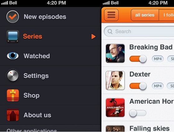
TV Serials side menu by Skelet Art features classic well-structured stripe layout with vivid realistic high-detailed icons and bold type.
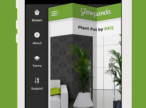
Side menu iOS by Grégoire Vella leverages zingy folding effect that helps to reveal menu. Designer makes use of perfectly balanced combination of black and white, making the side panel look clean and simple.
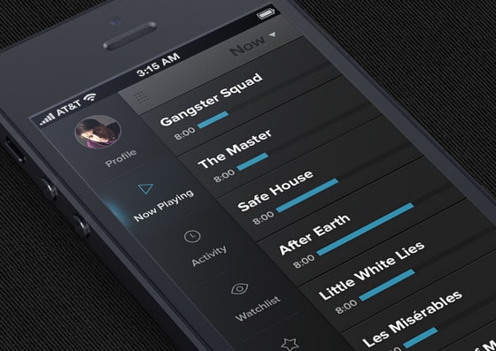
TV Freak Side Menu by Jakub Kittler has a very neat, clear and easy-to-use design, even in spite of a great deal of data displayed on a screen.
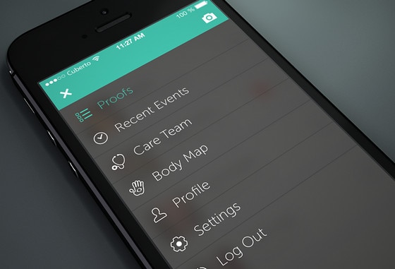
Side menu with video process by Cuberto nicely leverages darkened, slightly transparent background, trendy turquoise color for highlights and ultra-narrow font with sleek outline icons.
Close side menu by Eddie Lobanovskiy is another great example of utilizing cool 3-dimensional animation for hiding navigation panel.

Menu by Frantisek Kusovsky looks absolutely neat and sharp, chiefly due to harmonious colors combination, which is beautifully supported by flat graphics and casual type.
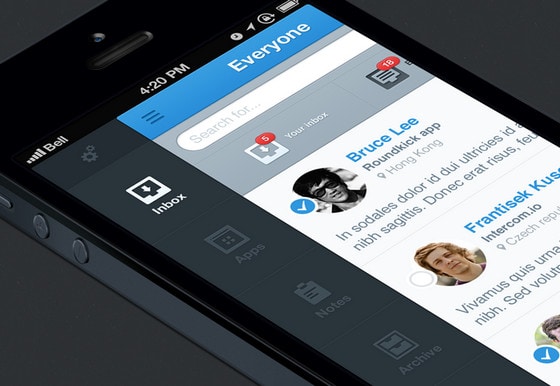
Wishdates App Design by SoGe Mobile conveys a warm atmosphere with comprehensive side menu that is made mainly in soft shades of brown. Sidebar also includes massive and contrast red button and nice yellow notifications that perfectly complement design.
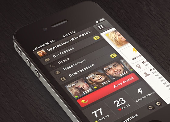
Side-Menu-1.0 by Muhammad El Melegy is a refreshing take on a minimal style. Bright outline icons and sleek, smooth typography wonderfully stand out on a dark solid background.
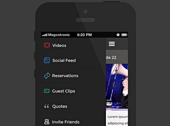
Gardening App Concept by Renato Pequito has a tiny and quite intuitive side menu that comprises only plain icons. Subtle shadow makes a panel slightly protruded and expressive.
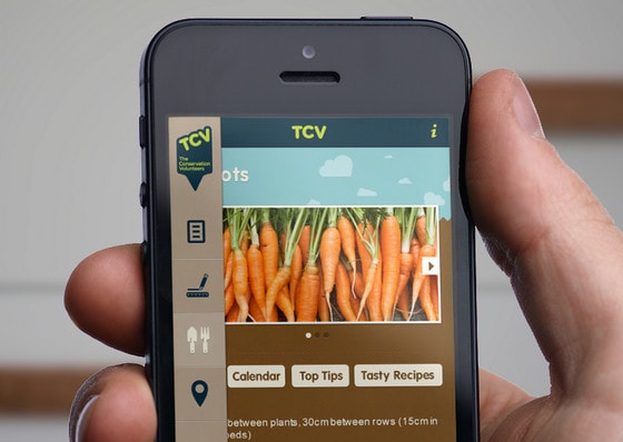
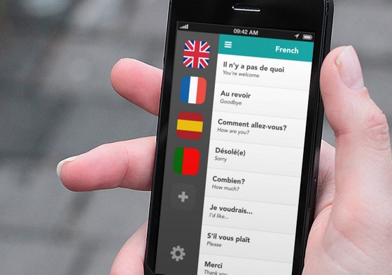
Side menu by Scott Stephens also strongly relies on icons excluding any captions. And it’s not surprising, since app is dedicated to language translation; so flag icons look more appropriate and intelligible.
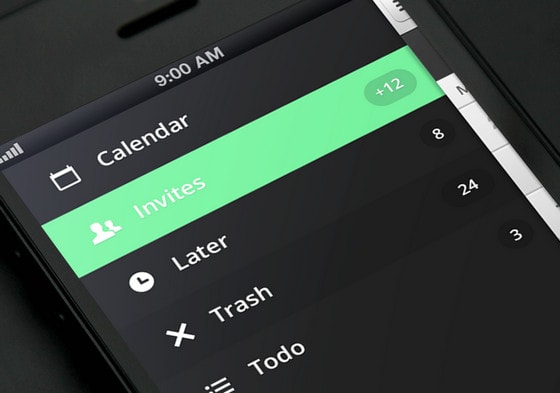
Side Menu Hover by Donny Smith. Designer capably combines almost black and neon like, green colors to craft an elegant and really vivid design.
Chicly Side Menu by Andrew Lucas. Designer does a good job of recreating really organized, neat UI for showcasing in-depth list of categories. He ably uses advantages of contrast between black and white colors spicing them up with sharp graphics.
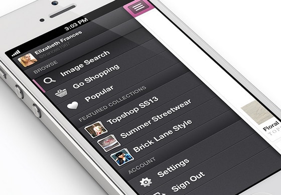
iPhone Side Menu by Zane David delivers strong and firm first impression. Skillful employment of textures, bright orange color and polished icons add to UI refined appearance.
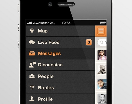
Deal in by Cuberto Design includes standard side menu that is brightened up with eye-catching animation. List of menu items is supplemented by search bar that brings more functionality.

Web app by The Funtasty leverages ultra-narrow, relatively small, colorful type that looks absolutely awesome on a single colored, dark background with sleek thin horizontal dividers.
![Web app [WIP] by The Funtasty](https://designmodo.com/wp-content/uploads/2013/07/Web-app-WIP-by-The-Funtasty.jpg)
Clyp – iPhone Sidebar by Riccardo Carlet looks simply fresh and refined. Vibrant color scheme instantly grabs all the attention.
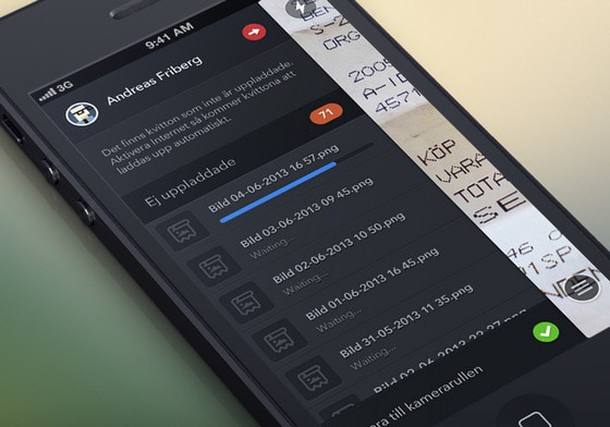
Ej Uppladdade by Fares Farhan is another impressive example of dark side menu in our collection. Although, interface seems to be a bit messy with a lot of details, it actually looks harmonious and easy-to-use.
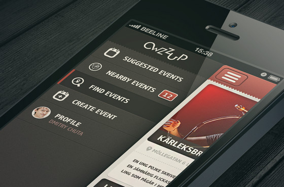
Owzzup App by Dmitriy Chuta demonstrates a meticulous attention to the details. Beautiful patchy background, muted colors, engaging font and smooth icons add a special zest to side menu.
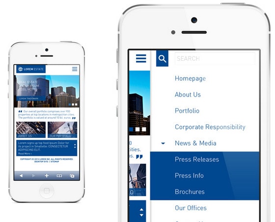
Real estate company mobile site by Crys has a strong and firm business vibe. Vivid combination of blue and white gives the whole design a sense of reliability and seriousness.
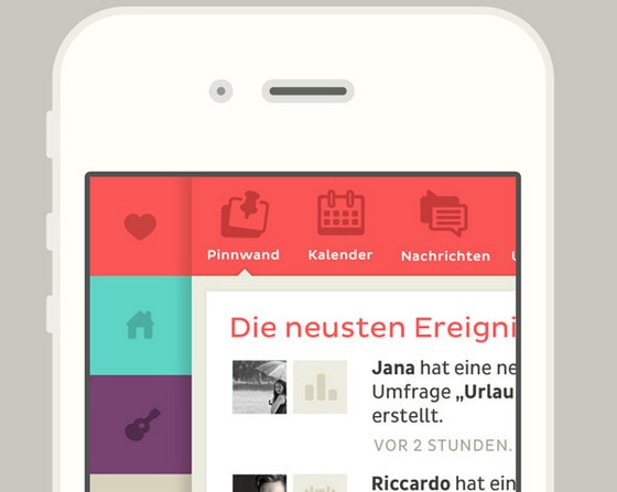
Slide Concept by Álvaro Carreras exhibits awe-inspiring, rather innovation sliding animation with curtain-like effect.
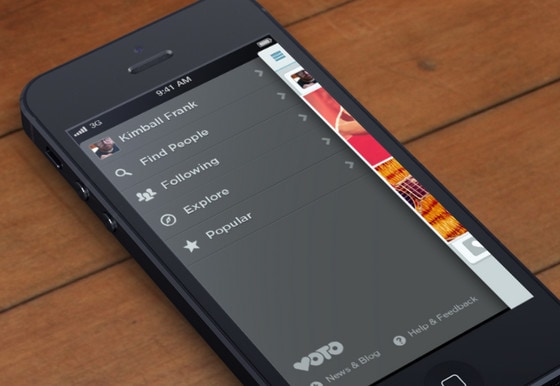
Side Menu by Kimball Frank Wirig has a harmonious, quite spacious appearance. Effective light grey typography is beautifully emphasized by delicate shadows.
Reflection
One of the most popular and widely-used approaches of hiding and revealing side menu – is a dragging mechanism, which is implemented by means of a small activation button (usually icon) that shifts the content to the right and reveals navigation on the left side. Moreover, this simple process is usually accompanied by enthralling animation that adds an extra flair to design.
So, what do you think about the utilization of side menus in mobile designs? Do they look appropriate in such projects? Which type of navigation (vertical or horizontal) do you prefer? Why?
