Design a Card Details App Screen in Sketch 3 (Tutorial)
You’ve likely heard about the Sketch App design tool for Mac, its intuitive usability and why user interface designers are switching over. It’s on version 3.2.2 and only $99.
If you haven’t tried it out yet, it’s about time you did, especially if you’re one of those that complain about the sluggishness of Adobe software. Sketch 3 is incredibly lightweight and splendidly fast. Grab a trial version here.
In this tutorial, we’ll create a card details app screen that takes advantage of iOS 8’s credit card scanning features. You might remember a similar feature from iOS 7 where you could scan iTunes gift cards emails with the camera as an alternative to tapping in the lengthy string of digits.
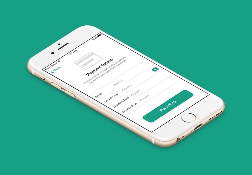
With the new card details feature the user inputs credit card information into the iOS device settings beforehand, so only a quick-tap is required to autocomplete the form fields when the user wants to make a purchase. The image below shows a screenshot of what we’ll be making.
Create an Artboard
Lets begin by opening up the Sketch app and tapping “A” on the keyboard. Sketch keyboard shortcuts are refreshingly easy to remember, and this one is short for “artboard.” If you have experience in Adobe Illustrator or other vector tools, this terminology should be familiar.
With Postcards Email Builder you can create and edit email templates online without any coding skills! Includes more than 100 components to help you create custom emails templates faster than ever before.
Free Email BuilderFree Email TemplatesIn the right-hand sidebar you’ll notice that iPhone Screens has already dropped down for you. Select the first option, Portrait — 6 Plus. Now that we have our iPhone 6 artboard we’re going to drop in a couple of UI assets that are instantly available in Sketch from the word go.
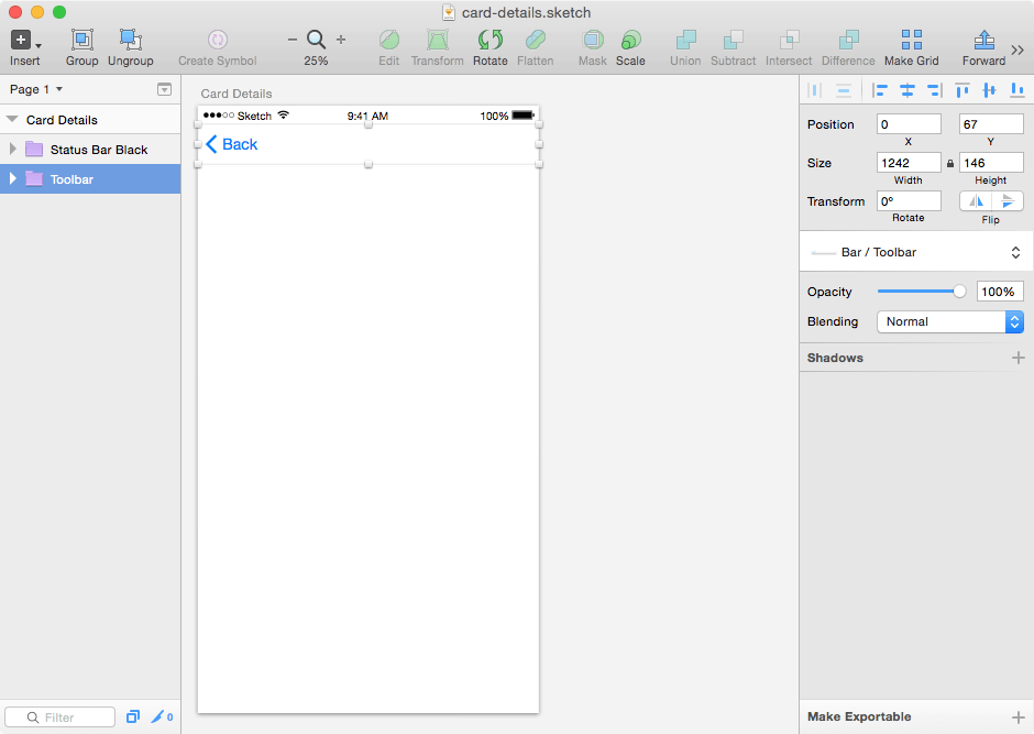
Navigate to File → New From Template → iOS UI Design. A new Sketch window will open up with an abundance of iOS UI assets. To use in our app screen, we’ll need to copy these assets into our artboard; a classic copy and paste will work flawlessly. From the left-hand “layers” sidebar, copy both Toolbar and Status Bar Black into our iPhone 6 artboard, and close the UI assets Sketch window since we won’t be needing it again.
You may have noticed that the assets are a little too small, but that’s fine. We’re working with vectors, so we can upscale these layers whilst maintaining crisp quality. Click on one of the layers to see its style attributes in the right-hand sidebar, make sure the tiny padlock between Width and Height is locked, and set the width to 1242. There, that’s better. When you’ve repeated this step on the other layer, drag both to the top of the artboard and check the image below to make sure we’re up to speed.
Quick Review
- Press “A” and select Portrait — 6 Plus
- Open the iOS UI Design under File → New From Template
- Copy the Toolbar and Status Bar Black into our artboard
- Resize layers and drag to the top of the app screen
Creating Text Fields
Now we’re going to learn a new shortcut, “R” for Rectangle. Draw it out and confirm in the right-hand sidebar that it is 1142px by 180px— this allows for a 50px margin either side of our text field. We don’t want to stretch the form across the canvas but we do want to use the large iPhone 6 screen effectively; this is to reduce overflow on text fields where the values are lengthy and often cut off.
Just like in any other design tool, you can double-click a layer in the layers sidebar to rename it, which I’ve done.
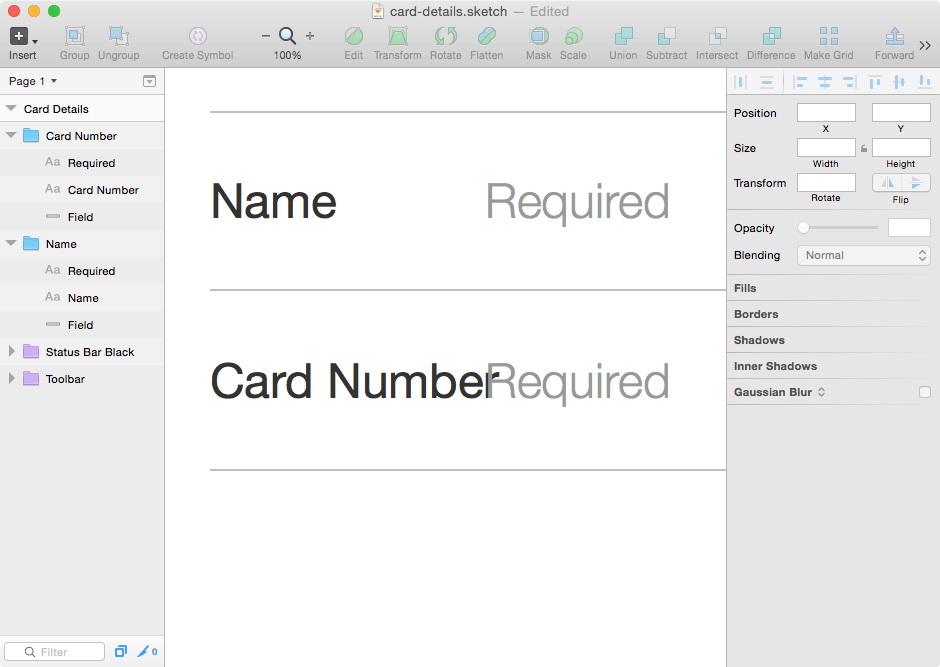
Now lets style the text field. Since (annoyingly) Sketch 3 doesn’t allow single-sided borders, we’ll have to make use of the Inner Shadows attribute. So untick Borders (and Fills while you’re there) and instead add an Inner Shadow. The values available are X, Y, Blur and Spread (like in CSS3). Replace the default settings with 0, -2, 0, 0 and change the default opacity of the Color to 25% to make the border more subtle. Now add another shadow, exactly the same, only change that -2 to just 2 — our text field now has an artificial top and bottom border. See the image below for reference.
If you zoom-in to 100% (CMD + “+”) the text field should look like this.
With Startup App and Slides App you can build unlimited websites using the online website editor which includes ready-made designed and coded elements, templates and themes.
Try Startup App Try Slides AppOther Products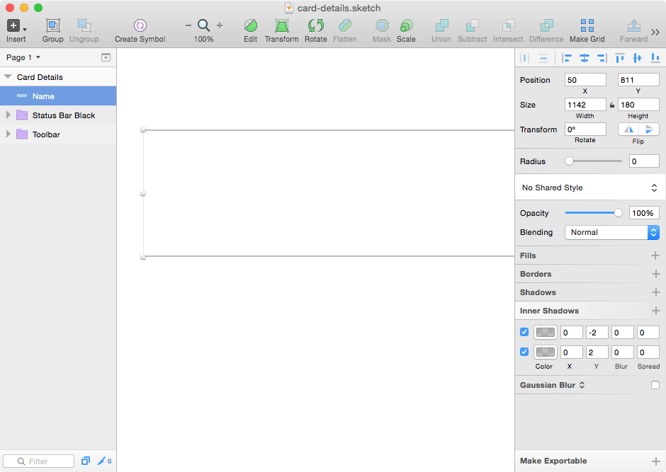
Now we’ll split the text field into three sections (not literally, but in our minds) consisting of a label, placeholder and optional space for an icon.
Why? It is the default behavior of a placeholder to disappear when we focus on a form field, and we can often forget what information we were supposed to provide after the placeholder hint goes away. This is why its best practice to have both a label and a placeholder — the label tells the user what information the form needs (e.g. “First name”) and the placeholder either offers a helpful hint (e.g. “Edgar Allan Poe”) or tells the user that the field is required.
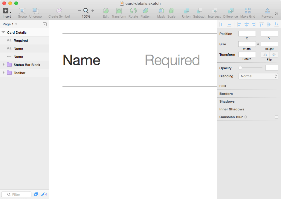
Press “T” to insert text and draw a container (like we did with the Rectangle tool) and type “Name.” We’ll want to keep the form labels short in order to leave more room for the user-submitted values. Now adjust the style attributes to match these settings:
Typeface: Helvetica Neue
Weight: Regular
Color: #333
Size: 48
Width: Auto
Duplicate this text layer, but change the Weight to “Light” and the Color to #999. Placeholders do not carry the same weight of importance in a form field, therefore they don’t require the same typeface weight either.
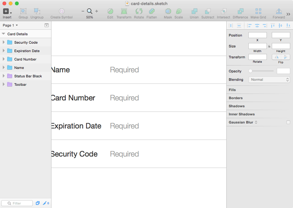
Since we’re going to use these styles again, we can Group them together. Select each form-related layer from the left-hand sidebar while holding shift and then use Group from the top menu. Now we can create multiple text fields by using CMD + D to Duplicate. However, the remaining form fields do not require that top border, so lets go and remove that before we continue.
You should now have two form fields, one with a top and bottom border, and another with only a bottom border. The form fields should be conveniently grouped and renamed in the layers sidebar, like so:
You would have noticed that one of the labels’ is longer than expected and overlaps the placeholder. There should be a short amount of space between the two, however each placeholder also needs to align vertically, so create the other two form fields and then position the placeholders relative to the longest label (this will be the expiration date).
Interesting fact: Extra fields such as start date, issue number and address were only required by legacy systems. Modern applications only require these four fields.
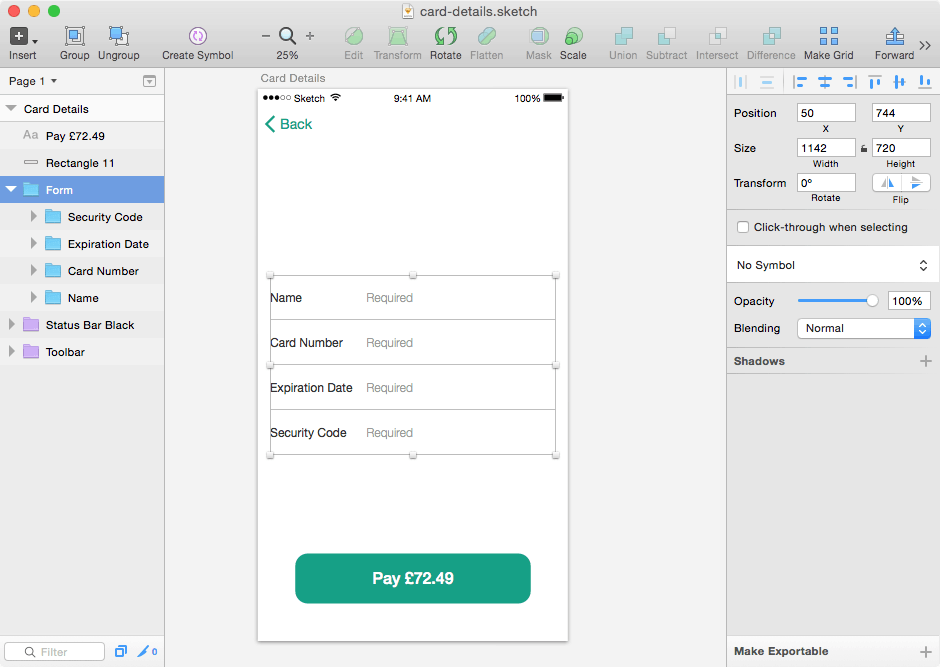
Do you remember how we used the Group feature? Now we need to place the four form field groups into another group of their own — we’ll call this “Form” and drag it right into the center of the artboard for now.
Red lines will appear on the canvas to illustrate when Sketch is able to snap-to a logical position in the artboard. Lines appearing both horizontally and vertically will indicate a true center alignment.
Since apps don’t always include a logo, this leaves us to impose our brand colors in the UI assets instead. Press “R” and draw another rectangle with the following styles (don’t forget to remove the borders first):
- Width: 942
- Height: 200
- X: 150
- Y: 1858
- Radius: 20
- Color: #16A085 (optional, but this is what I chose)
If you were designing this app screen without a tutorial you wouldn’t know about the X and Y positions, so here’s a quick tip: moving a layer with the directional keyboard buttons while holding shift moves it by a factor of 10px instead of 1.
After adding the text (weight: medium; color: white; size: 68), you should have something that resembles the screenshot below. Notice the back button and its icon counterpart have been updated to fit our brand.
Create Visual Aids to Help Users
By looking at the form labels and button text you can deduct that this screen’s objective is to collect your card details, but it isn’t immediately obvious. Some visual aids will help the user understand the goal of the form more clearly, which is to pay for the item in the quickest and simplest way. Since we pay for things online with a credit card, an icon representing that would be most appropriate.
If you’d like to take a stab at creating your own icons I won’t stop you. After all, we’ve learned how to create shapes and style them, but many would call this reinventing the wheel. Instead we’re going to find icons that are close enough to what we want and shape them to compliment our app’s design.
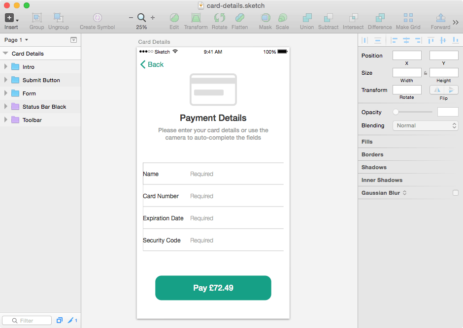
Sketch App Sources and Dribbble are two splendid websites for finding free Sketch resources; I’ve chosen this icon set by Phil LaPier. We used Sketch App’s built-in iOS kit at the beginning of this tutorial — the lessons learned there are completely applicable. Copy the brand-less blue card icon from Phil’s artboard into our artboard and make sure the Size is 384 x 264.
Blue would be too distracting; it only needs to be a subtle hint. In the left-hand sidebar you’ll notice that our copied icon has not been flattened yet. We’re going to manipulate these grouped layers and style this icon in a way that suits our app screen. With the following styles we can transform this colored icon into a less flamboyant line icon. Lets start with the base:
- Fill: remove
- Radius: 20
- Border: #ddd inside 15
Now the strip:
- Fill: #ddd
And finally the CVC/Security Code:
- Fill: #ddd
- Radius: 10
We’re also going to add some confirmatory text. Press “T” to begin:
- Copy: “Payment Details”
- Weight: Medium
- Color: #333
- Size: 72
- Width: Auto
And underneath we’ll need further elaboration:
- Copy: “Please enter your card details or use the camera”
- Weight: Medium
- Color: #666
- Size: 48
- Alignment: Centre
- Width: Auto
At this stage we’re adding a lot of new layers to the canvas. Just as if you were working in any other design app, we need to take a moment to clean up. Get in the habit of renaming layers and grouping related layers together; after that it will be much easier to move groups of elements around the artboard, which is exactly what we need to do now.
Look at the mockup below and position the layers in your artboard until both app screens look relatively the same. Simply dragging layers to activate the snap-t0-grid features will accomplish most of this.
Tip: The form should be about 200px above the submit button and the credit card icon should automatically snap to the bottom-center of the navigation.
Helping Users Achieve Goals Quicker
As mentioned at the start of this article, iOS 8 lets you store credit card details on your iPhone to save you tapping in those details every time you want to make a purchase — this is done by scanning your credit card with the iPhone camera. CNET demo’s this feature in a very short video.
However, there are downsides. Since the CVC/security code is located on the back of the card it has to be input manually; since the feature is activated from the keyboard interface, it cannot be used in conjunction with third-party keyboards. These are minor setbacks.
A camera icon has been added to the form in our brand colors. It does not (because it can’t) invoke the camera in any way, as this can only be activated from the keyboard when you tap “Scan Credit Card,” but it does let the user know that this feature is available. Perhaps the user will immediately notice the card scan feature when the keyboard interface pops up, but it can’t be guaranteed that they will; so we’ll add the camera icon to make sure.
By now you should be comfortable copying-in UI assets from other .sketch files and changing styles such as color and size. If not, I would suggest revisiting the “visual aids” step where we imported the credit card icon.
Conclusion
Prototyping is the most important stage in any design project. I did not construct this app screen on my first try, but in fact I tried many different variations before I found the best user experience. Reiteration is invaluable in the design process and Sketch App 3 makes it a breeze to try out colors, fonts and styles in a short time frame.
Hopefully, the skills in this tutorial have been indispensable. You might find creating and editing vector shapes a little more difficult, however, Sketch App makes this as simple as can be (maybe we’ll cover that in a future tutorial).
If you are in fact a beginner, what were your first expectations of Sketch and did it match those expectations? If you have used Sketch before, did you come across any useful Sketch tutorials lately?
Bonus: Export Assets
If you’re feeling confident about designing real-life apps in Sketch you’ll want to know how to export those icons into a variety of iOS-ready formats. It’s easy and one of Sketch’s most acclaimed features. Select (from the layers sidebar) the layer or group that you want to export and click “Make Exportable” in the bottom-right corner of the window.
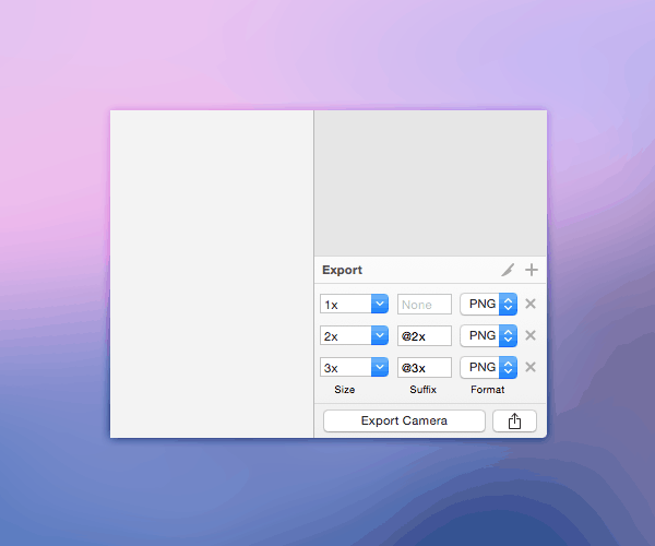
Sketch will take care of the iOS asset naming conventions by automatically appending a suffix (@2x, @3x, etc) and saving as a non-lossy transparent PNG, which is perfect for small assets.
Download Sketch File


 siter.io
 pulsetic.com
 static.app
 mailpost.io