Best Website Design Examples
As we wave goodbye to 2024, it’s a good time to look back on some of the great designs this year has had to offer. Many of the trends of 2025 showed up in the best website designs (and redesigns) out there.
Are you ready to make New Year’s resolutions, welcome the year, and take a look back at the outgoing one that was quite rich in events? 2025 blessed us with some predictable and unexpected, original and strange, ambitious and not-so-long-playing trends.
There were trends that carved a quite niche for themselves such as responsiveness, mobile-friendliness, and animations; others that matured such as flat style or scrolling effects; a few that remained unchanged like hamburger menu buttons or one-pages; and those that took the web by storm and quickly passed like dynamic patterns. The year certainly supplied creative folks with a fertile environment where one can easily go wild. Although it is challenging to trace every key moment, however, we can demonstrate the overall picture through a collection of ingenious and exclusive projects.
We are going to dive into the best web designs of 2025 that were highly and justly rewarded by the Designmodo team. Here’s what we have for you.
Best Websites of 2025
BBQ Cultures
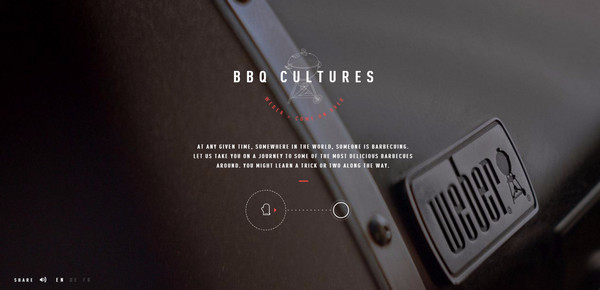
BBQ Cultures proves that restaurant-related websites made a giant leap forward. It falls in line with current trends and pleases visitors with grand design and interactive features. Outstanding photos, engaging videos, fancy graphics, and a slew of subtle non-static details – every tiny element makes it stand out from the crowd.
With Postcards Email Builder you can create and edit email templates online without any coding skills! Includes more than 100 components to help you create custom emails templates faster than ever before.
Free Email BuilderFree Email TemplatesIn Pieces
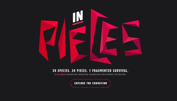
In Pieces is a top-notch dynamic exhibition. It was skillfully brought to life by intricate polygonal style with a sparkling of CSS and JavaScript. There are 30 species that are composed of 30 pieces in an engaging and amusing way.
Trippeo
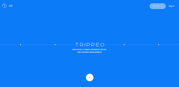
Trippeo demonstrates how to present an upcoming product using modern solutions. The project is still based on a classic horizontal stripe layout, however, such factors as an interactive trip, scroll-activated animations and motion do their job perfectly well, achieving a powerful impact.
Be More by Reebok
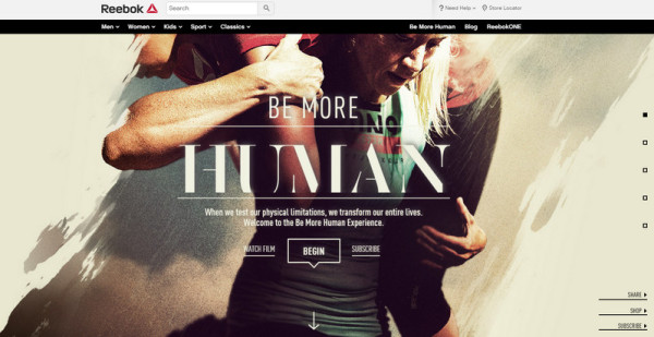
Be More by Reebok opts for a long one-page structure that effectively dishes up all the information. It is a fusion of impressive scenes with a grunge touch powerful urban vibe and dynamic effects that results in an outstanding user experience.
The DNA Project
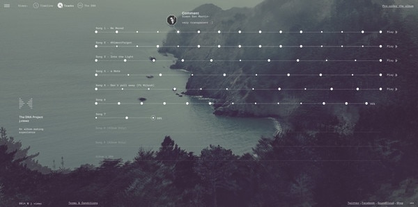
The DNA Project is an innovative music experiment that opens up a routine of the album-making process in an unusual and highly captivating fashion. Each song is broken into key points that cover sounds, the story behind the track, and the people that were involved. The project allows fans to get closer to the artist and his album.
With Pulsetic you’ll be instantly notified the moment your website, API, or server becomes unavailable. Monitor uptime from multiple global locations and respond to incidents before your users are affected.
Create beautiful status pages in minutes to keep customers informed during outages and build trust with transparent communication.
Start Monitoring for FreeACME Experience
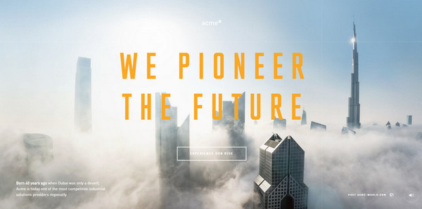
With such a loud and promising slogan, the website just could not help but visually support the company’s credo. The project is constructed from an asymmetrical layout, multi-layered techniques, subtle motion, vivid backgrounds and little tricks. Enjoy the productive and sophisticated symbiosis.
Weltrade
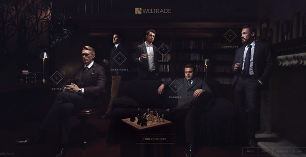
Weltrade is surrounded by an aura of sophistication, excellence, and mystery. Created by talented folks from Ukraine, this sumptuous website is driven by interactive features that take user experience to the next level. Choose the type of trader in the Forex market and find out what skills, characteristic traits and principles are applicable to it.
Georg Jensen
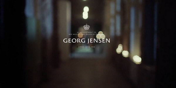
Georg Jensen meets online audience with a live-action short film that puts them into the majestic atmosphere of the brand. You are welcome to view details of each scene and even save the desired items in the wish list. This is an innovative way to present a new collection and foist the goods.
Tenslife

Tenslife is another e-store in our collection that fascinates us with its unorthodox appearance, good use of interactive elements, and exquisite aesthetics. It is marked by consistency in style. The two-column layout embraces all the necessary information, demonstrates the product range, and strengthens the general feeling with a beautiful photo on the right. There is a lot of stuff, but it is not messy or overpowering.
Quechua
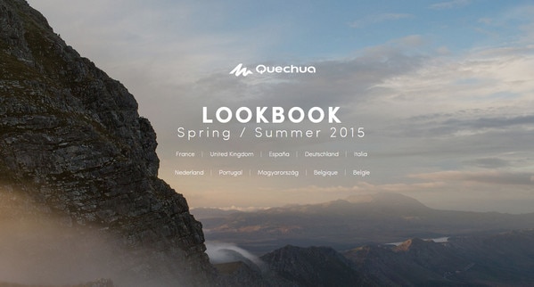
Quechua is famous for awesome lookbooks based on a harmonious blend of static details, typography, and dynamic elements. Spectacular natural scenes that accompany sections match the attitude and spirit of the brand as well as serve as great backgrounds. There are some playful twists that grab users’ attention as well.
Ice and Sky
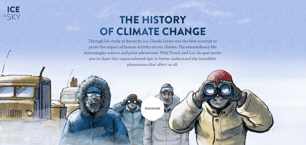
While websites with visual storytelling experiences are not new, they are becoming more sophisticated. Ice and Sky is a typical representative that surprises with some enhancements. It shows a clever use of video, smooth transitions and stunning illustrations. The great thing is that this educational and informative project saves its functionality across the majority of popular devices.
DogStudio
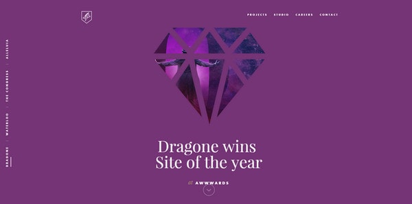
DogStudio is a multi-award-winning studio with a magnificent website. While it sticks to a classic time-proven way of arranging content, there are details that add spice to the aesthetics. Starting from the use of a masking technique to exhibit portfolio pieces and ending with small animations that unobtrusively follow shifting between sections; the team definitely knows how to get the most out of current solutions.
Namale
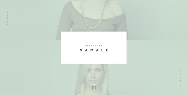
Namale has a lovely female appeal. It is skillfully centered around the collection of goods. An amazing lookbook is the driving force that catches the eye, focuses users’ attention on products and sets the mood. This is a masterfully crafted online gallery with a soul and passion.
Kingsman Movie
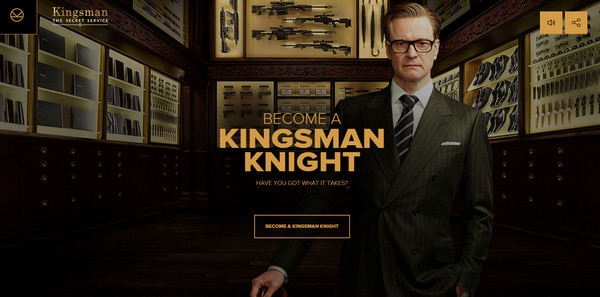
The website is aimed to support and promote an upcoming film. It is akin to a movie teaser, yet it is more advanced, sophisticated and enthralling. Scenes taken from the movie create the environment. Interactive details let users become an integral part of the story. Sounds and music background reinforce the effect.
Braastad
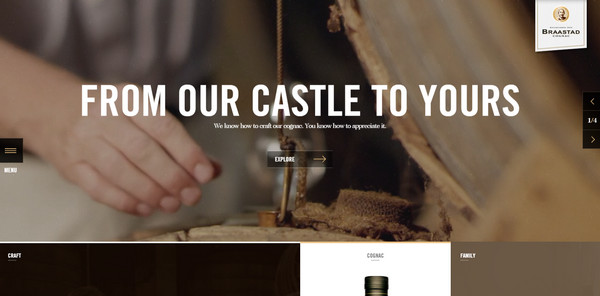
Braastad relies on a grid structure that puts everything in order and keeps users away from feeling confused. It has a beautiful UI with sleek components, formal typography, elegant details and a strong boxy vibe. Non-static features like smooth transitions and fancy full-screen animations add a surprising depth of emotion and enhance user experience.
Keep Portland Weird
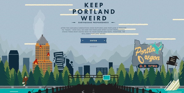
Keep Portland Weird makes the most out of a splendidly illustrated environment that is charged with motion. The latter gives the website a dynamic look. While the project is intended to be informative, there are playful notes that make it amusing and enthralling to explore.
YouTube 10th Anniversary
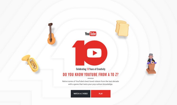
The leading video platform celebrated its jubilee with an excellent website. It invites users to take part in an intriguing, absorbing and fully interactive quiz that tests your pop-culture knowledge. There are small animations, dynamic tricks, fantastic illustrations and, of course, outstanding videos.
Environment by Subaru
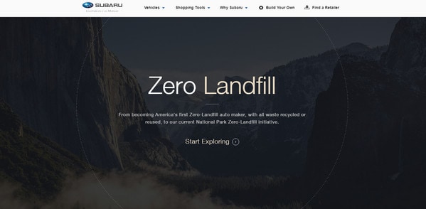
The project deserves attention because of numerous factors. It is fully interactive with pioneering elements and a spectacular photo-based environment. The navigation is fresh and cool. The featured content is presented in a unique dynamic way.
Silenza
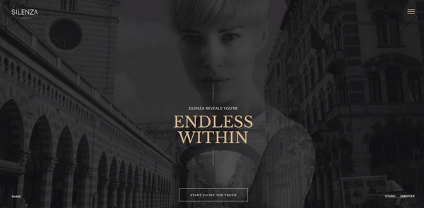
The website dedicated to multi-brand stores is an exceptional right from the beginning. It breaks away from the majority. It vividly tells a story about the company through a rich video full of interesting facts, and at the same time, offers more conservative users a standard structure with content to explore. The drawback is that it works only on desktops; in the era of the explosive growth of mobile traffic, this is a shot in the dark.
Sennheizer Reshaping Excellence
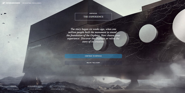
Sennheizer Reshaping Excellence goes for a mind-blowing interactive experience. There is also a static version with a sophisticated and exquisite design that is also worth your attention. It balances picturesque high-quality images and clean areas with product descriptions.
Void
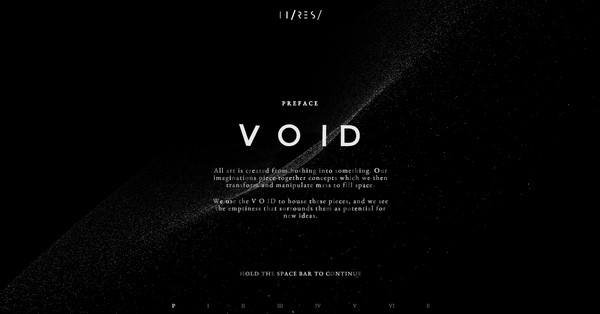
This matchless website is a gallery of various experiments that breathe with innovations and creative approaches. It pushes boundaries and tests the limits of cutting-edge techniques. Nevertheless, much like the Silenza, it reveals what is hidden inside only for desktop users with the latest versions of Chrome or Safari.
LegWork Studio
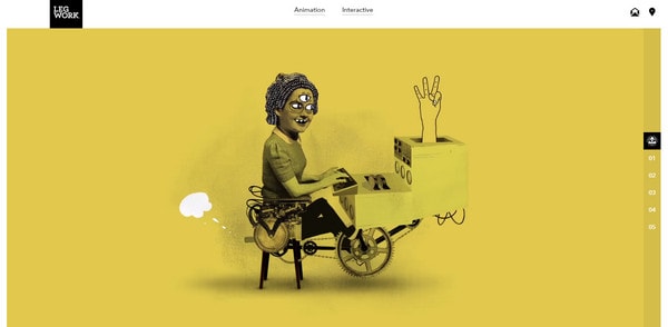
Specializing in building superfine interactive and unforgettable user experiences, the agency has an online portfolio that is empowered with animation patterns and subtle motion. This one-page website includes ambiguous yet eye-catching illustrations that single it out right away.
Conclusion
Interactivity and animations are characteristic traits of website designs that can be called the best. Developers go to the limit by performing bold experiments with high-end techniques and pioneering solutions. Although not all of them can boast of full browser compatibility and support for all popular devices; however, they push the web forward, making it a better place.
