Email Design Trends for 2026
As we move into 2026, email marketing still works really well for engagement and conversions. What’s changing is how emails are designed and experienced. People now expect emails to feel interactive, personalized, and easy to read on any device.
Since last year, brands used more interactive elements, optimized designs for dark mode, and adapted to new email authentication rules from Google and Yahoo. There was also a stronger focus on sustainability, better personalization, and cleaner, more creative layouts.
In this article, you’ll learn how 2026 is trending in email design and how to apply it in practice. We also share insights and predictions based on survey responses we collected, reflecting how experts see email design evolving in the year ahead.
Importance of Following and Introducing Email Design Trends
Before getting into specific email design trends for 2026, it is important to understand why trends matter.
Trends don’t mean copying what everyone else is doing. It means paying attention to how people read emails today and adjusting your design so your message feels familiar and easy to engage with.
When email design matches current habits and expectations, readers spend less effort understanding the email and more time interacting with it.
With Postcards Email Builder you can create and edit email templates online without any coding skills! Includes more than 100 components to help you create custom emails templates faster than ever before.
Free Email BuilderFree Email Templates- Email design trends often reflect broader changes in behavior. People skim faster. They open emails on smaller screens.
- They care more about privacy and control. When played right, it helps the company:
- Stand out from the email clutter and separate from the boring, generic, and stale competition.
- Capture readers’ attention more efficiently and capitalize on their short attention span.
- Make the brand appear modern and high-tech, amplifying its overall aesthetics and making it look more enticing.
- Increase engagement with the brand and its products.
- Positively impact brand perception by reinforcing brand image and position in the market.
- Increase brand visibility and generate buzz around the email campaign, its message, and offer.
- Spark new creative approaches and solutions in delivering the messages and revealing the company’s personality.
- Create opportunities to connect email and other communication channels, amplifying the marketing strategy.
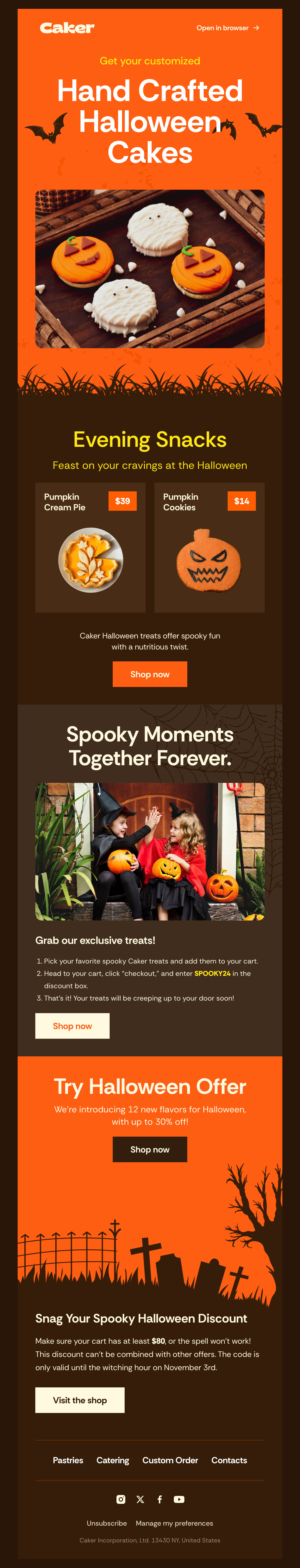
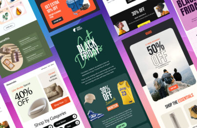
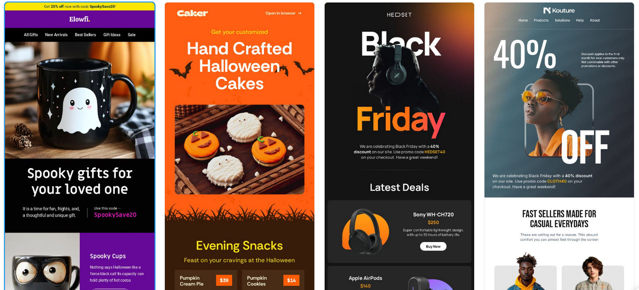
Caker – Halloween Email Template
How to Introduce Email Design Trends 2026?
Using new email design trends can help a brand stay relevant, but following every trend without thinking usually backfires. The better approach is to stay aware of trends rather than chase them all.
When bringing trends into your email design, keep a few things in mind:
- Choose trends that fit your brand’s personality.
- Use elements that add a modern feel without changing how your brand looks or sounds.
- Adjust trends based on your audience and campaign goals.
- Take the idea behind the trend, but keep your brand identity intact.
A professional email builder makes this much easier. Tools like Postcards are built for this balance.
Postcards come with ready-made blocks and layouts. The layouts are responsive and mobile-friendly, so you don’t have to worry about how emails look across devices or email clients.

Postcards – Professional Email Builder
The Email Design Trends 2026
So, what trends will inspire email marketers and shape communication in the channel next year? Here is a short list.
Data Privacy Inspired Series
In 2026, data privacy matters in email design, as email is still an easy target for attacks. Security threats are still rising, with an estimated 3.4 billion phishing emails sent every day.
With Pulsetic you’ll be instantly notified the moment your website, API, or server becomes unavailable. Monitor uptime from multiple global locations and respond to incidents before your users are affected.
Create beautiful status pages in minutes to keep customers informed during outages and build trust with transparent communication.
Start Monitoring for FreeThis tells us privacy is no longer limited to technical setup. It now influences how emails are designed and structured.
Brands should clearly show:
- Who they are
- Why a subscriber is receiving an email
- How to manage preferences.
This sets the foundation for design trends focused on confirmation emails, preference centers, visible unsubscribe options, and informative footers.
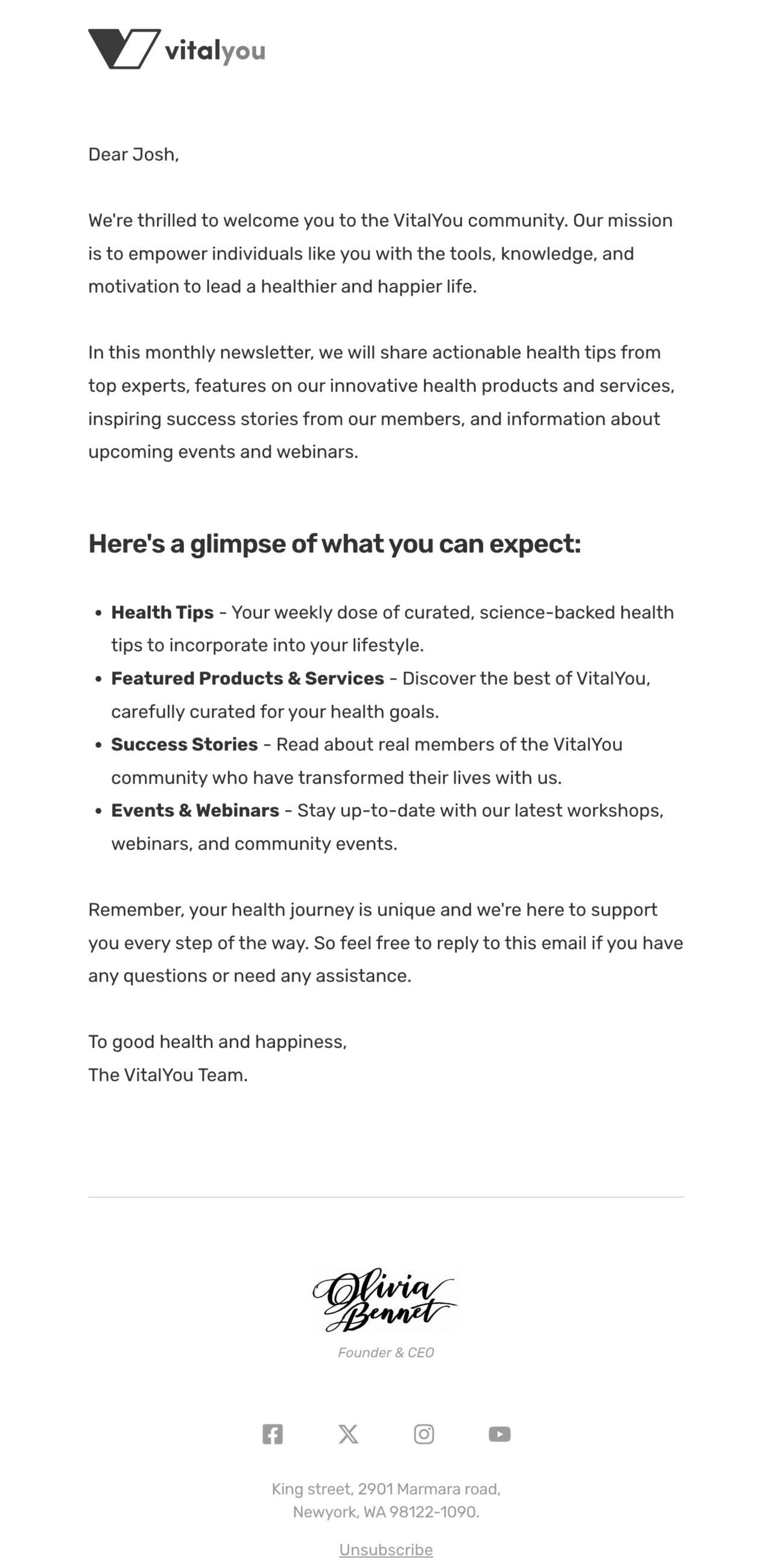
Visually Appealing Confirmation Emails to Perfect Double Opt-In
Confirmation emails are often the first real interaction between a brand and a new subscriber. Because of this, they play an important role in building early trust.
Many subscribers expect a clear confirmation that their signup was successful and that their email address is being handled safely. A well-designed confirmation email reassures users and helps them complete the opt-in process without confusion.
In 2026, these emails are moving away from generic and robotic messages. Brands are using clearer layouts, stronger branding, and simple visuals to make the message feel more personal. Small design details like readable text, clear buttons, and supportive visuals help users understand what to do next and why it matters.
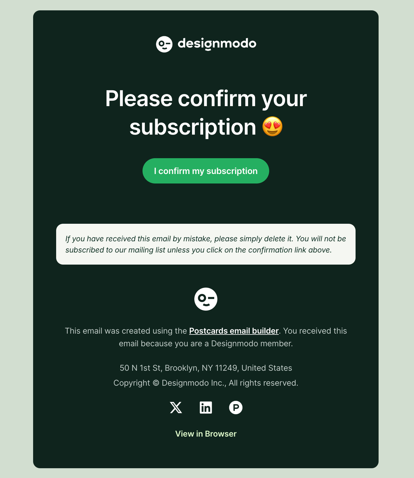
A Confirmation Email from Designmodo
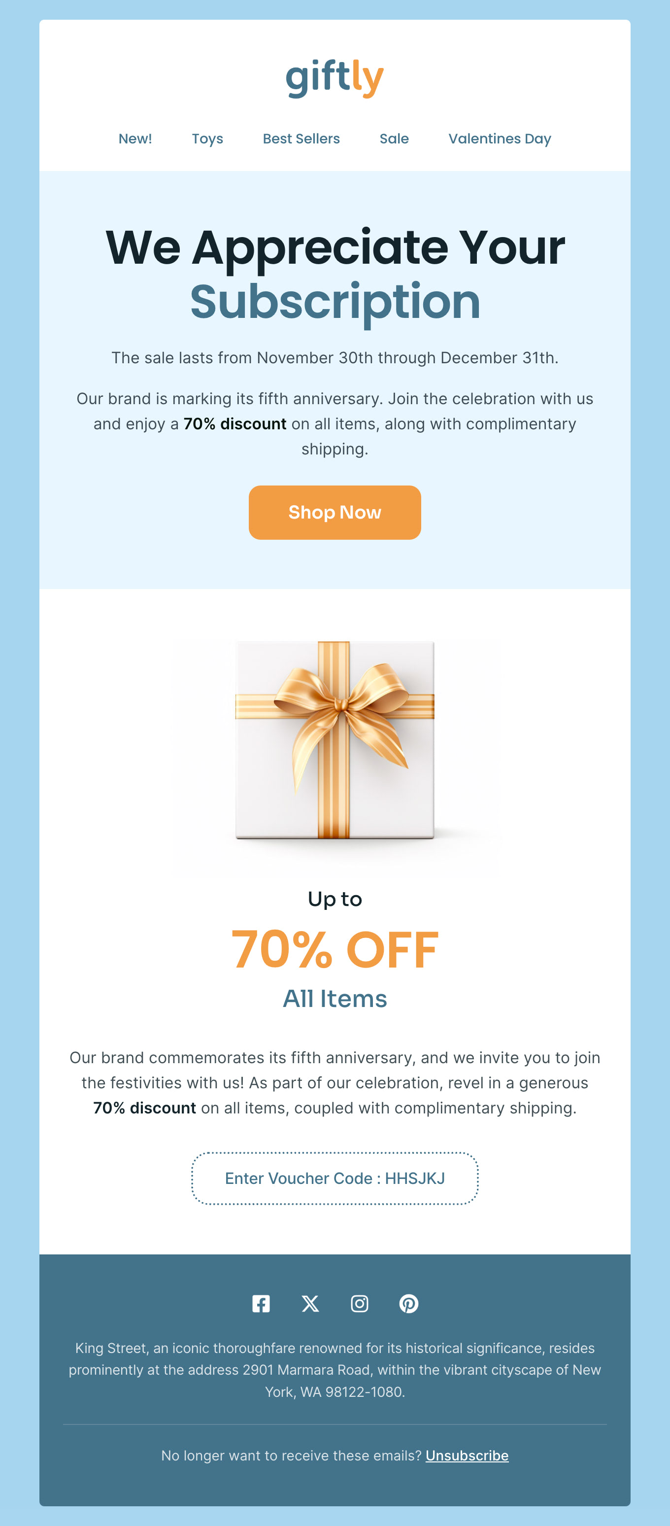
Personalized Emails Dedicated to Preference Centers
Preference centers give subscribers control over what they receive and how often they hear from a brand. In 2026, this control will play a larger role in how people respond to email communication.
When emails feel relevant, people are more likely to open and engage with them. In fact, personalized emails see a higher open rate, 44.3% compared to 39.13% for non-personalized emails. This difference shows why giving subscribers choice and relevance matters.
Highlighted Unsubscribe Links
Unsubscribe links are no longer something brands try to hide. In 2026, they are expected to be clear and easy to find.
Inbox providers now pay close attention to how subscribers react to emails. When people cannot unsubscribe easily, they are more likely to mark emails as spam. This hurts deliverability and makes future emails harder to reach the inbox.
Because of this, many brands are making unsubscribe links more visible by spacing them, formatting them, or using clear wording. A visible unsubscribe option helps set expectations, reduces frustration, and builds trust. When subscribers feel in control, email performance improves over time.
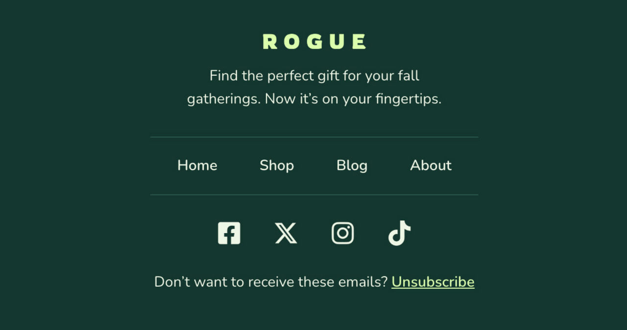
Perfectly highlighted unsubscribe link in Rogue template by Designmodo
Email footers have become an important place for building trust. Many readers scroll to the bottom of an email to check who sent it and how their data is handled.
In 2026, more brands use the footer to clearly share:
- Company’s contact information and physical address.
- Confidentiality statement.
- A brief privacy policy statement.
- Security measures.
- Alternative ways for customers to get in touch with a company.
- Copyright and trademark notice.
- Terms, conditions, or offer restrictions in promotional emails.
It is crucial to note that the email disclaimer is valuable real estate, as readers know it as a place to look for vital information. Therefore, it is highly recommended that you lay out your disclaimers so readers can easily scan and find what they need. Provide optimal readability and use proper formatting to convey information pleasantly.
Hyper-Personalization with AI-Driven Content
In 2026, hyper-personalization powered by artificial intelligence (AI) is reshaping how brands connect with subscribers. The focus has shifted away from surface-level personalization, such as using a first name, toward delivering content that reflects real behavior, intent, and preferences.
Hyper-personalization is becoming practical because modular design enables teams to swap content blocks based on behavior rather than rebuild entire emails.
According to Ila Bandhiya, Senior Digital Marketer at Middleware:
“The most important email design trend for 2026 is hyper-personalized, modular layouts. Emails need to feel like they’re crafted just for the recipient, not a one-size-fits-all blast. And modular sections let you mix-and-match content blocks based on user behavior, device, or preference, which keeps engagement high. When readers feel relevance instantly, clicks and conversions naturally follow, and it also makes testing and updating campaigns way easier for marketers.”
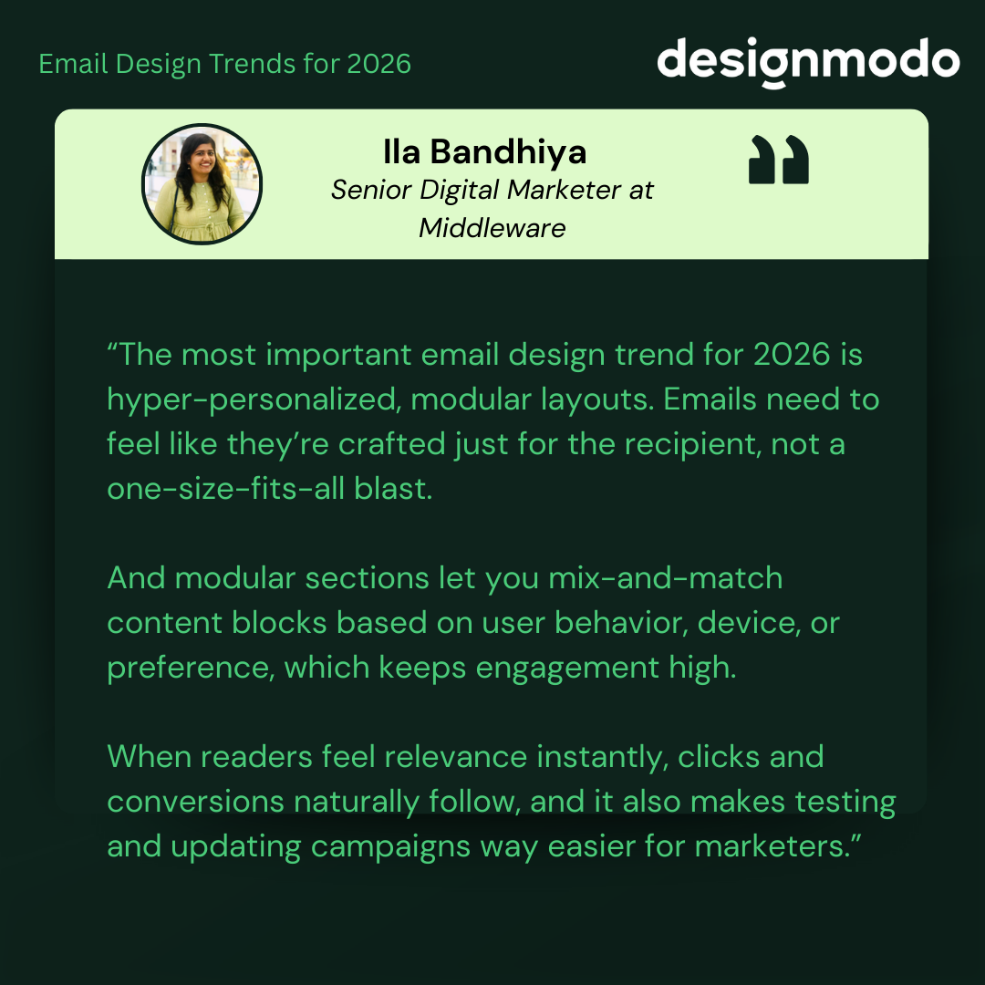
By combining AI-driven insights with modular layouts, brands can scale personalization without increasing production complexity. This approach supports stronger engagement while keeping email operations manageable.
Key Applications of AI in Email Personalization
AI is most effective when it is applied to specific use cases such as:
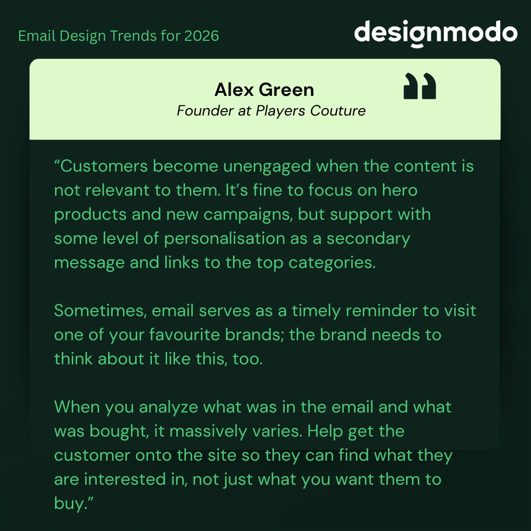
- Dynamic Product Recommendations: AI can analyze browsing and purchase behavior to suggest products that match a subscriber’s interests. For example, someone who recently viewed athletic wear may see related items instead of unrelated promotions.
Alex Green, Founder at Players Couture, suggests that targeting based on customer interests and behaviour is the most important thing. According to him:
“Customers become unengaged when the content is not relevant to them. It’s fine to focus on hero products and new campaigns, but support with some level of personalisation as a secondary message and links to the top categories. Sometimes, email serves as a timely reminder to visit one of your favourite brands; the brand needs to think about it like this, too. When you analyze what was in the email and what was bought, it massively varies. Help get the customer onto the site so they can find what they are interested in, not just what you want them to buy.”
- Content Customization Based on Behavior: Email content can change based on how someone interacts with previous emails or a website. A subscriber interested in travel may see destination ideas, while another may see local offers or category links that match their habits.
- Predictive Send Times: AI can help identify when a subscriber is most likely to open an email. By sending messages at those times, brands increase the likelihood that emails are seen rather than buried in the inbox.
Balancing AI-Driven Personalization with Privacy
As personalization becomes more advanced, clarity and trust play a bigger role in whether emails get attention or are ignored.
Clear hierarchy and upfront messaging help personalization feel helpful instead of intrusive.
Implementing AI-Driven Personalization: Tips & Best Practices
AI-driven personalization works best when introduced gradually.
- Leverage tools that integrate AI seamlessly: Many email platforms now offer built-in AI features that connect with CRM data, browsing behavior, and purchase history. These tools make it easier to personalize content without manual effort.
- Start small and scale: Begin with one or two personalization elements, such as product recommendations or send time optimization. Expand only after you see what improves engagement.
- Test and refine regularly: Personalization improves with testing. A/B testing different content blocks, layouts, or timing helps identify what works best for your audience.
Hyper-personalization with AI helps move email marketing away from one-size-fits-all messages.
Sustainability and Ethical Marketing
There has been a notable shift in recent years, with businesses recognizing the importance of ethical practices.
Over the last two years, we have seen industry leaders embrace this trend, and 2026 will not be any different.
Users demand transparency, integrity, sustainability, and environmentally friendly practices from their beloved brands.
How to Follow Ethical Marketing Trends in 2026
Apart from running email campaigns in a way that does not harm the environment, many companies use their digital correspondence to demonstrate their socially responsible position to the target audience.
Some brands are not afraid to be open about becoming more ethical and sustainable. Using digital newsletters, they inform customers about events and causes they participated in through visual reports or infographics.
Other brands lead with transparency and show the human side of their company by giving a glimpse into their prolific working culture. They include images of corporate events or employees.
In terms of email design, all of them demonstrate their ethical and eco-friendly position through styles associated with ecological aesthetics. This implies using many earthy and natural colors, authentic and raw imagery, and simple structures.
An alternative way to state your socially responsible and environmentally friendly position is by adopting practices that help to reduce email carbon footprint.
- Minimize email size by choosing compact structures.
- Avoid complex HTML, CSS, or JavaScript code to optimize loading time.
- Reduce image size.
- Cut down the number of images and graphic material in emails.
- Include only the necessary information.
These practices imply that companies will embrace minimalism with a focus on the critical message. So, expect compact digital newsletters with well-optimized images, less visual appeal, simple layouts with basic colors, and easy-to-read text snippets.
Oversimplified text-only email template by Designmodo
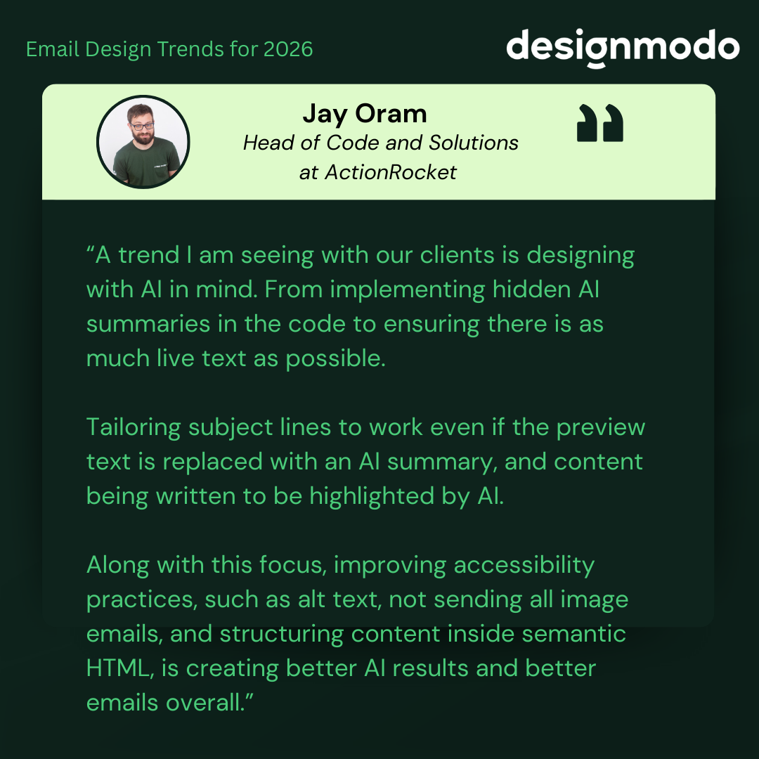
Interactive Elements and Gamified Experiences
This may sound odd in light of the previous trend, but the rise of interactive emails and gamified experiences is evident. Interactive elements like surveys in emails can increase click-to-open rate by 31.7%.
In earlier years, interactivity was often used to impress. Now it supports clarity and action.
Jay Oram, Head of Code and Solutions at ActionRocket, puts this perfectly:
“A trend I am seeing with our clients is designing with AI in mind. From implementing hidden AI summaries in the code to ensuring there is as much live text as possible. Tailoring subject lines to work even if the preview text is replaced with an AI summary and content being written to be highlighted by AI. Along with this focus, improving accessibility practices, such as alt text, not sending all image emails and structuring content inside semantic HTML, is creating better AI results and better emails overall.”
Let’s consider the most popular solutions to adopt this trend in the B2C and B2B sectors.
Interactive Emails in B2C Email Marketing
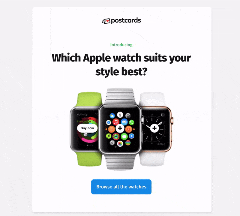
The B2C sector, perhaps, is the one that enjoys the most benefits from introducing this trend in its campaigns and strategies. Kinetic emails might drastically increase the click-through rate because customers are prone to spur-of-the-moment decisions and naturally fall for entertaining details. Here are some popular use-case scenarios:
- Inviting subscribers to browse product highlights through animated image carousels.
- Sharing instructional content or step-by-step guides using tooltips and hotspots.
- Enhancing infographic-style emails with interactive details.
- Adding calendars to simplify booking or scheduling.
- Using gamified discount codes to support promotional campaigns.
- Including polls to collect quick feedback and understand customer interest.
- Requesting reviews through simple forms or quizzes.
- Allowing users to add items to their cart directly from the email to support abandoned cart flows.
Interactive emails give B2C marketers many ways to engage subscribers, from small elements like menus and tabs to larger interactive layouts like accordions.
Use of hotspots in Postcards templates
Interactive Emails in B2B Email Marketing
Even though B2B is considered a sector with strictly professional communication, it also benefits from kinetic emails as they might efficiently remove some of the barriers in the sales funnel. In 2026, email marketers will use them for these tasks:
- Drive new user adoption of their product.
- Collect product feedback.
- Simplify or speed up event registration by linking to the online calendar.
- Have users RSVP via email with a quick form and an easy-to-use submit button.
- Ask clients to comment, leave feedback, or rate products.
- Encourage users to reply to an actual email through a Google Form paired with AMP.
- Improve onboarding flows with interactive guides.
Last year, we only scratched the surface of the possibilities of interactivity in email. With a broader adaptation of AMP, this trend will eventually become an integral email marketing tool. Therefore, expect kinetic emails of various kinds in 2026.
Mobile-First Email Designs
In 2026, mobile-first design is no longer optional. Why? Because 64% people open emails on their mobile, and delete if not optimized for mobile.
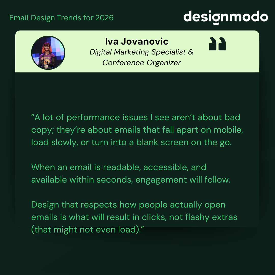
Iva Jovanovic, Digital Marketing Specialist & Conference Organizer, thinks the most important email design trend is designing for real inbox conditions, not perfect ones.
Here’s what she said:
“A lot of performance issues I see aren’t about bad copy; they’re about emails that fall apart on mobile, load slowly, or turn into a blank screen on the go. When an email is readable, accessible, and available within seconds, engagement will follow. Design that respects how people actually open emails is what will result in clicks, not flashy extras (that might not even load).”
What does this mean for email design in 2026? Three emerging subtrends in this area will shape next year’s digital correspondence.
- Single-column layout: this remains the most reliable structure for mobile-first email design. They create a natural reading flow, reduce visual friction, and adapt consistently across screen sizes and email clients.
- “Above the Fold” approach: Placing the most important information at the top of the email is critical in mobile-first design. Many subscribers decide whether to keep reading within the first few seconds.
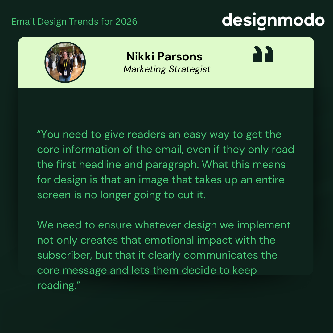
Nikki Parsons, Marketing Strategist, thinks the most important email design trend for 2026 is BLUF. She mentioned:
“You need to give readers an easy way to get the core information of the email, even if they only read the first headline and paragraph. What this means for design is that an image that takes up an entire screen is no longer going to cut it. We need to ensure whatever design we implement not only creates that emotional impact with the subscriber, but that it clearly communicates the core message and lets them decide to keep reading.”
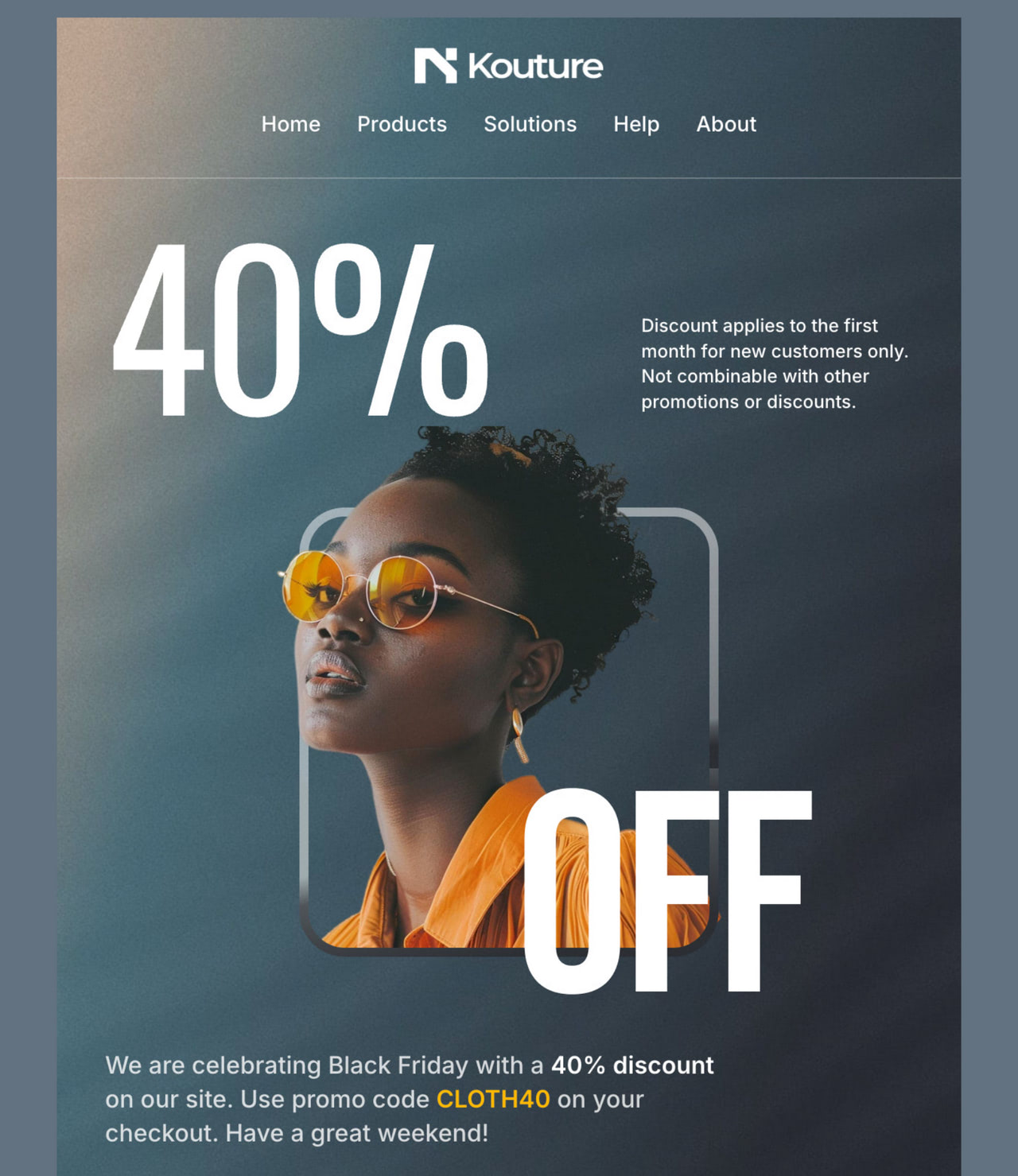
High-converting hero area in Kouture template by Designmodo
- “Cut to the Chase” philosophy: Mobile-first emails in 2026 favor directness over long storytelling. Readers want to quickly understand the email’s purpose and decide what to do next. This does not mean emails have to feel cold or transactional. Interactive elements, thoughtful visuals, and clear microcopy can still add personality, as long as they support the core message rather than delay it.
Mobile-first email templates from Designmodo
Mobile-First Micro-Animations
In 2026, mobile-first design remains central to email marketing, with micro-animations adding subtle engagement on small screens. These lightweight animations are built for mobile performance, helping brands capture attention without slowing load times or hurting usability. Use elements like:
Benefits of Mobile-First Micro-Animations
- Animated Call-to-Action Buttons: Subtle pulses or color schemes can increase visibility and tap rates.
- Loading Indicators for Rich Content: Brief animations reassure users when interactive elements or media are loading.
- Animated Product Icons: Small movements, such as a cart wobble or heart animation, reinforce actions and add visual feedback.
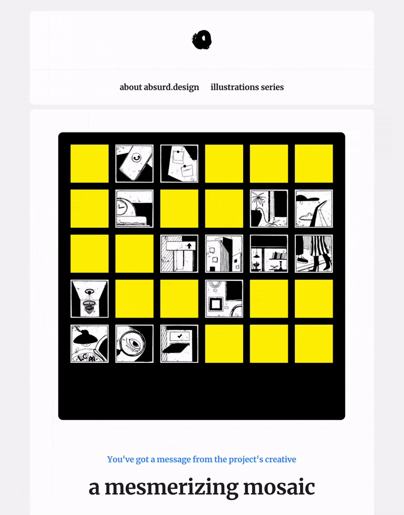
Email Design and Animation by absurd.design
Designmodo Email Animation
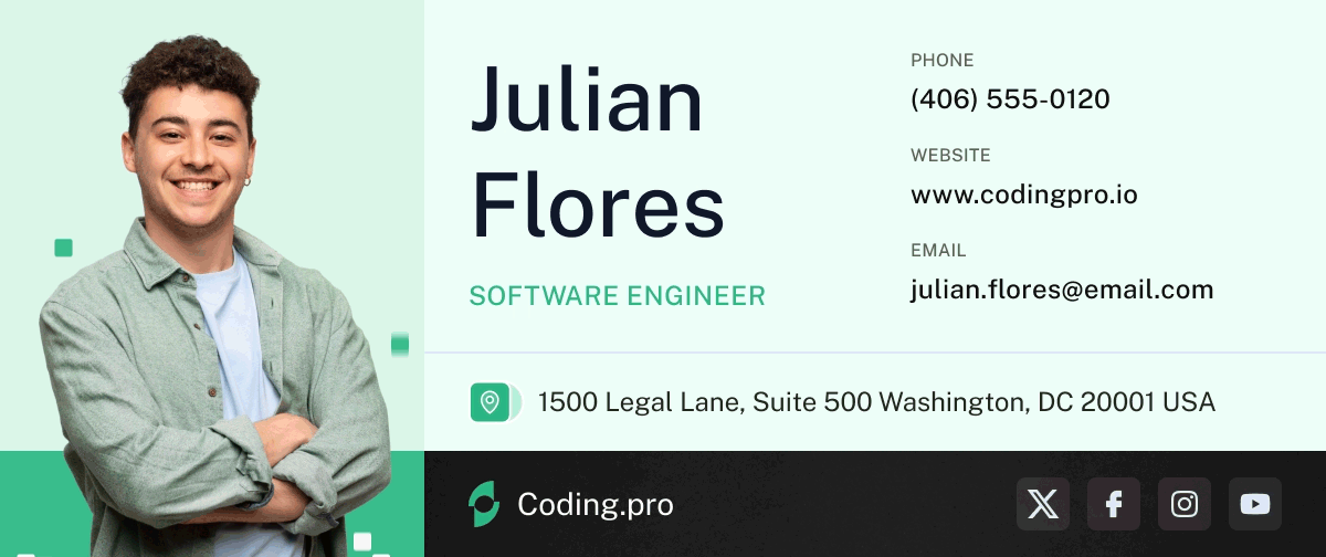
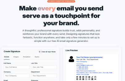
Animated Email Signature Template
Benefits of Mobile-First Micro-Animations
The reasons to use animations:
- Improved User Experience: Micro-animations guide users through actions like tapping or swiping, helping interactions feel more intuitive without overwhelming the interface.
- Enhanced Visual Engagement: Small, purposeful movements break up static layouts and draw attention to key elements, such as scroll prompts or CTA buttons.
- Brand Personality and Tone: Subtle animations reflect brand character and make emails feel more alive, memorable, and human.
Best Practices for Implementing Micro-Animations in Mobile-First Emails
Here’s what to consider while implementing:
- Prioritize Performance: Keep animations lightweight to avoid slowing load times. CSS animations are preferred over GIFs to reduce file size.
- Use Animation Purposefully: Every animation should serve a function, such as highlighting a CTA, supporting navigation, or explaining a feature.
- Test Across Devices and Email Clients: Animation support varies by client. Apple iOS Mail supports many CSS animations, while Gmail has limitations. Fallback designs are essential.
- Optimize for Touch Interactions: Design animations for taps and swipes rather than precise cursor movements, keeping interactions comfortable on small screens.
By using mobile-first micro-animations thoughtfully, brands can create emails that feel responsive and polished. When used with restraint, these details improve usability and encourage interaction without distracting from the message.
Subject Lines and Preview Clarity
Subject lines are the first thing readers see before opening an email. In fact, 72% of email recipients open an email based on the subject line alone.
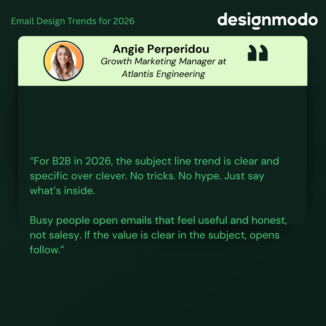
Angie Perperidou, Growth Marketing Manager at Atlantis Engineering, perfectly explains the importance of subject lines:
“For B2B in 2026, the subject line trend is clear and specific over clever. No tricks. No hype. Just say what’s inside. Busy people open emails that feel useful and honest, not salesy. If the value is clear in the subject, opens follow.”
If you want to write clear, on-point subject lines, tools like Designmodo’s AI Subject Line Generator can help you quickly test ideas and refine wording before sending.
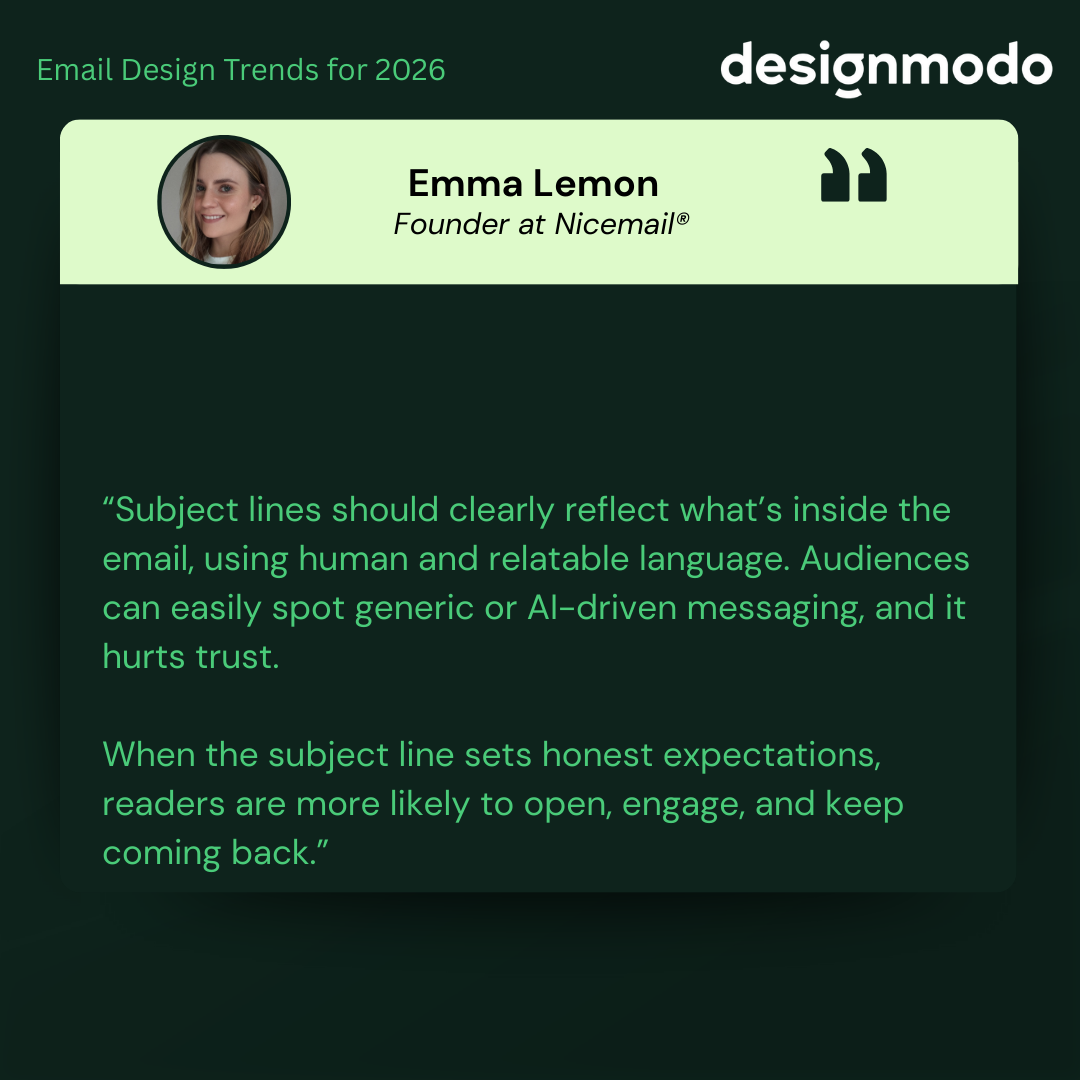
Emma Lemon, Founder at Nicemail®, also highlighted the value of subject lines:
“Subject lines should clearly reflect what’s inside the email, using human and relatable language. Audiences can easily spot generic or AI-driven messaging, and it hurts trust. When the subject line sets honest expectations, readers are more likely to open, engage, and keep coming back.”
Email marketing is gradually shifting towards hyper-personalized relationship-based communication between companies and clients. More businesses focus on individuals’ behavior, preferences, and purchasing histories to create a highly relevant, engaging branding message and meaningful connection. In fact, 71% of consumers expect personalization, and 76% become annoyed when it isn’t provided.
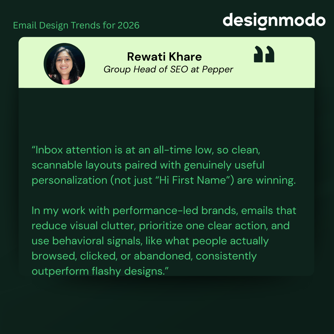
Rewati Khare, Group Head of SEO at Pepper, also emphasized this:
“Inbox attention is at an all-time low, so clean, scannable layouts paired with genuinely useful personalization (not just “Hi First Name”) are winning. In my work with performance-led brands, emails that reduce visual clutter, prioritize one clear action, and use behavioral signals, like what people actually browsed, clicked, or abandoned, consistently outperform flashy designs.”
This trend will persist and remain on the minds of email marketers in 2026.
So, how can you keep up with it and make it work for you? Here are some ideas:
Craft Impressive Welcome Email Designs
Welcome emails are often the first real interaction someone has with your brand. They set the tone for everything that comes next. That’s why many companies already treat them as more than just a basic confirmation message.
In 2026, welcome emails matter even more. Brands are spending more time making them feel warm, clear, and on-brand. A good welcome email helps people feel comfortable right away and leaves a strong first impression.
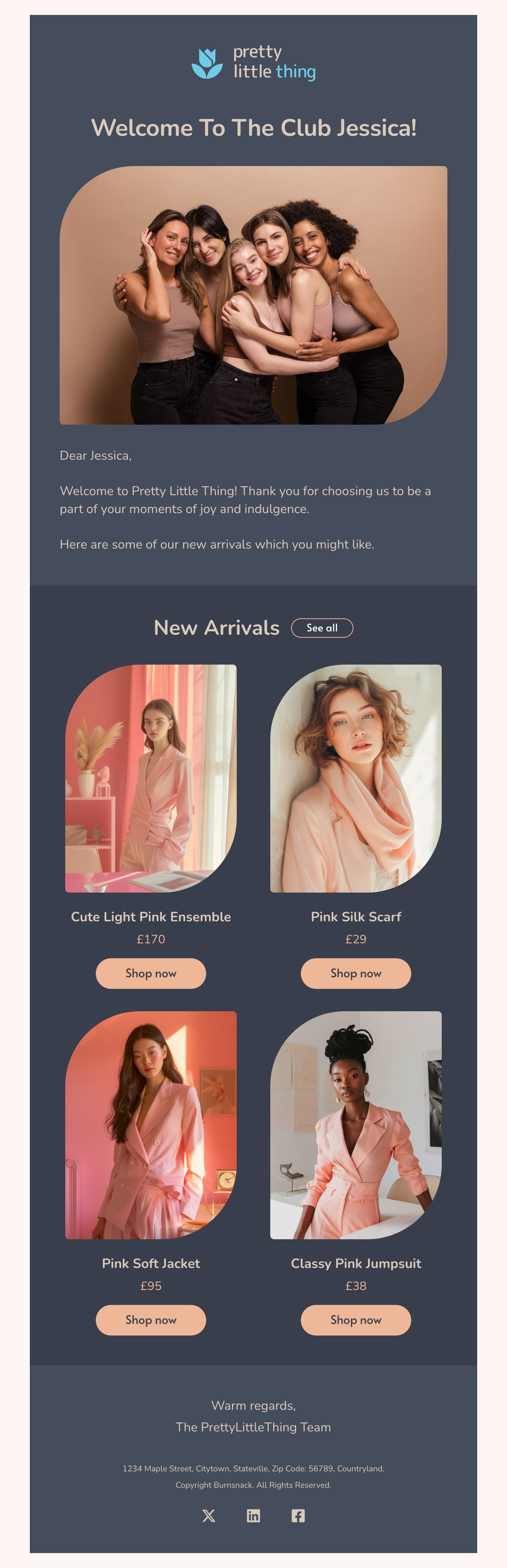
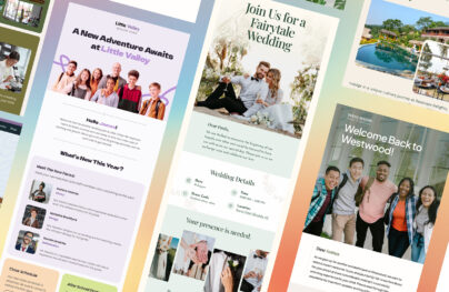
Welcome email template by Designmodo
Entertain with Onboarding Emails
Another area where you might see the trend is in onboarding emails. As the first critical step in integration, onboarding emails are vital for clients to feel comfortable in their newly established relationships with the company and enjoy all the benefits of the product or service.
You might have noticed how onboarding emails have transformed from boring text-only pieces into engaging and entertaining media-rich newsletters. Not only do they inform and guide customers through the adaptation process, but they also entertain and produce favorable, long-lasting impressions.
In 2026, companies will take them to the next level by introducing bright graphics, infographics, illustrations, dynamic elements, and interactive features to produce an outstanding user experience.
Run Heart-Warming Appreciation Campaigns
The trend of developing relationship-centric email marketing campaigns revolves around appreciation emails. Since customers value thoughtful interactions with companies, businesses should send thank-you messages, greetings, rewards, apologies, and milestone or achievement updates, rather than only promotional emails.
In 2026, they will continue to do that by employing the power of styles and interactive features. Expect brighter, more vibrant email designs, branded illustrations, authentic messages, and dynamic details that elevate gratitude newsletters to the next level.
Appreciation email template by Designmodo
Digest-Format Emails
A digest email is a magazine-style format designed for quick consumption. It is a shortened version of blog posts or articles that allows readers to review key points quickly without committing to long reads.
Platforms like YouTube and TikTok popularized this approach by optimizing for short attention spans and efficient interaction. The same logic now applies to email, where speed and clarity matter.
In 2026, brands will rely more on compact emails that let readers quickly scan multiple updates. To align with this trend, follow these practices:
Therefore, expect more of these compact, tightly packed, yet well-formatted emails in 2026. To play along with this trend, follow these practices:
- Select only relevant, high-value information.
- Use short content snippets so readers can jump directly to what interests them.
- Support snippets with visuals such as images, illustrations, or simple graphics.
- Balance text and visuals so neither overwhelms the other.
- Limit the number of sections. Four to five content blocks are usually enough.
- Separate primary and secondary content through clear formatting.
- Use generous white space to keep the layout readable.
Single-column layouts remain one of the most effective options. They provide room for strong visuals and concise copy while guiding readers naturally through the message.
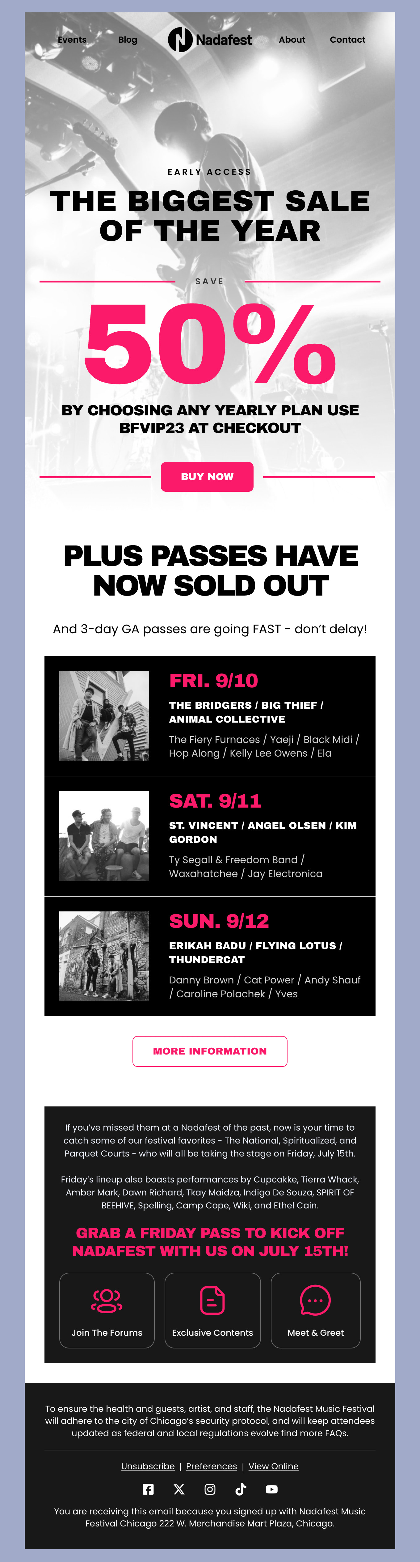
Digest-format in Nadafest email template by Designmodo
Accessibility in Email Design
Accessibility in email design is not a trend. It is a requirement. In 2026, with ethical marketing and sustainability taking priority, brands must design emails that work for all audiences and reflect that commitment.
Accessible email design supports people with permanent or temporary impairments, who represent over 16% of the global population. It also improves readability and usability for everyone else. This includes users who rely on screen readers or read emails on very small mobile screens.
When emails are accessible, more people can understand the message, interact with the content, and complete intended actions without friction. To meet this expectation in 2026, accessibility should be built into every email, not treated as an afterthought.
Check out our guide to accessibility in email design to meet this critical requirement in 2026.
Turn 2026 Email Design Trends Into Results
Not every trend needs to be adopted at once. Start small, test what works, and track results like opens, clicks, and conversions. Following trends thoughtfully keeps brands current without losing identity, while ignoring them may make you look outdated.
In 2026, the strongest email strategies will balance modern design, usability, and trust, helping brands stay relevant and competitive as expectations continue to evolve.
Choose trends highlighting the best side of your brand personality and use Postcards and our ready-made email templates to ensure your message and design look refreshing, contemporary, and coherent across devices and platforms.