How to Create and Verify an Email Newsletter Before Sending [Checklist]
Need to know how to create an Email Newsletter? Every website owner has asked this question at least once. Whether you have a simple blog with occasional updates, an online magazine with stories published every hour or an e-store, chances are you regularly run email campaigns.
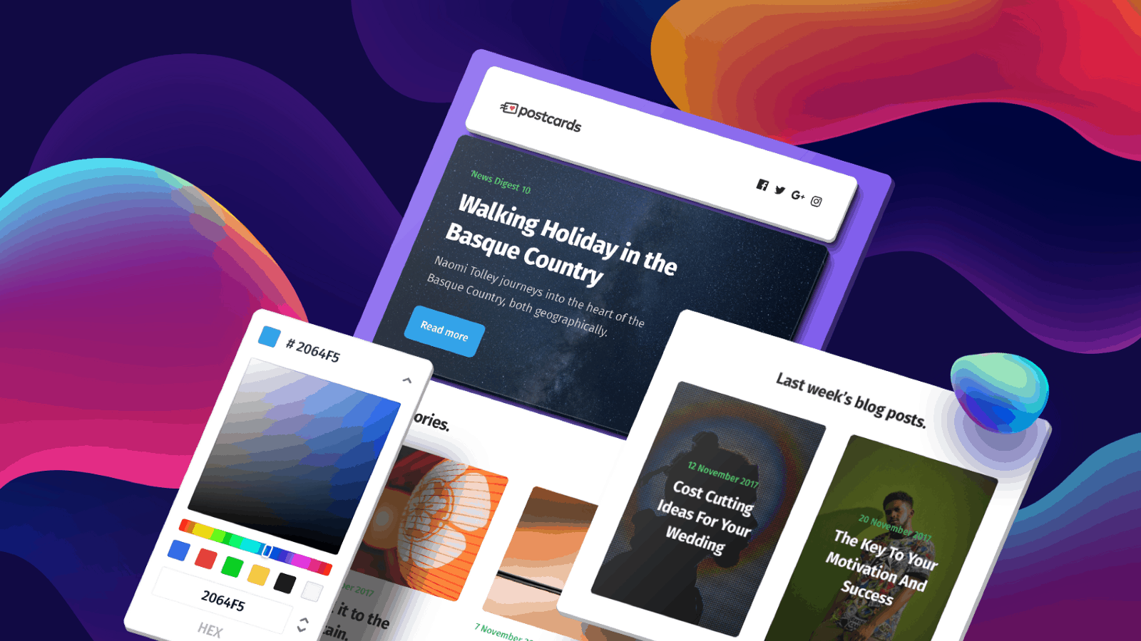
Tip: Try Postcards and create HTML emails in minutes without coding knowledge.
Collecting subscribers is the most natural thing on the internet; everyone does that. Even the infamous GDPR has not managed to discourage or slow us down. Despite the obstacles, email campaigns are thriving. They are time-proven tools for informing readers about updates as well as increasing conversion rates and selling goods.
Knowing the basics of creating a message is at the heart and soul of every online email campaign. If you feel like you are missing something during this process, our guide can be a handy resource. It covers crucial elements and two helpful checklists.
Goals of Email
Focus on your goal.
Let us start with the very first thing: You must decide what your goal is. I know, almost every guide begins with this point. It might seem cliché, but there are a dozen different types of email newsletters, including:
With Postcards Email Builder you can create and edit email templates online without any coding skills! Includes more than 100 components to help you create custom emails templates faster than ever before.
Free Email BuilderFree Email Templates- Announcements
- Welcome Emails
- Tutorials and Tips Emails
- Digital magazines
- Customer Stories/Brand Stories
- Cart Abandonment Reminders
- Confirmation Emails
- Time-Sensitive Promotions
- Receipt Emails
- Sales Follow-ups
- Review Requests
- Event Invitations
- Product Update Emails and others
Do you want to notify subscribers about updates to your blog, invite them to an upcoming event, or draw the attention to discounts and lure potential customers to your online shop?
Ask yourself first, what the goal is. Everything including design, content, visuals and motivational messaging depends on your mission. So, the first thing is to make up your mind and set your goal.
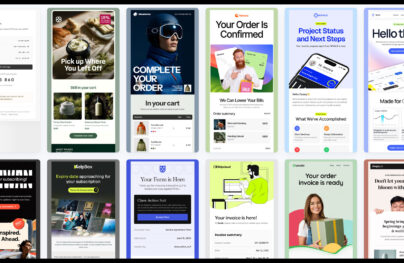
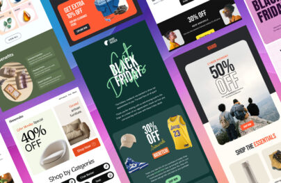
Email Content
![How to Create and Verify an Email Newsletter Before Sending [Checklist]](https://designmodo.com/wp-content/uploads/2019/02/email-design.jpg)
The content is essential.
The goal will determine what content to include.
If it is a regular update from your blog then you should include titles, images, excerpts and backlinks to stories; if it is an email campaign that is targeted at increasing CTR, then you should take care of the motivational part and CTAs. It is up to you to decide what to include in the body, yet, some things are essential for every email newsletter:
- Brand identity. It can be logotype or just a nameplate. Make it consistent every time.
- Small navigation. This is usually displayed as a regular top header menu. Each link should be made as an anchor that quickly gets the readers to the desired part of the letter.
- Link to your website.
- Social media links. As a rule, they are located in the footer.
- Sharing. If you have interesting facts or offers, then readers should have an opportunity to share this.
- Contact information. Skype, Viber, WhatsApp, Telegram, or link to the online chat on your website.
- Physical Address. While you may think that this info can be obsolete since social media links and your Skype ID are more than enough, yet, this is a matter of meeting the CAN-SPAM Act. It should be included, no questions asked.
- Link to the webpage version.
- Link to the plain text version. This is vital since it is your backup.
- Unsubscribe link that lets the readers opt out of receiving future emails.
- Personalization tokens. This is a privilege for those who use professional marketing software. Much like smart content, they help to make your newsletter more personal and alluring for readers.
- Properly optimized graphics. Images and icons are like magnets – they instantly draw attention. It is here where you need to exercise caution. Too many images will make your newsletter heavy and overwhelming, whereas lack of images will kill the mood. Always remember to optimize images: no one wants to get a giant email.
- Alt text. If you have images, then you should have alt text. These things are interconnected. Much like the plain text version, alt text can save the day if pictures fail to load.
- Clear and catchy headlines to pique interest.
- Actionable language when it is needed.
- Backlinks to a landing page, articles, tutorials, tips.
- Call to action. There is a fair chance that you will need one in your email newsletter even if you do not promote a product. Buttons should stand in contrast to background and foreground elements.
- Last but not least, tracking code. It is here where the magic of analyzing and improving marketing strategy begins. So do not forget to set them up properly.
There are many things to take care of – here is a concise checklist.
Do you have all of these things in the body of your email newsletter?
- Brand identity
- Top navigation
- Link to your website
- Social media links
- Sharing buttons
- Contact information
- Link to webpage version
- Link to plain-text version
- Unsubscribe link
- Company details and physical address
- Personalization tokens
- Smart content
- Optimized images
- Alt texts
- Clear headlines
- Actionable language
- Backlinks to articles
- CTAs
- Tracking codes
Tip: Use the Postcards – Online email template builder.
With Pulsetic you’ll be instantly notified the moment your website, API, or server becomes unavailable. Monitor uptime from multiple global locations and respond to incidents before your users are affected.
Create beautiful status pages in minutes to keep customers informed during outages and build trust with transparent communication.
Start Monitoring for FreeEmail Design
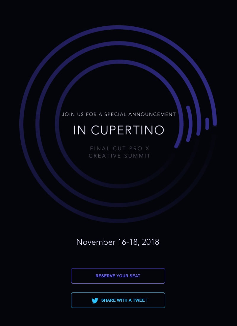
Design your email.
Much like with content, your mission imposes the rules for design. If your email newsletter is just an announcement, then it will be neutral. If it is a part of a marketing scheme for goods, then it will undoubtedly have some juicy images and catchy headlines.
What’s more, the arrangement of blocks varies. If there is a huge discount or special time-sensitive offer, then it should be placed right at the top of the newsletter to catch immediate attention. If it is an invitation to an event, the CTA can be displayed at the end of the story.
Make the design of the newsletter appropriate to its goal. If it requires some eye-catching CTAs, dramatic pictures, or modest aesthetics, then this is a way it should be. Several important tips:
- Make the design a part of the brand. Use logotype, tagline, slogan, catchy phrase or just company’s colors.
- Align the design of email newsletter with your website; if the latter has a time-specific decor, match it.
- Strike a balance between the graphical and informative part of the design. Lots of text looks boring; lots of graphics are overwhelming.
- Try to stick to a tested layout. Experiments with the laying out content are good but not in case of email newsletters. Generally, it is just 600 px wide, so do not get carried away. When in doubt use a one-column structure.
- Do not forget that white, packed content is challenging to read.
- Make CTAs eye-catching.
- Make the layout mobile-friendly.
- Make the layout compatible with modern browsers.
- Do not forget about the web version.
- Do not forget about the plain text version.
Email Test
Do not underestimate the power of testing. One should never squander an opportunity to improve.
Here is a small checklist for that moment before you finally hit the send button.
Final Email Preparations
- Did you proofread?
- Did you format your copy?
- Did you check all the backlinks – are they active and lead to where they are supposed to?
- Are all the images alts in their places?
- Are the CTAs purely coded?
- Is font size big enough to be comfortably read in browsers as well as mobile devices?
- Is the language appropriate for the target audience?
- Does the subject line meet the email content?
- Does the pre-header text look good and informative?
- Did you set up tracking correctly?
- Does an email newsletter have an optimal weight?
- Did you test email across popular browsers from Chrome to IE?
- Did you test email across email providers?
- Did you test email across various mobile platforms?
- Did you test email through a spam checker?
- Did you send an email to yourself?
Analyze the Email
After everything is checked, sent and done, it is not a time to relax. It is time to analyze. Of course, it will take some time before you get feedback and valuable data for analyzing the success of the email newsletter. Remember there is always room for improvement and a good marketing strategy requires constant control.
If you have some useful tips or advice to add, share it in the comments section; we will be glad to improve our checklists with valid points that come from your personal experiences.
Related: Try free the Postcards email builder – Create beautiful emails online.