Flat Web Design: Beautiful Examples of Websites
Flat Design is a new trend labeled by the community as an interface striking similar to Microsoft’s Metro UI because it leaves drop shadows, embossing, subtle textures and gradients behind, while favoring clean layouts, sharp typography and solid colors. The new Google design and Microsoft’s come-up with Windows 8 is actually based on an older trend called Flat Design, which was not extremely popular back then, but was very easy to design, therefore people used it.
In this article we would like to show what in our opinion are great examples of Flat Design websites.
Examples of Flat Designs in Web Design
SpellTower
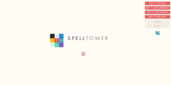
SpellTower is a single-page website for an Android puzzle game which uses several color backgrounds throughout the layout, as well as some buttons for their simple, clean menu. Big images are not missing from their design either.
Kickfolio
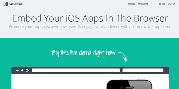
Kickfolio is an interactive app for the iPhone and their modern, slick website uses different solid color and buttons with slick, modern effects.
With Postcards Email Builder you can create and edit email templates online without any coding skills! Includes more than 100 components to help you create custom emails templates faster than ever before.
Free Email BuilderFree Email TemplatesLorenzo Verzini
Lorenzo is an Italian art director and designer from London who embraced the Flat Design style extremely well. He has great, big graphics and images and interactive elements all over the site.
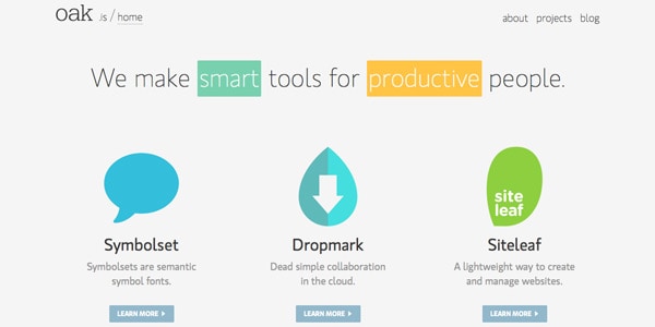
Oak.is
Oak.is creates fonts and other graphic solution for what they call to be productive people. It seems Flat Design was perfect for these guys and their website which is fantastic and is also responsive – and all of us like a responsive site I assume.
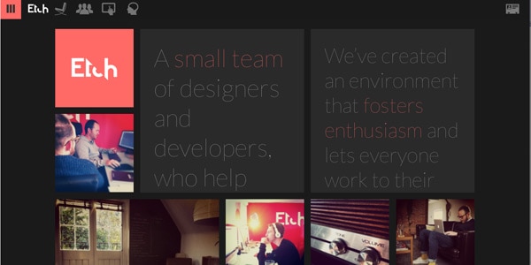
Etchapps
Etchapps is a team of designers and developers who “help brands with big ideas”. They do interface design and application development and their website is fully responsive and designer with Flat Design. Their website is very similar to the Windows 8 interface, which is itself built on the Flat Design style.
Microsoft
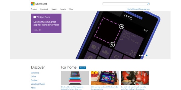
Microsoft’s webpage is the most popular Flat Design out there. Some might argue that this is not Flat Design, but Metro UI, however keep in mind that Metro UI was built on a Flat Design framework, therefore the striking similarities. Microsoft uses the same approach, with big images, large text and makes use of the whole browser width, including when the browser is resized.
With Pulsetic you’ll be instantly notified the moment your website, API, or server becomes unavailable. Monitor uptime from multiple global locations and respond to incidents before your users are affected.
Create beautiful status pages in minutes to keep customers informed during outages and build trust with transparent communication.
Start Monitoring for FreeBuild Windows
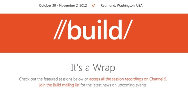
Build Windows is another Microsoft page, so it’s quite normal that it is designer in the same way as its parent organization’s website. This is a single-page website featuring an even from November 2012 held by Microsoft in Redmomd, Washington. The site works great in full size and on mobile, although I feel like they miss some styling details here and there on portable devices.
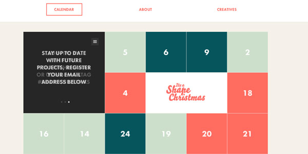
It’s a shape Christmas
This is an interactive online calendar built on Flat Design framework and features the same large images, only this one has some kind of interaction between users featured into it. Although the design is beautiful, the page does not feature a responsive grid.
Invoisse
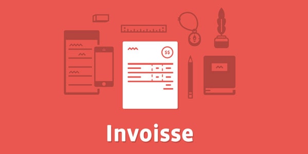
Invoisse is the landing page of a web app that has not been released yet. The site is a single-page with possibility to scroll down. What is unique about it is the fact that during scrolling the background colors change. Very nice touch to an otherwise simple, clean and modern website.
Built By Buffalo
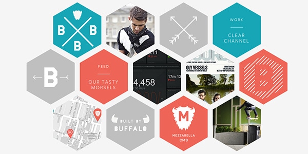
This is a creative agency from Brighton, UK, with a very modern Flat Design website. It features several pages, it is responsive (and looks good both on desktop and mobile) and features very good information architecture. Their page is amazing and I simply love it!
Square
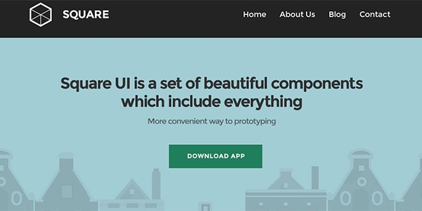
The page where we present a great set of beautiful components based on the Flat Design trend is another cool page designed with this framework.
Plover
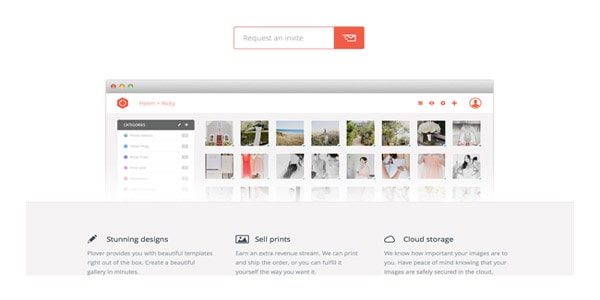
Plover is a website featuring a web application where users can create photo galleries, sell prints and even save their images in a cloud. The page is not responsive, although it works with images (and that’s bad), but nevertheless the design is a simple, Flat UI worthy to look at.
Rdio
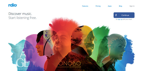
Rdio is a great web library of songs that can be listened online. Their website is very, very nice and I am especially in love with the section above the fold on the home page, which you can see in the screenshot below. Just like at how amazing this home page is. And another good feature is the responsiveness of the grid.
Vine
Vine’s webpage is designed on a Flat framework and is extremely simple and clean, although I feel like they should have more information on their own page instead of sending users to Twitter. But this has more with information architecture to do than with design, which is flawless. The truth is that it is difficult to do something wrong when you keep it so simple.
Lowdi
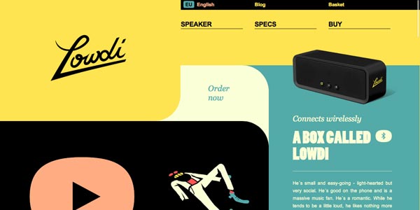
Although not as simple as the other pages showcased here, Lowdi’s webpage is unique and comes with a nice feeling. Navigation has a natural flow to it and it is a pleasure to browse around.
Osborn Barr
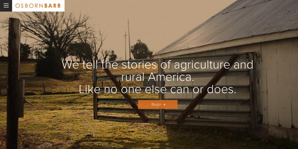
Osborn Barr’s website features huge pictures and easy-to-read text, which everybody appreciates today. And when the website is responsive too, then it’s clear they don’t come much better than this one.
All these were websites which are currently up and running, but we have three more examples of Dribble projects that are not yet created, however their designs deserve to be mentioned here.
Student Guide
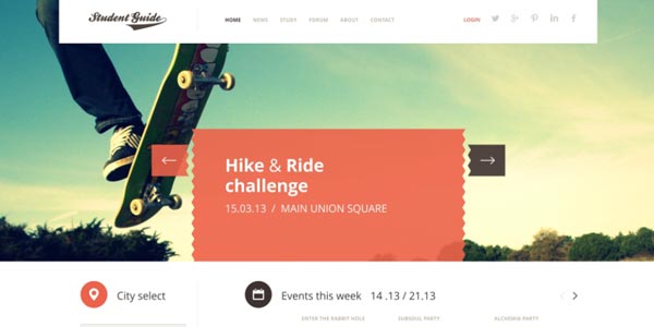
The home page looks very nice, featuring a big header image and showing all kinds of important information right above the fold.
CottagePages
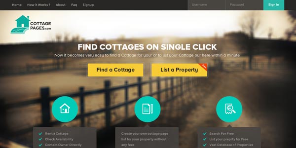
CottagePages is another Dribble design which could as well be a real website, because it looks really good. It features a huge background image which gives a specific feeling while not stealing the focus from important content.
CreativeStatus
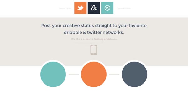
CreativeStatus features a very simple home page design and integrates social media into it. I believe the layout is not entirely finished yet, however I think it looks very good.
Flat UI Kit
You have probably heard about Bootstrap, the popular front-end framework developed by Twitter employees for their own use. Well, you might have heard about Flat UI too, which is a free HTML user interface kit based on Twitter’s Bootstrap.
There was a clear need of a new framework because although Bootstrap works excellent, it is often left without custom style and it doesn’t look too sparkling, but monotonous and default.
Therefore here at Designmodo we decided to build our own framework/template and people seem to love Flat UI, which packs PSD files of buttons, selects, inputs, checkboxes, tags, progress bars, menus, navigation elements and sliders, but also color swatches and SVG glyphs.
This front-end framework makes your life so much easier, because it helps you with elements that usually you would spend hours on designing. And what is even more amazing is that we offer all these things for free. And it seems we are not the only ones thinking this front-end framework is amazing, but also all designers out there who started using it.
Bottom line
All websites showcased above are beautiful examples of flat design, which seems to be a new trend, especially with the introduction of Metro Style/Modern UI by Microsoft. Although it was a retro style until few years ago, it seems it is on its way back and I wouldn’t be surprised to see even more websites adopting this style in the near future.
