Modern Food-Related Website Designs – Best Examples
In a world where most industries aim to meet human needs, the restaurant business occupies one of the leading positions. The competition between food-related establishments is like anywhere else tough and ruthless. Therefore, it’s not surprising that restaurateurs resort to the latest ways of winning customers, throwing their attention to the online audience.
All the more building an online presence is crucial and necessary for every enterprise. Especially considering the fact that people like to make quick decisions that usually concern the entertainment sphere, establishing yourself online is a huge step forward great relationship between you and your customers.
However, in order to succeed in attracting clients – it’s vital to make the website both informative and appealing. Rely only on spectacular detailed photos of main dishes that will stimulate users’ appetites is not enough, it’s important to shed light on the menu and special offers, focus visitors’ attention on the interior and pleasant location with a picturesque view; one word to say, you need to advertise an establishment online from head to toe.
Here you will find a showcase of amazing food-related websites that will fascinate you with their appetizing designs and creative approach to familiarizing users with the facility itself.
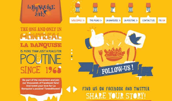
Poutine La Banquise uses a whole bunch of hand-drawn illustrations with slight grunge touch that are harmoniously complemented by quaint typography.
With Postcards Email Builder you can create and edit email templates online without any coding skills! Includes more than 100 components to help you create custom emails templates faster than ever before.
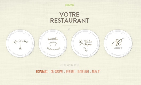
Free Email BuilderFree Email TemplatesVotre restaurant has an elegant vibe that is achieved by use of neat pastel textures and refined graphics.
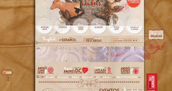
Andres distantly resembles scrapbook style with rough textures as a background and a great deal of compactly packed headlines and decorative elements.
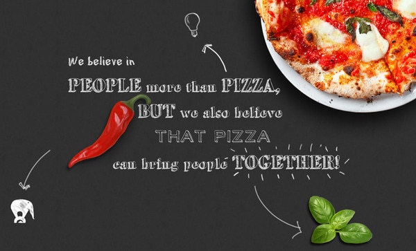
My pizza oven harmoniously combines highly detailed cut out photos of food items with chalkboard texture that plays a role of a desk for writing a tagline.
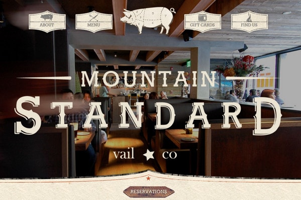
Mountain Standard Vail exudes an image of sophistication and first-class which is achieved by high-quality full screen photo slider, topnotch typography and accurately implemented grunge style.
With Startup App and Slides App you can build unlimited websites using the online website editor which includes ready-made designed and coded elements, templates and themes.
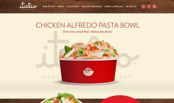
Try Startup App Try Slides AppOther ProductsItalio has perfectly combined together wood and paper texture with a plenty of derived delicious food images.
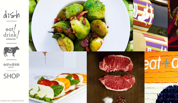
Eat Drink Inc welcomes its users with an exceptional navigation system that occupies all landing page. The website is based on parallax effect where each page looks neat and clean with a bunch of appetizing images.
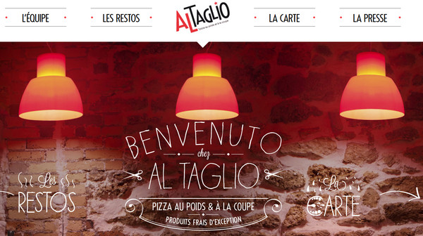
Al Taglio is driven by black and white color palette that is supplemented by vibrant restaurant photos and marvelous typography.
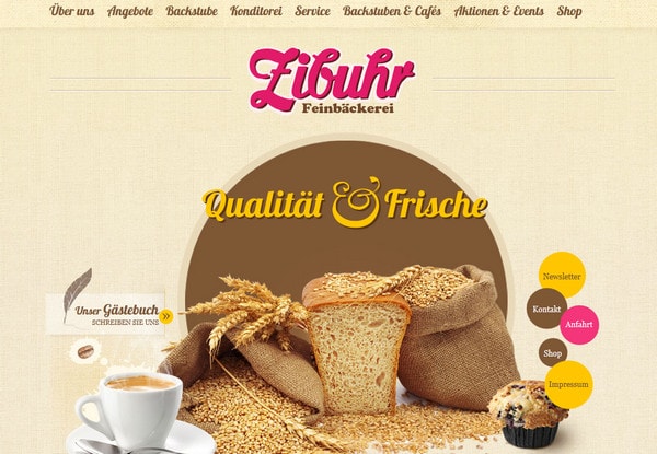
Zibuhr is based on sackcloth textures and a range of circles that serve as basis for data widgets and display of information.
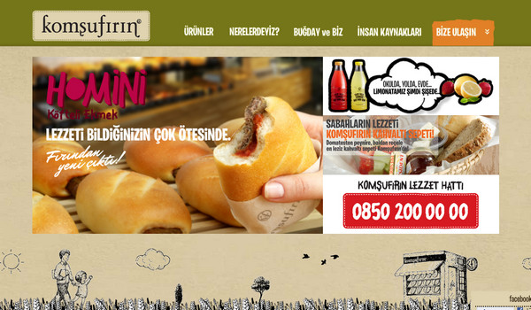
Komsufirin features monochromatic hand-drawn illustration as a footer background that relates to bread production – the main activity of a company.
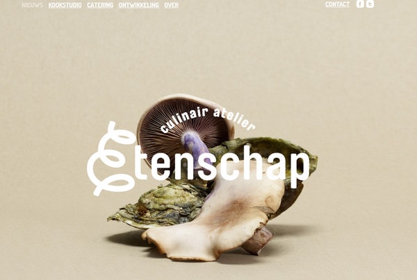
Etenschap alternately reveals visual and text data about company providing every section with delicious photos of greengrocery products.
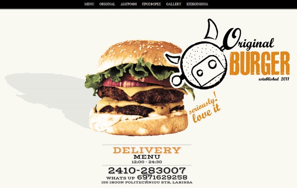
Original Burger keeps things in order, showing all necessary data by means of parallax effect and clean and clear representation with a very small number of images.
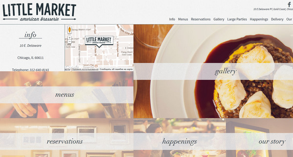
Little Market makes use of photo-based menu items in order to attract visitors with a help of a visual aspect. Moreover, contact information and small map widget are also located on the home page.
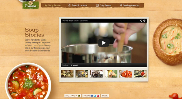
Soup Stories goes for realistic representation, complete with warm wood texture background and images with vapor effect.
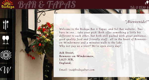
Bodega Tapas and Sol Bar is primarily supported by the widescreen slider with high-quality bar photos that are occasionally completed by semi transparent data pop-up windows.
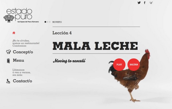
Tapas en Estado Puro is a truly innovative website design that amuses users with extraordinary video.
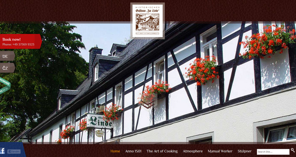
Gasthaus Zur Linde bets on power of presentation, colorfully showing popular dishes in a most delicious way.
Sakala Bali has an absolutely dark design with white plain typography; only vibrant full of life images at times break of somber empty space.
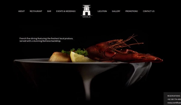
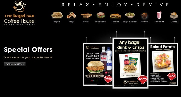
The Bagel Bar Coffee House is another example of using dark as a core color; with the help of this approach you can easily make every foreground item stands out.
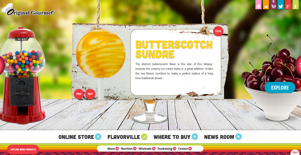
Flavorville stimulates your appetite by vibrant colorful design that is packed with vivid tasty images. You also get an opportunity to explore any treat you like.
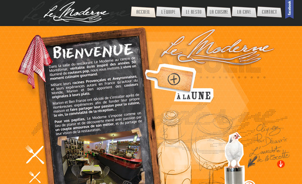
Le Moderne is a modern take on a scrapbook style which is implemented by means of numerous paper-based decorative elements.
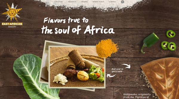
East African Bakery has a truly realistic vibe which is achieved by neat integration of dark wood texture that performs a role of a table, and vivid supplementary food images.
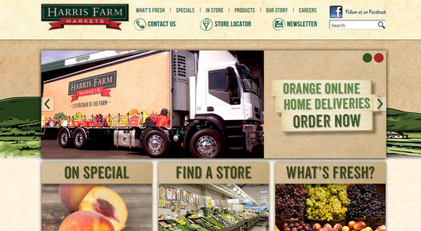
Harris Farm Market does a great job of pairing soft cardboard texture and media data diluting them with green bold type.
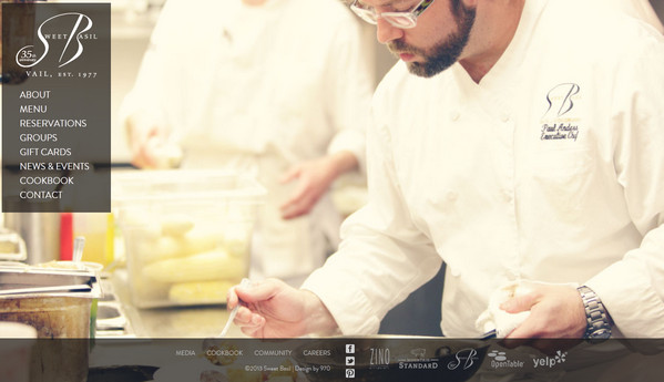
Sweet Basil Vail familiarizes users with restaurant using a set of professional wide screen photos.
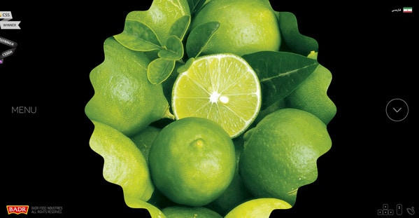
Badr Food Industries is another dark website design that is centered around curved images depicting food products.
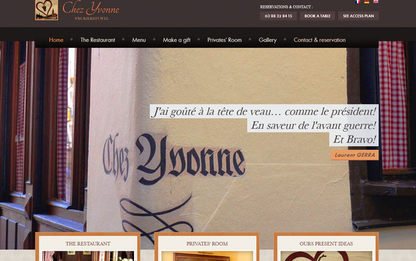
Restaurant Chez Yvonne – like many others this website can’t do without widescreen detailed images showing restaurant in the best light, but in this case they are not so prevalent, making a text to play a vital role.
Are you ready to place an order?
Nowadays, you can easily book a restaurant on the spot. Moreover, you have an opportunity to browse the menu online, take a look inside a restaurant, choose a table or read customers’ reviews during a leisure walk. All the more so majority of restaurant owners aware of all power that is hidden behind mobile web and trying to provide their clients with warm and welcoming online place that will cast a proper light on their establishment.
So, tell us what do you think of modern food-related website designs? Is it worth of trying? Do you think concept of “the more visual information the better” is working? Do you prefer to get only necessary data? Also, tell us which one example shown above you find the best?
