Best Figma Components to Try in 2026
Do you know that Figma attracts over 3 million users monthly? Figma sees exponential growth every year, making it one of the most promising tools in web design.
Why does it outperform Sketch and other design tools for design and team collaboration? The answer lies in its core vision and mission.
Figma prioritizes simplicity in helping non-tech designers and teams achieve their goals. It is super-intuitive and uses cloud-based technology to work on various devices and platforms. It also relies heavily on its community, whose members regularly develop solutions to help each other. As a result, the Figma directory houses plugins, tutorials, planning templates, workshop ideas, developer tools, and Figma components that dramatically facilitate the designing process.
Among this diversity, Figma components come of true value. As reusable fundamental blocks, they extend the possibilities of Figma users. From buttons to fully-fledged layouts, they help to shape ideas regardless of skills, experience, and knowledge.
Unlike traditional UI sets, Figma components come with changeable aspects. They allow modifying the design element without overriding individual layers. That brings more control over the design process and gives individuals and teams much-needed flexibility.
Let’s consider the benefits of using Figma components and the top best picks so you can kick start your next project immediately.
With Postcards Email Builder you can create and edit email templates online without any coding skills! Includes more than 100 components to help you create custom emails templates faster than ever before.
Free Email BuilderFree Email TemplatesBenefits of Using Figma Components
The web is teeming with Figma alternatives. However, despite the competition, it is still the number one choice when creating websites from scratch. Whether you are a newbie or a professional designer, the software effectively achieves basic and non-trivial tasks thanks to its regularly updated collection of Figma components.
Apart from providing users without design skills or experience with reliable instruments to transmit their ideas into digital mockups, they do lots of other good.
- They make ideation more accurate and precise. That amplifies collaboration between the client and the team.
- They make the design process less prone to mistakes. Components and their properties are under total control of creators. They may allow or, on the contrary, forbid changing certain aspects of the component by setting rules if needed. That improves the accurate usage of instances across the project and team members.
- They allow modifying the design element without overriding individual layers. This is possible due to properties. The latter are changeable aspects that shape the component.
- They reduce the number of visits to documentation. Figma encourages users to create descriptions for units and links to further information in the documentation. That makes components self-explanatory. Plus, definitions are consolidated into a single set of controls. Team members do not need to spend much time in documentation to understand what is changeable or what they can do. Everything is on the surface.
- They occupy less space in the design system or library files. Figma components come with Boolean properties. Although they can be set only in two values (true or false), this is enough to minimize variants for each state simply by manipulating the layer’s visibility.
- They are flexible design systems. Figma allows users to decide which aspects transform into component properties and which into variants. That provides better control of minor details and the overall system.
- They limit poor design decisions across team members. Thanks to so-called swap property, designers may create a curated set of components to replace existing ones. That way, they provide team members with a range of units to choose from, thereby minimizing inconsistencies in design and style and, at the same time, eliminating guessing games.
All these capabilities substantially benefit those who use Figma components. Here is a short list:
- They save time, effort, human resources, and money.
- They help create the most up-to-date interfaces that meet the current client’s needs and the market’s expectations.
- They speed up the design process.
- They maintain consistency across design and styles.
- They provide better control over design and its tiny details.
- They increase the reliability of the project.
- They allow fast prototyping of dynamic effects like hover or scrolling.
- They improve collaboration among team members and between clients and the company.
Best Practices for Creating and Organizing Figma Components
Components can be very powerful in streamlining processes and pushing design projects forward. However, things may quickly get messy without control, order, and structure. Let’s consider the best practices for creating and organizing Figma components and tips to unlock their potential.
Use clear, straightforward, and maintainable naming
Setting meaningful and descriptive names for layouts and variables is essential. First, it makes elements self-explanatory. Second, it reflects the purpose and intent of the unit. Third, it reduces confusion, especially among new team members. Fourth, it improves understanding of the logic and flow of the program. Finally, it promotes effective collaboration.
Follow well-established conventions for naming
Sometimes, you need to follow trivia to create reliable and valuable components. Conventions make your Figma components easy to read, understand, and navigate by the others. Plus, it frees time and allows designers to focus on more important things. You might use camel case, underscore-separated names, or forward slash naming. Alternatively, you may use frames as containers to organize components and layers within.
Try a documentation container
Do not ignore a description field that comes with every master component. It allows you to attach relevant content, explain how the component works, and interact with others.
With Pulsetic you’ll be instantly notified the moment your website, API, or server becomes unavailable. Monitor uptime from multiple global locations and respond to incidents before your users are affected.
Create beautiful status pages in minutes to keep customers informed during outages and build trust with transparent communication.
Start Monitoring for FreeNot every component needs that, so do not comment on every step; otherwise, you risk making the design too content-heavy. Use this technique on nested components and particular states and variations.
Create self-documentation
Spend some time creating self-documentation inside the Figma environment by using consistent variable naming conventions in tandem with comments. It will not take long, but it will certainly save you precious time in the future. Self-documentation makes Figma components intuitive and reduces the number of visits to guides and manuals. You can easily do this if you follow the best practices featured here.
Create a maintainable system
Create a reliable, flexible, and maintainable system to manage and structure component states and variations. As the project grows, the number of variables increases exponentially, making it hard to understand. Several methods exist to sort out dependencies and create order out of chaos.
The easiest way to maintain consistency is to separate master components for each variation. That allows you to change state and variation fast and efficiently.
Another way is to put all nested variations into a single master component. That might hide some variations, making discovering a layer you need difficult. Yet, it will reduce components in the assets panel and make the project clean.
Set the layout grid when it is necessary
Add constraints relying on the best practices for creating mobile-friendly and responsive interfaces. That would help your team members understand a component’s behavior as the interface adjusts to different sizes.
Capitalize on text overrides
As an in-built feature of Figma components, text override streamlines usage of swap instances and manually updates the text after you change them. It works on various properties: text, color, effects, nested instances, swap instances, and component size. You may use them to adapt components across different user scenarios.
Do not shy away from Figma shortcuts
They eliminate constant menu navigation visits, help work faster, and increase productivity by doing multiple tasks efficiently. To kick things off, you may try these basic shortcuts:
- OPTION+CMD+K or ALT+CTRL+K for creating a component
- OPTION+CMD+O or ALT+CTRL+O for accessing a team library
- OPTION+2 or ALT+2 for showing the asset panel
- OPTION+1 or ALT+1 for returning to the layers panel
Tips to streamline and improve the design process
Here are some tips you can adopt during your design process to increase overall productivity or sort out banal tasks efficiently.
Apply clip content to repetitive elements. Tables and lists benefit from this technique the most. Hide unnecessary options to reveal the component’s logic without overwhelming viewers with too much data.
Refer to the context menu to swap related components. It is a Figma shortcut, so right-click on the instance to activate the menu with that option.
Create an independent frame through ditching relationships between the master and the inherited one. Again, right-click on the component brings a submenu where you can choose this option.
Select all matching layers across the entire component set to make the same changes to all variants in one go by using a target symbol.
Review updates and see a side-by-side comparison to identify small changes by clicking an update icon next to instances.
Change the base unit for all scaling and spacing tasks in menu-> preferences-> nudge amount.
Try the innovative smart selection feature to edit spacing in bulk. That can also be used for various trivia tasks like adjusting spacing, aligning objects, rearranging, and grouping.
The Best Figma Components
Siter
We are going to start with Siter. While originally not a user interface kit, it is still a fundamental asset that helps companies make the most of Figma components.
Siter is a powerful website builder – the top in its niche. It serves thousands of teams across the Globe and has proved its validity in numerous scenarios. Oriented at non-tech-savvy users, it has a super-intuitive environment that anyone can handle.
Its main task is to generate fully-coded websites from Figma designs of different complexity and scale. It exports files directly into its environment and turns them into working HTML and CSS prototypes aligned with current standards. This way, it does all the heavy lifting of conversion, saving the clients precious time, resources, and effort.
As a feature-rich instrument, Siter allows users to manipulate their Figma-based files and modify them if needed. You can tune up components, create responsive page versions, and even add custom code through the editor. Check out How to Export Designs from Figma to Siter to take your Figma design projects to the next stage within minutes.
Startup Blocks

Speaking of landing pages, there is another ultimate set to build selling pages aligned with the client’s brand identity within minutes. Startup Blocks is a professional library of Figma landing page templates and fundamental blocks. You will find here everything to kick-start digital marketing campaign or bring the web interface to life. Whether a single page or a fully-fledged portal, the bundle meets all the design needs.
Among its main features are:
- Seamless integration with Figma environment
- Flexibility and control over all aspects
- Easy customization
- Responsive layout with mobile-friendly experience
- Constant updates to follow the current trends and standards
- Community support
The best part is that Blocks Figma components can be quickly converted into working HTML/CSS templates, put into production, and hosted via Static.app, a reliable hosting solution for small projects. You may save lots of time, money, and human resources.
Figma Email Templates
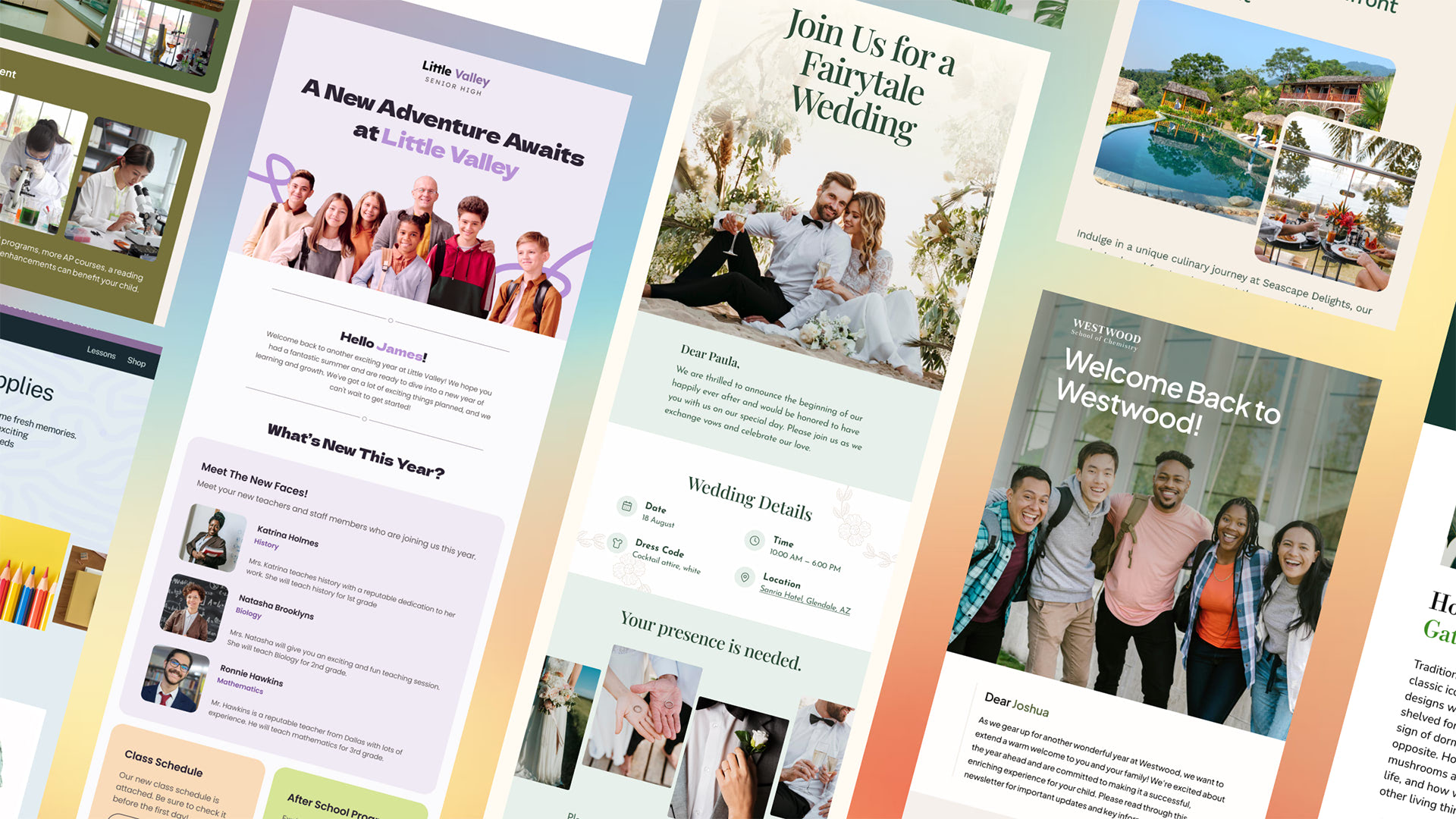
Boost your email marketing efforts with our versatile collection of free email templates on Figma. Crafted with flexibility and ease of use in mind, these templates are perfect for a variety of purposes, including newsletters, promotional emails, transactional messages, notifications, and more. Each template is fully responsive, guaranteeing a seamless experience across both desktop and mobile devices.
Customize and Export with Ease
- Postcards Email Editor: Customize these templates effortlessly using the Postcards email builder. Tailor each design to your brand’s unique style, and then export your work as HTML, ready to be used across multiple platforms.
- Download More Templates: Explore an even wider selection of free templates in our HTML email templates gallery.
- Export to Any Platform: Once you’ve customized your templates, you can easily export them for use in all major email platforms, including Mailchimp, HubSpot, Klaviyo, Brevo, SendGrid, Zoho, Gmail, Outlook, and more.
Key Features:
- Versatile Designs: Our templates cater to a wide range of needs, including newsletters, welcome emails, promotional campaigns, transactional notifications, and receipts/invoices.
- Simple Customization: Use Figma to effortlessly modify layouts, components, and styles to perfectly align with your brand.
- Postcards Integration: The Postcards email builder allows you to easily edit and export customized templates to HTML, ideal for email marketers, designers, and developers seeking high-quality, responsive email code.
- HTML Email Templates Gallery: Find inspiration and ready-to-use designs in our extensive HTML email templates gallery.
- Built-In Components: Includes social media icons, app store icons, and design styles to maintain consistent branding across your communications.
These free email templates are perfect for businesses, designers, and marketers who want to create professional-grade emails without the hassle. Whether you’re starting fresh or seeking inspiration, our templates will help you deliver captivating content directly to your audience’s inbox.
Essential UI
After adding Siter to your toolbox, it is time to replenish it with reliable collections of pre-designed user interface components that will streamline your design process and give you some valid instruments to shape your idea.
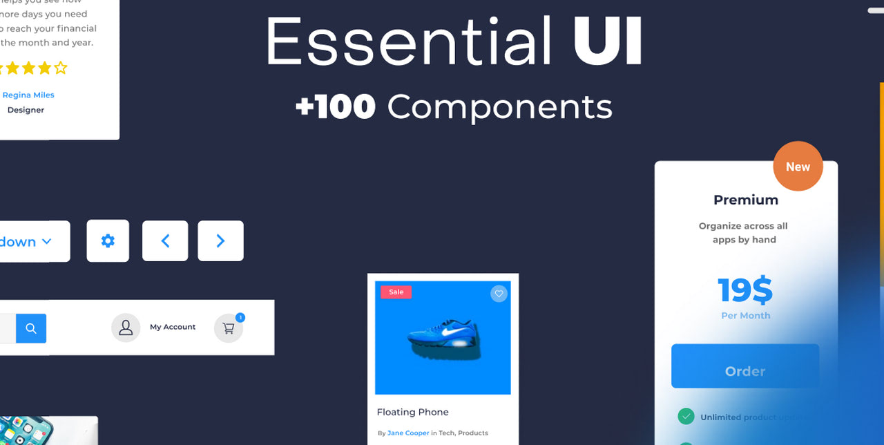
The first on our list is Essential UI, which has over 100 elements. Created by Captain Design, it covers the fundamental units seen across all types of interfaces. This includes buttons, form items, sidebars, dashboards, tables, lists, testimonials, pricing, cards, and a range of navbars to meet the requirements of large-scale projects like e-commerce. Most of them have a set of predefined colors and font styles to maintain consistency in design.
In addition to the basics, designers may find ready-made landing page templates for testing marketing strategies. With fully responsive behavior, they are perfect to cover the target audience on large and small devices.
Use this set of Figma components to craft a basic interface layout for a website, mobile site, web application, or marketing campaign.
Untitled UI
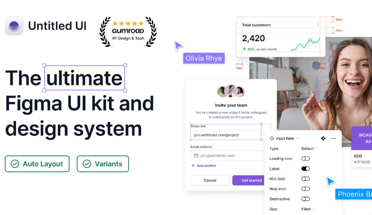
Perhaps Untitled UI is one of the most popular user interface packages among the Figma community. It has almost 5000 likes and over 100 thousand fans. However, this should not be a surprise since some good reasons stand behind its popularity.
It is the largest UI kit that you can find in the Figma repository. It has 10,000 components. Each one is handcrafted with an auto layout and is supported by smart variants.
It comes with over 350 global styles, including diverse typefaces and color palettes. You may match components to your branding identity within seconds.
Thousands of icons are included. From basic navigation and clarifying glyphs to unique and rare country flags and payments, you may quickly improve your interface with tiny visual cues.
And it has hundreds of page design examples. Landing pages, mobile application interfaces, standard pages, dashboard, and settings pages – here, you will find everything you might need to craft a web UI within minutes.
The good news is the Untitled UI is available in both free and premium versions. That means you get a regularly updated collection of units and responsive support from the team.
Material 3 Design Kit
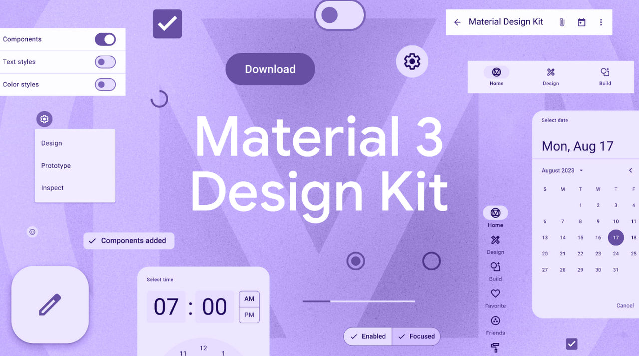
Those who fall for the Material Design elegance, intuitiveness, and meaningfulness will certainly appreciate this fantastic set of Figma components.
Guided by the best practices of Material Design, the team has brought to life a user interface kit that meets the standards of this popular design system. To create meaningful interaction, they have followed the main principles of applying grid-based layouts, responsive animations, transitions, padding, and depth effects. As a result, web interfaces created with this kit have an optimal user experience.
Inside the Material 3 Design kit, users may find hundreds of components. This includes carousels, tooltips, menus, checkboxes, date pickers, switches, text fields, cards, widgets, and other fundamental blocks. The team has also provided styles and custom variants so that users may create consistent interfaces.
Although you will not find pre-design layouts like in the case of Untitled UI, numerous adaptive units and widgets perfectly collaborate, making it easy to create well-tuned interfaces within minutes.
Material UI for Figma (and MUI X)
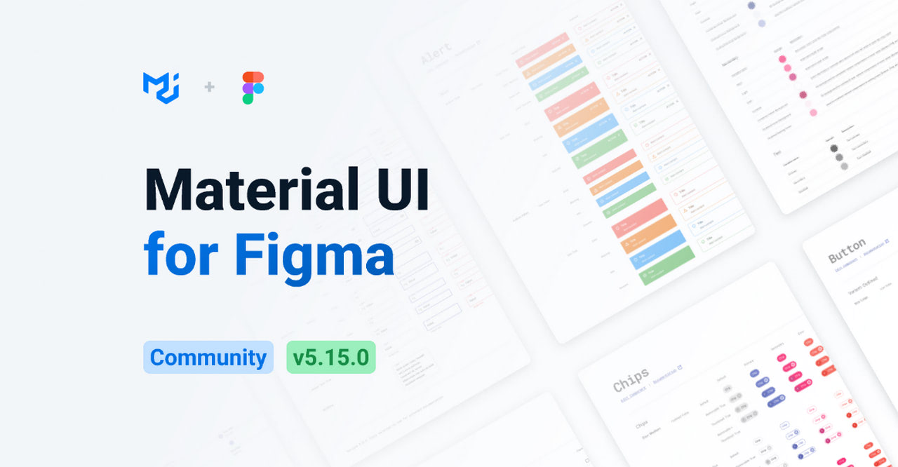
As if one Material kit was not enough, another set of Figma components was made with Google’s design system in mind. It is a perfect alternative to the previous product, which has a premium version. You may find some unique Figma components and styles to pull off Material Design projects.
The kit includes hundreds of handcrafted components: buttons, alerts, notifications, sliders, cards, switches, checkboxes, etc. There are also advanced elements for MUI X and many styles for typography and coloring. Although variables are available only in the paid version, you should take time to adjust the elements in the free version. Nevertheless, the library still facilitates and accelerates the design process dramatically. Plus, you can extend your possibilities by upgrading to premium.
Apple Design Resources – iOS 17 and iPadOS 17

Are you looking for an all-encompassing UI kit for building iOS-based interfaces? Look no further than this amazing set of Figma components. Created by none other than Apple’s team itself, it provides fellow creatives with everything they might need to kick-start any project for iOS 17 and iPadOS 17.
As the company’s first official design kit for Figma, it covers all the core elements. The pack includes not just user interface fundamental blocks such as buttons, controllers, checkboxes, panels, and widgets but, most importantly, views, system interfaces, text styles, color styles, materials, and layout guides. Tabbed apps, split views, sheets, and even Home Screen and Lock Screen templates can be found in the library. That allows designers to create highly polished, cohesive, and visually stunning designs for iOS-powered devices like iPhones and iPads.
On top of that, the team has taken care of accessibility by providing a full dynamic type chart with accessibility sizes. Designers may follow it to align their projects with Apple’s design guidelines and WCAG recommendations.
Bootstrap 5 Design System – UI Kit
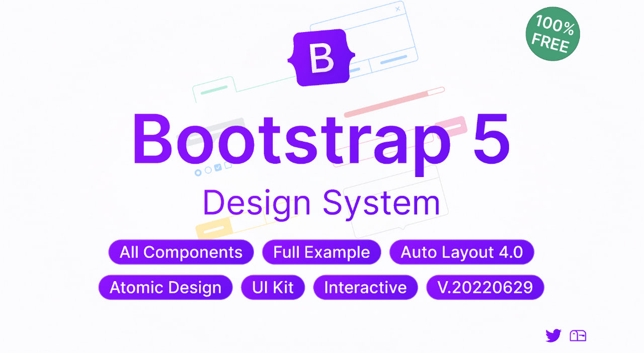
Crafted with precision and attention to detail, the Bootstrap 5 Design System kit is an ultimate stop for all who need to create a design for this popular CSS Framework.
Following the latest documentation and specifications, the team has assembled an all-embracing pack of user interface elements. The library is rich in Figma components applicable to various scenarios. From resizable buttons and forms for crafting sections and widgets to panels and functional units for developing pixel-perfect responsive and mobile-first user interfaces, you may build anything you want.
Another big advantage of this kit is that the team has followed the Bootstrap classes and created all variants to provide designers with instruments to generate semantic layouts. They have also preserved the naming convention and supplied each component with a description, making it easy to find and manipulate.
There is more. There are examples of interactive components that can be easily modified to meet your particular needs. Use them to present your project to stakeholders and team members.
Mobile Wireframe UI
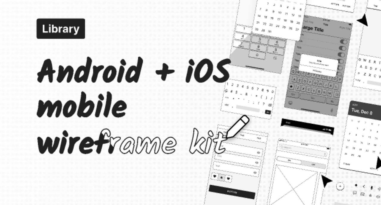
Wireframing is an essential step for many projects. If you are searching for helpful tools to amplify your efforts during this stage, check out this versatile set of pre-designed UI elements for rapid wireframe creation. Although it mostly focuses on mobile projects, it could become a solid foundation for any big project.
Mobile Wireframe Kit has numerous Figma components that help shape, iterate, and refine ideas to make the point or test several options for a better user experience. It has elements to catapult wireframing for iOS and Android-powered projects. You may find inside the library an array of elements: nav bars, top bars, alerts, controls, toggles, checkboxes, date pickers, lists, and much more.
On top of that, it has generic agnostic placeholder Figma components and pixel-perfect handwritten font for developing lower-fidelity wireframes.
Landify UI Kit
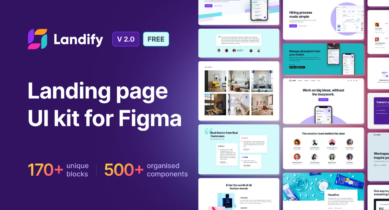
With landing pages at the core of most marketing campaigns, the UI kit created by Aravind Little Jack is arguably the most essential instrument for web designers. It has everything the team might need to assemble a selling page or even a range of pages to meet the demands of clientele.
The library has a staggering number of blocks and Figma components. They are pixel-perfect, handcrafted, and available for three crucial breakpoints: desktop, tablet, and mobile. Everything is fully customizable. You may change any block detail from layers to effects to align the project with brand identity guidelines.
Among the variety, designers will be delighted to see ready-to-use functional blocks like portfolio or team sections, fully-fledged block systems, some Figma components with variants, and five ready-to-use samples. Numerous tiny blocks exist to personalize the landing page design according to marketing campaign requirements. That facilitates the routine and speeds up the process.
Dialect
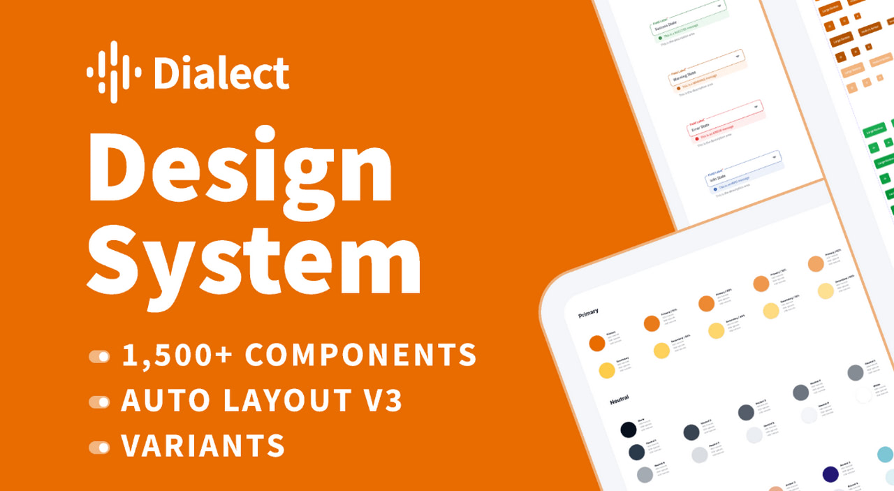
Dialect is a new kid on the block. However, that does not stop it from winning over users every single day. It has already helped over 20 thousand community members and earned many likes and praises.
The secret to its success lies in being an all-around kit. It has a whooping number of Figma components at 1,733. Plus, more is coming, so it has the potential to meet any growing demand. There are templates, alerts, cards, dividers, menus, links, modals, sliders, tables, tabs, tooltips, and more. All of them are fully customizable.
In addition, there are also over 200 predefined styles for text, colors, placeholders, images, shadows, and layout grids. So you can iterate your idea within minutes.
The team has also created documentation, step-by-step guides, several useful plugins to get the most out of the library, and architecture diagrams. You may also contact them through Twitter to address any issue.
Last, but not least
Here is a short list of niche-specific user interface kits with Figma components:
Delivery App UI Kit; With Uber Eats turning into a billion-dollar business, more and more food-related brands consider delivery of their products as a moneymaker. This fantastic kit can become a perfect starting point for shaping their vision of presenting, ordering, and delivering goods to their clients.
AI Fitness Coach: The fitness industry is booming these days. This set of pixel-perfect Figma components meets this growing demand. It includes niche-specific units like progress trackers or exercise recommendations.
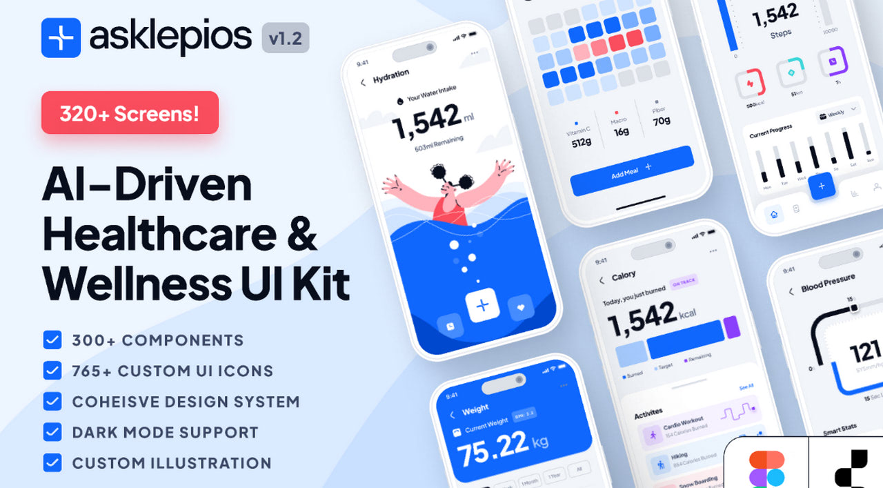
Healthcare and Wellness App UI: According to stats, the global healthcare app market will reach $111.1 billion by 2026. With such a demand, you may certainly need this UI kit. It has everything to create designs in this category.
Conclusion
Whether you are a whiz in design or not, today’s modern technologies allow you to digitally shape ideas and bring them to life using simple, intuitive instruments. One of them is user interface kits. While on their own, they can be tricky to handle; but when they are developed for Figma, it’s relatively easy.
We have assembled a collection of 13 trending sets of Figma components to prove this in practice. From Apple’s official release of iOS components for fans to local yet grandiose projects by fellow community members like Untitled UI, you have reliable instruments to get the job done and even take it to the next stage with Siter by converting it into a working HTML/CSS prototype.
When using these kits, applying the best practices like naming conventions or keeping layers and files organized is crucial. This way, you get the most out of Figma and the components created for it, accelerate the routine, and increase the productivity of team collaboration.