Globes and Spheres – 3D Circles in Web Design
Last year we saw a passion for using plain geometric shapes in interfaces: rectangles, triangles, lines and circles. They were everywhere: in hero areas, footers, main sections. More recently, circles have captured our attention; though not in its habitual flat interpretation but rather a volumetric one.
Spheres, globes and balls are populating designs, setting a new trend. Used in with techniques such as WebGL, they look incredible, giving interfaces a wow factor. It seems that developers let their imaginations run wild since we have come across absolutely stunning examples. Consider Alef mobitech and Launch It.
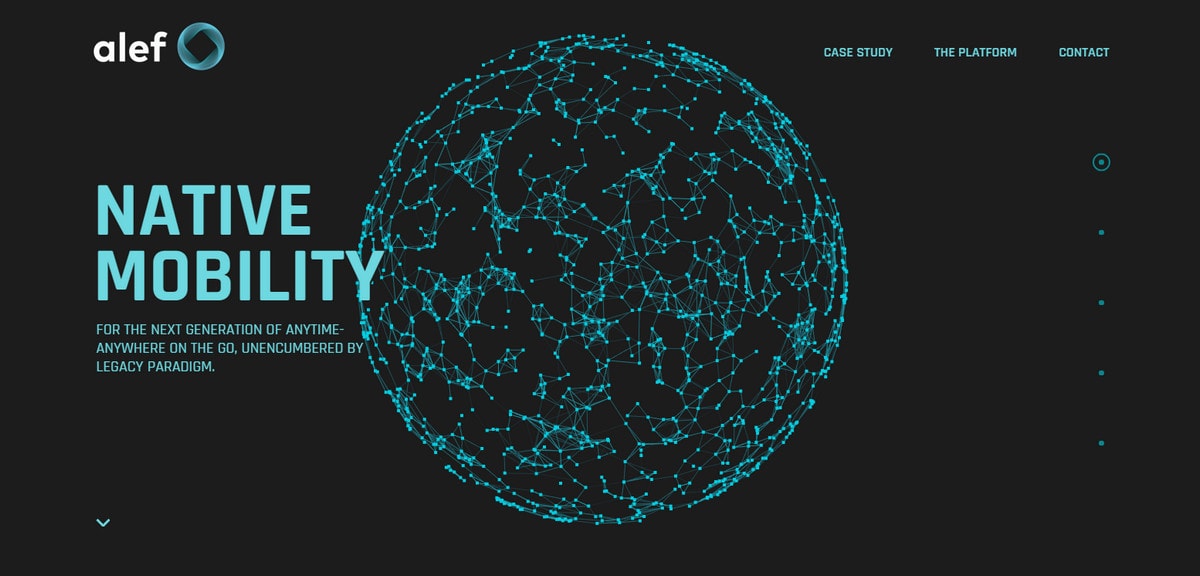
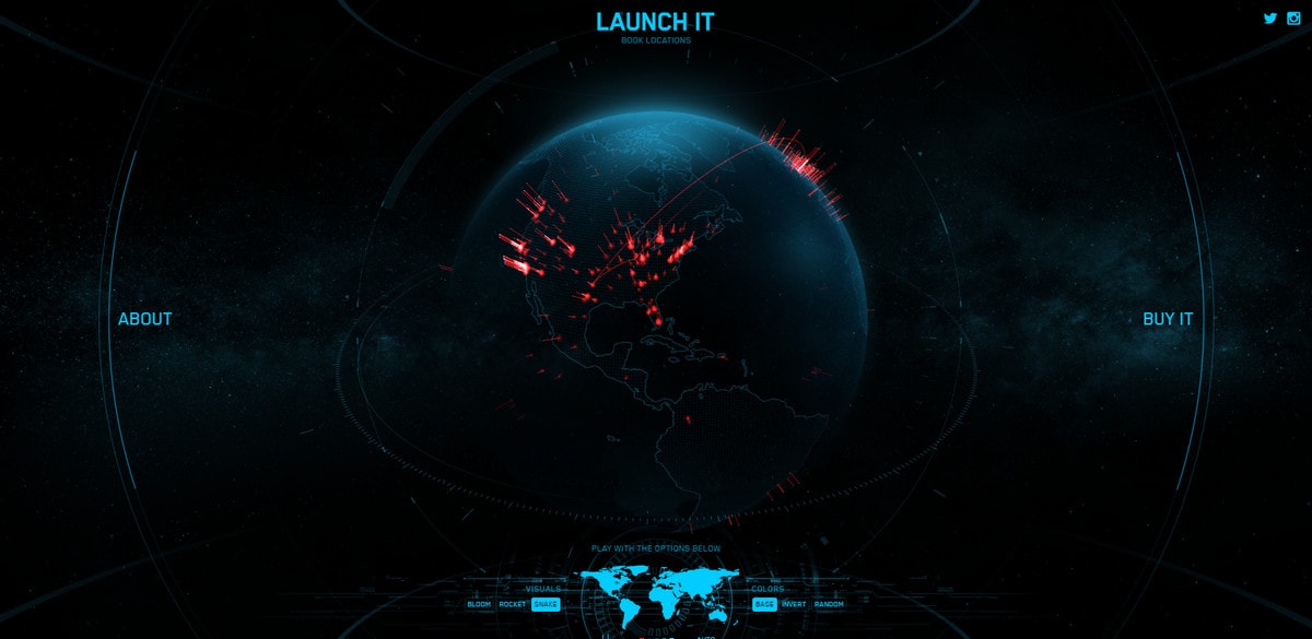
The front page of Alef Mobitech boasts a sophisticated particle-based orb that has a mostly decorative role; yet it nicely echoes with the brand. The Launch It hero section is marked by a skillfully reproduced globe with an enigmatic feel that lies at the heart of the user experience. These are powered by the latest techniques, such as WebGL, but they are different, showing the diversity that is inherent to this area.
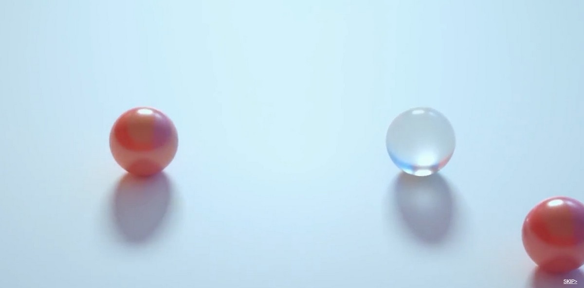
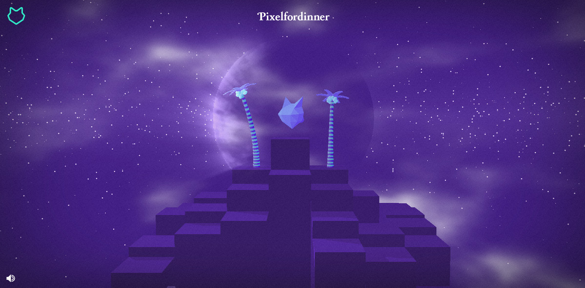
Truth be told, spheres are found in images and videos, such as Hotel Poispois, where the intro features several moving glass balls, and Pixelfordinner where the huge globe constitutes a background. 3D circles have become an important instrument in web designers’ toolkits.
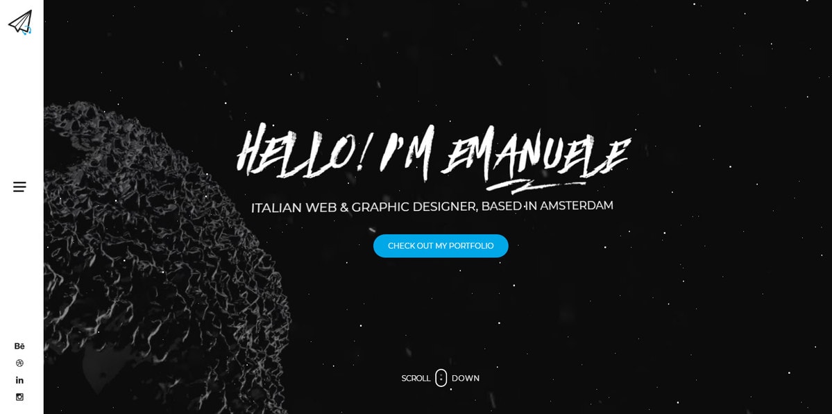
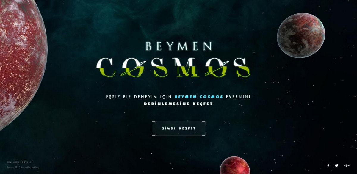
The great thing about this trend is that it is inspiring. There are so many versions of spheres and globes. Although they are largely used to produce and strengthen first impressions, like in case of Emanuele Papale where the moving polygonal sphere gives the front page a cutting-edge feel rather than underlie the user experience like Beymen Cosmos, where the theme is nothing without planets. The trend has carved out quite a niche for itself.
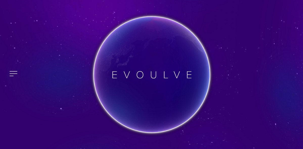
Let’s set look at projects that pursue dramatic effects. They are the most intriguing and amazing. Coming in different stylistic choices from outrageous and offbeat like in Gilles Riviere to elegant and refined like in Evoulve, spheres surprise with variety and creativity.
With Postcards Email Builder you can create and edit email templates online without any coding skills! Includes more than 100 components to help you create custom emails templates faster than ever before.
Free Email BuilderFree Email Templates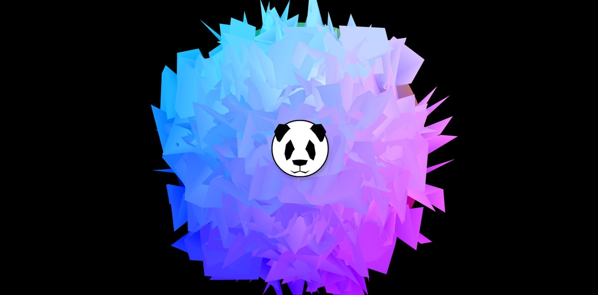
Modern libraries and plugins allow bringing to life unbelievable ideas. You can use now familiar techniques such as particles or polygons to push limits in favor of unusual interpretations that imitate real-life surfaces. But don’t forget about behavior. Such projects are non-static and as a rule have some tiny, but thrilling dynamic features. Consider several mind-blowing examples.
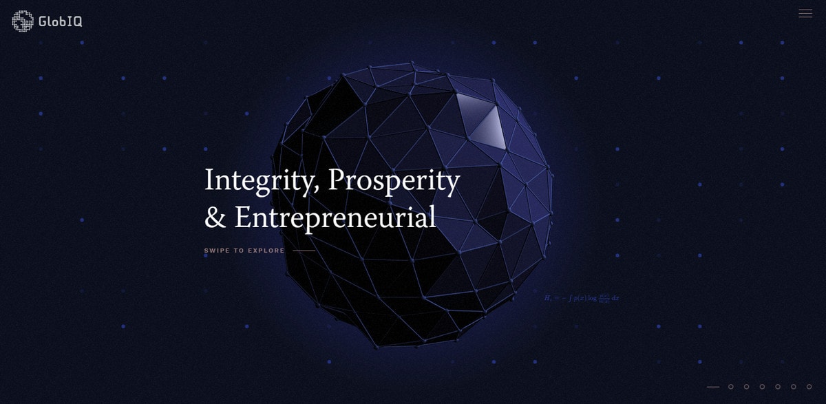
GlobIQ sticks to a classic approach. It is a stunning example that shows successful transition of polygonal art into a 3D plane. Not only does the sphere move in space but it is also supplied with a mouse hover effect that lets users highlight segments, making the experience even more engaging.
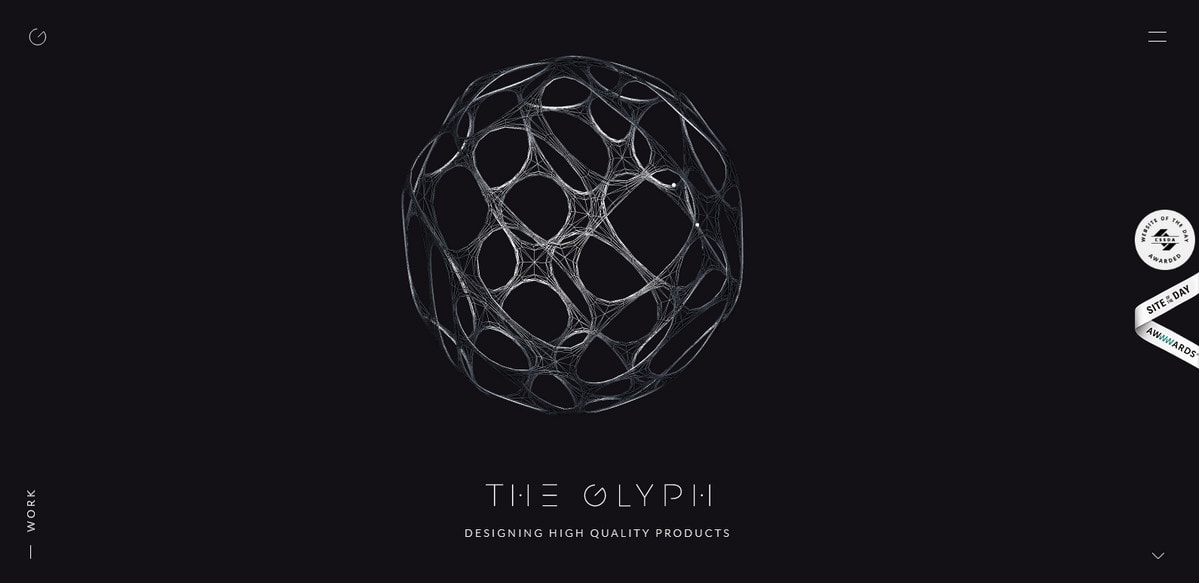
The Glyph Studio demonstrates an ingenious experiment with the surface. It is made as a cunning weave that looks fragile and subtle. The sphere takes up a relatively huge area. Thanks to “holes” it does not visually overload the design; it looks light and even ethereal.
Globes
Another huge area where spheres are flourishing is globes. Cosmos and planets allure with unexplored potential and mysterious scenes. It seems that this year designers reflect their love for the science fiction with the help of websites, showering us with out-of-this-world solutions. Despite the fact that in the majority cases the choice is Earth, interpretation differs in many aspects, including coloring, design, behavior and purpose. Designers try not to repeat themselves coming up with truly impressive solutions. Let’s consider some interesting examples.
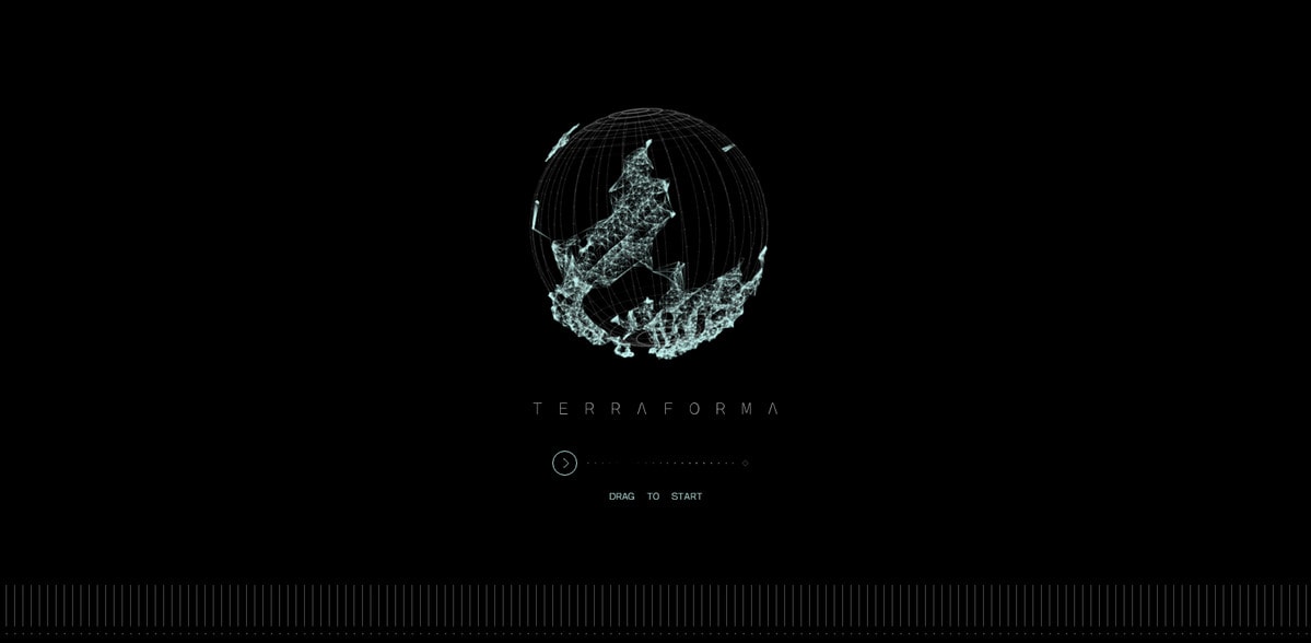
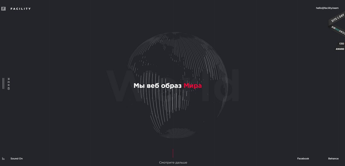
Terraforma and Facility Team demonstrate refined versions of globes. They are made of particles and thin lines. Both teams deploy them as an element of introduction that supports the informative part of the project. Their presence is fleeting but they strike the eye and contribute to the general aesthetic.
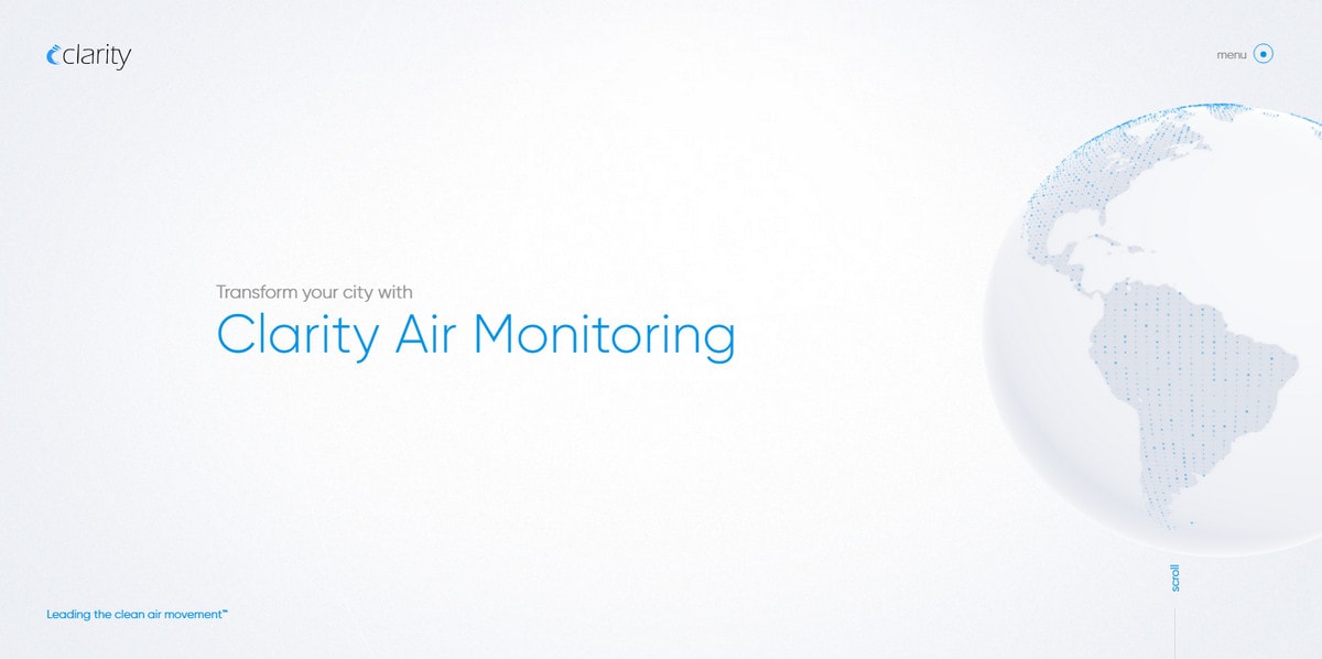
Clarity has an interactive Globe made in solid white with blue pins scattered throughout. You can toy with the sphere by rotating it on a different axis. The solution perfectly complements the beautiful light theme with a high-tech atmosphere providing the interface with an excellent finishing touch.
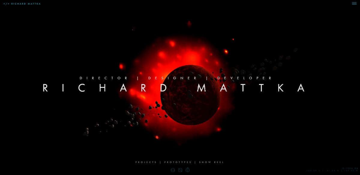
Whereas the previous examples demonstrate different versions of Earth, the personal portfolio of Richard Mattka shows an obscure astronomical body. The artist expands boundaries and invites its visitors to enjoy a fantastic scene from the cosmos where black unknown planet takes center stage.
From abstract to realistic, let’s consider an example that uses a skeuomorphic approach to its advantage. From Here to Everywhere features a clean 3D model of Earth that revolves around an axis. You can drag it in different directions. It serves as a base for the user experience, presenting a bulk of data in an engaging manner.
With Pulsetic you’ll be instantly notified the moment your website, API, or server becomes unavailable. Monitor uptime from multiple global locations and respond to incidents before your users are affected.
Create beautiful status pages in minutes to keep customers informed during outages and build trust with transparent communication.
Start Monitoring for Free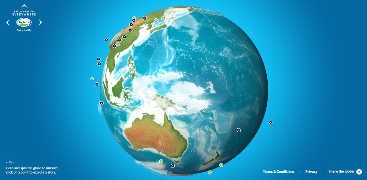
Conclusion
In terms of design, globes are nothing new, but they have matured. They are not just regular pictures of Earth that adorn the background; they have transformed into interactive pieces that are packed with engaging dynamic details.
Globes may be from the past, but interactive WebGL-powered spheres are certainly from the future. They surprise with a modern and sophisticated appearance. It is a place where designers exercise their capabilities and show off their skills and creative thinking.
Each of these directions has its own potential and a huge area to be explored. Together, 3D spheres give artists new tools for providing interfaces with a high-tech aura and futuristic appeal.
What do you think about spheres and globes in web design? Which solution do you prefer? Which interpretation do you find most inspiring?
