Grids and Icons for Creating iOS 7 Templates
Most of us already have seen the keynote from Apple in which they announced the new operating system for their portable devices, iOS 7. As people have been discussing for a long time, Jony Ive’s team flattened the interface and went for a simpler feel and design.
After the keynote, pundits have been criticizing Apple for their poor design, lack of balance and wrong decision-making in many elements of their new GUI, but they don’t realize that this whole overhaul has been done in only 7 months. Until the final release will appear, things will probably be improved.
Here at Designmodo, we have been browsing the internet for the past couple of days to find useful resources for you in regards with the new iOS, as many of you might want to start designing interfaces for your apps or templates. Below you can see the resources we found for you, most of them for free, and you can download and use them for your own purposes. Don’t forget to give credit to the guys who designed them.
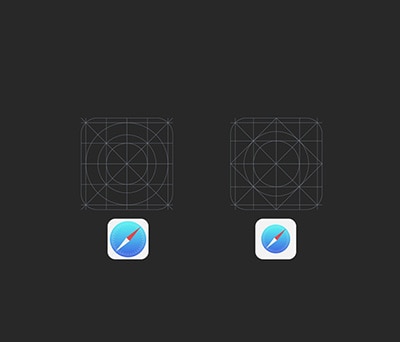
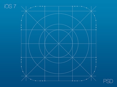
These first two are icon grids for iOS, which you can basically use to build any other icon on top of it, while also following the guidelines Apple set in their icon design process. Both of them look quite the same. I am showcasing both so you can learn from each one of them, unfortunately only the first one is available for download.
With Postcards Email Builder you can create and edit email templates online without any coding skills! Includes more than 100 components to help you create custom emails templates faster than ever before.
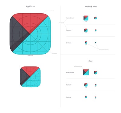
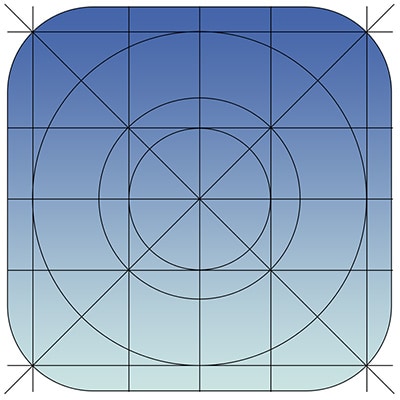
Free Email BuilderFree Email TemplatesThe following two examples are icon grids as well, both of them available for download, which can also be used for the same purpose as the ones above. The first one comes in different sizes and for different devices, such as iPhones and iPads.
You can create pretty much every icon you want with the grids showcased above. There were much more to choose from, but to be honest most of them look the same (as it would be normal) an it’s not worth spending time showcasing them. Having the ones above should be enough.
Let’s take a look at some icon redesigns done by different designers. Some of them can be downloaded as well and used for your own purposes, but pay attention to the creative licenses.
The first example is a redesign of Chrome, Weather and Evernote.
We continue below with different redesigns of Safari’s icon, some of them, I might say, even better than the original one.
With Startup App and Slides App you can build unlimited websites using the online website editor which includes ready-made designed and coded elements, templates and themes.
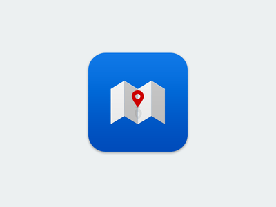
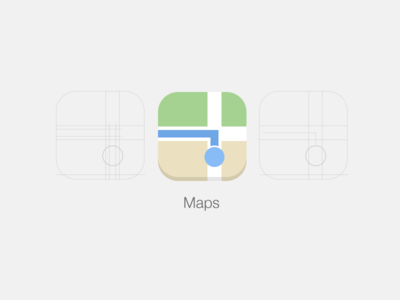
Try Startup App Try Slides AppOther ProductsThe following two, although very different, are both examples of the Maps app in iOS 7.
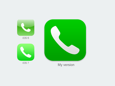
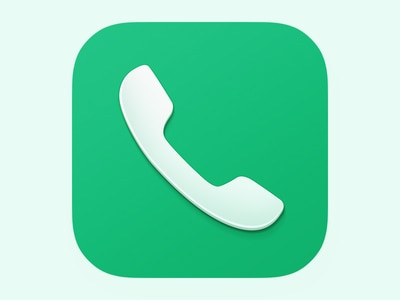
Below there are three redesigns of the Phone app for iOS7.
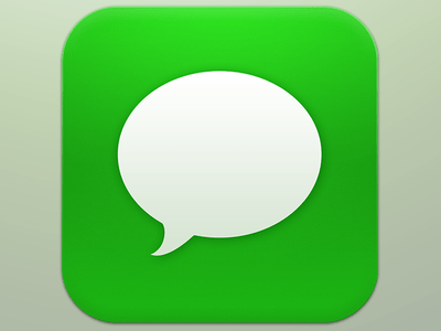
And now, four examples of the redesign for the Messages app.
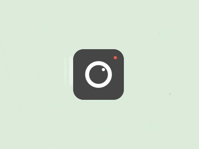
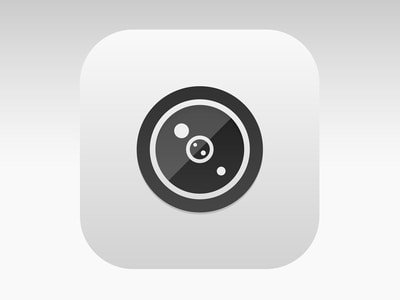
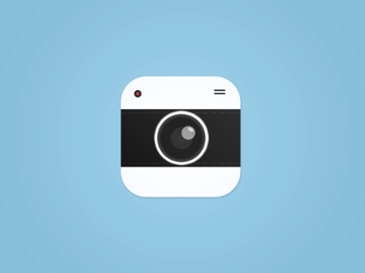
There are even more good examples of redesigns for the Camera app. You can find more on the internet, but I believe the best five are showcased below.
Other icon redesigns can be seen below. We will start with one for the Mail app and two for the calendar.
As you can see above, many designers already started to redesign iOS 7 icons. With the grids you have in the beginning of the article, and the inspiration you can get from the examples, it shouldn’t take much time until we will see some more redesigns from you.
Make sure you stay within the guidelines set by Apple and let your creativity flow. The worst thing that can happen is to come up with an amazing design.
