A Guide to Making Your Images and Videos Accessible
When you think of accessibility, do you envision things like ramps outside of restaurants or handicap bathroom stalls?
While consumers have long fought for equal access to places of public accommodation, it’s no longer just in the physical world where this battle rages. Digital businesses are just as responsible for giving everyone easy access to their websites regardless of their impairment or limitation.
Why does this matter? And what exactly do you need to do about it?
Web accessibility is a huge topic and not one that I can fully unpack here today. However, what I can do is explain why it’s something you can’t afford to ignore and how to take some simple steps towards making your website accessible.
Starting with your images and videos.
Why Accessibility Matters for All Websites
Winn-Dixie, Domino’s, and even Beyonce have been sued for having inaccessible websites.
With Postcards Email Builder you can create and edit email templates online without any coding skills! Includes more than 100 components to help you create custom emails templates faster than ever before.
Free Email BuilderFree Email TemplatesAs larger websites are targeted with very expensive and high-profile lawsuits, they’ll all eventually get the message and comply with the Web Accessibility Initiative. This, in turn, will set the expectation that every website must offer the same level of access to everyone.
If your website isn’t accessible, don’t expect consumers to let it slide. You could be subjected to your own lawsuit, negative press, and lost revenue as a result. It can also hurt your SEO efforts.
Now, there’s a lot that needs to be done to make a website compliant. However, if you start with your website’s images and videos, you can slowly start to chip away at the issues your impaired and limited visitors face.
To be clear, I keep mentioning “limited” visitors because accessibility isn’t just about developing sites so that visually, physically, or mentally impaired people can use it.
Accessible design also helps:
- Search bots “read” the content of your visuals for the sake of indexing and ranking them.
- Mobile users who are in data-roaming mode and can’t see the visuals on the page.
- People in public places who can’t watch a video without disturbing everyone near them.
Accessible web design really is about making a website easy for everyone to use.
How to Make Website Images Accessible
Let’s start with your images. In order to make them web accessible, you’ll need to know how to program it into your code.
Don’t worry. It’s easy to add some simple lines of HTML to help all of your website visitors understand what they’re not able to see. You can also use your website builder to do this.
With Pulsetic you’ll be instantly notified the moment your website, API, or server becomes unavailable. Monitor uptime from multiple global locations and respond to incidents before your users are affected.
Create beautiful status pages in minutes to keep customers informed during outages and build trust with transparent communication.
Start Monitoring for FreeLet’s look at some examples to see when and how to make your images accessible:
Decorative Images
Images that serve no purpose other than to add some texture or color to your site don’t need an accompanying description. The same goes for nondescript graphics.
For instance, this is the type of graphic that appears alongside each benefit mentioned on First’s homepage:
It’s not like anyone will miss out on the fact that no one described this graphic. It’s not as though it tells us anything more about First’s API or digital payments. It’s more just here to bring balance to the section.
The same is true for background images or textures.
Take this graphic that appears in the top banner of the Odessa Opera’s News page:

If this image had been part of the homepage hero image, that would be a different story. However, the faded image is on this page solely for decoration. By taking the time to spell this out, you’ll only keep visitors from learning about the news they came here to read.
Descriptive Images
Let’s say you’re building a website or blog for a veterinarian and they have a page with information on how to take care of a dog’s paws.
While that information could be described with text alone, it’s probably more useful to show your visitors photos of what’s being described.
In that case, you’d add alt text to the image.
Short for “alternative text”, the alt text attribute describes what we see in an image. This is a must for making visual content accessible.
You can add it to your website builder’s “alt text” field when uploading the image, like this WordPress example:

Or you can write it into your image’s HTML. For example:
<img src=”dog-paw-pads.webp” alt=”Person holds up the paw of German Shepherd puppy to inspect for dry, cracked pads” width=”1280″ height=”680″>
The information goes after the alt= attribute. When someone uses a screen reader or views the mobile website while roaming, this text will represent the image, so make sure you fully capture all the details they need.
What’s more, the better you describe your images, the easier it’ll be for search engines to rank them in Images search results.
If images contribute to the story, add context, or otherwise support the written content on the page, they need alt text. For example:
Illustrations or screenshots like this one on the Asana homepage:
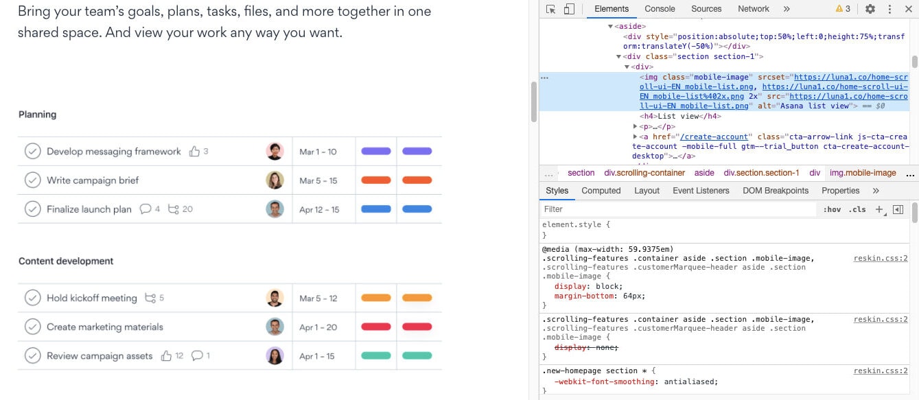
The alt text for this graphic is “Asana list view”.
Photographs that tell an important story and provide context like the ones you find on the NASA website:
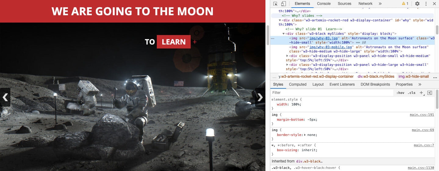
This alt text says “Astronauts on the Moon surface”.
Logos like the kind agencies and tech companies tend to place on their homepage as Verbal+Visual does:
The alt text for each of these logos reads “[company name] logo melanin”.
Data visualization like this infographic on the Wordstream blog:
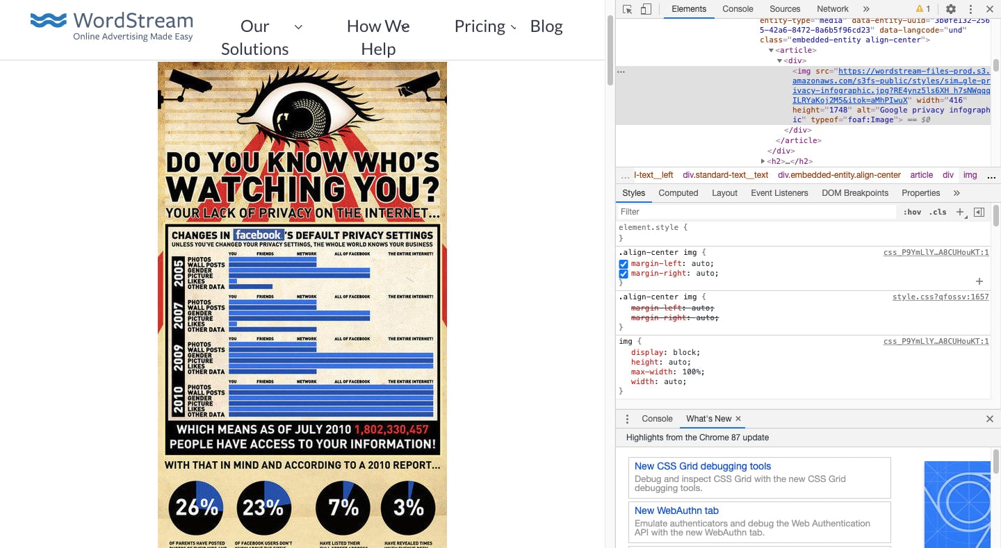
The alt text is “Google privacy infographic”.
Featured images like the ones you find on the BuzzFeed website:
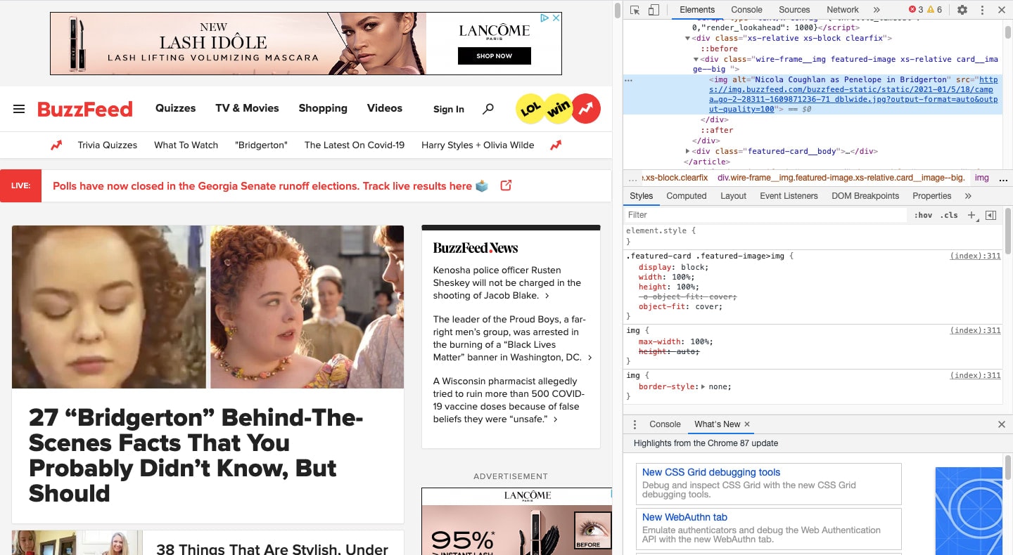
The one we’re looking at here has the alt text “Nicola Coughlan as Penelope in Bridgerton”.
How to Make Website Videos Accessible
When it comes to videos, there are four things you need to do to ensure the content is accessible:
Accessible Video Players
It’s best to embed videos from external sources since video files can be huge drains on your server. But be careful which video players you host your content on.
You’ll need one like YouTube or Vimeo that allows you to accomplish two things.
The first is to enable users to control the player without a mouse, just as I’m doing by tabbing through this Britney Spears video:
The same thing should happen when impaired visitors want to use the keyboard to control videos embedded directly on your site, like this one from Moz:
Users should also be able to access the player’s controls with a screen reader.
Captions
The second thing your video player should do is offer users the option to turn on captions.
Captions appear on the screen of your video and allow people who either cannot hear the audio or who have turned it off to follow along with anything said or heard.
By default, many video players will automatically generate captions for you. If you want them to be more precise and accurate, you can create and upload your own.
Once they’re uploaded, your viewers can turn on the closed captioning feature, just as I’ve done with this Fast Company video:
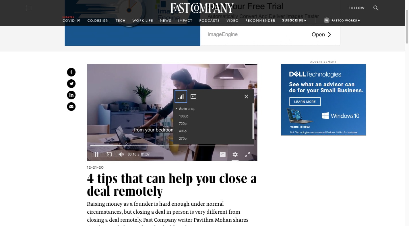
It’s also a good idea to automatically set your videos to mute (as the example above does).
If someone can’t see the screen, the auto-playing video could be a pretty big shock for them and they’ll feel rushed to find the video player and to turn off the sound. The same goes for people who visit the page while they’re in a public place and weren’t expecting it to come with audio.
Audio Descriptions
For people who can hear the video but not see it, there’s information they might miss that regular captions won’t help with. This is what an additional audio description track or text file is for.
Audio descriptions are similar to alt text in that they describe what’s happening on the screen. They also vocalize any words that may appear within the video.
Similar to alt text, you only need to include audio descriptions when it makes sense.
For instance, if the video is of two people chatting during a podcast, audio descriptions aren’t necessary. But when someone’s presenting data visually in a webinar, they are.
Popular video players like YouTube and Vimeo don’t support audio description unless you actually include the snippets in your video’s audio or its captions.
If this is a critical accessibility feature for your content, you’ll want to use one of these accessible video players that supports it.
Transcripts
The last thing you’ll need to make a video accessible is a transcript.
A transcript is a document that spells out:
- What was said in the video
- Who said it
- What happened on the screen
- When each thing was said or appeared
TEDx Talks actually come with transcripts translated into over a dozen languages:
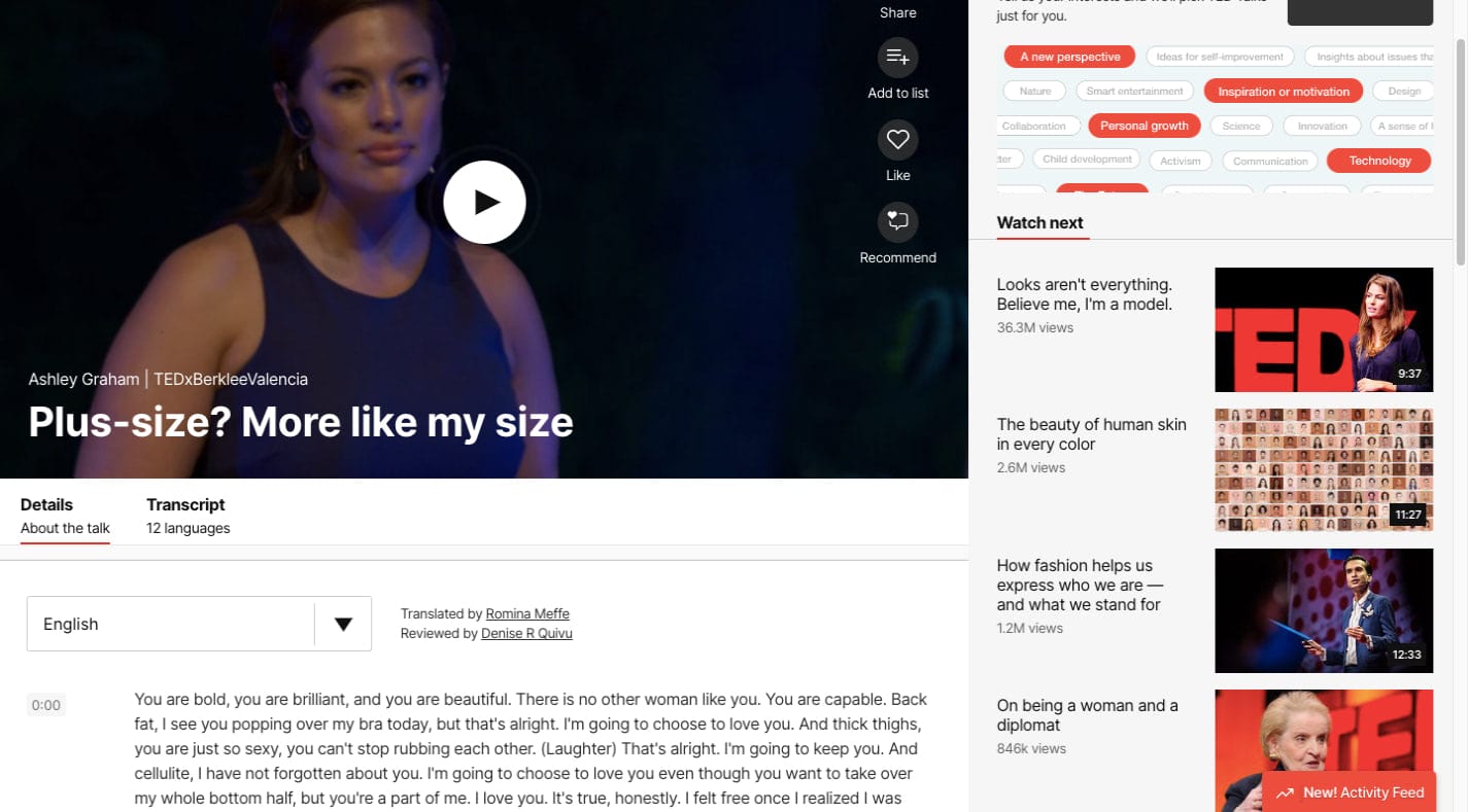
Transcripts aren’t just useful for impaired visuals who can’t hear or watch videos.
They’re useful for people who are more comfortable reading through the recap rather than watching a 20-minute video.
They’re also useful for SEO as they appear directly on your web page beneath the video. If you optimize them for search the way you do your other pages, your videos can actually be indexed and ranked like everything else.
Wrap-Up
This is only the tip of the iceberg when it comes to web accessibility, but it’s a very important part of it.
We often use visual content in order to enhance the messaging on our websites and provide further context for our points. Everyone who visits the site should have access to the full story and not just what they’re able to hear or see.
Making your images and videos accessible allows that to happen.

